Brand identity
JANG (FR)
Jang, an agency specializing in real estate property management, is about to enter the market. Comprised of a young team with a strong background in the real estate and legal sectors, their journey has been marked by hard work, meticulous prospecting, and the establishment of a strong network. However, they were missing a crucial element: a visual identity that fully reflects their essence.
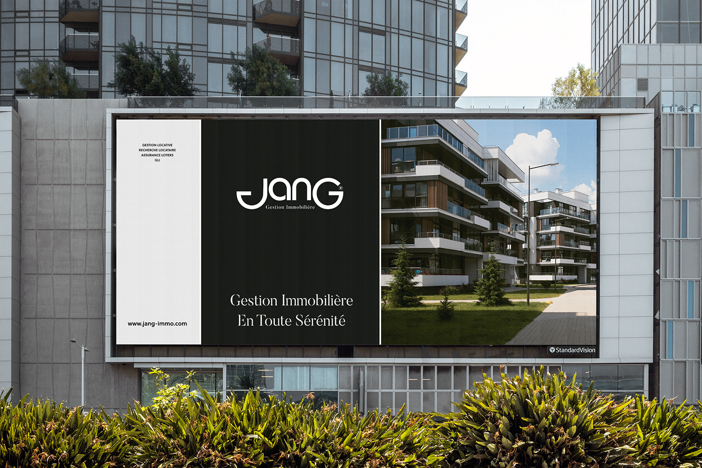
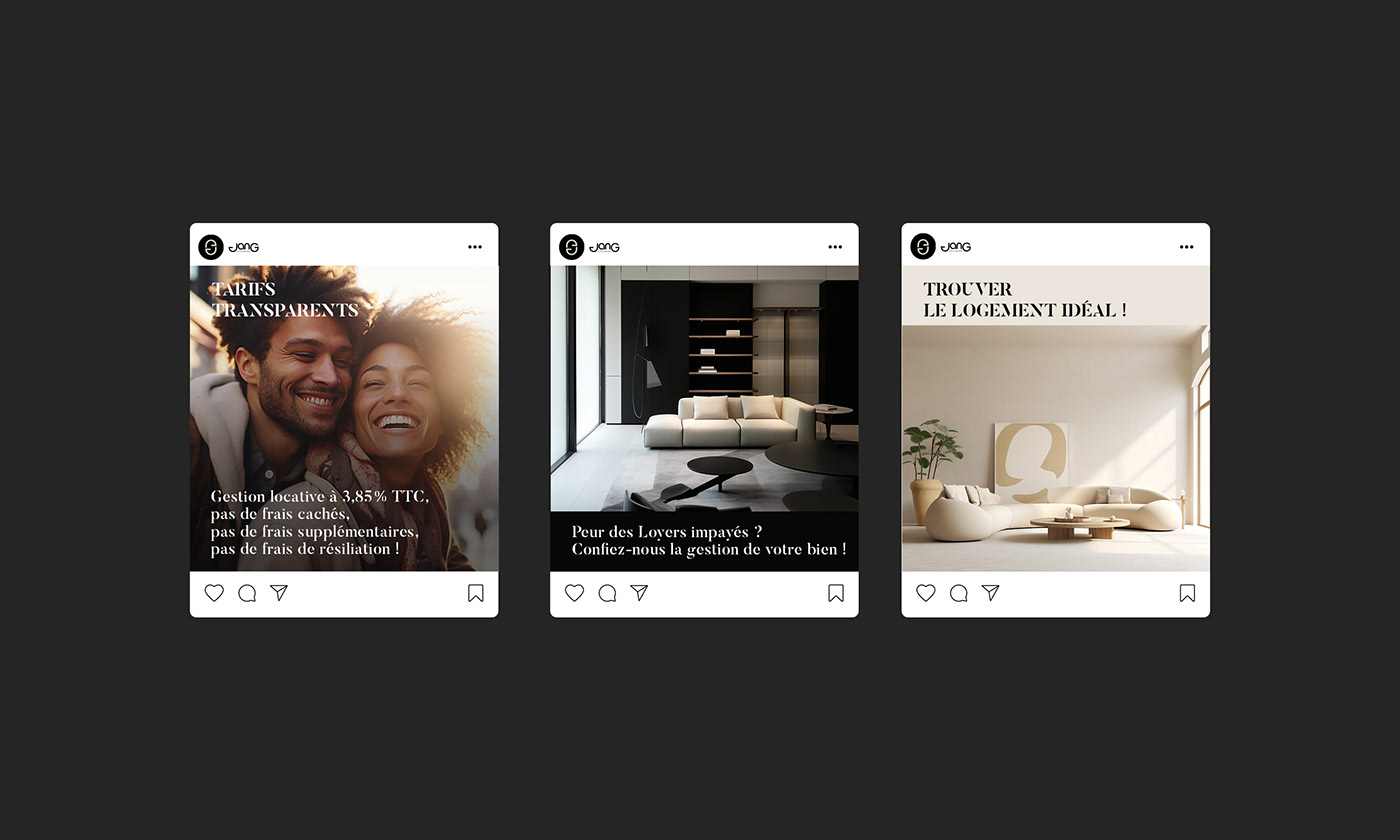
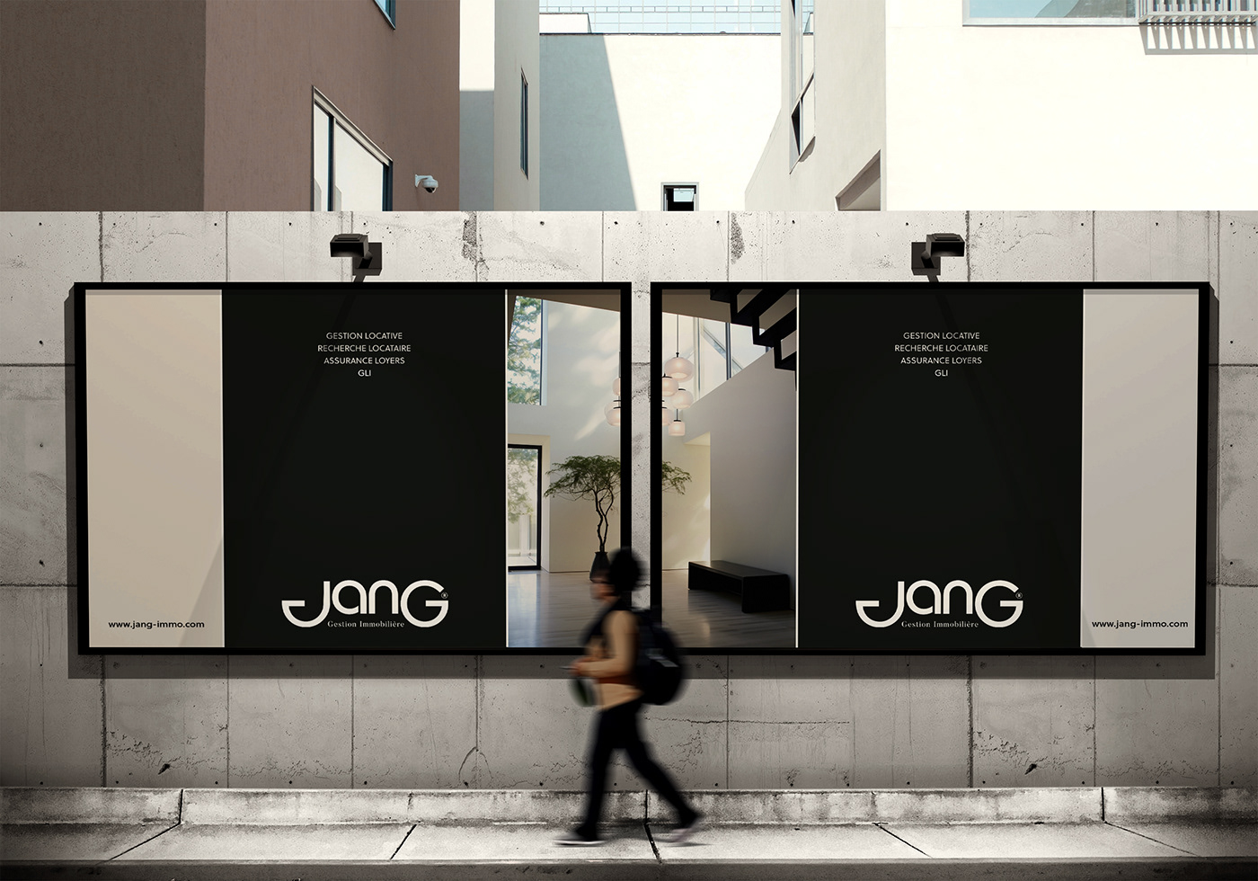
The main challenge of this project was to create a brand identity that is both warm and minimalist, capable of communicating the unique personality of the company in a simple and transparent manner: a touch of eccentricity and extravagance, without compromising credibility and professionalism. The goal was to inspire confidence while appearing both youthful and experienced. Jang wanted its image to convey the message: 'We are young, accessible, and offer top-quality services with serious guarantees in a welcoming atmosphere.
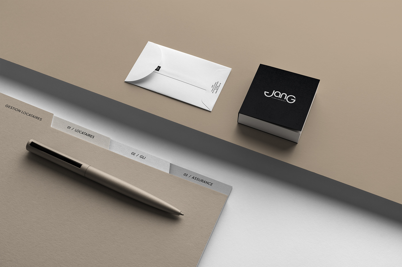
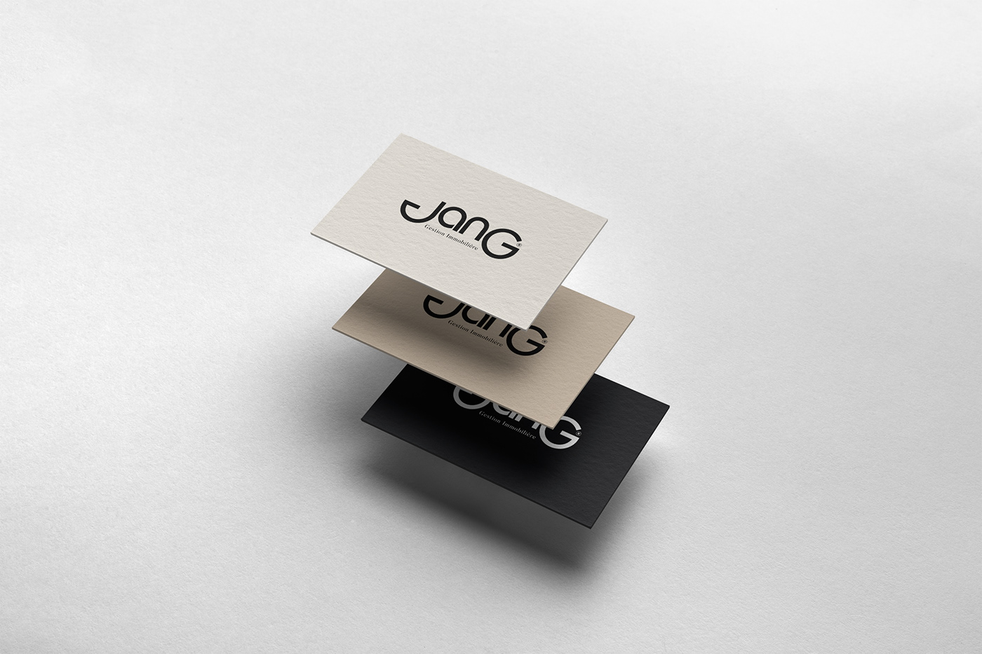
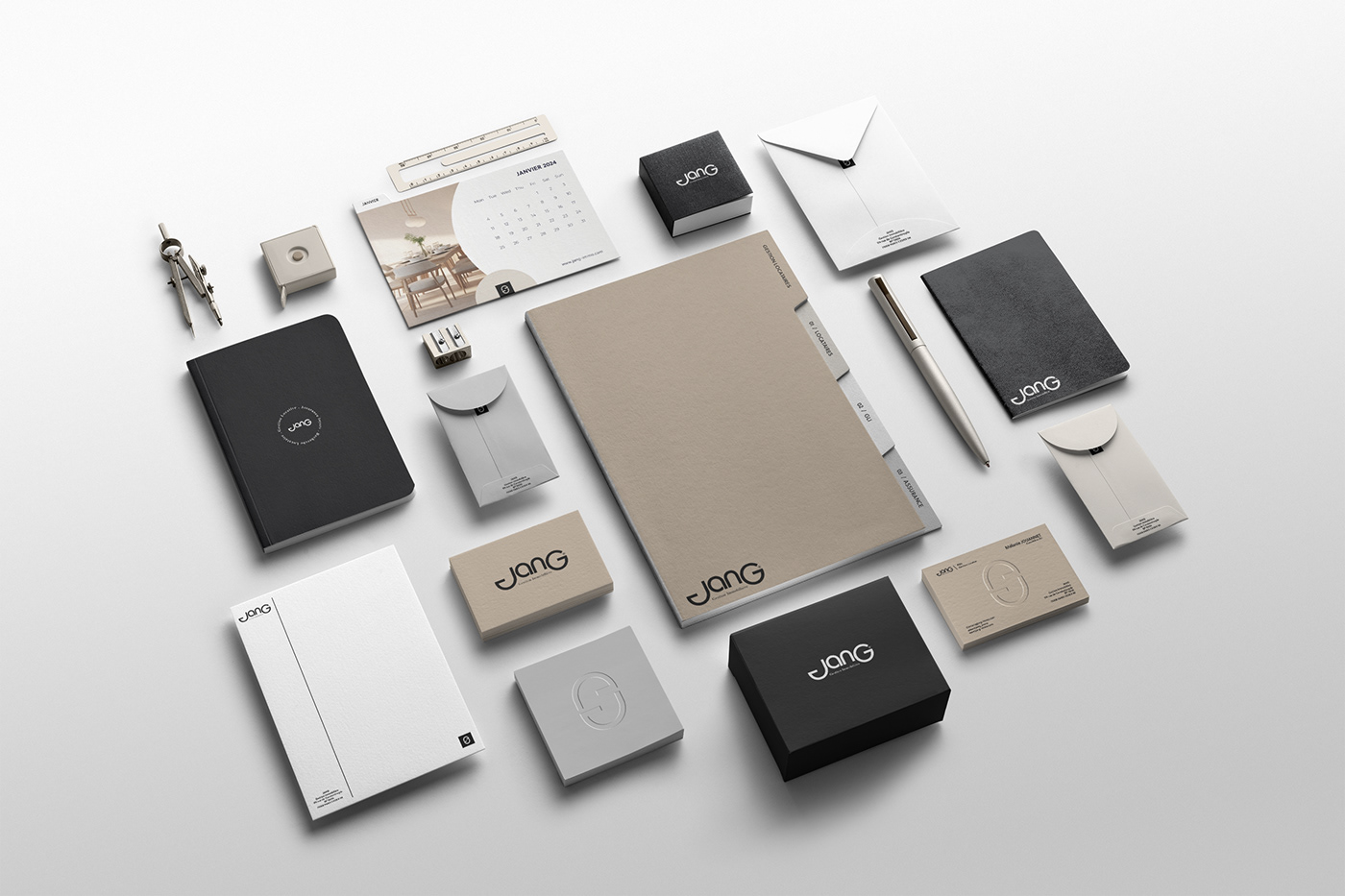
To meet this vision, we opted for a primarily typographic logo that can be used on its own or with its pictogram. The logo stands out by boldly displaying the first and last letters in disproportion compared to the other letters, symbolizing the touch of eccentricity and extravagance that characterizes the company. The stability of the overall logo, as well as the geometry of the 'J,' mirroring the curves of the 'G,' illustrates the legal and institutional dimension of Jang. These two letters also represent the company's two client bases: property owners and tenants, who are complementary and inseparable from each other.
To know more about my works : noemiaa.fr I Instagram