


Presentation of the landingpage
ASSIGNMENT
This assignment is for SuperFood Inc., an agricultural biotechnology company
focused on the production of superfoods. Thanks to the health craze of the last years, they
are doing well enough among the target interested in a healthy lifestyle but this is not
enough. SuperFood, Inc. wants to reach a wider audience with a campaign to popularize
superfoods called “Beet, Don’t Kale My Vibe”. They want to position superfoods as
something not just healthy, but fun, young and appealing. For this I was in charge of a
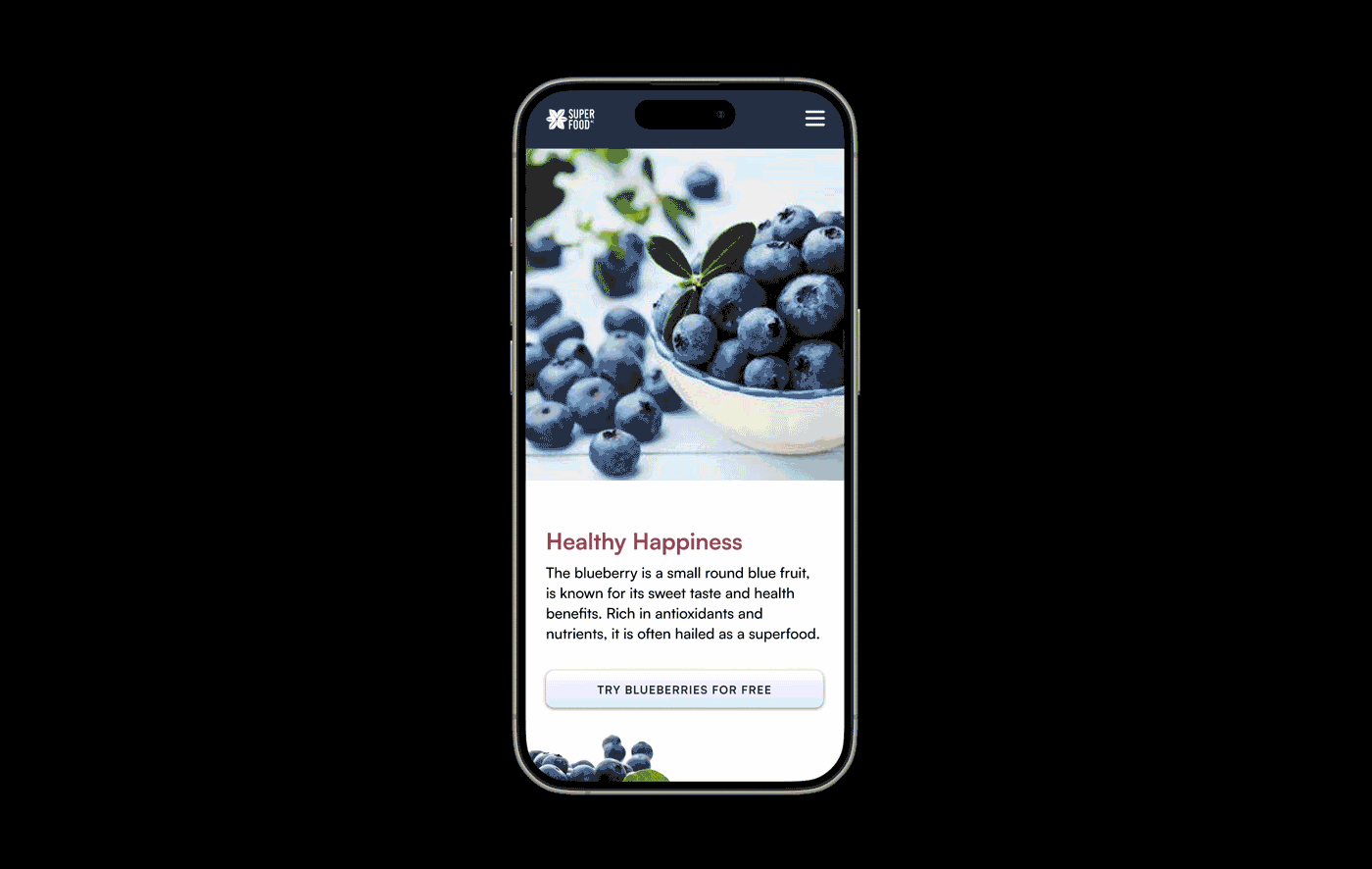
key element of this campaign: designing and building the landing page. The blueberry was the superfood I had to promote.
PROBLEM
Superfood Inc. wants to introduce a broader target group to blueberries
QUESTIONS
Who is the user? What do I want the user to do? What is the goal? What problem needs to be solved here? I created a rough mindmap, see below
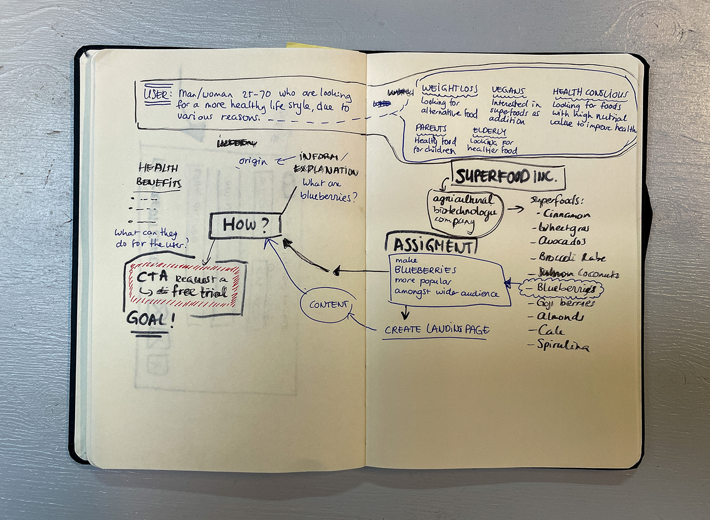
Mindmap to find out where the focus needs to be
GOAL
Entice the user to download a voucher to collect a free sample box of blueberries from selected addresses. The voucher can be found on a landingspage from Superfood Inc.
On the landingpage we invite our target group to try and taste our product. For that we need to will:
• Inform and explane (more information about blueberries and the background)
• Sum up the health benefits
• Invite to try the bluerries –> CTA download voucher

The different steps in the design process, versions 1 to 7
DESIGN PROCESS
During the designing I came to stand for a few chooses.
* Because the blueberries look good and tasty I chose to use many images. Another
additional benefit: they are quickly recognized by newe users for example in stores.
* Because of the roundness of the blueberries, I'd taught it would be good to use a font
with round angles. I chose for Satoshi, because that also has a good readablility, also
very important!
with round angles. I chose for Satoshi, because that also has a good readablility, also
very important!
* For primary color I chose for a dark, warm blue, that matches the blueberry. I chose
a contrasting warm dark pink to accompany the primary color.
a contrasting warm dark pink to accompany the primary color.
FINAL DESIGN
During the designing I came to stand for a few chooses.
* Because the blueb

Final design
Daily UI | Day 003


