

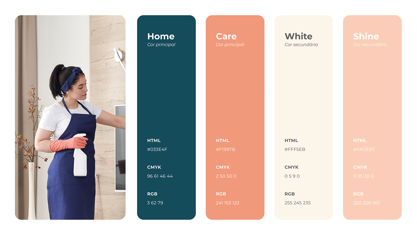
Sobre a marca
A Healthy & Shine é uma companhia de limpeza que conta com uma equipe
altamente qualificada e empenhada em criar um ambiente limpo e confortável
para a sua casa. Com uma forte dedicação à limpeza e ao bem-estar, sua
equipe de especialistas oferece serviços de limpeza de alto nível que não só
deixam o seu espaço brilhando, mas também promovem uma vida ou ambiente
de trabalho mais saudável.
__
__
About the brand
Healthy & Shine is a cleaning company that has a team highly committed to
creating a clean and comfortable environment to your house.
With a strong dedication to cleanliness and well-being, your team of experts
offers top-notch cleaning services that not only leave your space shining, but
also promote a living or ambiance healthier workplace.
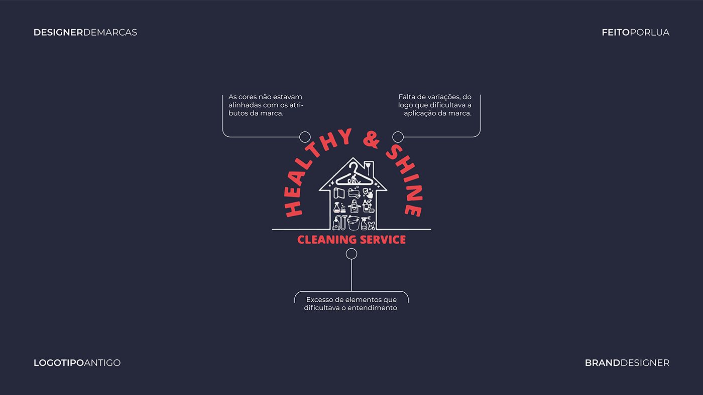
Sobre o redesign
O antigo logotipo da marca apresentava problemas de diagramação e
legibilidade, que prejudicavam a identificação e leitura. Além disso, utilizava
ícones clichês no ramo que fizeram com que a Healthy & Shine se misturasse
com a concorrência.
__
About the redesign
The old logo of the brand had layout and legibility issues that hindered
identification and readability. Additionally, it used cliché icons in the industry
that caused the Healthy & Shine to blend in with the competition.
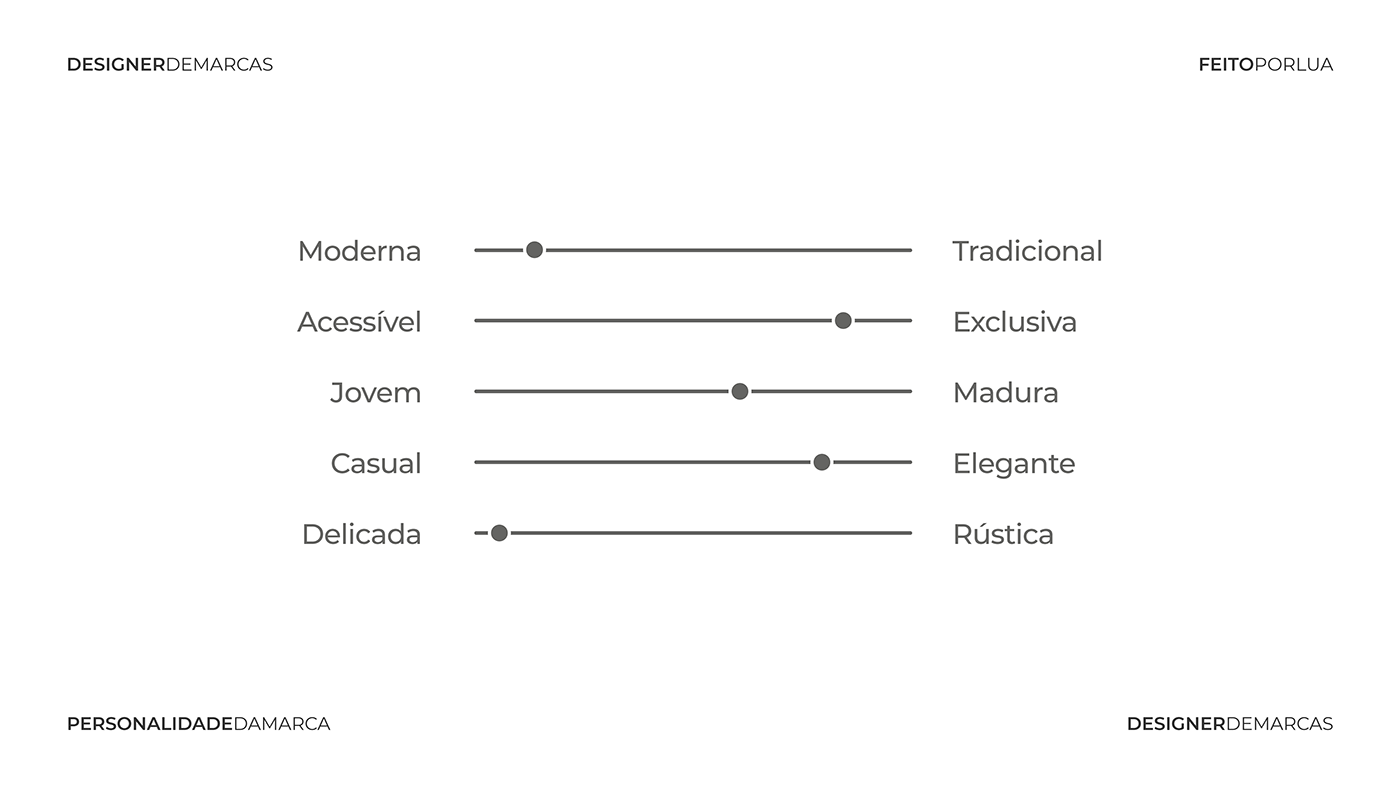
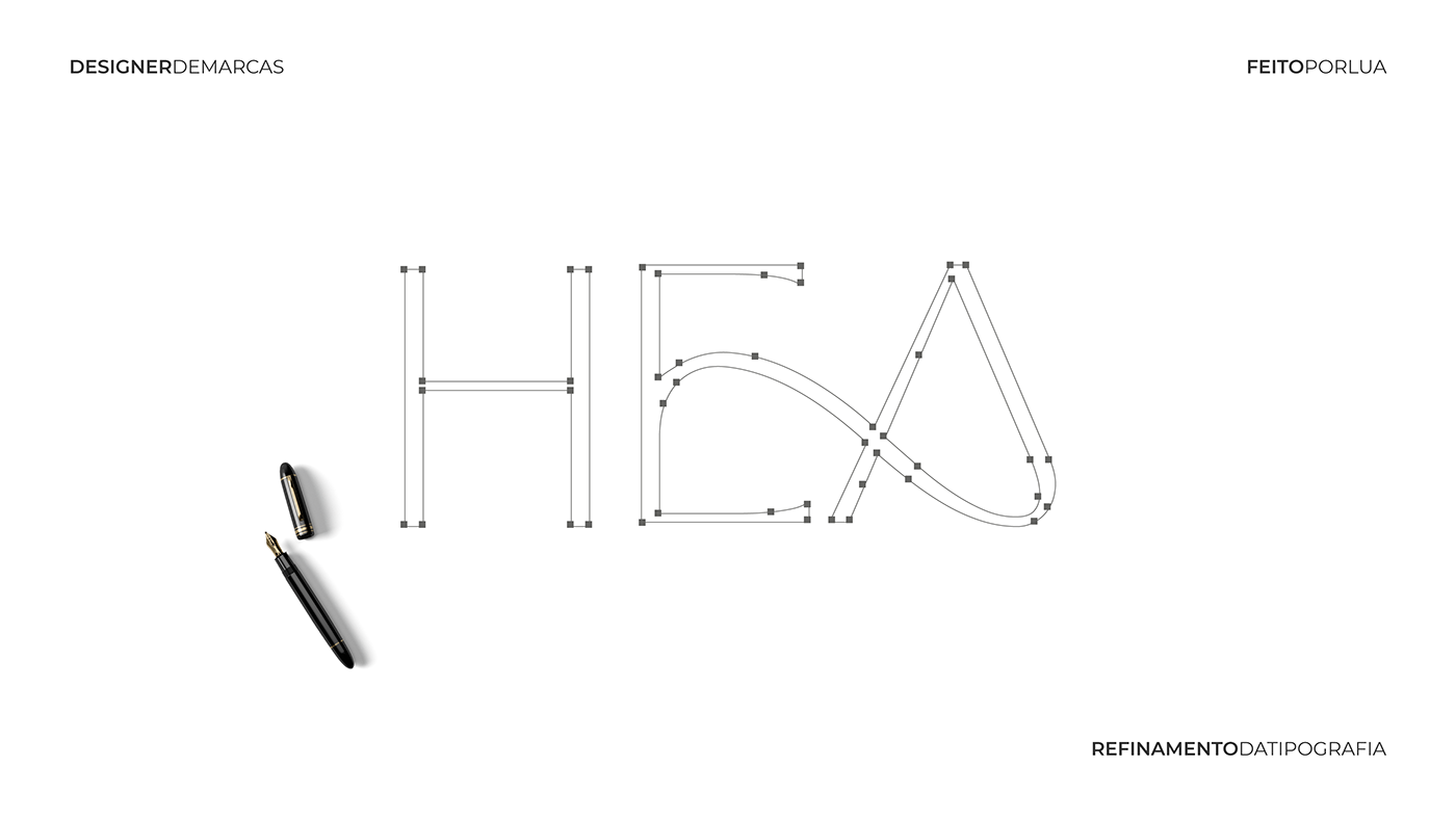
Sobre a identidade visual
A marca carrega atributos como: confiável, moderna e exclusiva, que devem
ser transmitidos na identidade visual.
A tipografia foi modificada exclusivamente para a marca, tornando-a única e
totalmente autêntica. O conjunto expressa segurança e eficácia, além de
representar uma marca moderna com atenção aos detalhes. As letras em
caixa alta traduzem a responsabilidade e o compromisso da Healthy & Shine.
__
About the visual identity
The brand embodies attributes such as: reliable, modern and exclusive,
which should be transmitted in the visual identity. The typography was
modified exclusively for the brand, making it unique and totally authentic.
The set expresses safety and efficacy, in addition to represent a modern
brand with attention to detail. The letters in capital letters reflect
Healthy & Shine responsibility and commitment.
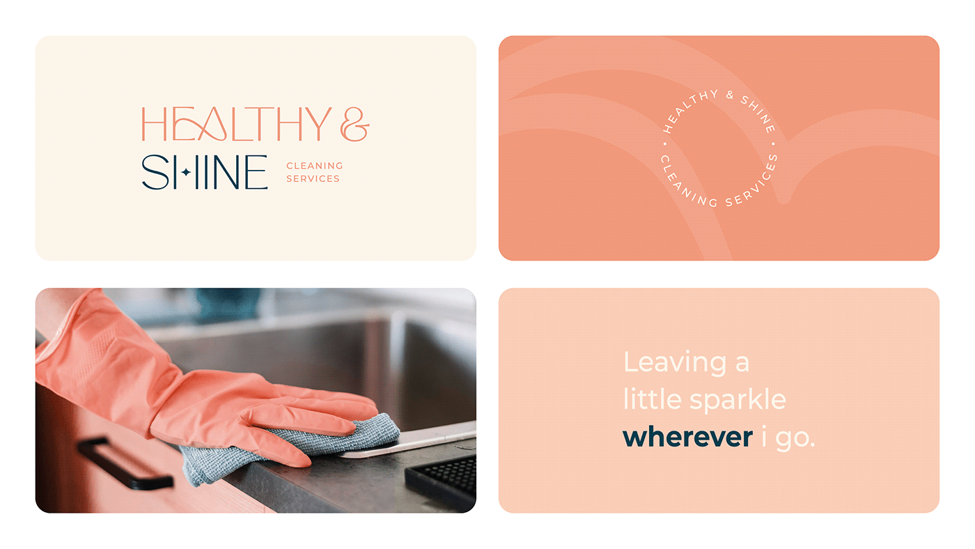
Sobre o logotipo
Evitar o uso de ícones clichês na área da limpeza, como vassouras
e rodos, sugere que a Healthy & Shine está adotando uma abordagem
inovadora e contemporânea em relação aos serviços de limpeza.
Isso pode atrair clientes que buscam soluções mais modernas.
__
About the logo
Avoid using cliché icons in the cleaning area, such as brooms
and squeegees, suggests that Healthy & Shine is adopting a
innovative and contemporary in relation to cleaning services.
This can attract customers looking for more modern solutions.

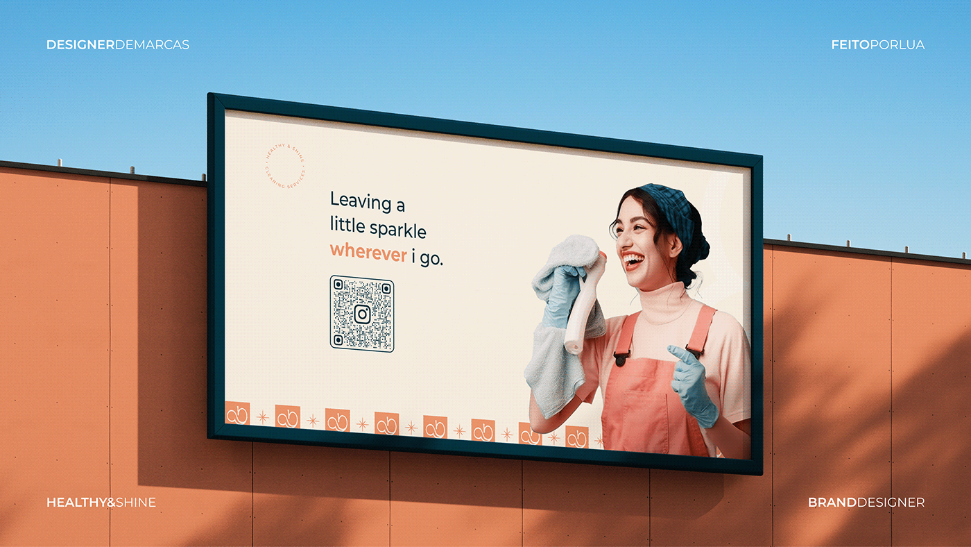
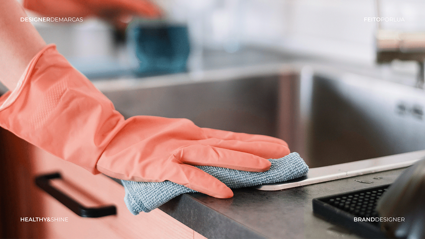
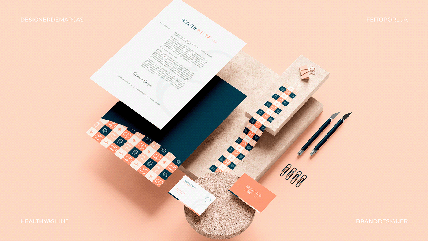
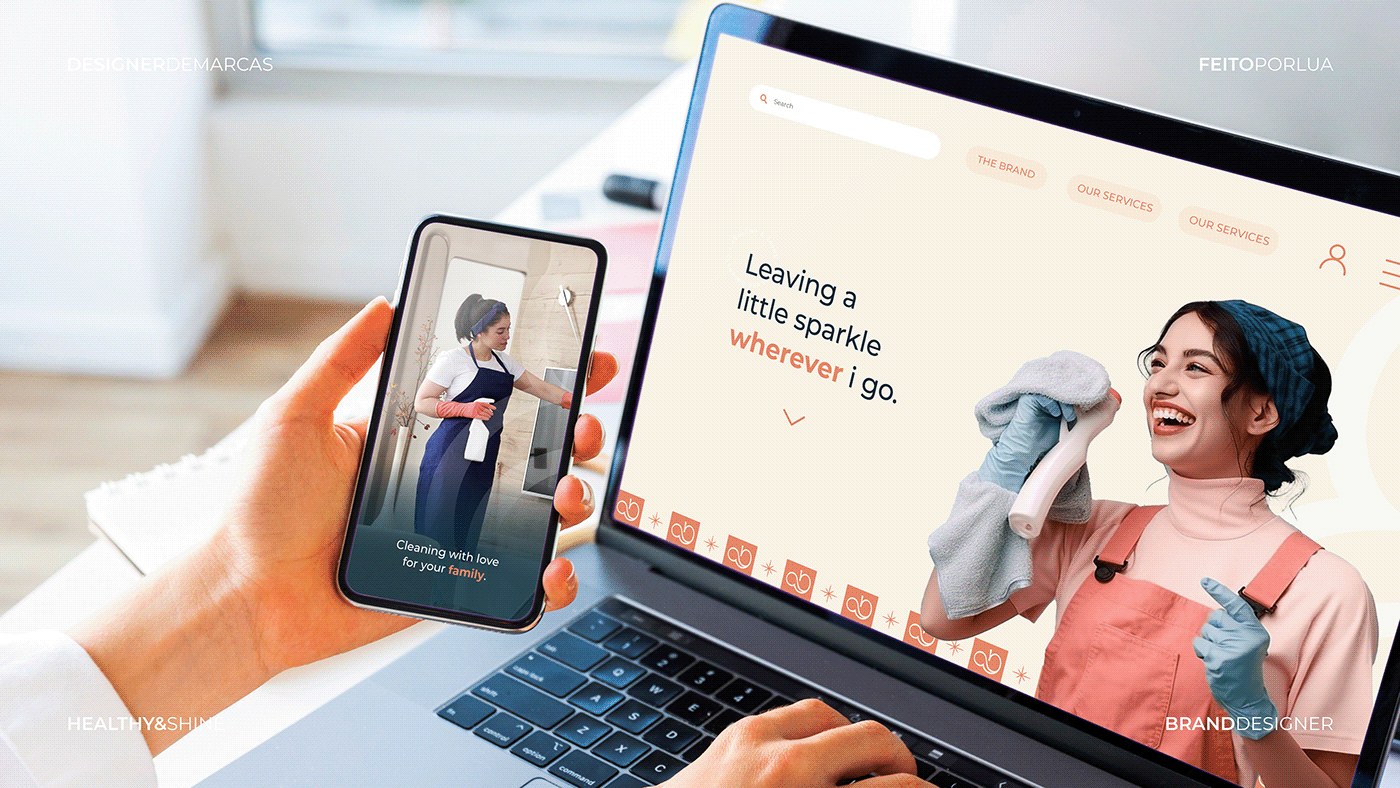
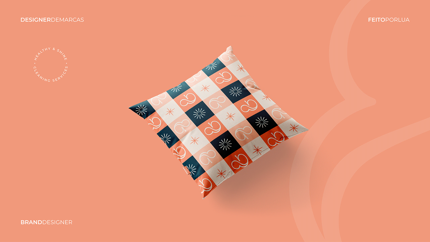
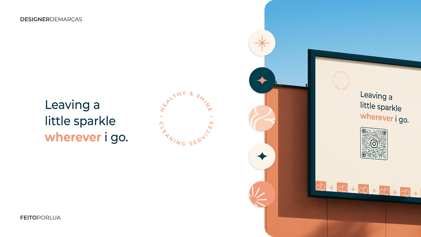
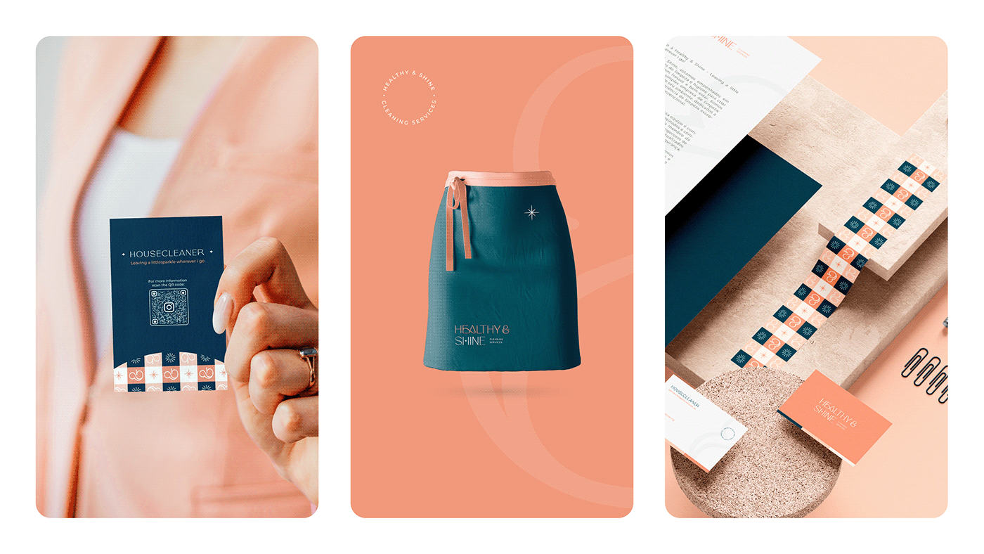
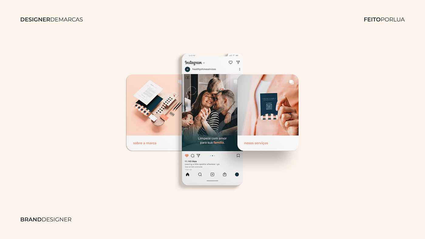
Sobre as aplicações
Por tratar-se de uma faixa-etária ampla, foi levado em consideração a
facilidade de leitura por parte dos usuários, assim como o aspecto de
segurança que a composição como um todo transmite sem perder a
empatia de uma marca que preza pelo acolhimento.
__
About the applications
Given the wide age range of our audience, we took into consideration
the ease of readability for users, as well as the sense of security that the
overall composition conveys, without losing the empathy of a brand that
values hospitality.

Chegamos no final da apresentação, obrigada por vir!
Projeto de Identidade Visual e Branding ©️, 2023 | Feito por Lua
Instagram: @feitoporlua
Orçamento: solicite aqui
Orçamento: solicite aqui


