

Aconchego da Coruja
Babysitting with learn-and-play
I started with some concepts that resemble the owl, an ideal concept for the client as it brought wisdom since the company proposes to care for and empower children through play, aiming at the skills they need to achieve at each stage of their development.
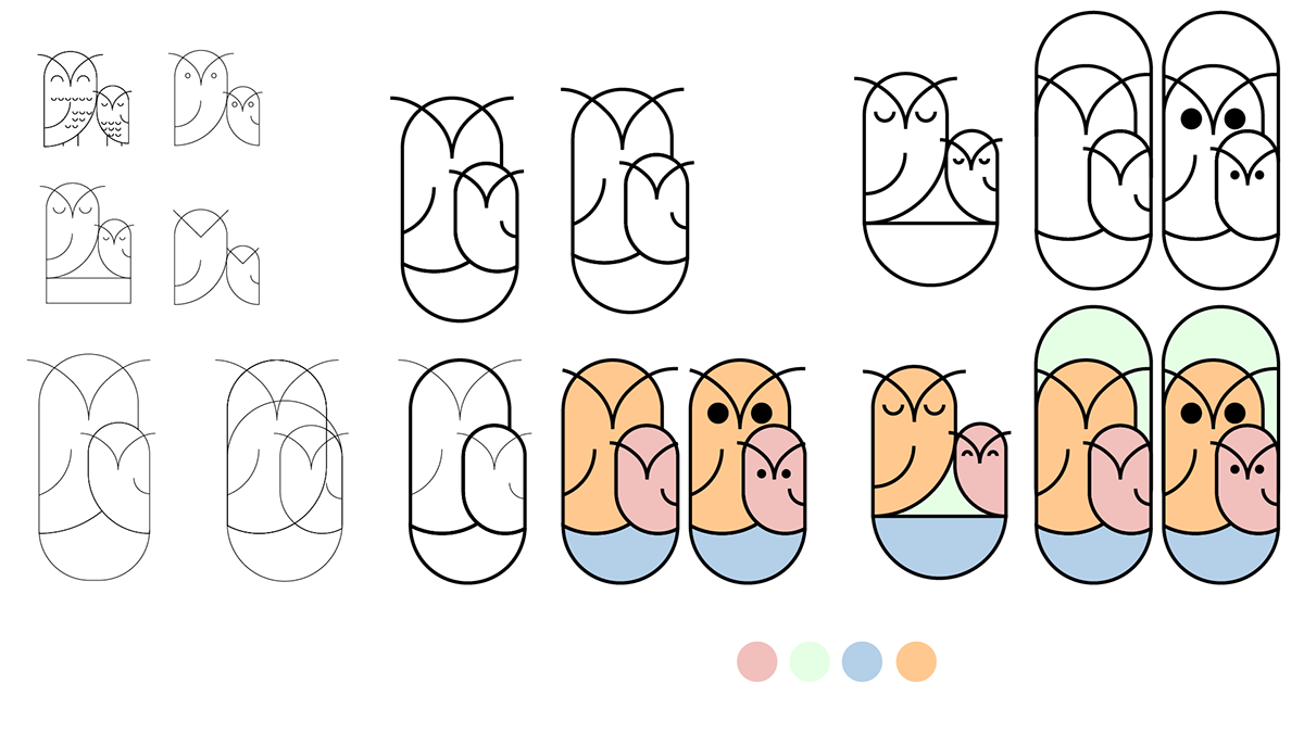
Refining the idea, I decided not to use the blue and pink colors that strengthen the erroneous concept of boy and girl, bringing pastel tones that match more with the tranquility that the brand conveys in the care reinforced by the blue tone, the brown of owls through beige and dark brown, which marks the company’s commitment
and seriousness for their clients.
and seriousness for their clients.

The first proposal presents the nest as a place of safety and comfort with serenity and care as you would do with your offspring.


The second proposal brings the frame of the hole in the tree where the nests are located, further reinforcing the safe and careful environment that the company provides for customers. The owl's eyes are slightly squinted as happens when smiling to bring the joy of playing and learning.


In the last proposal, we have something more conceptual and with greater longevity, leaving some concepts that are already in the company's name, focusing on caring for the environment provided with learning by the company and the serious commitment to child development.


