Brand identity
OPIUM (CA)
Creative Blossom of Opium
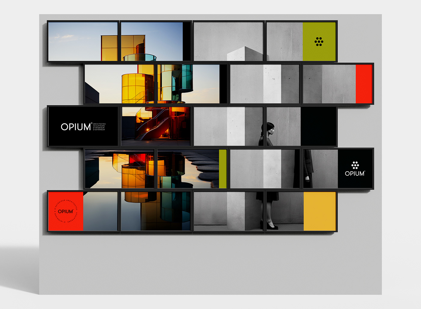
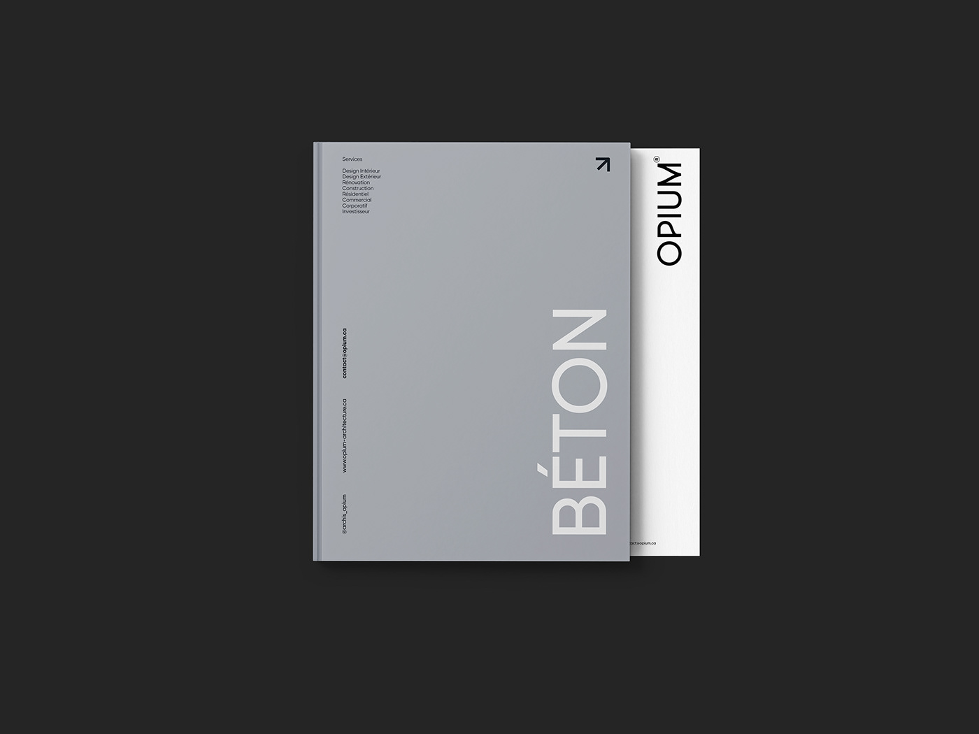
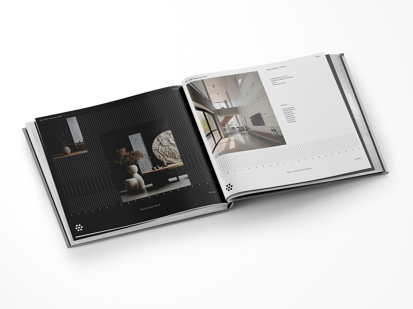
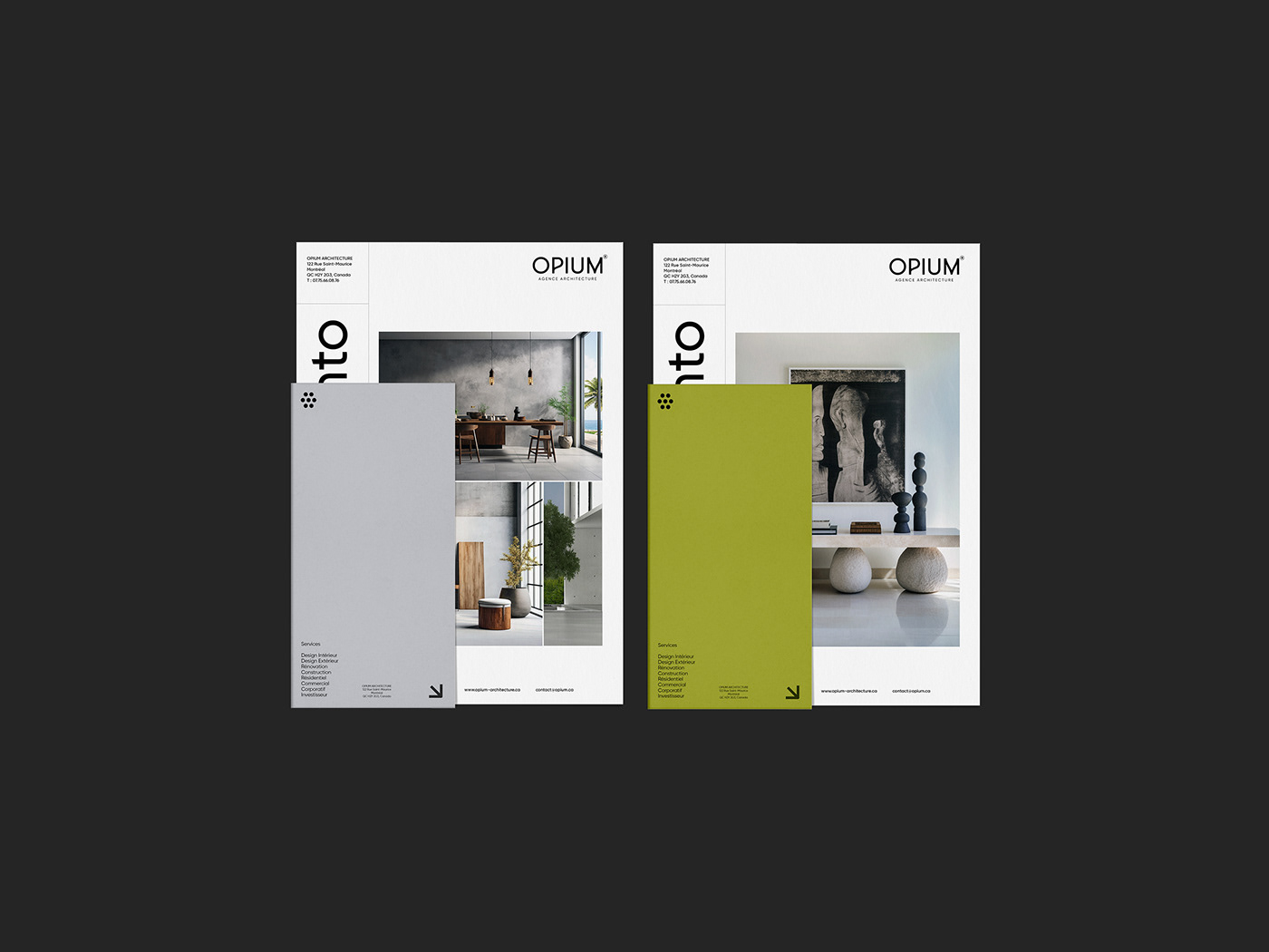
In a world where creativity is the very essence of transformation, Opium, a visionary architectural agency, embraces the philosophy of endless inspiration. Its logo embodies this vision.
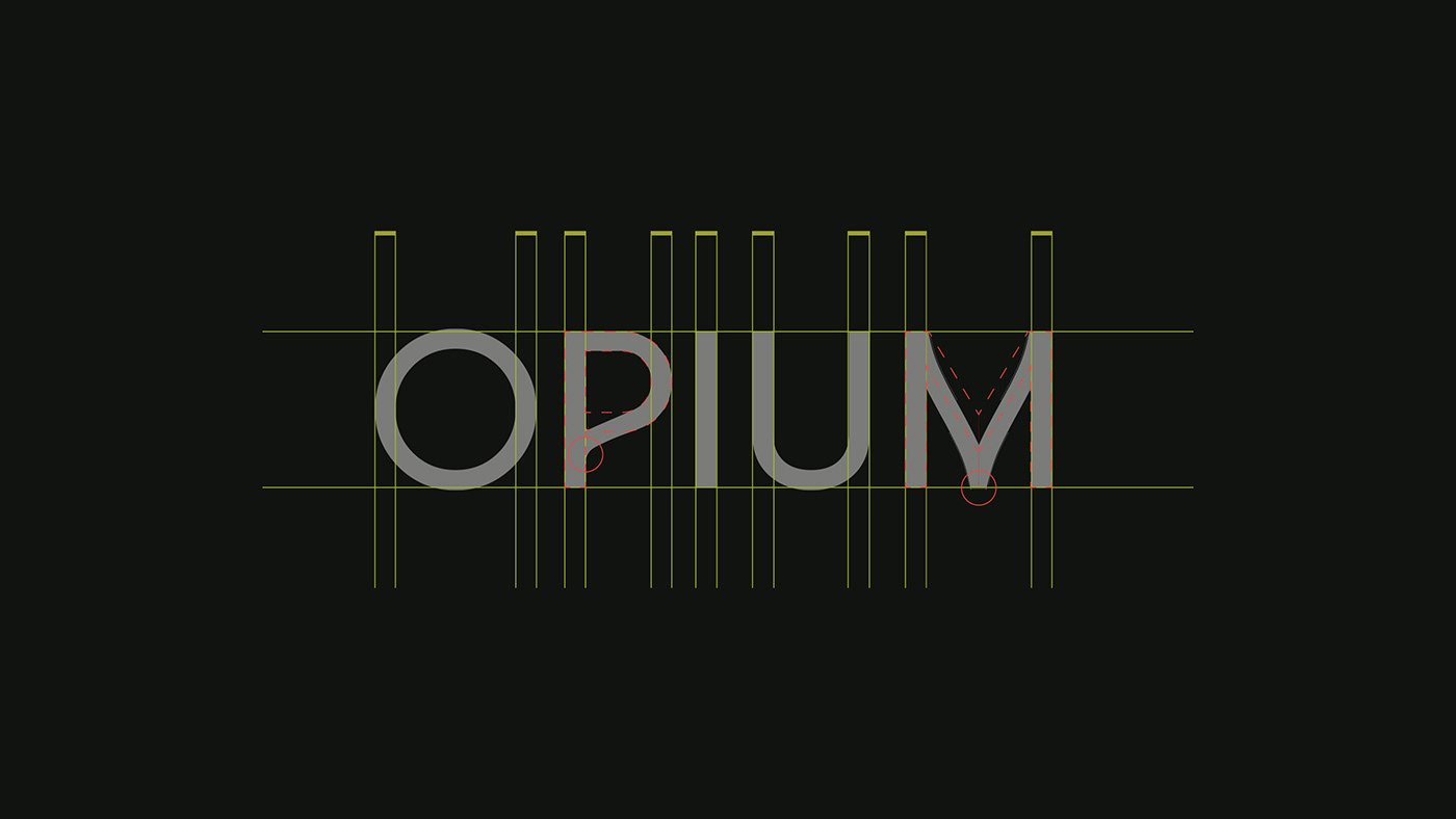
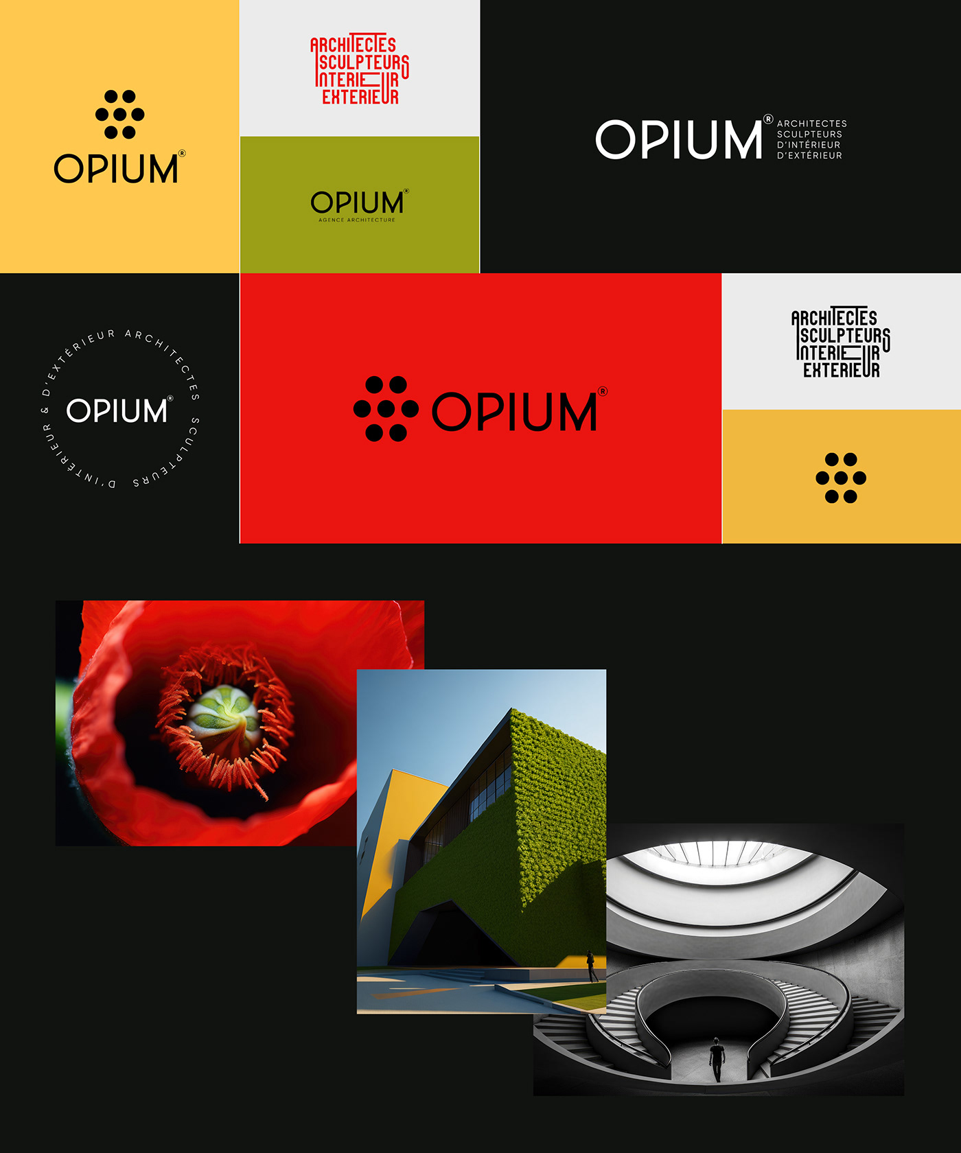
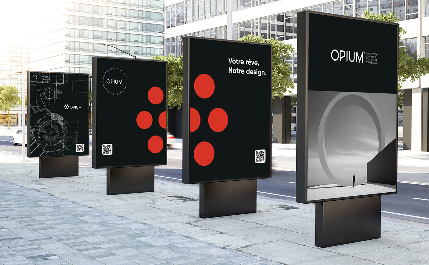
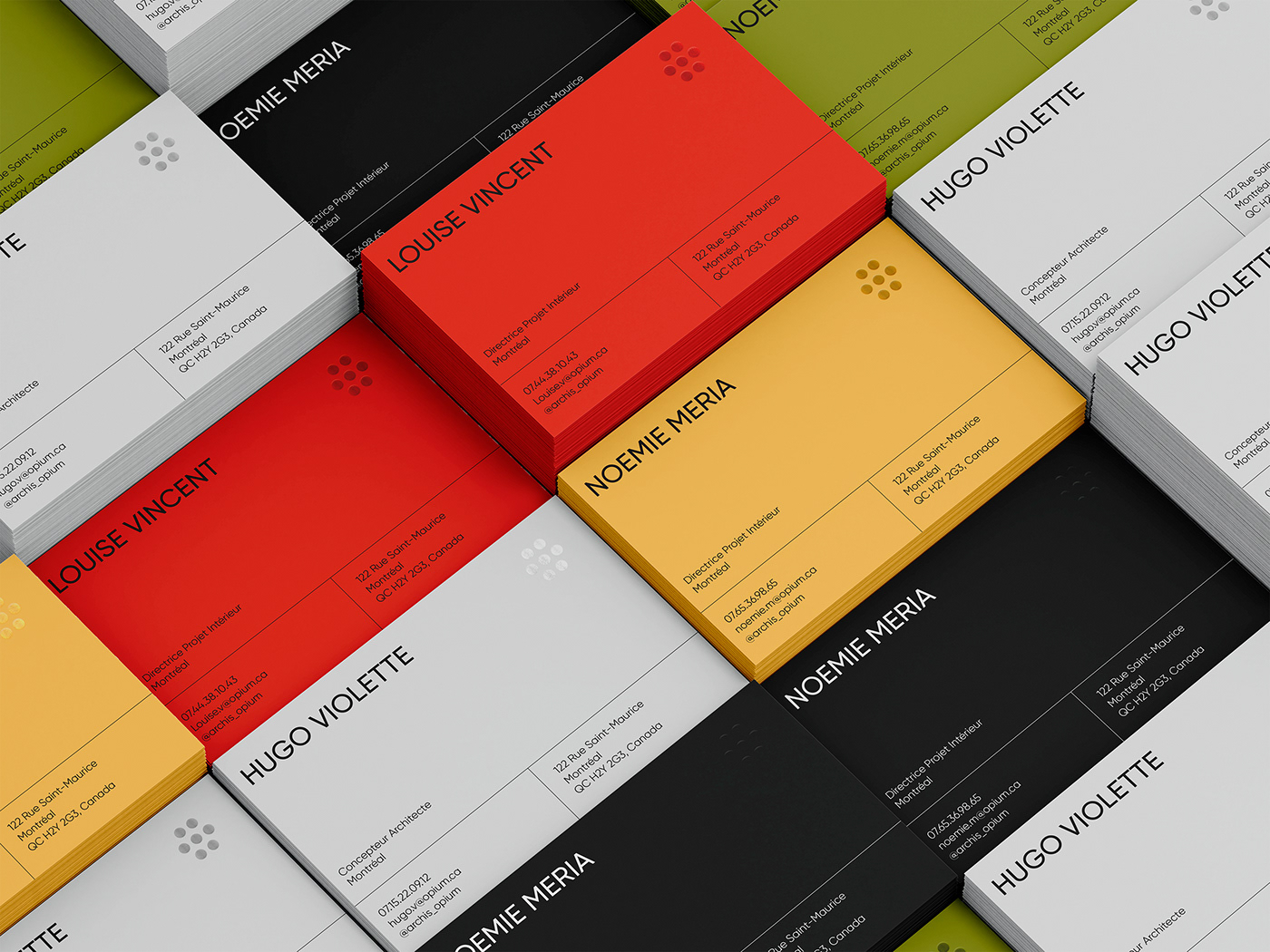
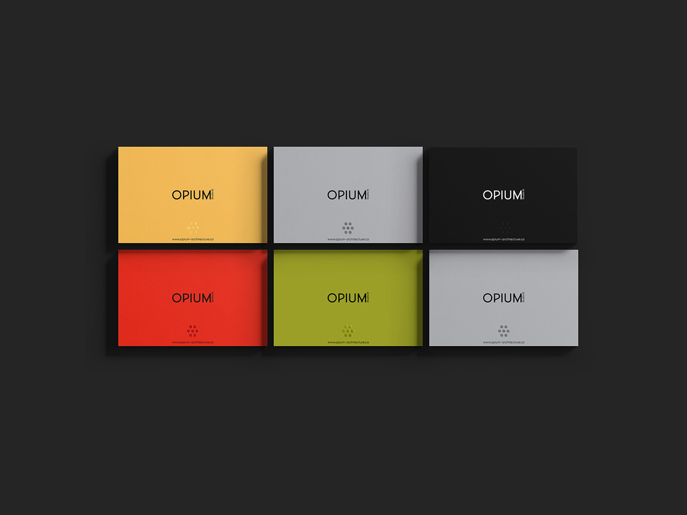
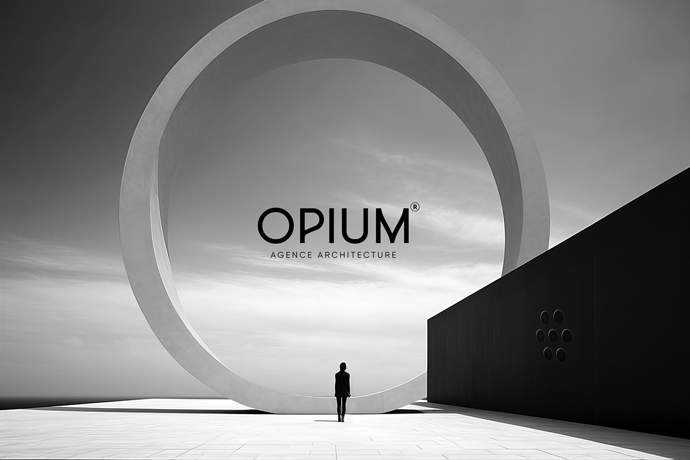
At the core of Opium's identity lies the opium flower, a symbol of transcendence and escape since ancient times. But this flower is transformed into something new and architectural. It is crafted from seven circles, each representing a particular dimension of the art of architecture.
The first circle symbolizes the idea, the seed of creativity. It is followed by the circle of design, where dreams take shape. The third circle conveys the precision of execution, while the fourth represents the function, the utility of architecture. The fifth circle speaks to aesthetics, the element that feeds the soul. The sixth circle conveys sustainability, a commitment to the future, and the seventh circle embodies inspiration, the creative escape that binds it all together.
By uniting these seven dimensions, Opium creates an architectural harmony that transcends the bounds of reality. Its logo is not just a flower; it is a representation of the artistic process and a commitment to innovation. Each petal of the flower is a design element in itself, but together, they form an architectural symphony.
When you see Opium's flower, you are invited to explore each circle, to immerse yourself in the array of architectural dimensions, and to be carried away by the creativity that emanates from it. The logo is the starting point for a journey into a world of ideas and inspiration, where architecture becomes much more than buildings. It becomes an artistic experience that transcends the boundaries of imagination.
To know more about my works : noemiaa.fr I Instagram
