


About the project
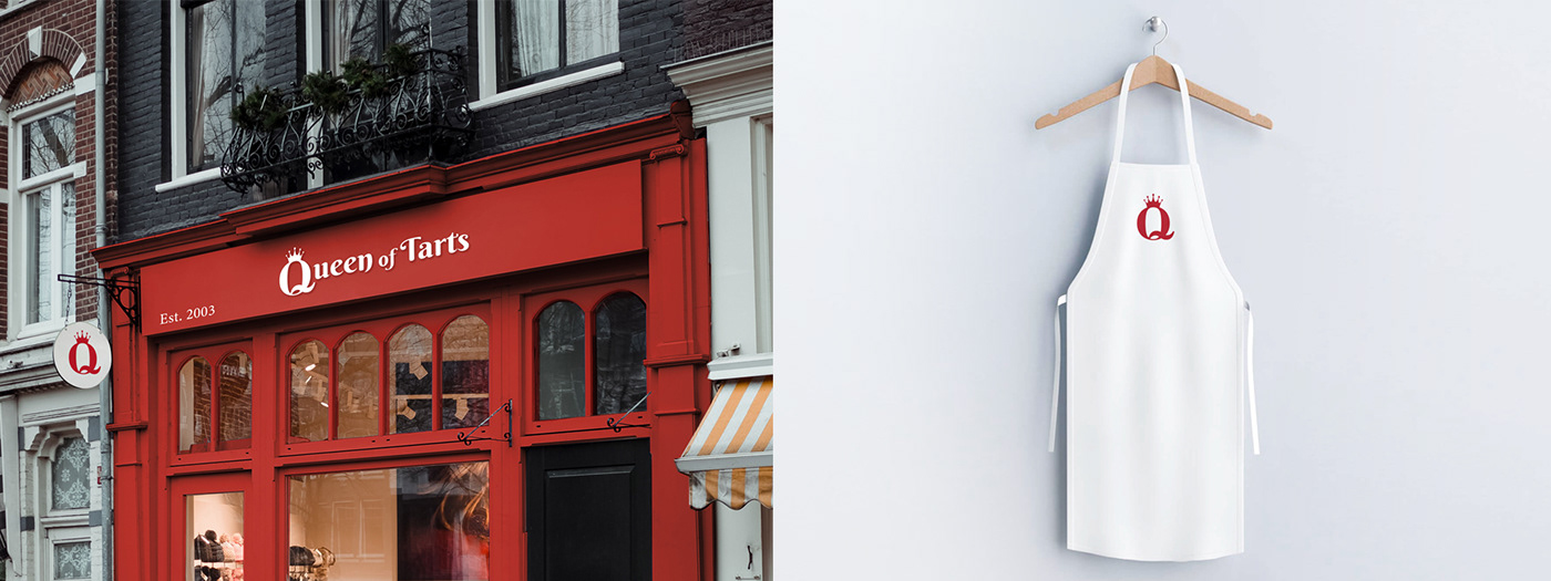
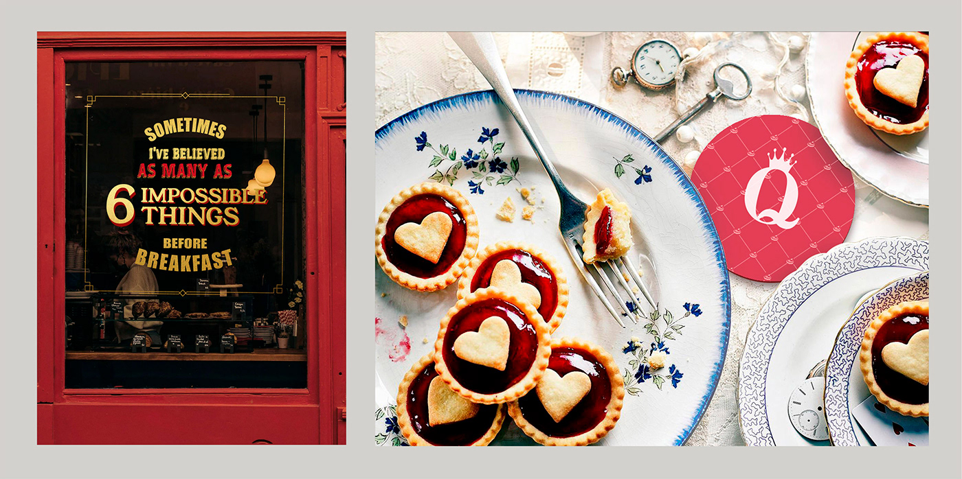
QUEEN OF TARTS a bakery with homemade tarts and unusual recipes
Task: Develop a logo, corporate identity and design for social media.
The logo and identity needed to stand out from the competition, but also be easily recognisable to new customers.
The logo is based on the silhouette of a letter “Q” with a crown and a visual related to the deck of cards and the Queen of Heart from “Alice in Wonderlands”
Colour Pallet: The color palette was inspired by the red suits of playing cards. In addition to the dominant fiery red, pastel tones evoke lightness and desserts. Besides being fun, the colours pair well with a traditional local Café.
Brand Designer: Caio Sampaio


Thanks for watching


