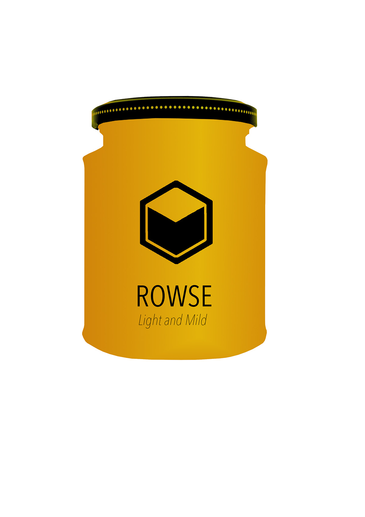
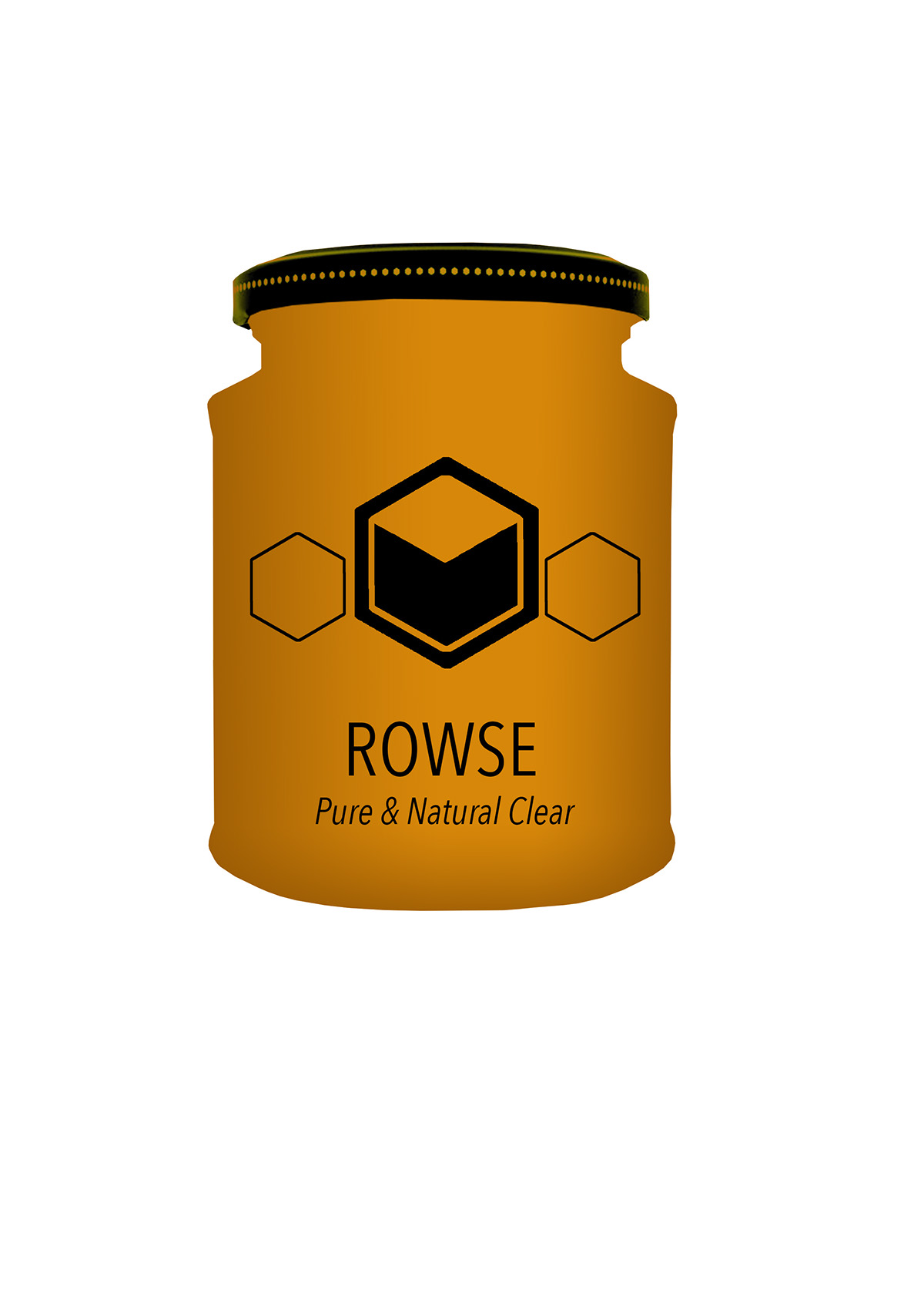
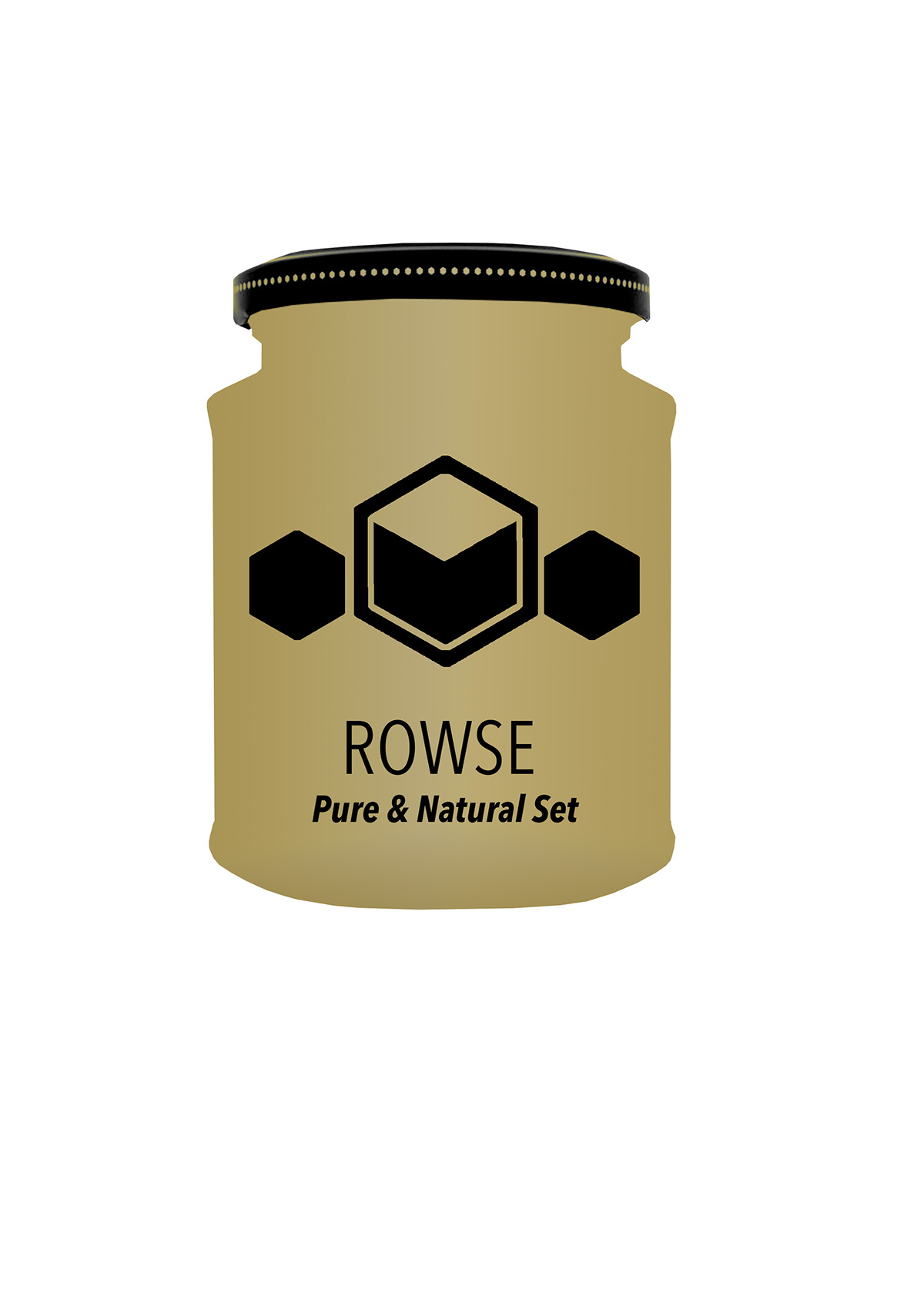
This was a live brief for the company BrandOpus who have done the branding for Rowse Honey in the past. The task was to repackage and rebrand 3 differnt products: Rowse light and mild, Rowse pure and natural clear and Rowse pure and natural set.
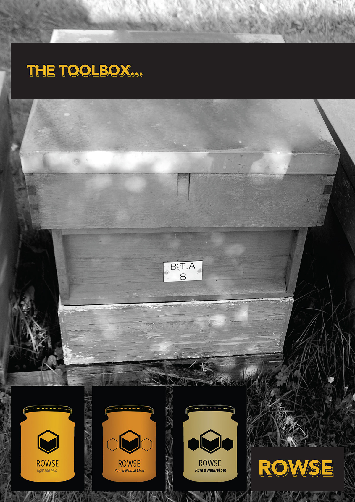
I decided to look at shapes within the honey-making process. I took inspiration from the shape of a 3d hive and the hexagon shape and combined these two in a set of logos for each product. I used a simple font and teh colour scheme of black and honey colour. These set of sahpes i have done for the logo also reprents the shape of a bee with the two smaller, outer hexagons symbolising the wings.
This logo is a simplified,sleeker and more sophisticated look for the rowse brand.

Original branding and packaging

logo sets
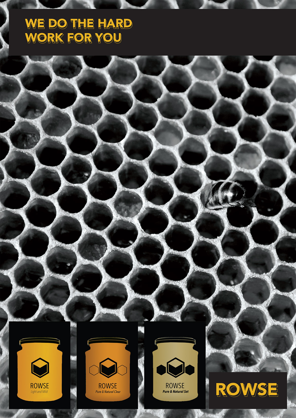
Potential advert poster for new branding
Second potential advert poster


