Curyo, an Australian-based clothing brand, specializes in crafting exquisite garments from high-quality wool. Their collection embodies a harmonious blend of comfort, style, and casual elegance that allows wearers to effortlessly embrace fashion without sacrificing comfort.
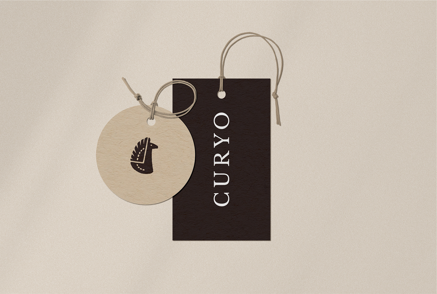
Situated in close proximity to a llama farm, Curyo sources its primary material from the fine wool of llamas. In light of this association, the brand decided to incorporate the essence of these magnificent creatures into their signage.
Situated in close proximity to a llama farm, Curyo sources its primary material from the fine wool of llamas. In light of this association, the brand decided to incorporate the essence of these magnificent creatures into their signage.
From the Brief
Taking the client's vision into careful consideration, Curyo aimed to depict the llama as a focal point in their sign, as it serves as their beloved mascot and symbolizes their predominant use of llama wool. The client expressed their desire for an image of the llama that strikes a balance between refined sophistication and youthful charm, avoiding both overly simplistic and excessively ornate designs. The signage was envisioned to maintain a sense of clarity and readability without overwhelming viewers with intricate details.
Taking the client's vision into careful consideration, Curyo aimed to depict the llama as a focal point in their sign, as it serves as their beloved mascot and symbolizes their predominant use of llama wool. The client expressed their desire for an image of the llama that strikes a balance between refined sophistication and youthful charm, avoiding both overly simplistic and excessively ornate designs. The signage was envisioned to maintain a sense of clarity and readability without overwhelming viewers with intricate details.
Solution
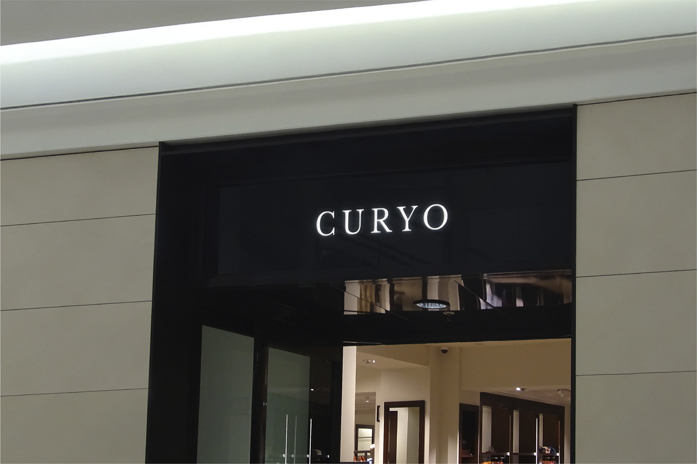
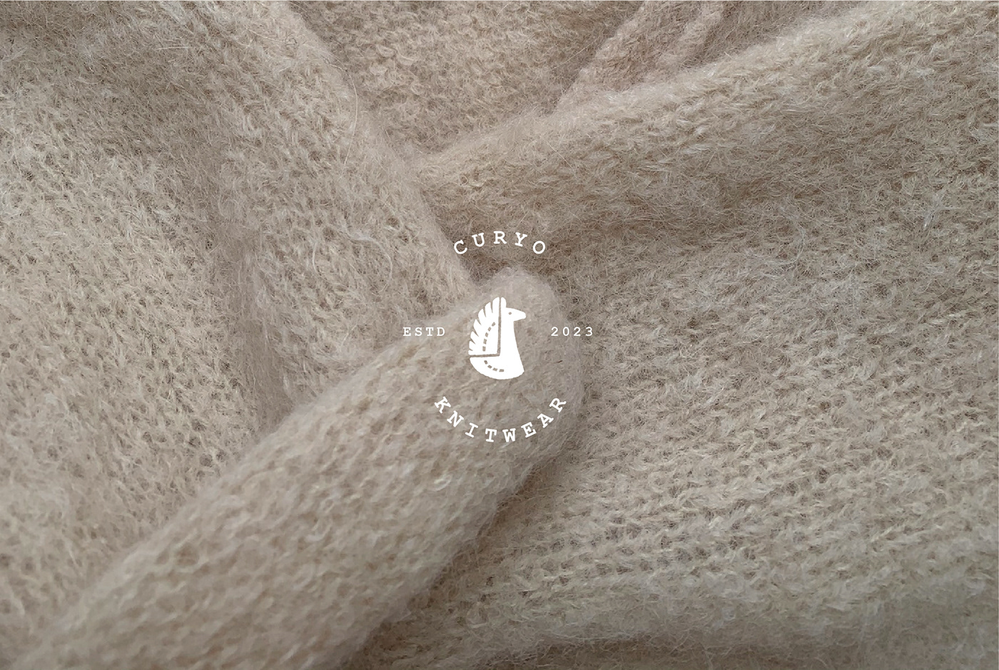
As a solution, Curyo's creative team meticulously crafted a hand-drawn sign that exudes a welcoming and approachable aura, aligning perfectly with the client's preferences. The design strikes a fine balance between a relaxed aesthetic and a sense of refined elegance. Its simplicity ensures that even when scaled down, the signage remains clearly discernible on various carriers.
As a solution, Curyo's creative team meticulously crafted a hand-drawn sign that exudes a welcoming and approachable aura, aligning perfectly with the client's preferences. The design strikes a fine balance between a relaxed aesthetic and a sense of refined elegance. Its simplicity ensures that even when scaled down, the signage remains clearly discernible on various carriers.
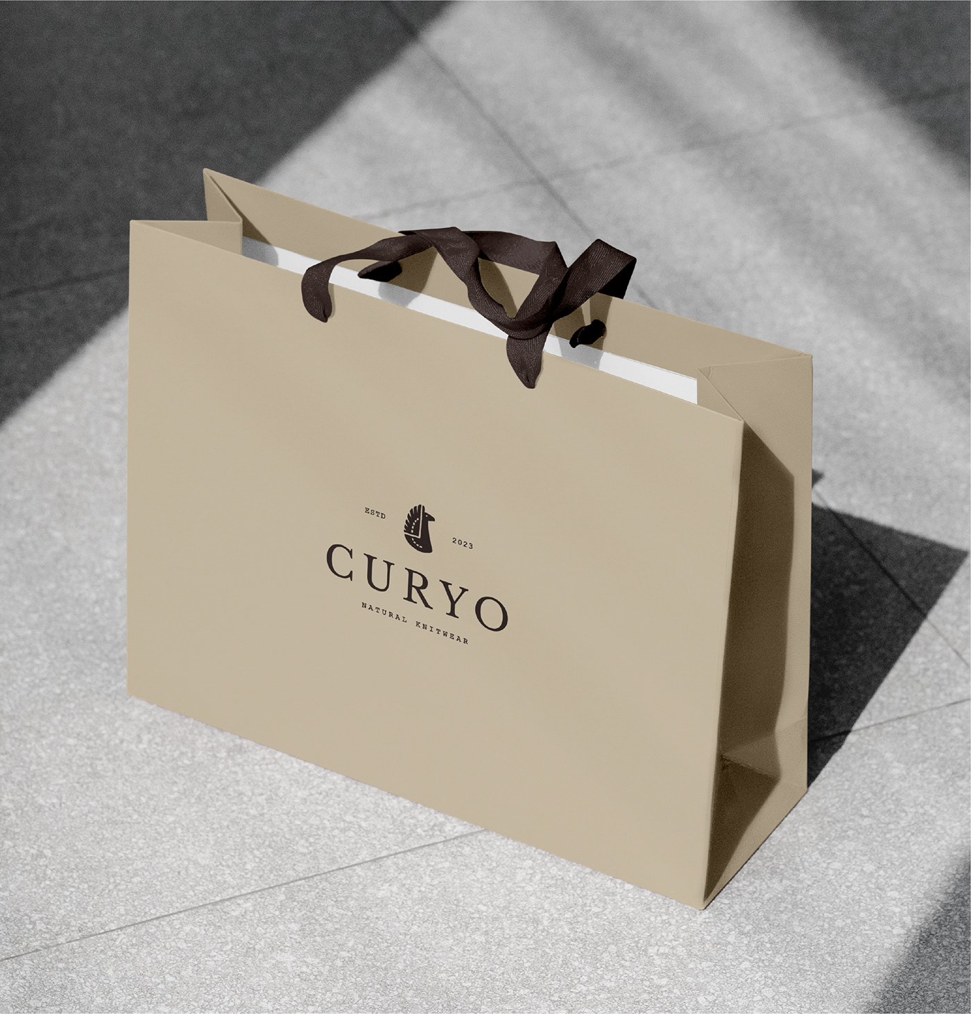
In addition to the sign, Curyo developed a comprehensive branding strategy aimed at captivating individuals with its distinctive style and embracing warmth. By incorporating elements that reflect the brand's unique energy and aesthetic, Curyo ensures its allure extends beyond mere garments, creating a captivating experience that draws people in.