


Marcus C - Oxymoron | Album Packaging
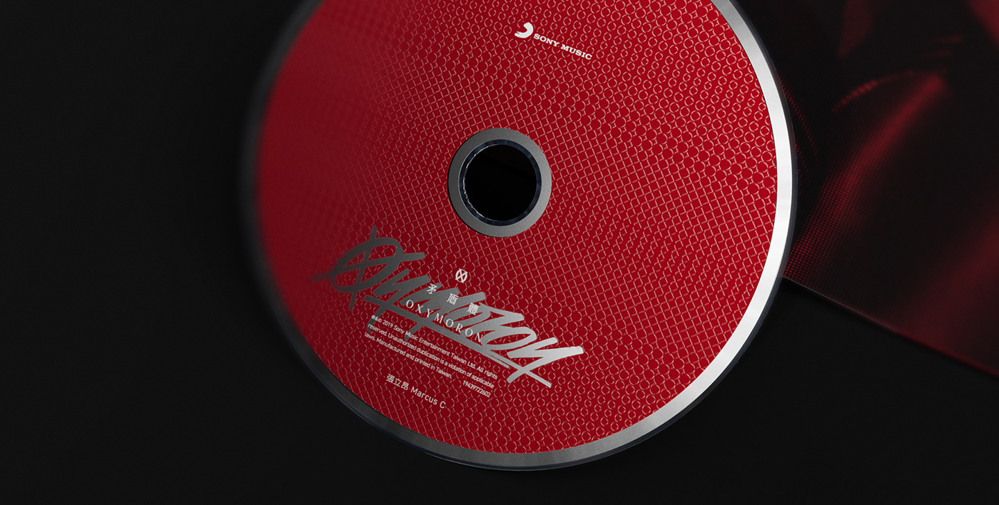
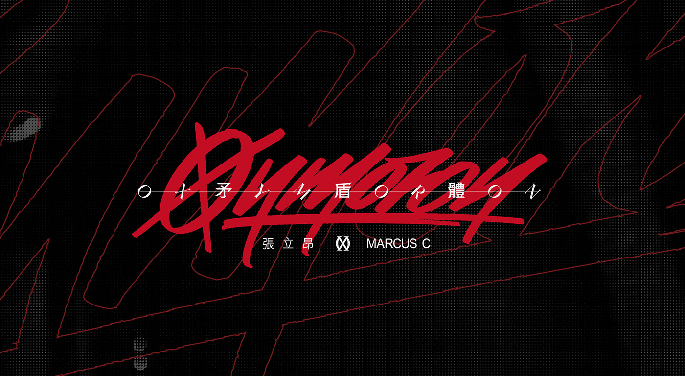
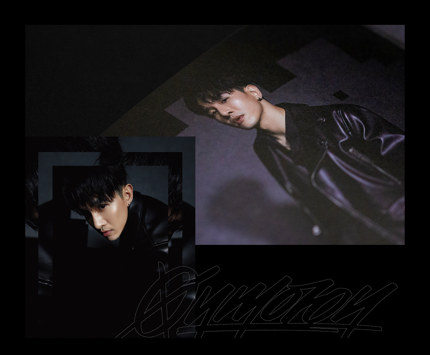
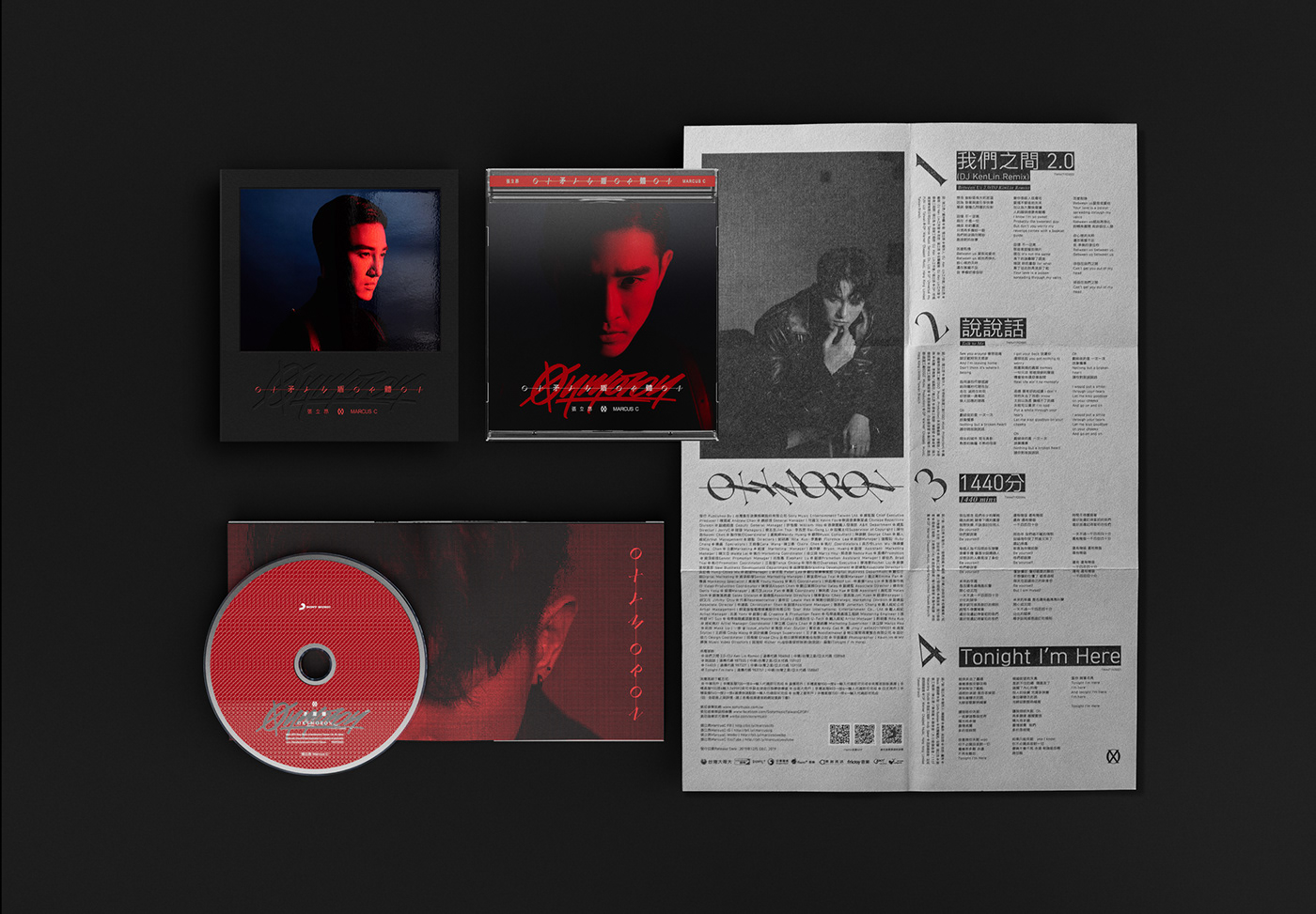
In 2020, Grandvity Design collaborated with Sony Music on the Oxymoron album. This innovative album design utilizes the 'O' and 'X' symbols to convey a theme of contradiction, with rebellious handwritten fonts symbolizing the conflict between the artist's public image and true self.
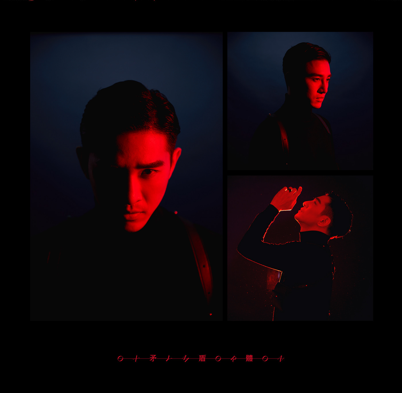
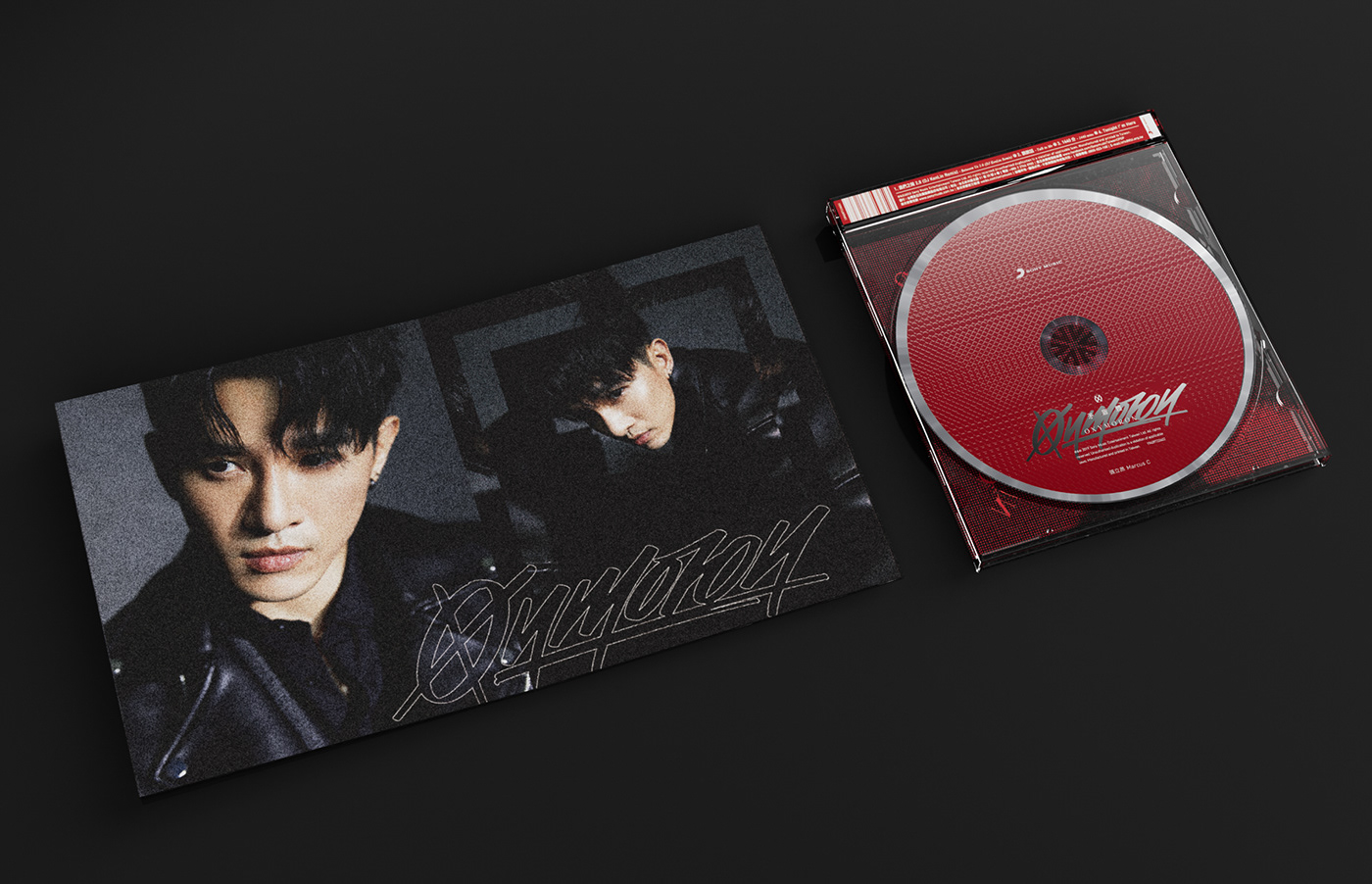
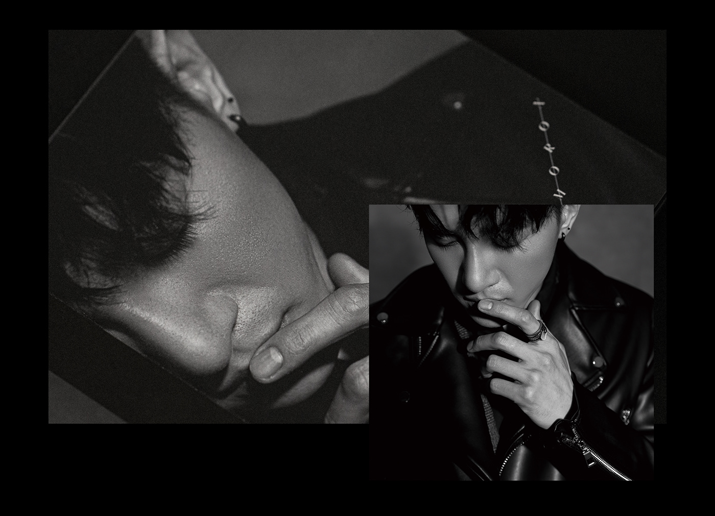
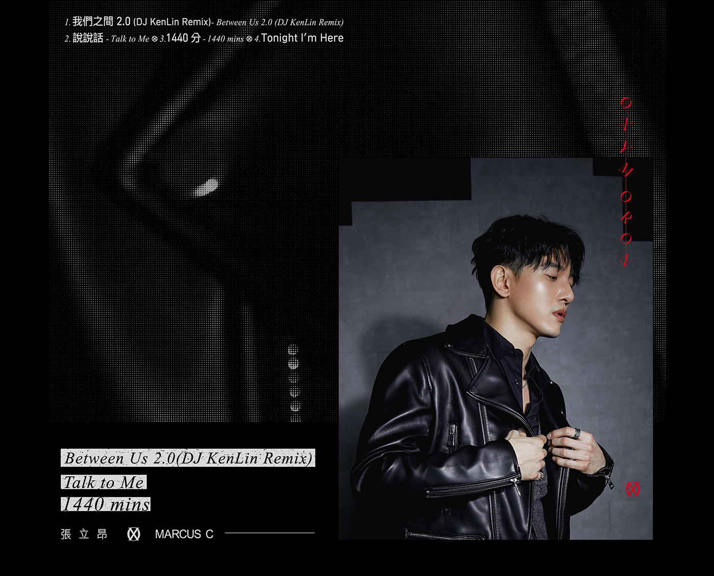
The packaging breaks free from conventional CD cases, featuring a reversed CD hovering over a lyrics poster, emphasizing the 'OX' concept. The lyrics poster is printed on rough, handmade paper with a unique halftone pattern, compellingly contrasting the high-quality artist's photos. With its textured black card stock cover and 'N-fold' layout, the photo book distinguishes the artist's two looks, allowing fans to explore the concept of contradiction from different angles.


Credits
Client | 索尼音樂 Sony Music Taiwan CPOP
Production | Grandvity Design
Marketing Supervisor | Marco Hsu
Art Director | Noodlemaker
Account Manager | Grape Chiu
Project Manager | Grape Chiu
Design Director | Si Jia Sun
Logotype Designer | Noodle Wang
Album Designer | Noodle Wang
Portfolio Designer | Si Jia Sun
Album Photography | Kaizer Zhuang


