


In March 2023, we received a design commission from Qfufu to build the brand and spatial visual system.
Qfufu - The golden grain of autumn, representing the joy and gratitude of a bountiful harvest, follows the traditional Chinese solar term and uses fresh and natural seasoning based on seasonal ingredients to make products suitable for the Chinese stomach.
2023年3月份,我们收到来自秋麸麸Qfufu的设计委托,搭建品牌与空间视觉系统。就这样,开启了OnedayDesign第一个「品牌视觉+包装系统+空间」的全案服务,在与品牌主理人的沟通碰撞中,我们展开了对秋麸麸的无限想象。
项目开始前,品牌主理人给我们发送了一份长长的项目介绍书,秋麸麸——秋季的金黄粮食,代表丰收的喜悦和感恩,遵从中国传统节气,根据时令的食材,选用新鲜自然的调味,来制作适合中国胃的产品。
Brand 秋麸麸®️Qfufu
Time 2023
Location Hangzhou
AD Tessie
Brand Janet、Bao Bao
Space Shan Shan
© 2023 Oneday Design

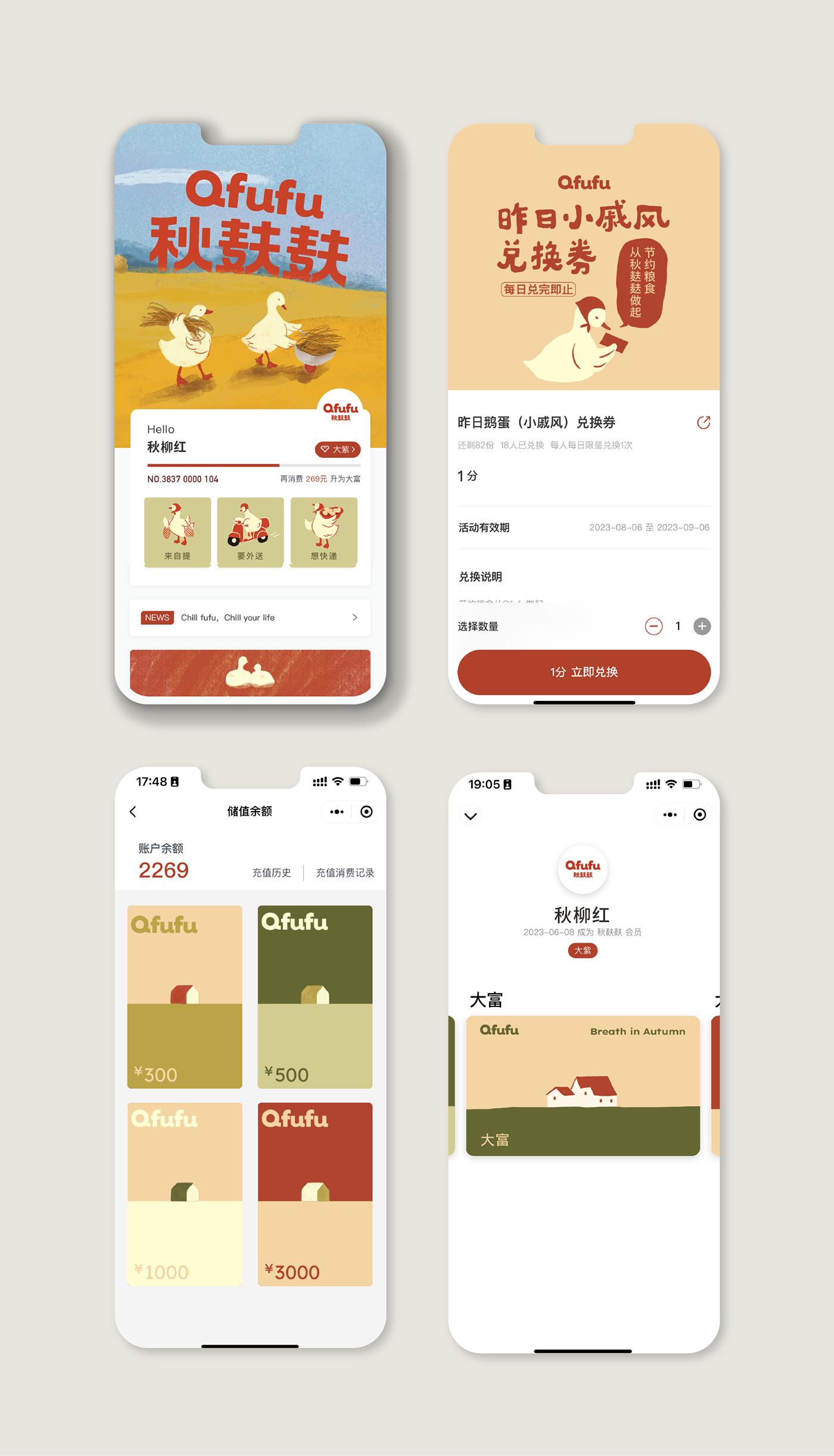
Chill fufu, Chill your life.
Qfufu, inspired by the seasonal crops of the four seasons, integrates the author's ingenious ideas in taste and ingredients. We extract the left side "He" and "Mai" of Qfufu and combine them with the impression of autumn to create a brand atmosphere positioning of "Wind Blowing Mai Lang". In order to amplify the atmosphere of the brand, the most direct copywriting is to convey the relaxed feeling of "autumn" with the words "Child fufu, Child your life".
秋麸麸Qfufu,以四季的时令作物为研发灵感,在口味与食材中融入手作者的巧思。我们提取秋麸麸的左偏旁「禾」「麦」结合秋日印象,形成「风吹麦浪」的品牌氛围定位。为了放大品牌的氛围感受,以最直接的文案“Chill fufu, Chill your life“传达”秋“的松弛感。


The product design of Qfufu is based on Chiffon and positioned as a specialized shop for Chiffon. From this, we designed a Chiffon special packaging with the idea of "packaging gifts", and the most basic Chiffon cake is also the most simple birthday gift.
秋麸麸的产品设计以戚风为基础,定位为戚风蛋糕专门店。由此我们以“打包礼物”的思路设计了一款戚风专用包装,最基础的戚风蛋糕也是最朴实的生日礼物。
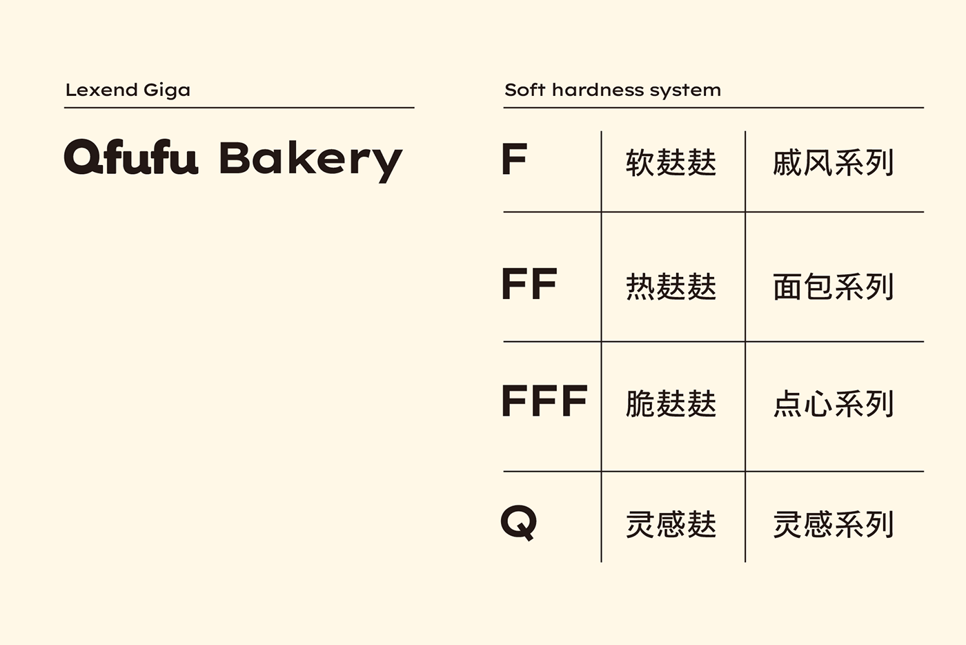
In addition, starting from "bran" and targeting different taste experiences, we have divided the product into four categories from the perspective of dough gluten: soft bran, hot bran, crispy bran, and inspiration bran. We have established a taste system belonging to Qfufu, allowing consumers to understand the taste characteristics of the product in the first place.
此外我们从“麸”出发,针对不同的口感体验,从面团麸质的角度将产品划分成四个类别,软麸麸、热麸麸、脆麸麸和灵感麸,建立了属于秋麸麸的口感系统,让消费者在第一时间了解产品的口感特点。


The graphic symbol of Qfufu is extended from the initial letter "Q" of English Qfufu. In terms of graphic proportion, we apply the finished product size of 1/8 of the cut piece Qi Feng to graphic disassembly; At the edges of the font graphics, change the sharp strokes to reflect the brand's relaxed and soft visual experience with more rounded strokes.
秋麸麸的图形符号,由英文Qfufu的首字母「Q」延展而来。在图形比例上,我们将切件戚风1/8的成品大小运用在图形拆解中;在字体图形的边缘,改变尖锐的笔触,以更圆润的笔画来体现品牌轻松、产品松软的视觉感受。
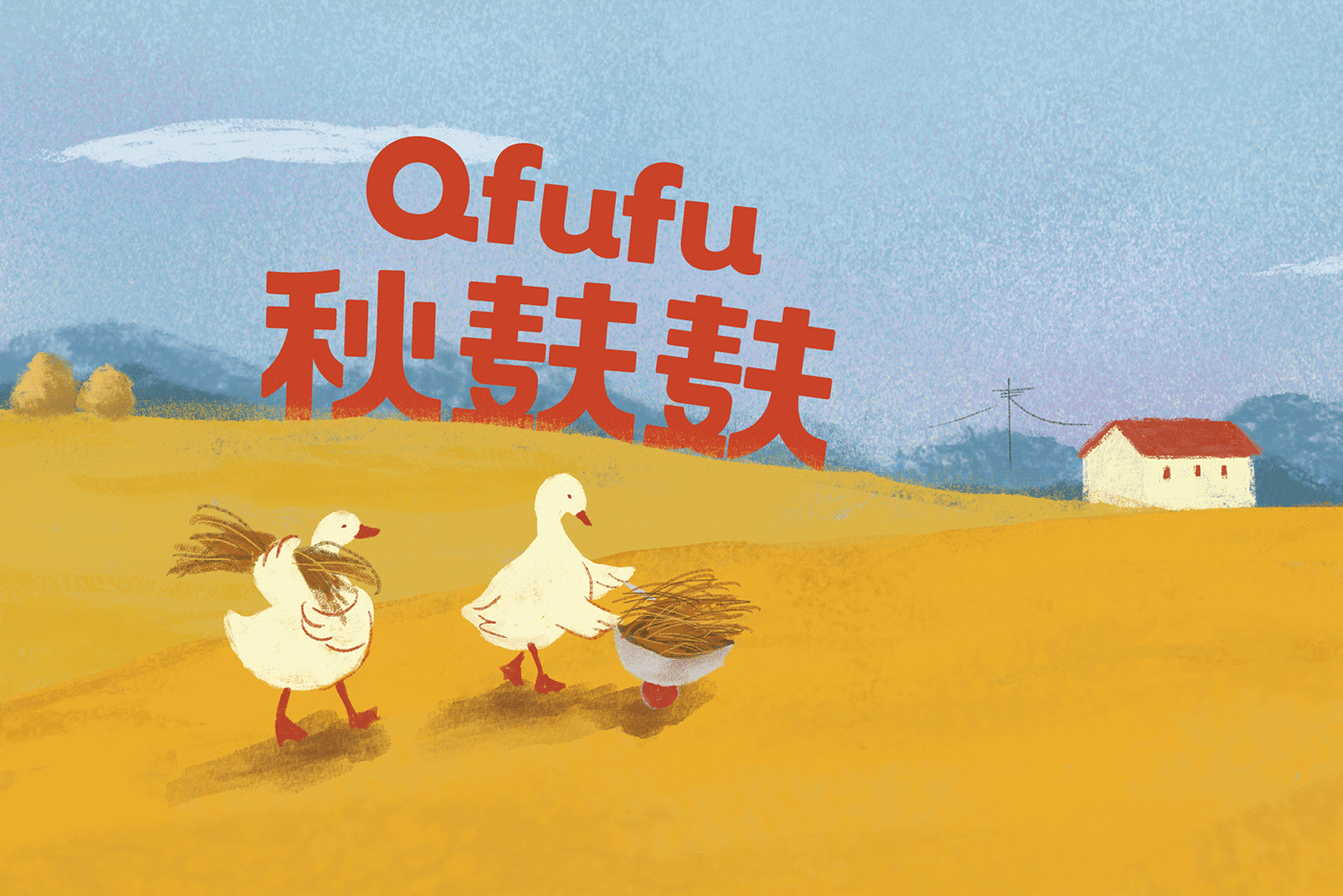


In the color construction, the manager expressed the hope that the brand could reflect the retro sense of Eastern temperament, as well as expressed their love for brick red. Therefore, in the entire color system, we combine the brand concept of "wind blowing wheat waves" and use "Harvest Red" as the main color of the brand, forming a warm and seasonal color system specifically for Qfufu, which is "spring born, summer wild, autumn harvest, winter storage".
在色彩构建中,主理人表达了希望品牌能体现东方气质的复古感,以及表达了对砖红色的喜爱。因此整个色彩体系中,我们结合品牌概念「风吹麦浪」,以「丰收红」作为品牌主色,整体构成了偏暖调的专属于秋麸麸「春生-夏野-秋收-冬藏」的季节色系。
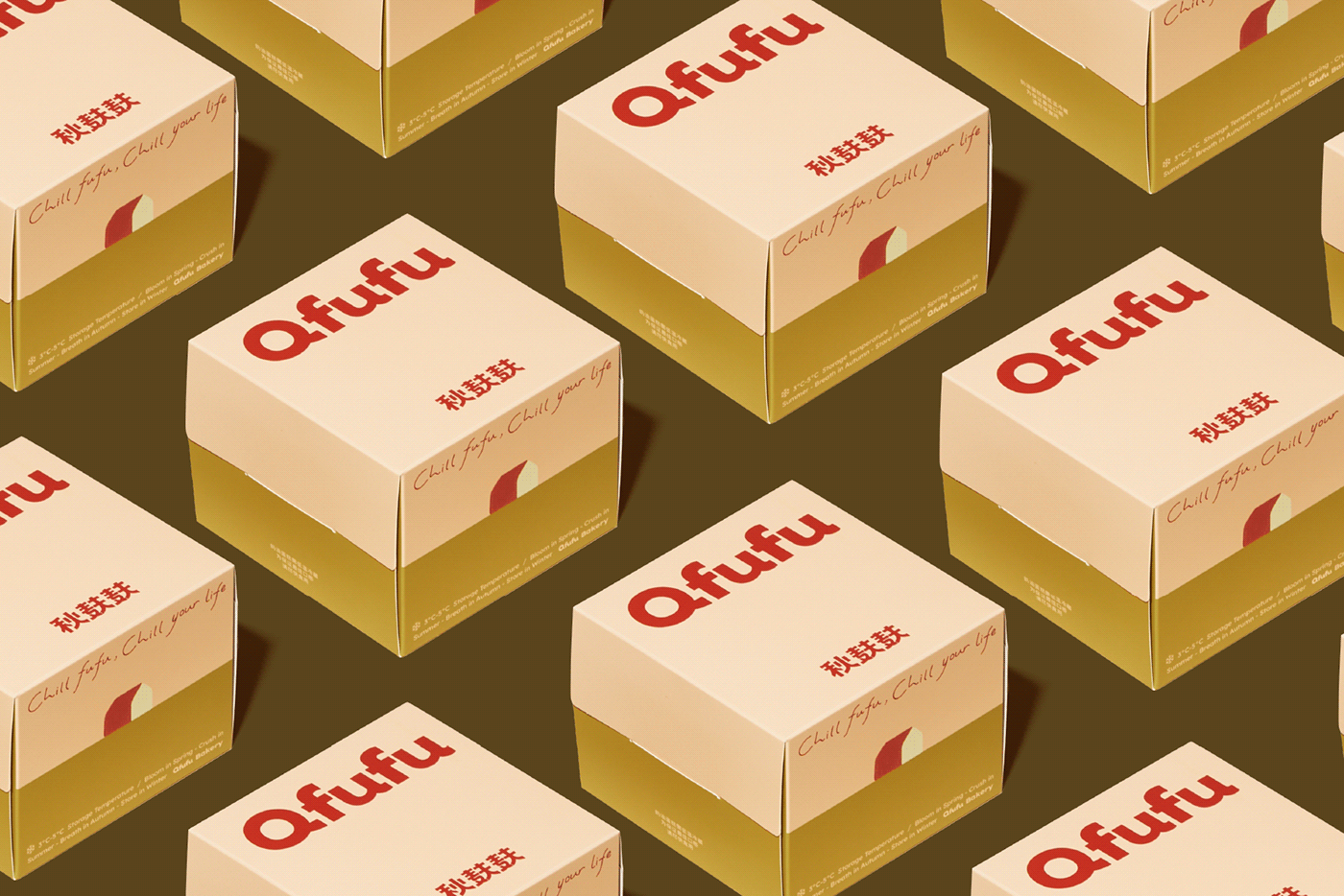


On the packaging, we depict the same grain pile scene through color changes, inspired by Monet's "Haystack" and presenting the "seasonal" nature of Qfufu product development through seasonal changes.
在包装上,我们通过色彩变化描绘同一个谷堆场景,它的图形灵感源自莫奈《草垛》,用季节的更迭变化呈现秋麸麸产品研发的“时令性”。


In order to enrich the brand vision of Qfufu, we joined the "Wind Blowing Wheat Waves" experience - two geese, "Liuqing" and "Liuhong", inspired by the daily farming of the independent manager. Their arrival brought a lot of joy to her daily life and also inspired our creations.
We will use anthropomorphic techniques to integrate "willow green and willow red" into flat vision and offline materials, allowing autumn bran to interact more with consumers and bring them closer.
为了丰富秋麸麸的品牌视觉,我们加入了「风吹麦浪」中的体验者——两只鹅「柳青」「柳红」,灵感源自主理人的养殖日常,它们的到来给她的日常带来了很多快乐,也为我们的创作带来很多灵感。
我们将“柳青柳红”用拟人化的手法融入在平面视觉与线下物料中,让秋麸麸与消费者产生更多的互动,拉近与消费者的距离。


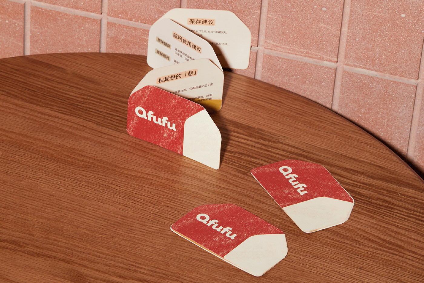
In the Qfufu space, there are clear and rugged wooden retro furniture with exposed and mottled red brick walls paired with brand concept illustrations. The warm retro color scheme slows down the overall atmosphere of the space.
在秋麸麸Qfufu空间里,有着纹理清晰且粗犷的木质复古家具,裸露斑驳的红砖墙壁搭配着品牌概念插画,温暖复古的色系搭配让整个空间氛围慢下来。


