I was tasked by a local agency here in Cape Town to come up with a series of type centric posters promoting a new fashion card that VIPFashion is currently advertising.
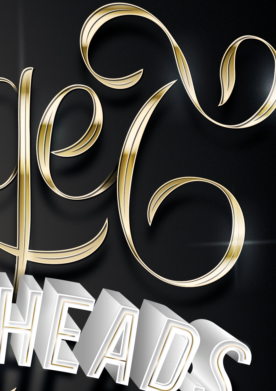
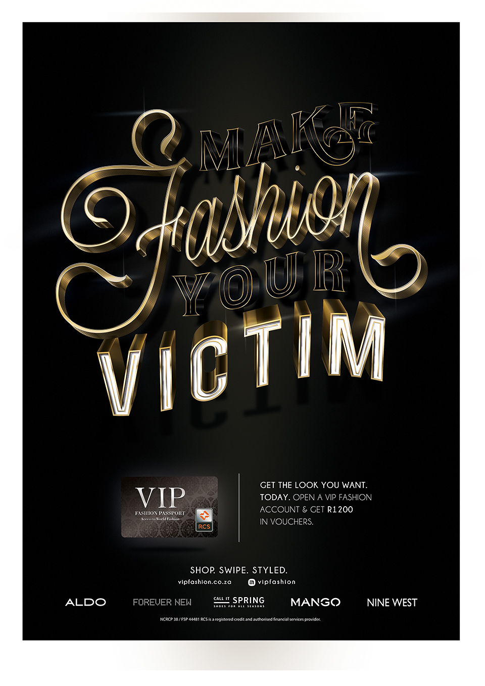
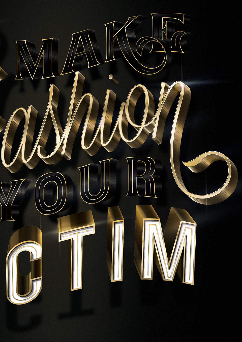
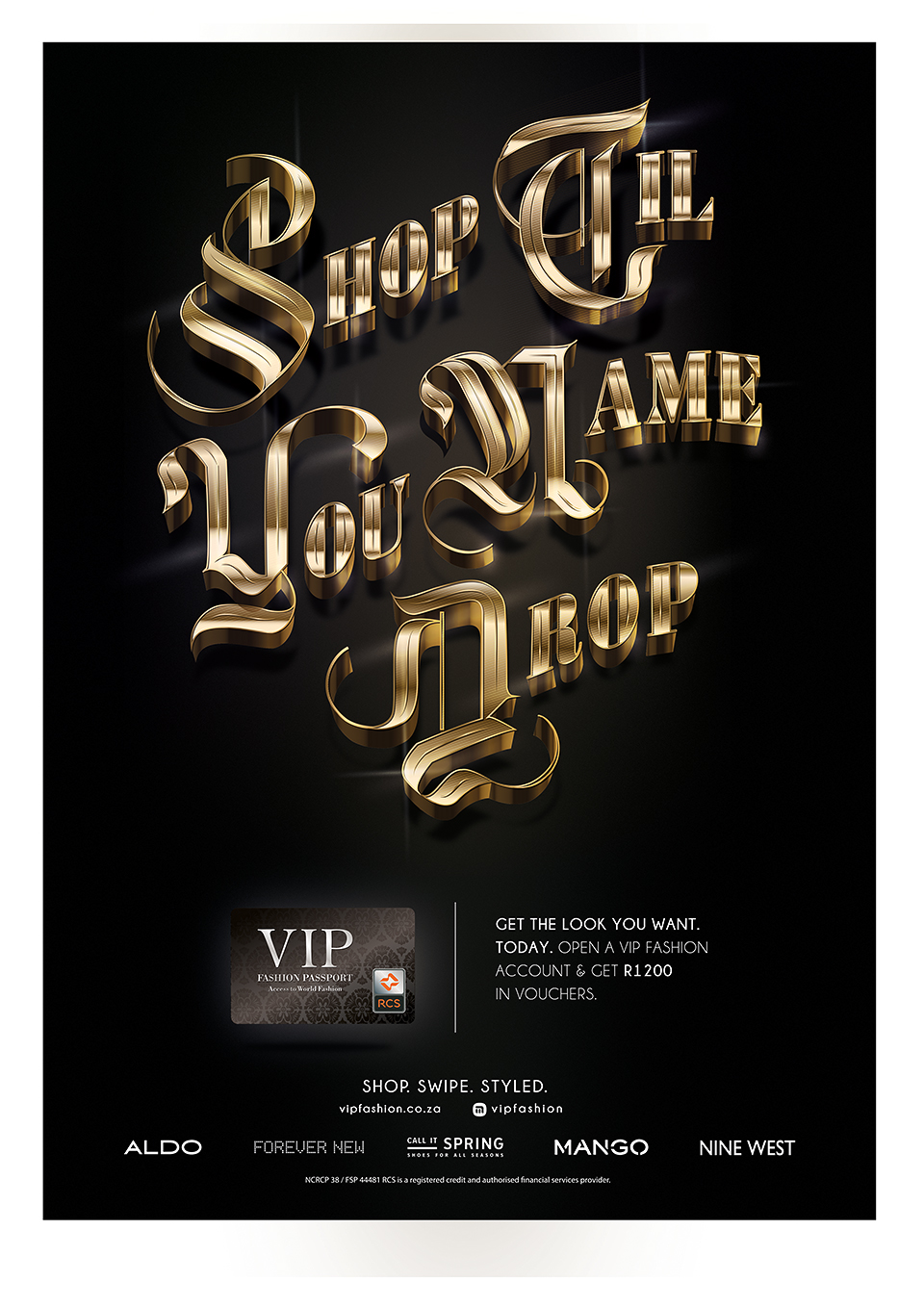
I had a limited colour palette of only gold, white and black, so the project required some thought as to how to combine the 3 colours, while still creating a unique feeling and atmosphere for each poster. The typography had to portray a premium feeling, conveying the bling, style and attitude of a fashionista’s lifestyle.
The target market is primarily middle aged women, who shop often and on credit.
I started with pencil sketches, and then moved quickly to digital, where i spent the next 2 months creating each piece, with each piece having multiple revisions etc.
Tools used : Pencil, paper, Illustrator, Photoshop.
All typography is 100% custom. No fonts were used in the making of these pieces.
Here are the final posters to be printed A4 into a magazine spread. ( actual printed pictures still to come)
Enjoy!
1. ” The Only Thing Higher Than Your Heels Should Be Your Standards ”


2. ” Forget Turning Heads Drop Jaws Instead ”


3. ” Straight From The Catwalk To Your Closet ”


4. ” Make Fashion Your Victim ”

5. ” Shop Til’ You Name Drop ”


Thank you.


