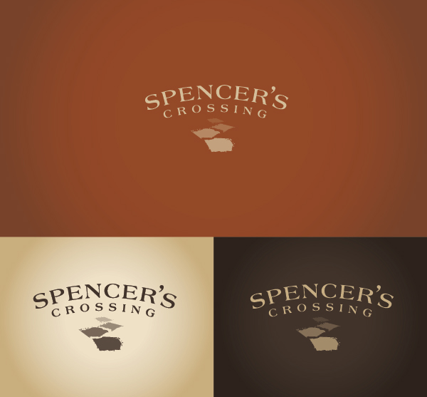
The identity programming for
Lennar's newest community took a
whimsical old school direction.
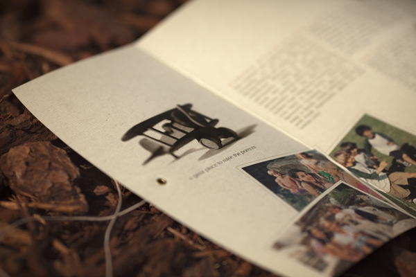
The logo graphically focused on one of the
strongest selling points, the walking trails with the
name forming a bridge that crosses over.
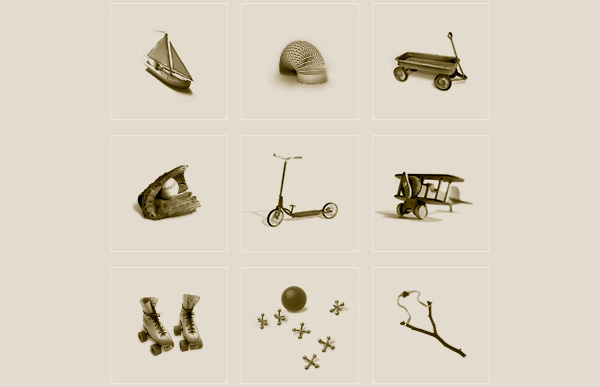
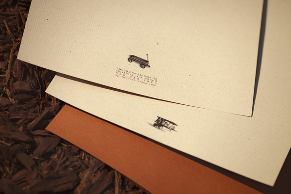
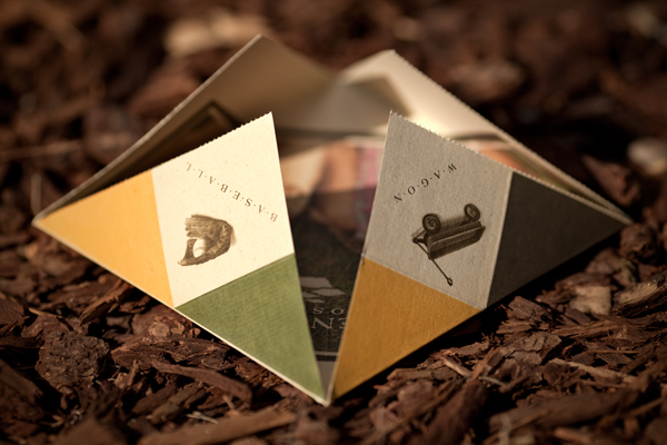
Iconic toys of yesteryear
reinforced the positioning statement
'designed for the kid at heart'.
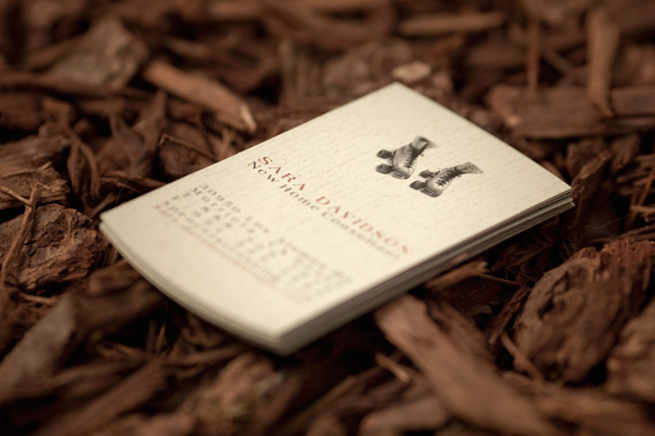
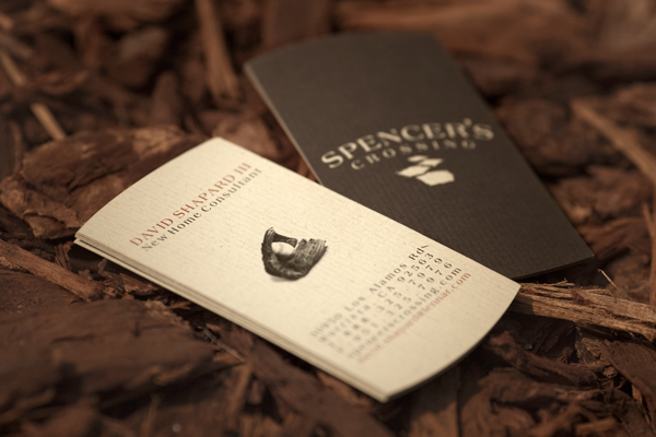
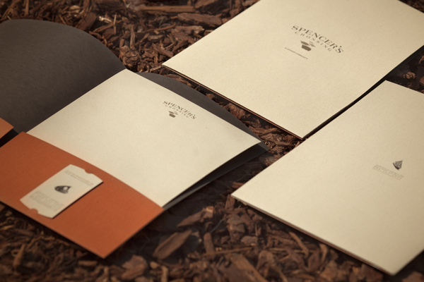
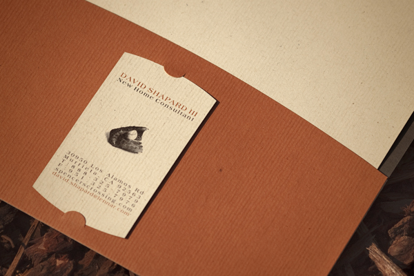
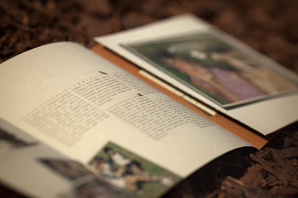
The collateral and sales office program
stayed consistent with the brochure
designed as a game to play.
Lennar's newest community took a
whimsical old school direction.
The logo graphically focused on one of the
strongest selling points, the walking trails with the
name forming a bridge that crosses over.
Iconic toys of yesteryear
reinforced the positioning statement
'designed for the kid at heart'.
The collateral and sales office program
stayed consistent with the brochure
designed as a game to play.