bar 枯渇(Kokatsu) | Visual identity
2014
The visual identity of "bar Kokatsu" in Okinawa.
Kokatsu is Japanese of the meaning of having been drained.
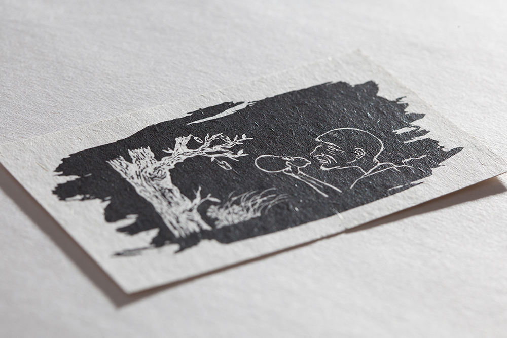
The logo designed three, the type of a standard Chinese character, the type which abstracted the Chinese character and was made into the code, and the type which made it the Japanese painting further.
Moreover, it became a logo which combines feeling and logic by using a silver ratio for those balance.
Three kinds of these logos are properly used by a specification use.
The campaign which gives concern to those who see was performed by putting the cloth which printed the code type logo before opening on a signboard.
Since "bar Kokatsu" was bar which mainly treats Japanese alcohol, Japanese paper was used so that a peace taste might come also out of a paper item.