


Rent out safely, move in with ease 🟣🔑🐈⬛
Y.Rent is a service that makes it easy to find the perfect home or tenant. Our team developed their visual identity to convey a reliable and human-centered brand that radiates convenience.
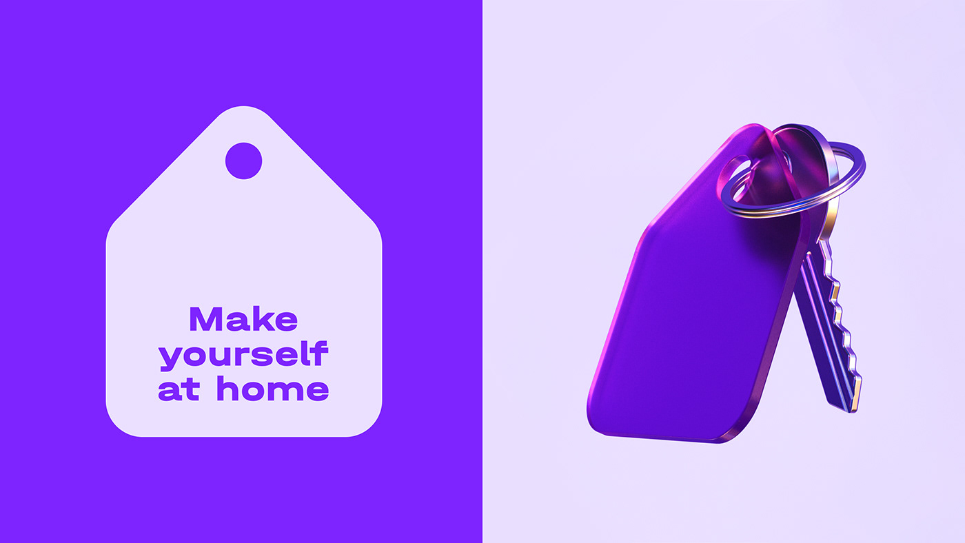
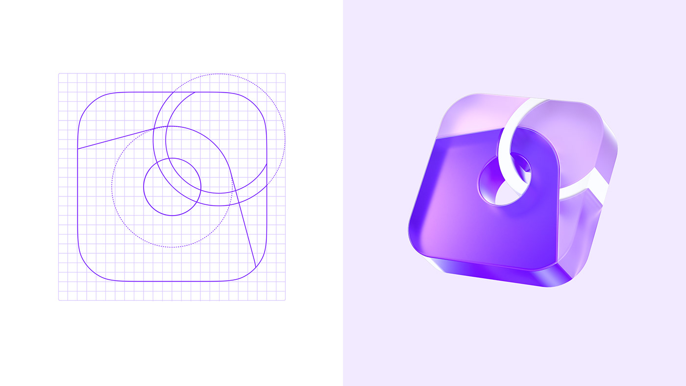
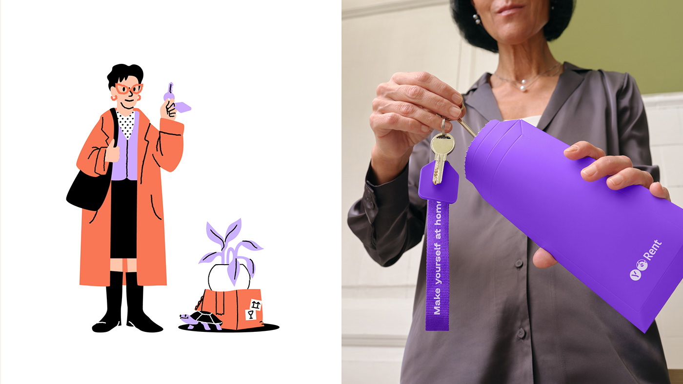
We used a keychain as the main visual metaphor. Shaped like a house, it evokes a feeling of familiarity, making it a keeper of comfort. This way, when you leave the house with your keys, you carry a piece of home with you. The keychain with a ring in the app icon represents the link that Y.Rent creates between tenants and owners by matching people to their ideal home. The circular ring hole is a recurrent motif that ties in the brand’s graphic elements.
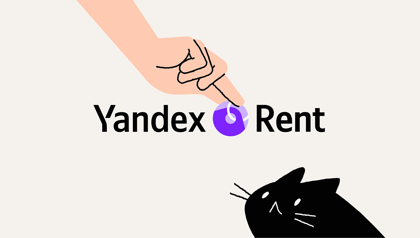
For the main color, we chose a purple that reflects service’s dependable elements, contrasting perfectly with cozy shades of yellow and orange. Adding charm are lively illustrations, introducing relatable owner and tenant characters, complete with animal companions. And just like a good cardboard box, the Halvar typeface used here is simple, straight, and weighty, making sure the Y.Rent's brand resonates from screens to streets.


ESH
Art-director: Stefan Lashko
Lead Designer: Nadi Kosenkova
Designer: Polina Syrvatka
Motion Design: Nadi Kosenkova
Project-manager: Narek Vatinyan
Manager: Ivan Matskevich
Yandex Rent
Art-director: Vladimir Kulikov
Producer: Ksenia Boyarkina
Producer: Dari Sokolova
Illustrator: Emma Nizamova
Animation: Emma Nizamova
3D: Oleg Ronzhin, Sasha Volkov
Photos: Tape Production
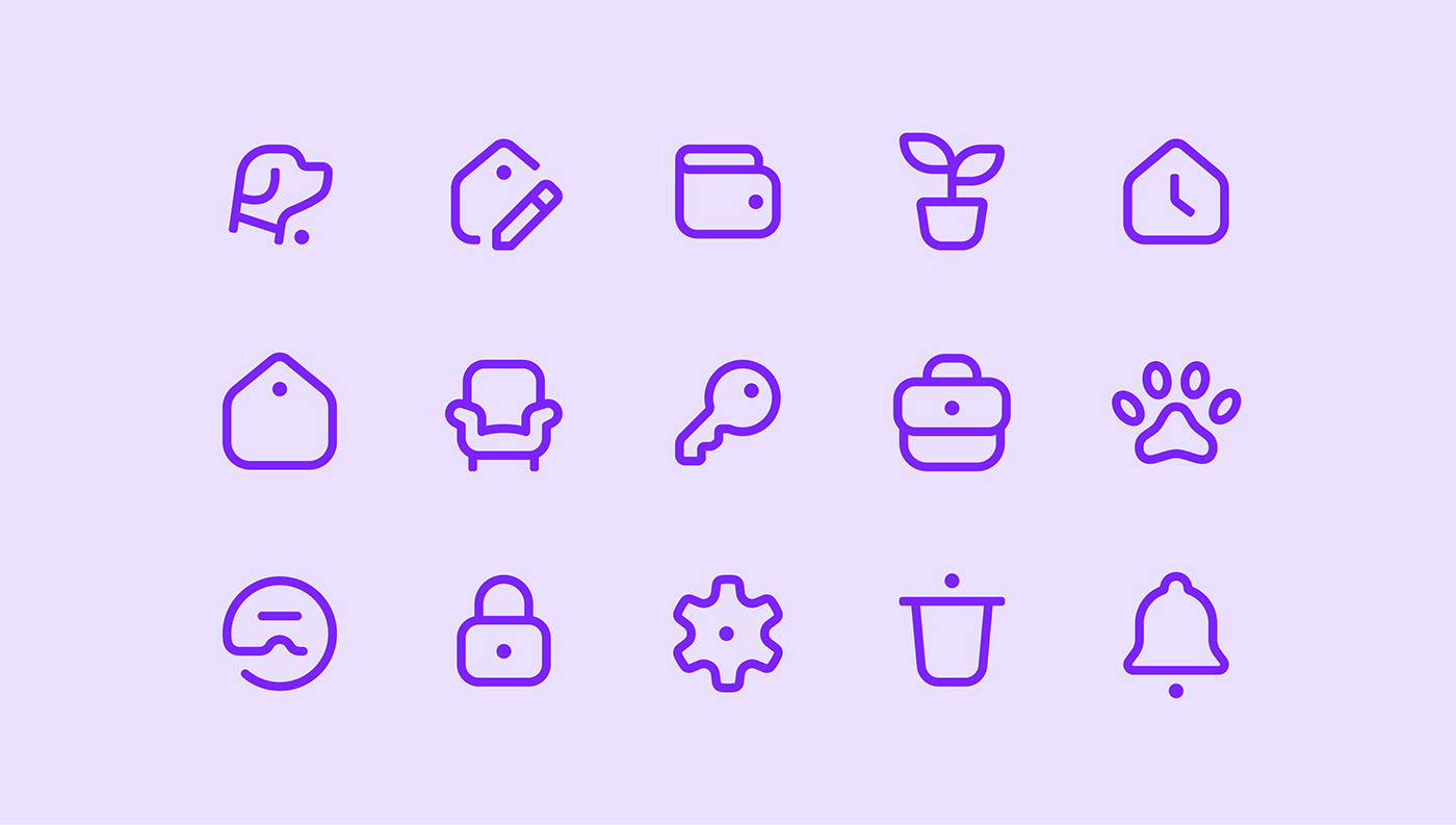
Pictograms: Sergey Osokin
Cat: Tucha (Туча)
Typeface: Halvar Breitschrift
Year: 2021 – 2023


