I designed a pasta package for “Salute” which is a company that has recently been bought by a young and ambitious entrepreneur and wants to improve the brand image. Salute is a company that was family owned and it is based in Naples, Italy. The target audience is young high-income urban professionals.
The logo was a based on a mosaic from an old building in Naples, since Italian culture is also known for its history and I used the mosaic that I reproduced in illustrator as the symbol of the company.

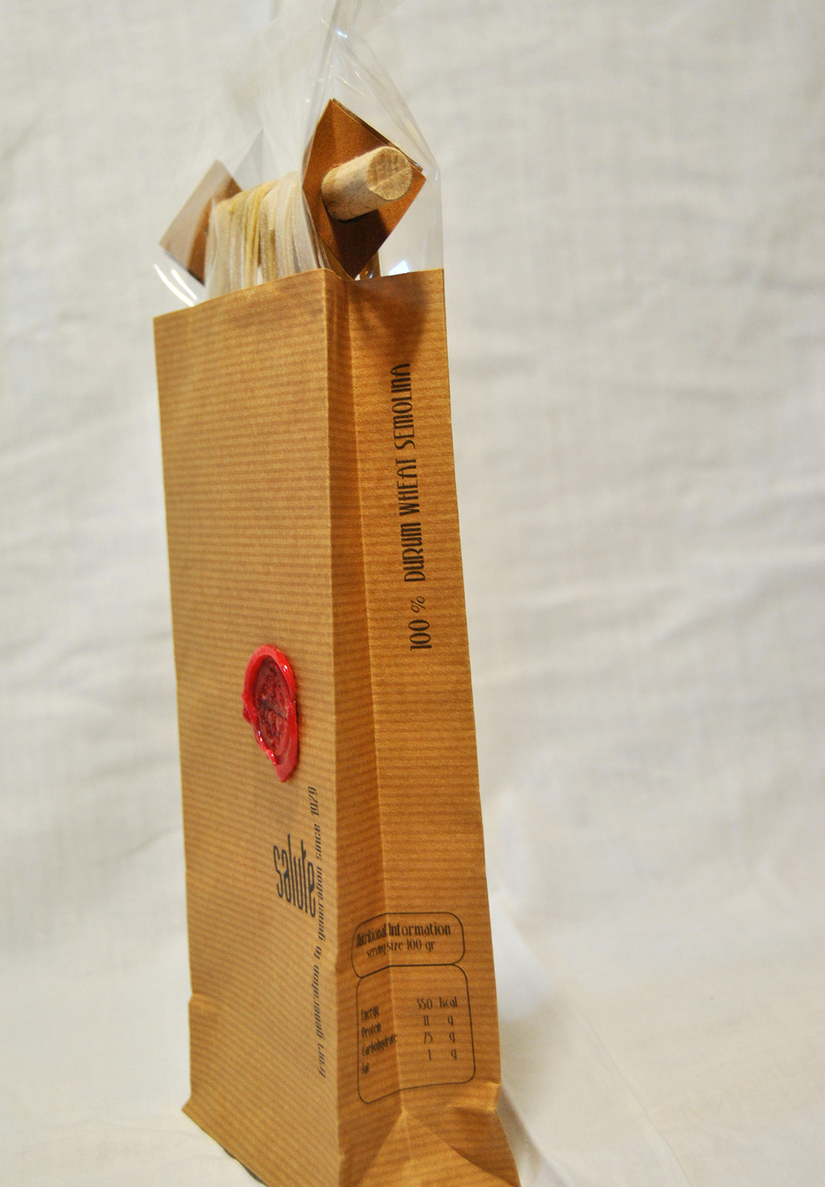
I decided to use wax seal to create the mosaic because wax seal gives the feeling of expensive and mysterious.


I tried to design a traditional way of making pasta, which they make the pasta and hang them, to dry. I cooked my own pasta and hanged them until dry. They were delicious.
I wanted to insert this method into the package and so I created this package out of recycled paper and hanged the spaghetti on a stick.


The design of the package was inspired out of the brown food bags so it gives the feeling of traditional but with delicate typeface and input so it looks high class pasta for the audience. The typefaces I used are scalpel and stonyisland. They are typefaces that are delicate and suit the environment of the target audience.

Tags


Spaghetti


Penne


Thank you!!


