


Your Partner
in Smart Logistics Solutions
Introduction
In the rapidly evolving logistics service industry, marked by the continuous growth of platforms and technological advancements, Smart Minds eagerly embraces change and innovation. With years of experience in the field, we recognize the need to break free from conventional norms and transcend our identity beyond a familiar symbol in the logistics sector.
Our primary mission is to connect businesses with seamless logistic solutions. As part of this commitment, we are excited to introduce a fresh brand identity and a versatile design system that elevates our role and steers our company towards the forefront of the logistics industry as a leading provider of platform and technology.
Formerly recognized as Zeek Corporation, Smart Minds now stands as a global logistics powerhouse with a significant presence in various countries, including Hong Kong, Taiwan, Vietnam, Singapore, Thailand, and Malaysia. We've shifted our strategic focus to evolve into a comprehensive smart solution platform.
Our rebranding journey as Smart Minds signifies a pivot toward intelligent logistics solutions. This strategic transformation empowers us to deliver innovative, efficient, and forward-thinking logistics solutions to our valued customers.

Reasearch
Overall, the brands are focused on showcasing the distinctive elements of the logistics industry such as reliability and credibility, through a dominant color scheme (such as blue) and content. (Editorial Style).
Illustrations are used to emphasize friendliness and accessibility.
The messaging content is centered around communicating the benefits and addressing the needs of the users.
Illustrations are used to emphasize friendliness and accessibility.
The messaging content is centered around communicating the benefits and addressing the needs of the users.

Concept
Our goal is to transform the logistics industry into an intelligent, promising concept, closely linked with innovation and progress. This identity celebrates our commitment to position Smart Minds as a trustworthy and groundbreaking partner in the logistics field, through the elements that define the Smart Minds brand, centered around the core concept of 'Dynamic Flow'.
The concept "Dynamic Flow" encompasses the notion of unceasing motion and vitality for Smart Minds. "Dynamic" symbolizes the fleetness, malleability, and perpetual progress of technology, especially in the logistics domain. It signifies the capacity to adapt swiftly to shifting landscapes, displaying flexibility, innovative prowess, and a penchant for innovation. On the other hand, "Flow" alludes to the incessant and seamless movement within logistics procedures. It epitomizes enhancement, streamlining, and effectiveness in the transit of commodities, data, and services.

Outcome
We designed a flexible identity representing the evolution of technology and translated brand values.
Logo
The logo takes its cues from the "Dynamic Flow" concept. It is built around the fusion of the two characters, "S" and "M," symbolizing the Smart Minds brand. The typography in the logo maintains the clean and streamlined aesthetics of the symbol, using a sans-serif font to imbue a contemporary touch.

Graphic Device
The graphic device, known as the ‘Flow’ serves as a dynamic and energetic element within Smart Minds visual identity. This graphic device encapsulates the essence of movement, innovation, and adaptability that Smart Minds embodies. Through its fluid lines and vibrant energy, the ‘Flow’ graphic device symbolizes the ever-evolving nature of technology and solutions that Smart Minds provides. Its usage in various brand applications infuses a sense of vitality and modernity, capturing the essence of the company’s commitment to delivering cutting-edge solutions in a constantly changing landscape.

Color
Color palette is not merely a random selection, it has been meticulously chosen based on the values and messages we aim to convey. The color palette signifies modernity, creativity in the field of iinformation technology, while also generating a sense of distinctiveness and breakthrough, as well as reliability and innovation. The color palette is also associated with openness and adaptability, reflecting our ability to innovate and adapt to cope with challenges in the logistics industry. In essence, the color palette reflects the profound values and messages of Smart Minds.


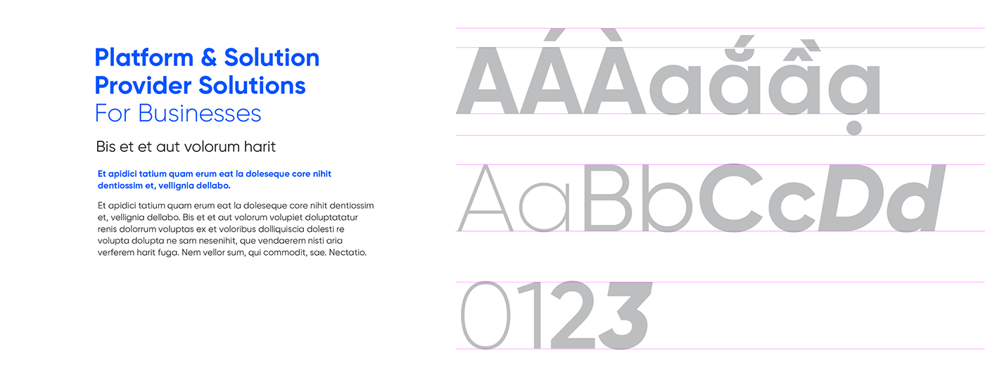
Typography
Our choice of typography serves as a visual manifestation of our brand’s voice. The typefaces we use create a visual texture that adds a sense of warmth and depth to our written content. This enhances the vibrancy of our words, ensuring they resonate with our Graphic Device.
SVN-Gilroy is the primary brand typeface of Smart Minds
Photography Style
To accurately convey the positioning of Smart Minds as a solution logistics entity, specific image styles are defined for brand communication activities. These styles encompass four main categories: Portraits, In-Action, Absstract, Enviroment.


Credits
_
_
Industry: Logistics
Locations: Hong Kong
Client: Smart Minds corporation
Agency: brandSTORY™
Locations: Hong Kong
Client: Smart Minds corporation
Agency: brandSTORY™
Services: Brand Identity
_
Graphic Designer: Hoang Anh
_
Thanks for watching & your appreciation
_
Thanks for watching & your appreciation


