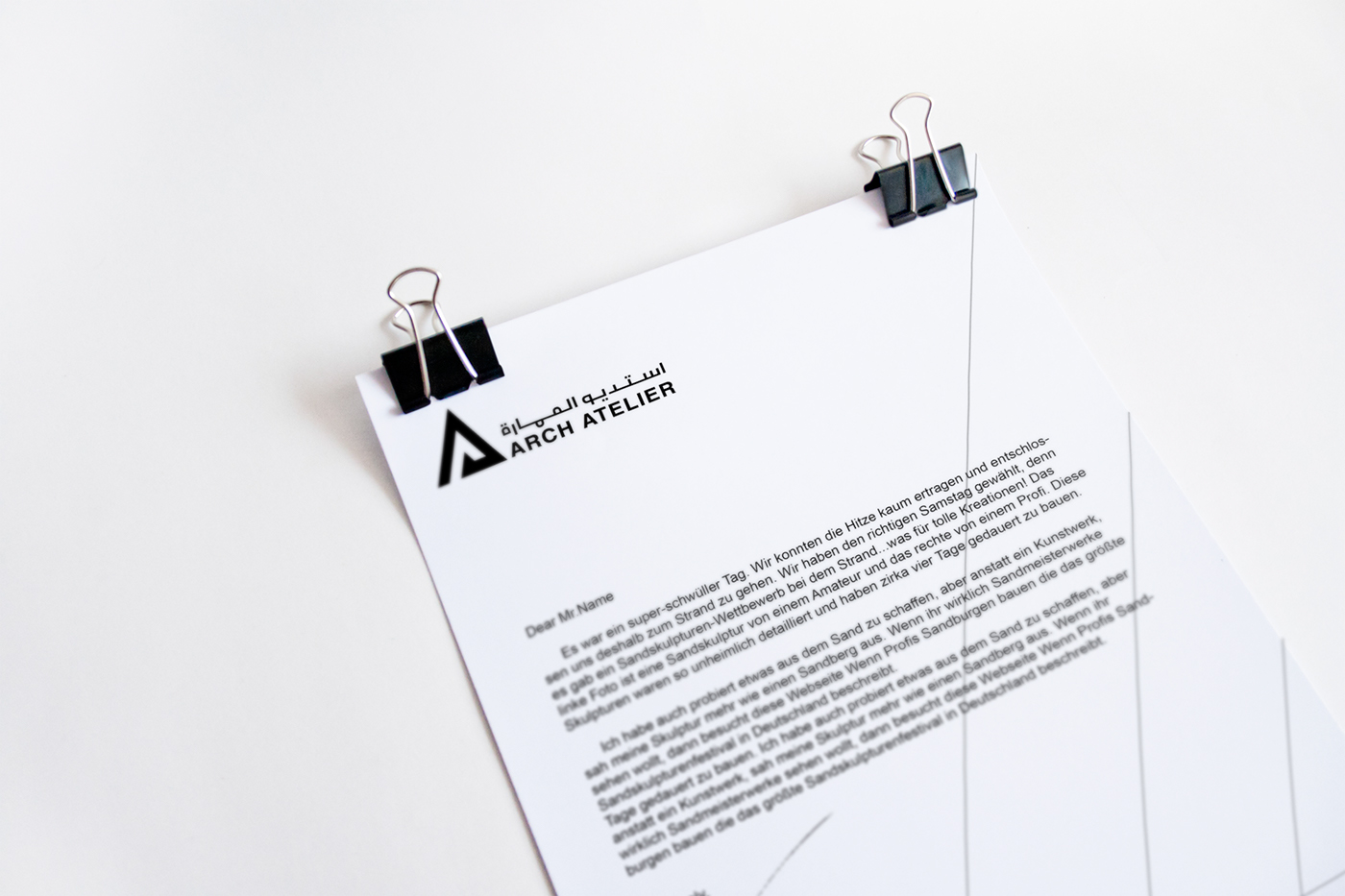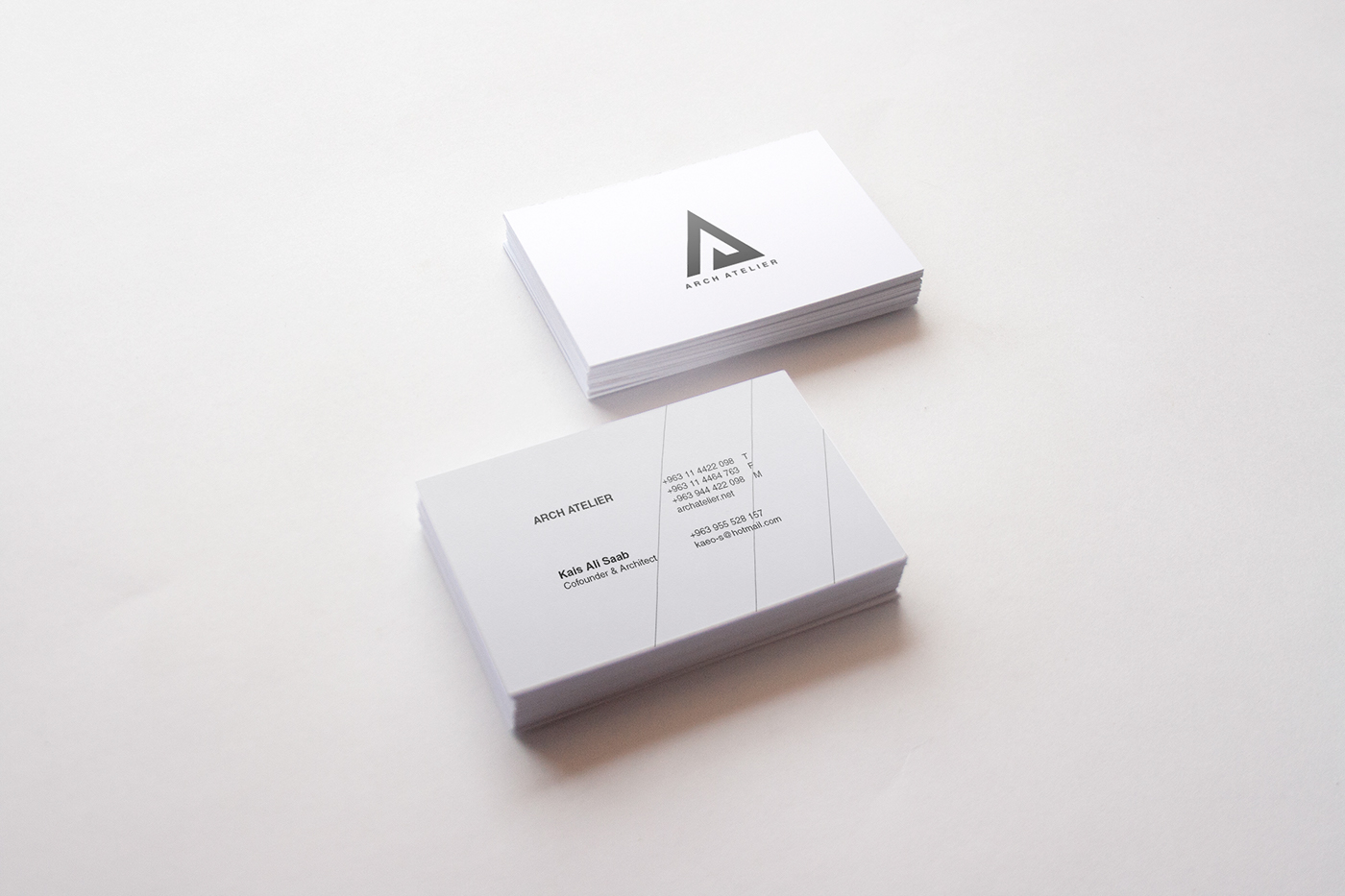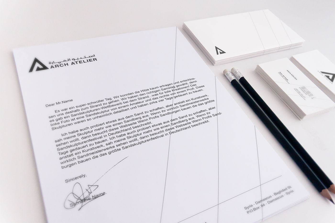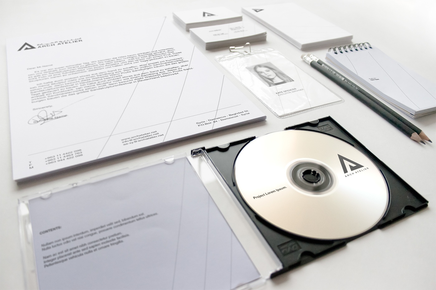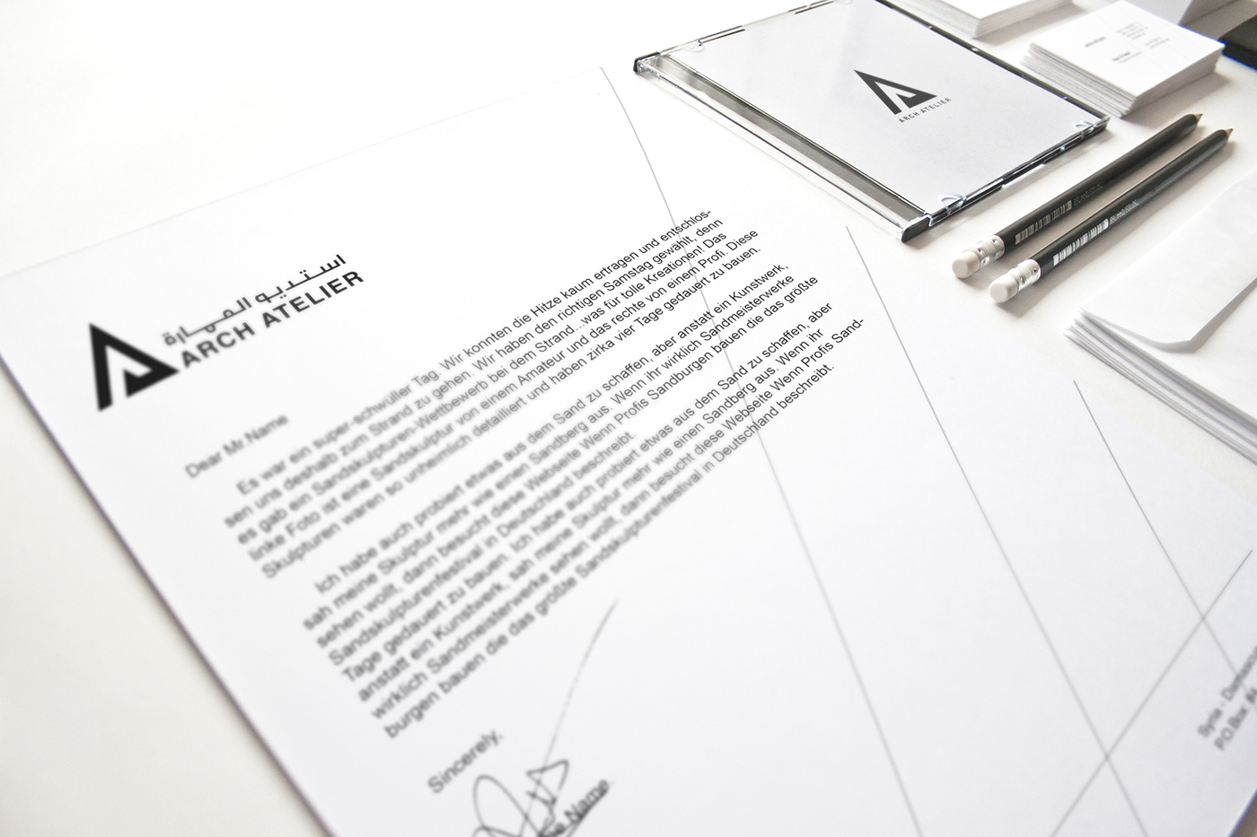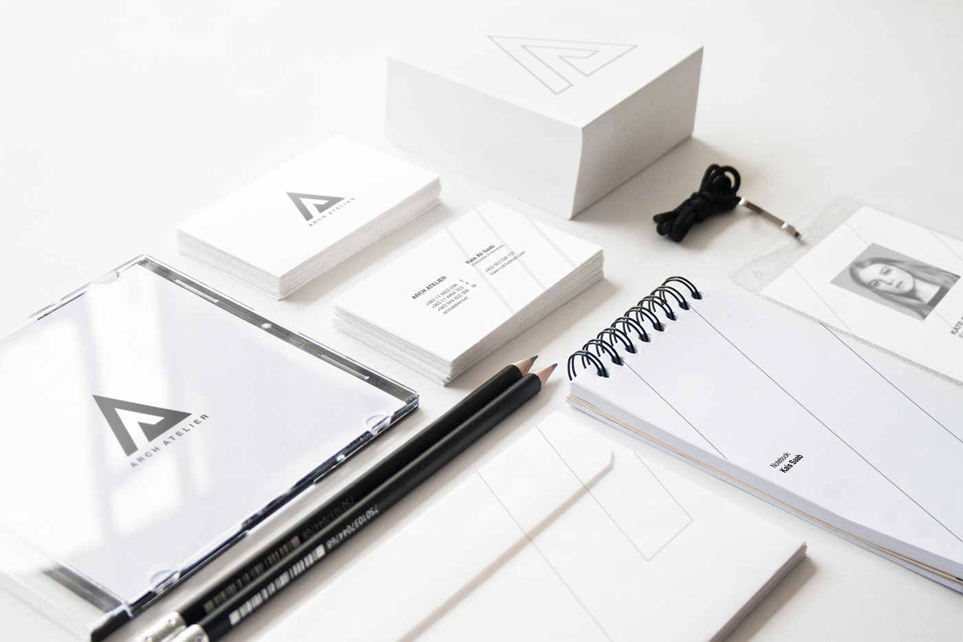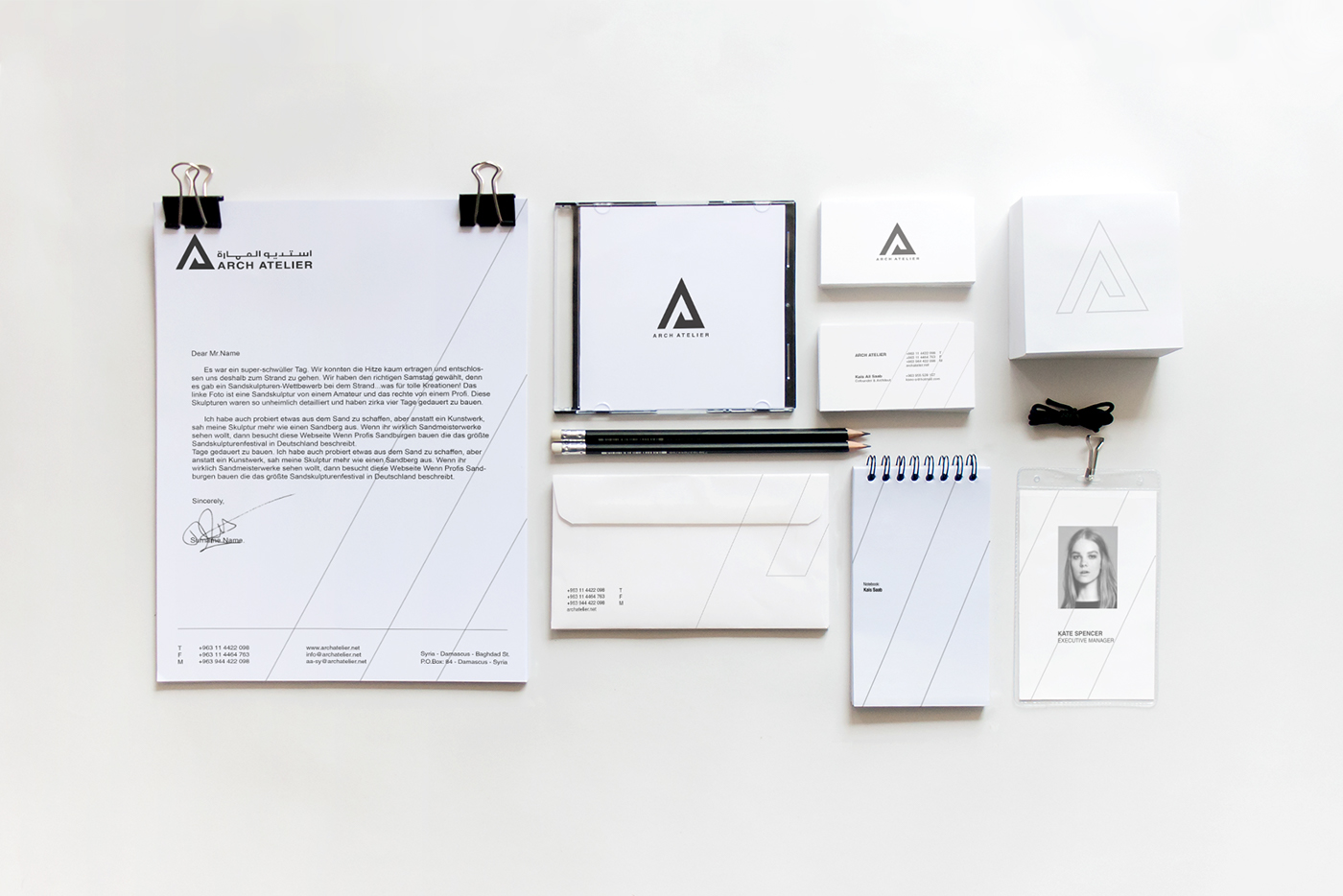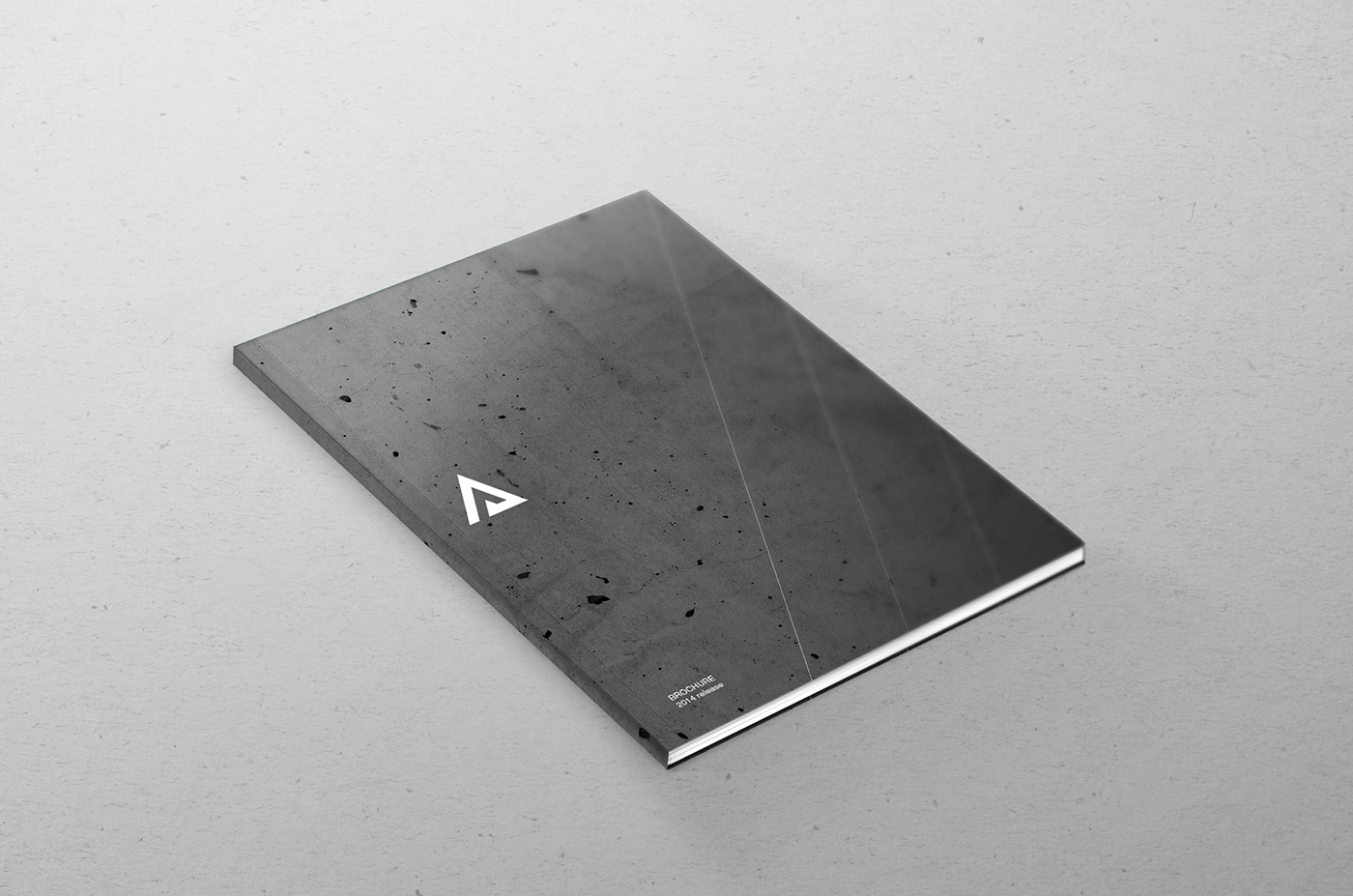
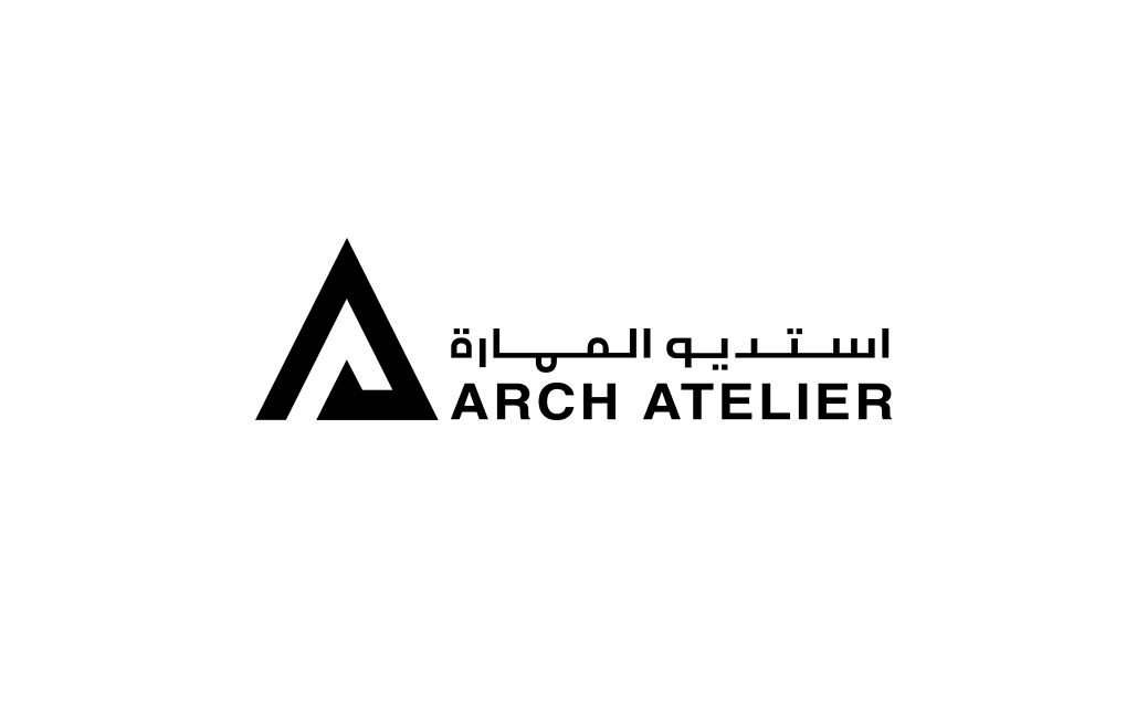
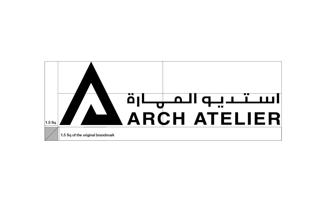
ARCH ATELIER is an architecture and interior design studio based in Damascus, Syria. Formed and ran by a group of young architects who carry big dreams to expand the studio and spread their works all over the world. The identity had to reflect this feel of motivation and innovation. It had to have the global brandmark sense, but with keeping relation to the Syrian and Arabic market by specially designing an Arabic type for the brandmark.
The Mind Map:
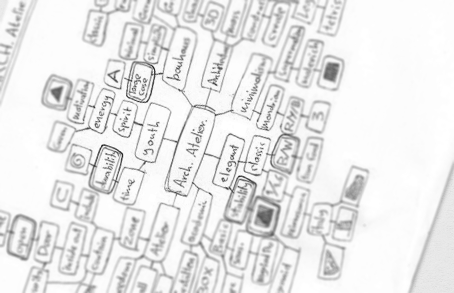
Keywords:
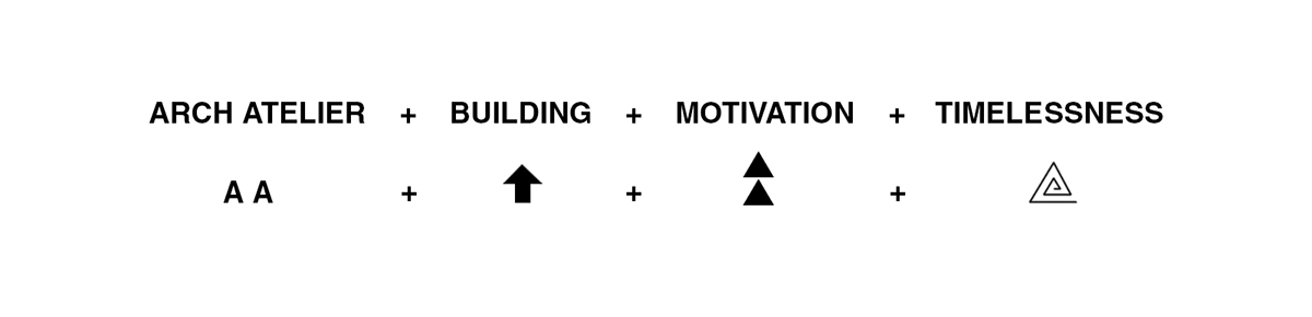

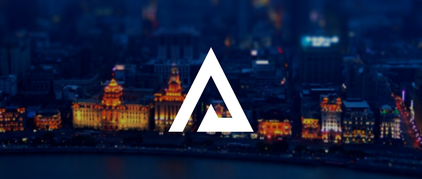
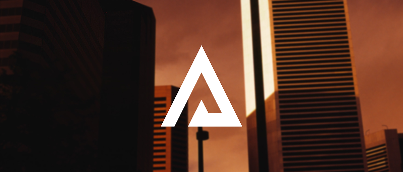
The main idea behind the logo, and which inspired the whole identity, was very minimal. I tried to hit the very core concept of architecture, which is building. Which can only be oriented upwards. From the ground towards the sky. I also took advantage of the two A's in Arch Atelier to enhance this feeling and include the motivation factor of the atelier. The logo was built on a squared map to suggest stability and trust, which is also a value of Arch Atelier. The contrast element in architecture was also key in inspiring the logo, so it's either a building or an empty space, inside versus out, black versus white.
*The logo was nominated for the Hiiibrand Award 2013 - Professional Logo Category.

Study:
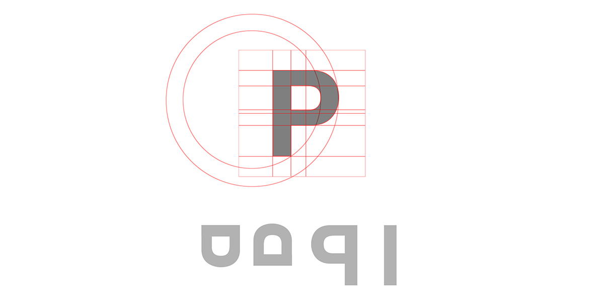
Deriving the Arabic Type from the capital bold letter "P" of Helvetica (OT1).
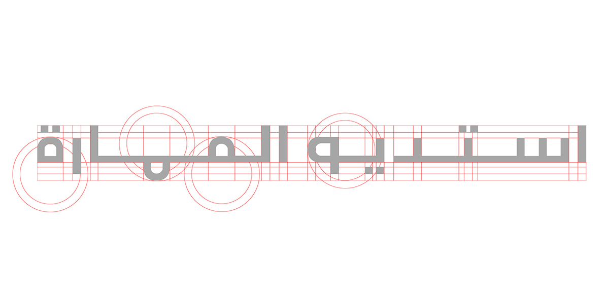
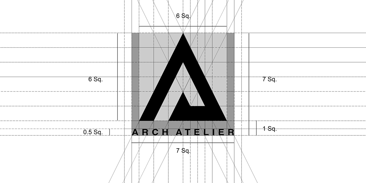
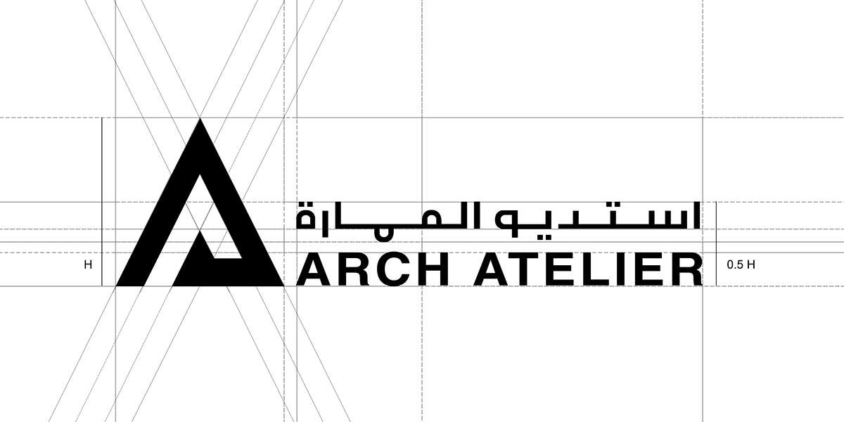
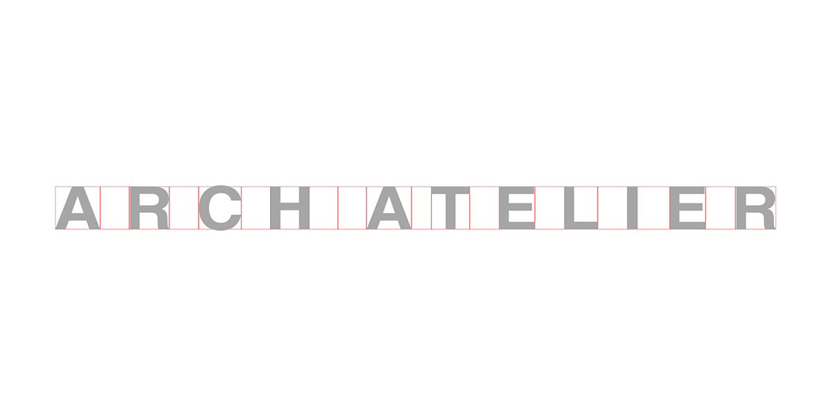
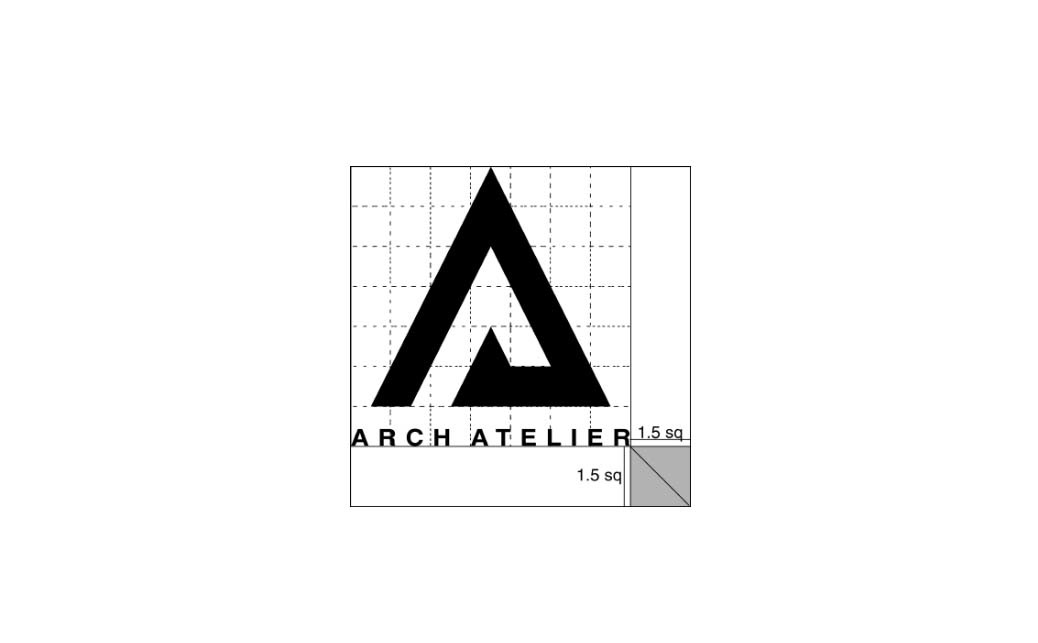
Margins:
Color Palette:
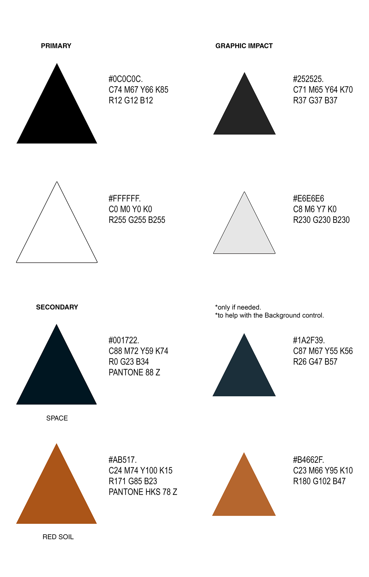
Secondary colors are also derived from the concept of raising buildings from "SOIL" towards the "SPACE".
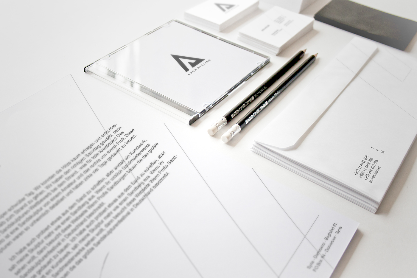
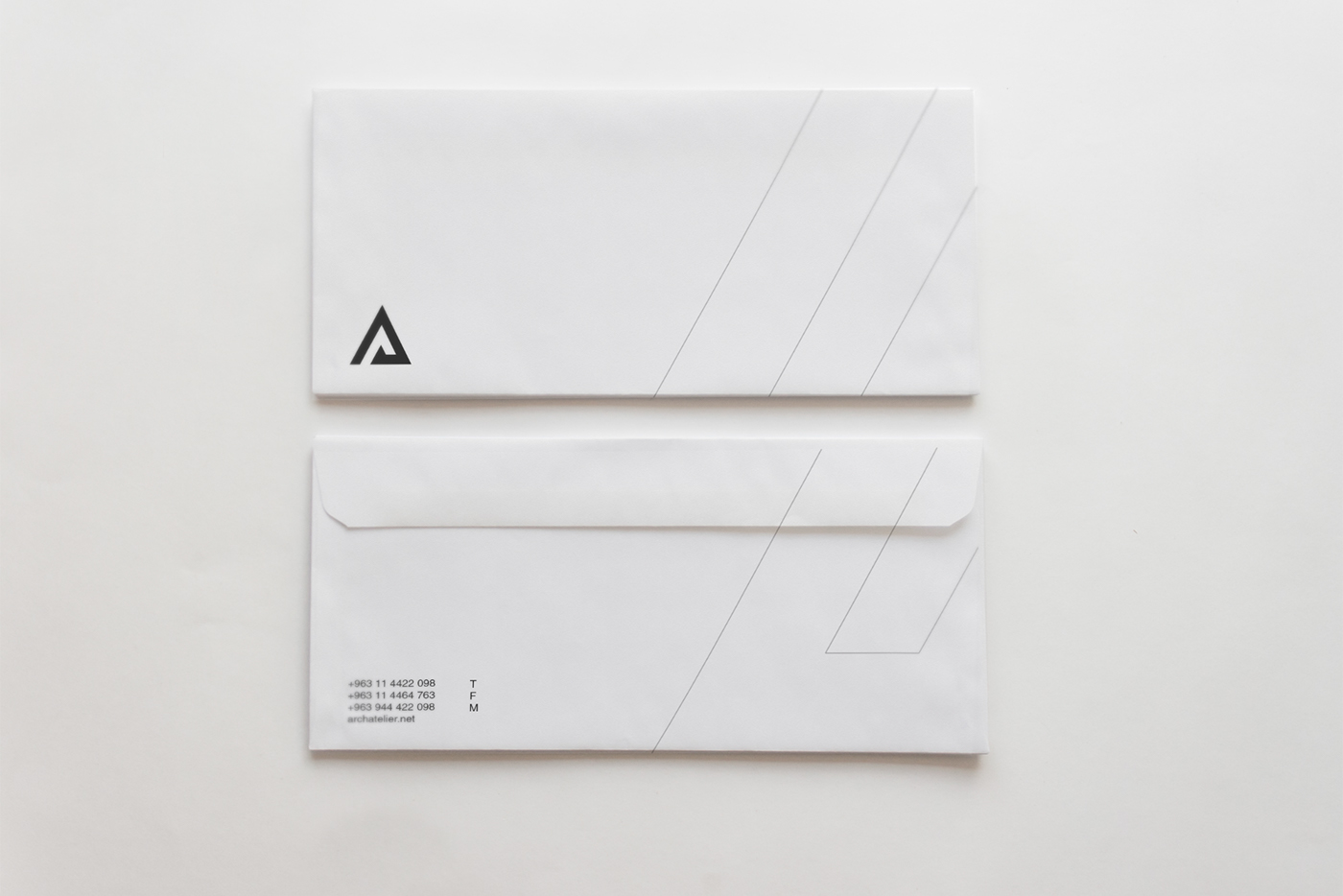
The use of secondary colors is limited to the guidance in selecting proper elements to background the brandmark logo, in addition to BLACK & WHITE images.