

H O M E P A G E
Mood-based content
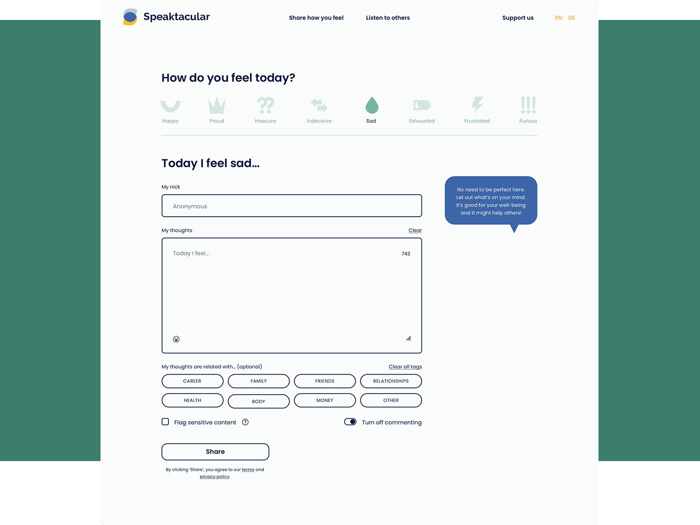
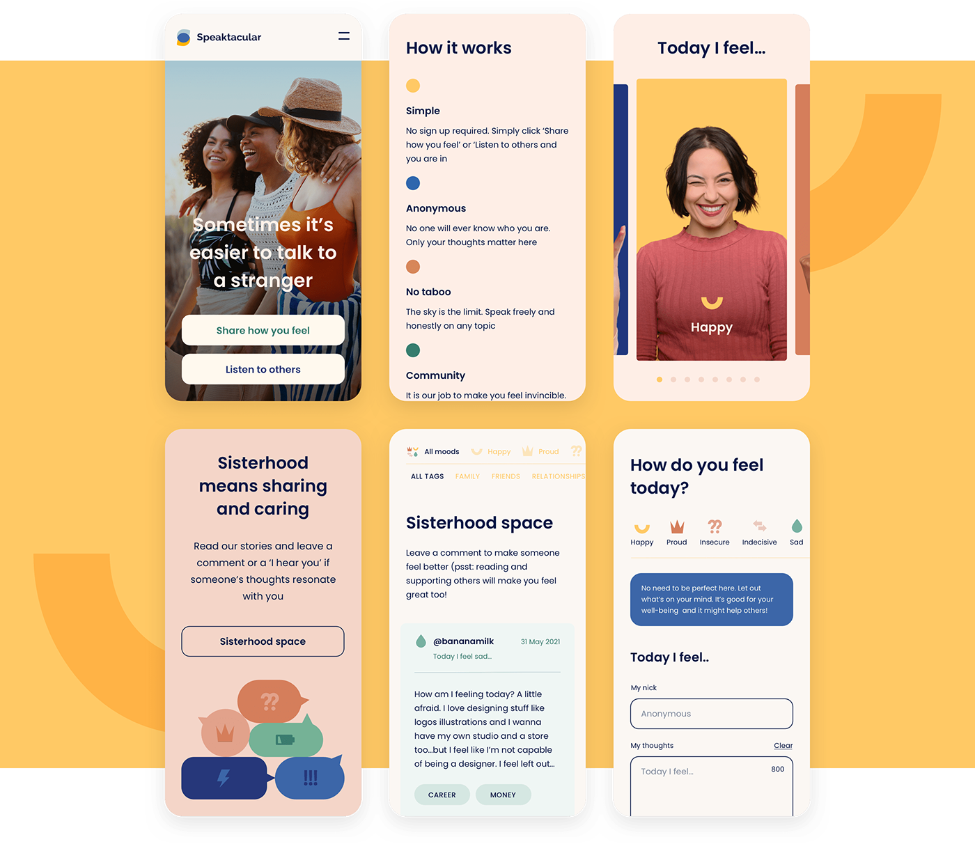
The simple and welcoming feel of Speaktacular’s homepage was to emphasize the platform’s core values of anonymity and positivity. One of the site’s key features allows the users to choose their current mood from a selection of options, and then create a new post based on that mood. This functionality is aimed at bridging the gap between written words and perceived emotions, boosting authenticity and empathy.

P O S T S
A thought-sharing platform
Expressing your thoughts on Speaktacular’s platform is simple and intuitive. Apart from the aforementioned moods that can be paired with a post, users can select relevant tags, such as “family”, “careers”, or “health”, which improves discoverability. It’s also a great feature if you’re not ready to post yet and prefer to look through posts with problems similar to yours first.
L I S T I N G
With the user’s comfort in mind
The Post Listing was made to serve as a powerful tool for women to communicate, prioritizing emphatic and uplifting support. For the user’s safety and peace of mind, some posts are blurred to signal a trigger warning if the content is sensitive. This is an important feature that helps to protect the emotional well-being of users, while still allowing them to connect with others who may have similar experiences.

S I N G L E T H R E A D
Building a community
With the Single Thread feature, users can react to a post by clicking the "I hear you!" button – a simple way to express empathy. Obviously, each post also has a comment section, where users can provide feedback, offer support, or share their own experiences. This creates a sense of community and allows users to build relationships with others who are going through similar challenges.

M O B I L E
Support made accessible
Easy access and simplicity of use are paramount to the success of any social media platform, and mobile-ready websites are a must. That’s why our team put great effort into designing mobile screens for Speaktacular. The mobile screens have been designed to be intuitive and user-friendly, with a layout that is optimized for smaller screens. This ensures that the platform remains accessible and easy to use, regardless of the device being used.
B R A N D I N G
Conveying the values
The Speaktacular branding has been carefully crafted to convey a feeling of warmth, friendliness, and support. Simple icons paired with pictures of women of different ages and moods further emphasize the platform's inclusiveness and diversity, while reinforcing Speaktacular’s core values of positivity and empathy. The overall effect is a brand that feels approachable and relatable, while still maintaining a professional and credible image.

L O G O T Y P E
Making a connection
The logotype we created for Speaktacular is a simple yet effective representation of the platform's brand identity. The emblem in the logotype cleverly depicts the connection of various colors, which represent different moods, also making a connection to the company name through the shape of the letter “S”. Additionally, the logotype refers to the simple icons used throughout the Ul design, further reinforcing the consistent and cohesive branding of Speaktacular.

K E Y V I S U A L
Colors that tell the story
Speaktacular’s color palette has been thoughtfully designed to reflect the platform's values. The shades of yellow, blue, green, and brown are warm and inviting, creating a friendly and approachable atmosphere. Each mood on the platform has been assigned a specific color, making it easy for users to identify and navigate content that is relevant to their current emotional state.
Typography-wise, Poppins, a modern and clean font that’s easy to read, has been selected to complement the friendly and approachable tone of the platform. The font’s sleek and minimalist design goes well with the rest of the site, reinforcing the platform's focus on simplicity, positivity, and connection.

T E A M
A team full of empathy
It was a tremendous privilege to work on such an impactful initiative with Speaktacular. The project was a collaborative effort that involved a Project Manager, Designers, and Developers working together to bring the platform to life. Each team member brought their unique skills and experience to the project, resulting in a cohesive and successful outcome that reflects the values and mission of Speaktacular.

Thanks for watching!
Adchitects is a leading product & web design agency based in Europe.
Let’s shape & build your next digital product together:
Message us at hello@adchitects.co or visit our website
Copyright (C) 2023 Adchitects


