Como: un logo sul lago
Chi visita Como sperimenta facilmente la sua atmosfera da città di frontiera, sospesa tra le dualità proprie del luogo: l'acqua e la terra, il lago e le montagne, l'Italia e la Svizzera, il pieno e il vuoto, la presenza e l'assenza, l'emerso e il sommerso. Di tutte, fa da demarcazione la linea del lago, che ne definisce non solo il profilo su scala urbana e extraurbana, ma anche uno stato emozionale, da molteplici punti di osservazione: percorrendo il lungolago, guardando la città dal battello o gettando lo sguardo oltreconfine dall'altura del Faro Voltiano.
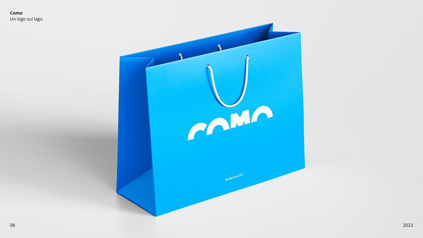
Questo studio per un logo della città racchiude questa sospensione, partendo dal suono, così semplice e rassicurante, del nome e dall'immediatezza grafica delle lettere che lo compongono, al punto da poter essere mentalmente completate nella forma, come riflesse sull'acqua, anche se viste soltanto per metà.
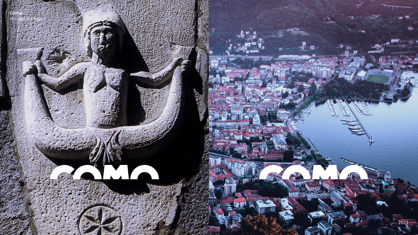
Il logo evoca l'emergere del profilo di Como dallo specchio d'acqua. La vita sommersa del lago popola l'immaginario dei cittadini e dei visitatori, come testimoniano le sirene a due code scolpite su diversi muri e portali del centro storico. Il lago è rappresentato ma non disegnato. È rivelato attraverso una sottrazione.
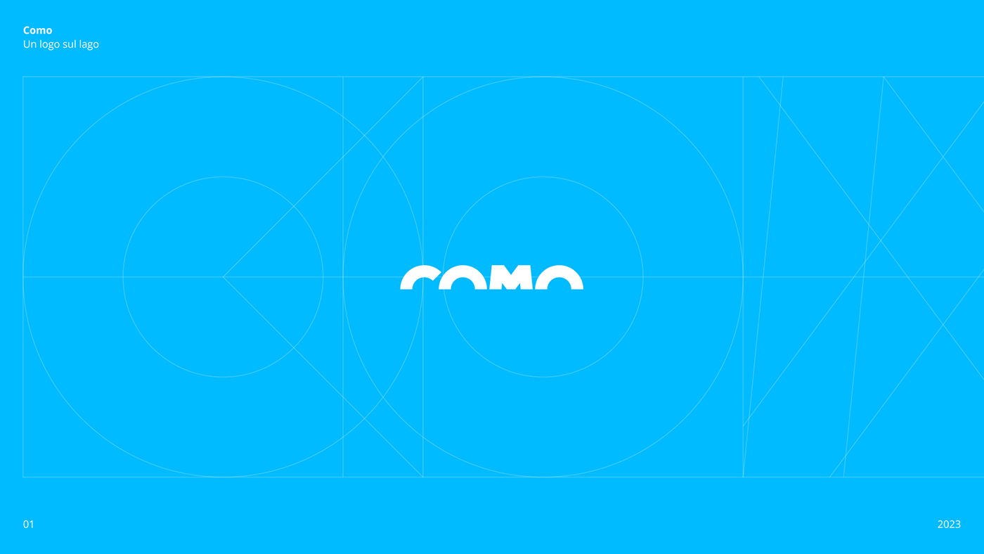
Un lettering personalizzato e creato da zero, senza grazie, senza variazioni di spessore né correzioni ottiche, è disegnato su una griglia in cui ognuna delle lettere, compresa l'immaginaria metà mancante, è inscritta in un modulo di forma quadrata. Rigoroso e essenziale, come l'austerità degli edifici storici, come la calma sospesa del lago, come la geometria delle architetture di Terragni.

Como: a logo on the lake
Those who visit Como easily experience its border town atmosphere, suspended between the dualities proper to the place: water and land, lake and mountains, Italy and Switzerland, fullness and emptiness, presence and absence, the emerged and the submerged. Of all of them, the line of the lake acts as a demarcation, defining not only its profile on an urban and suburban scale, but also an emotional state, from multiple vantage points: walking along the lakefront, looking at the city from the boat, or casting your gaze across the Italian border from the heights of the Volta Lighthouse.
This study for a city logo encapsulates this suspension, starting with the sound, so simple and reassuring, of the name and the graphic immediacy of the letters that compose it, to the point that they can be mentally completed in their shape, as if reflected on water, even if only half seen.
The logo evokes the emergence of Como's profile from the body of water. The submerged life of the lake populates the imagination of citizens and visitors, as evidenced by the two-tailed mermaids carved on various walls and portals in the historic center. The lake is represented but not drawn. It is revealed through subtraction.
Custom lettering created from scratch, sans serif, without variations in thickness or optical corrections, is drawn on a grid in which each of the letters, including the imaginary missing half, is inscribed in a square-shaped form. Rigorous and essential, like the austerity of historic buildings, like the suspended calm of the lake, like the geometry of Terragni's architecture.