Sobre o projeto
[PT-BR]
[PT-BR]
Além dos padrões, criando marcas singulares.
A Rupture Branding é um estúdio brasileiro focado em estratégia de marcas de alto padrão, que já ajudou a construir identidades visuais memoráveis em todo o mundo.
O projeto foi idealizado com o intuito de representar a visão da marca, tudo que ela quer transmitir para o seu público alvo e toda a singularidade que seus trabalhos oferecem.
About the project
[EN-US]
[EN-US]
Beyond patterns, creating unique brands.
Rupture Branding is a Brazilian studio focused on high-end brand strategy, which has helped build memorable visual identities around the world.
The project was designed with the aim of representing the brand's vision, everything it wants to convey to its target audience and all the uniqueness that its work offers.
RUPTURE © 2023 - BRANDING AND VISUAL IDENTITY PROJECT


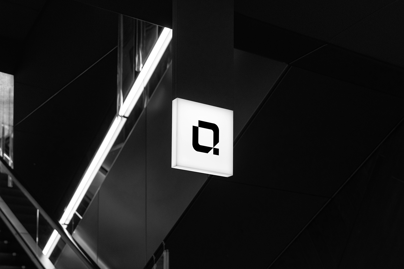
Conceito
[PT-BR]
[PT-BR]
A construção da marca da Rupture foi baseada em duas palavras, singularidade e disrupção. Ao iniciarmos a criação, demos vida a esses significados através das letras centrais do nome da empresa e do símbolo.
Letras centrais: Através das letras centrais focamos em destacar o "tu" (você), representando o cliente que vai entrar em contato com a marca, mostrar que ele vai se destacar entre os demais e se tornar singular (único) em seu mercado.
Símbolo: Já na construção do símbolo, com formas arredondadas e quadradas trouxemos essa quebra de padrão e uma fuga do convencional, juntamente com a inicial da marca (R).
Desenvolvemos sua identidade visual focando nisso, destaque e quebra de padrão, para representar toda essa singularidade que a marca quer construir em torno de seu branding.
Concept
[EN-US]
[EN-US]
The construction of Rupture's brand was based on two words, uniqueness and disruption. When we started creating, we brought these meanings to life through the central letters of the company name and symbol.
Central letters: Through the central letters we focus on highlighting the "tu" (you - in Portuguese), representing the customer who will come into contact with the brand, showing that they will stand out among the others and become singular (unique) in their Marketplace.
Symbol: In the construction of the symbol, with rounded and square shapes, we brought this break from the standard and an escape from the conventional, along with the brand's initial (R).
We developed its visual identity focusing on this, highlighting and breaking the mold, to represent all this uniqueness that the brand wants to build around its branding.