
Smucker's Goober Redesign
C. Dolan
Graphic Design 3 Project

In 1897, Jerome Monroe Smucker sold his first jar of apple butter from the back of his wagon, thus starting a legacy known and enjoyed by millions. Smucker’s Goober was first introduced to the table in 1968, consisting of alternating peanut butter and jelly stripes. I decided to redesign Smucker’s Goober with the goal of giving it a fresh, new look.

The new logo uses an image of a peanut as a fun way to both spell the product logo, but also to show what a goober is. The new label includes a new elephant character, so to appeal more to children and young families, holding the other character to show what the other half of the product is, either a grape, strawberry, or a cherry. The combination of the peanut in the logo and the other fruit on the label will be able to help those who cannot read or have trouble reading English, this way a consumer can quickly look at the label and understand what flavor the product is.
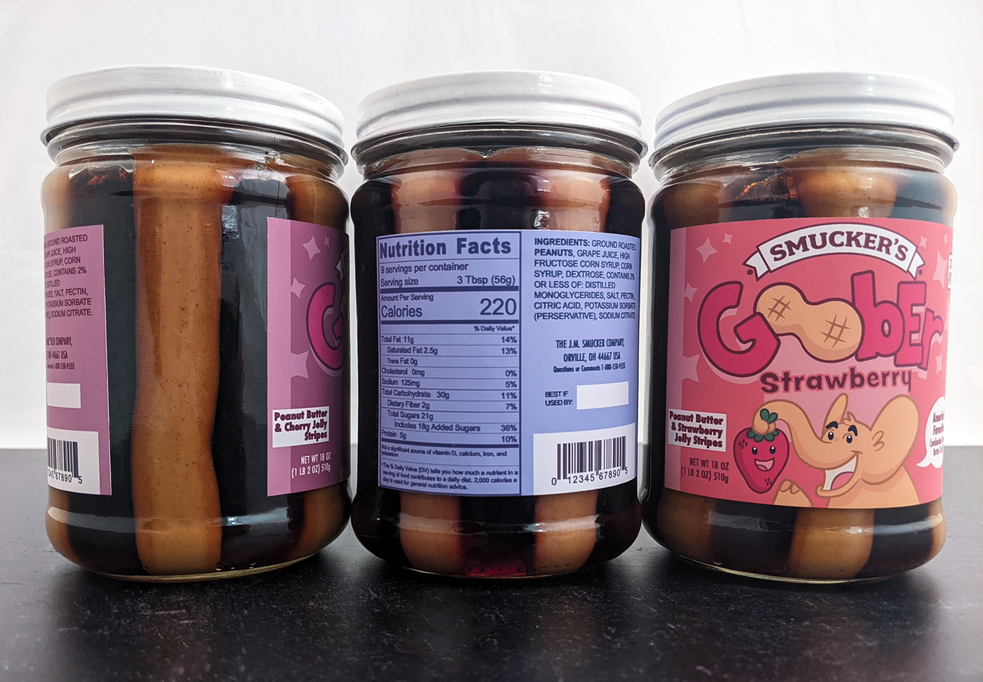
The fonts that were chosen for this product were chosen to compliment the inherent silliness of the title of the product. With a product titled “Goober,” it is important to understand that while goober is another word for peanut, the word as English speakers see it is not a serious word or a word that is regularly used in a regular situation.
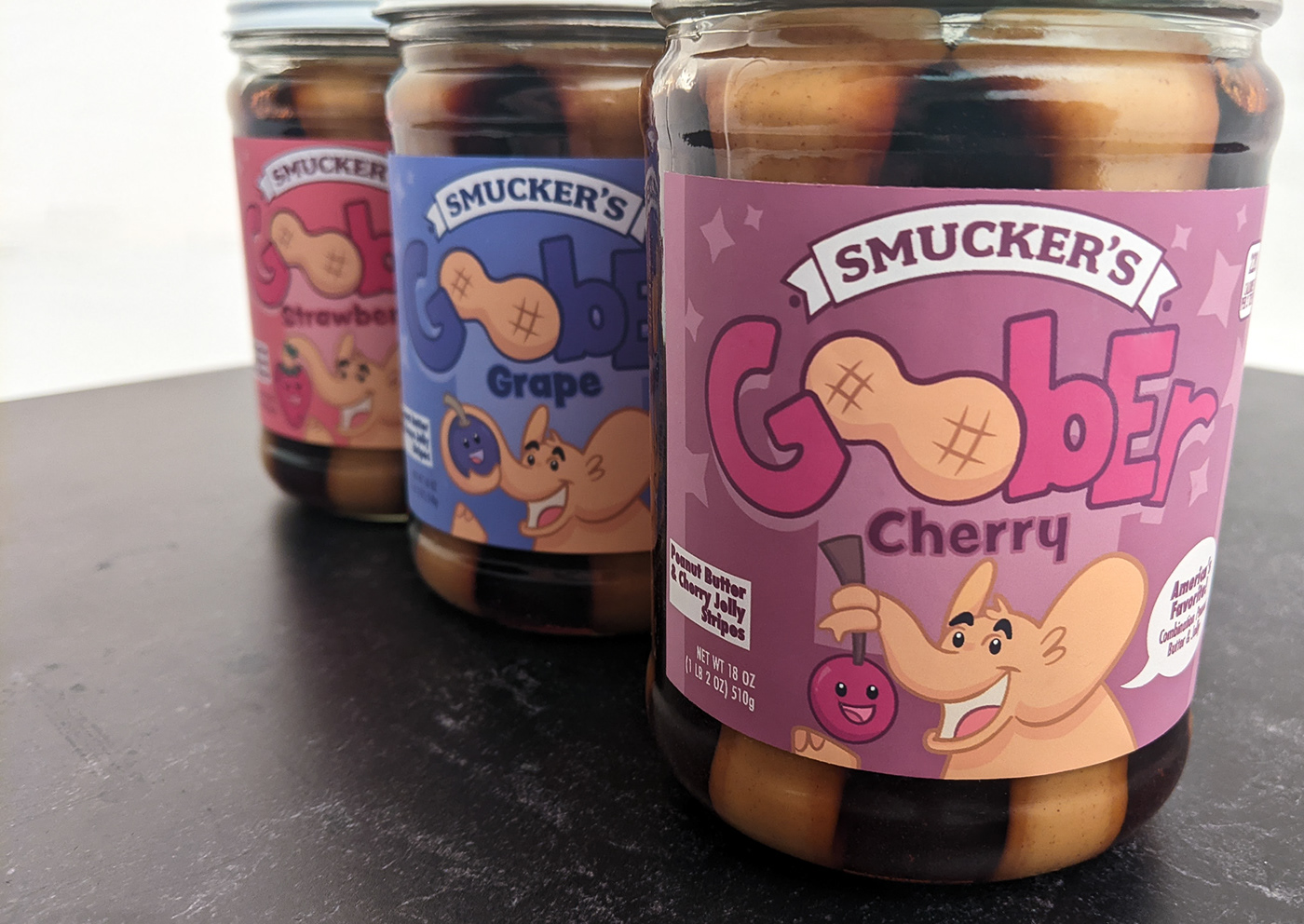
Each background color is chosen to be cohesive to the jelly flavor, with a lighter tint to push the fruit forward. The elephant character is specifically chosen to be the same shade as the peanut within the logo to create harmony through the label. The white lid is to catch the consumer’s attention without taking anything away from the label.


