Design Bridge Dogs Bollocks 3D Silver Award Winner 2014
This project takes inspiration from the Seabrook heritage, it's Yorkshire origins and the decade that it was founded. The uniquely shaped packaging has been designed for easy sharing, considering how and where people eat crisps. The aesthetics are honest and traditional, in keeping with the brand values. As Seabrook was founded in 1945, the second world war was one of our main themes. We researched war time documents and packaging and these provided some of the inspiration for our designs. We chose Gill Sans as our typeface as it is classic, British and was commonly used on propaganda during the war. The patterns on the packets have been hand painted using water colour paints to reflect the style of wartime posters and each pattern takes influence from the place that the flavour comes from. York Ham - the windows at York Minster, Wensleydale Cheese - the stone walls in the Yorkshire Dales, Whitby Sea Salt - Whitby Whale Bones and Yorkshire Square Ale - the original iron gates of the brewery. The packets are made of grease proof paper, one of the most popular packaging materials during the 1940s.


The easy share packets are perforated down each side so that they can be eaten in the regular way and scoffed by someone on their own, or they can be torn open and placed on a table for everyone to enjoy.


When crisps packets are usually torn open, all you can see is the silver foil. We put newspaper inserts into the back of our packets so that they can be read while people are eating the crisps and also so that once the packet is opened, people can still recognise the packet as Seabrooks. We wrote the newspaper articles ourselves and then collaged them to make them more visually interesting. Each newspaper tells the interesting facts and stories behind the flavours, for example, York Ham was first smoked using the sawdust generated from the construction of York Minster. This also gives reference to the heritage of the brand as when it very first started it was a fish and chip shop.

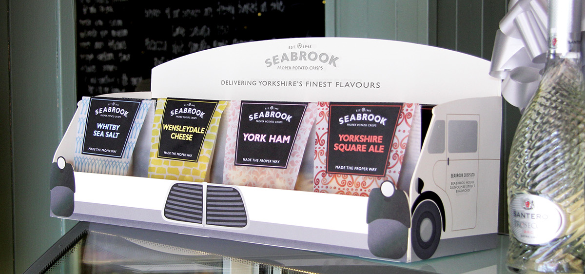
Seabrook used to have a fleet of branded vans that hand delivered their crisps around Yorkshire. We used this piece of brand history to develop the idea behind our point of sale.
The multipack is perforated like the individual packets so that it can be torn open and the packets shared.


Throughout our rebrand we wanted to place an emphasis on sharing. We designed flyers that would be placed in shops or inside food magazines. The idea is that Seabrook want to share their crisps with the world and then they want the consumer to share them too so that the word of the product spreads. We have used perforation again so that the packet on the front of the flyer can be torn away and this is then a voucher for the consumer to go and claim a free packet of crisps.


We liked the idea of bringing back the traditional Seabrook delivery vans as we felt that they give the brand a friendly, personal touch. We chose a small, retro looking van rather than a big commercial one to add to the appeal of it being a friendly, personal service. The livery is kept simple but has the patterns we designed on the roof and back of the van to make it a bit more modern looking.


