
Company Name:
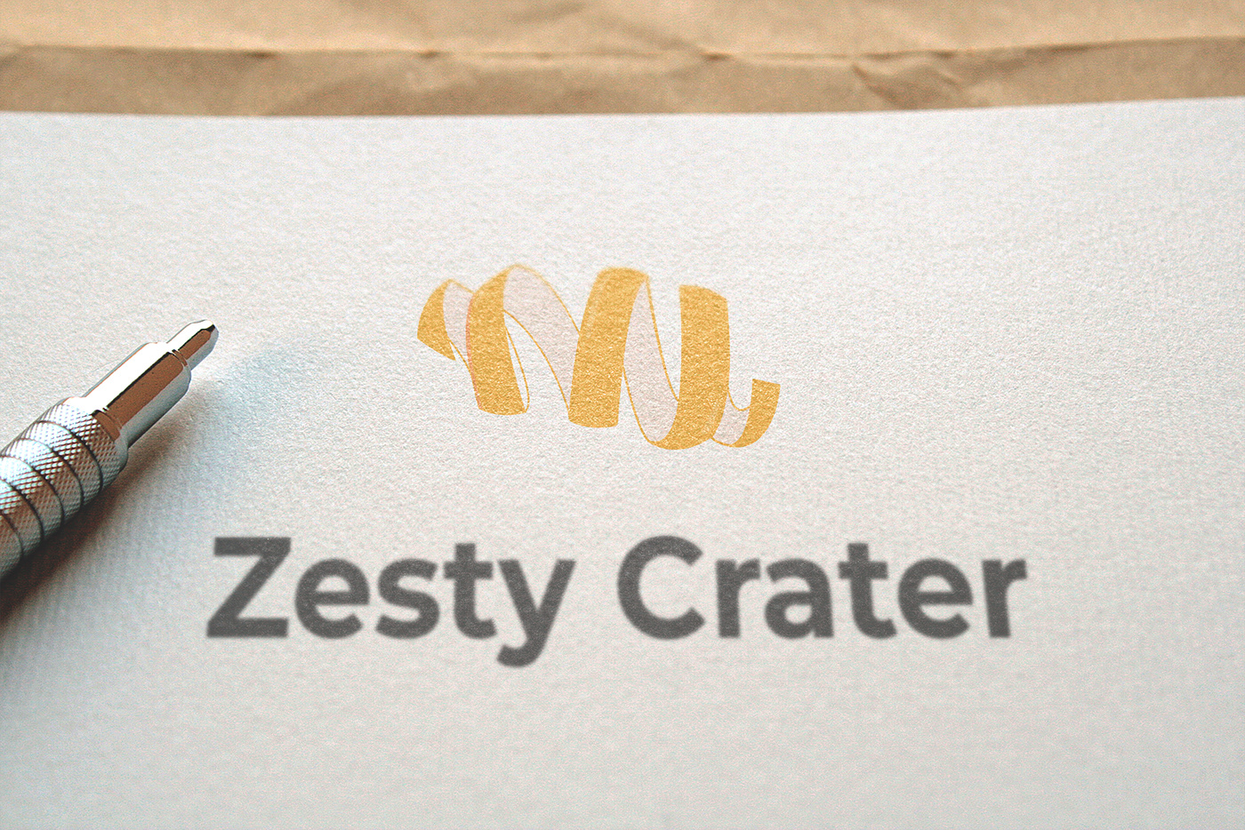
Zesty Crater
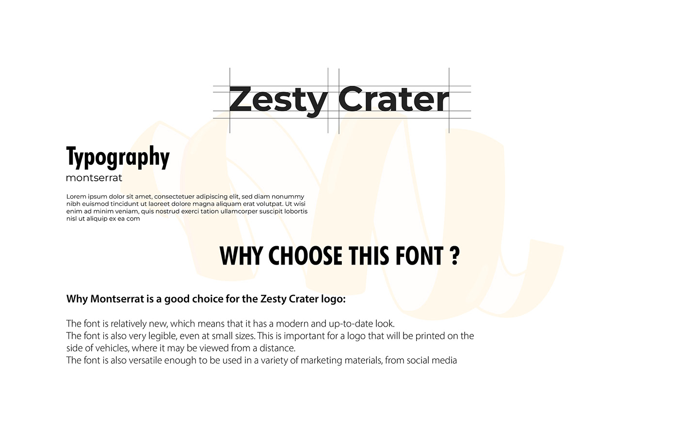
Zesty Crater
Company Description:
We are a company that makes and distributes low-calorie snacks. Our main product is made with love and
served in your favorite diners. Our target audience is parents. We want to convey a sense of excitement, while
at the same time being old-fashioned.
We are a company that makes and distributes low-calorie snacks. Our main product is made with love and
served in your favorite diners. Our target audience is parents. We want to convey a sense of excitement, while
at the same time being old-fashioned.
Job Description:
You must create a logo using the information given in this brief. They would prefer an abstract logo mark
that uses the color orange The logo will be printed on the side of vehicles. Take into account the company's values and
preferences, and make sure it will work for the planned use-cases.
You must create a logo using the information given in this brief. They would prefer an abstract logo mark
that uses the color orange The logo will be printed on the side of vehicles. Take into account the company's values and
preferences, and make sure it will work for the planned use-cases.

RESEACH
Zesty Crater is a company that makes and distributes low-calorie snacks. Their main product is made with love and served in your favorite diners. Their target audience is parents. They want to convey a sense of excitement, while at the same time being old-fashioned.
Abstract Logo Mark
An abstract logo mark is a logo that uses shapes, colors, and symbols to represent a brand without using words. Abstract logo marks are often more visually appealing and memorable than wordmark logos.
Orange Color
The color orange is associated with energy, excitement, and creativity. It is also a color that is often associated with food and drink.

PROCESS
Te orange peel is a symbol of both freshness and nostalgia. It reminds us of the simple pleasures of life, like eating a delicious orange on a hot summer day. The circular motion of the peel suggests that Zesty Crater is a company that is always moving forward, innovating and creating new and exciting products. The vertical orientation of the peel gives the logo a sense of stability and reliability, which is important for a company that is targeting parents.
Overall, your logo design is both visually appealing and meaningful. It conveys the company's values and brand identity in a clear and concise way. I am confident that it will be well-received by Zesty Crater's target audience.
Here are some additional thoughts on why your logo design is effective:
The logo is simple and easy to understand. The orange peel is a familiar and recognizable symbol, and the circular motion is a natural and intuitive way to represent the company's focus on low-calorie snacks.
The logo is also versatile. It can be used in a variety of contexts, from social media graphics to print ads. It can also be scaled to different sizes without losing its impact.
The logo is also memorable. The orange peel is a visually striking image, and the circular motion is a dynamic and engaging element.
Overall, your logo design is a well-conceived and executed piece of work. I am confident that it will help Zesty Crater to achieve its business goals.


COLOR THEORY
Orange is a great choice for the Zesty Crater logo because it is a bright, cheerful, and energetic color. It is also a color that is often associated with food and drink, which is in line with the company's focus on low-calorie snacks.
In addition, orange is a versatile color that can be used to create a variety of looks, from bold and eye-catching to elegant and understated. This makes it a good choice for a company that wants to have a logo that can be used in a variety of contexts.
A gradient is a smooth transition from one color to another. Gradients can be used to create a sense of depth and dimension in a logo. They can also be used to convey a sense of movement and energy.
Using an orange gradient in the Zesty Crater logo is a great way to convey the company's values of excitement, creativity, and innovation. It is also a good way to create a logo that is both eye-catching and memorable.
Here are some additional thoughts on why an orange gradient is a good choice for the Zesty Crater logo:
The gradient adds a sense of dynamism and movement to the logo, which is appropriate for a company that is focused on innovation and creativity.
The gradient also helps to make the logo more visually appealing and memorable.
Gradients are a popular trend in logo design, so using an orange gradient can help the Zesty Crater logo to stand out from the competition.
Overall, an orange gradient is a great choice for the Zesty Crater logo because it is a bright, cheerful, and energetic color that can be used to convey the company's values of excitement, creativity, and innovation. It is also a good way to create a logo that is both eye-catching and memorable.


