


About
Wanna?Bе! — is a jewelry brand with ten years of industry experience.
Wanna?Bе! — it’s also a community and a space for self-expression and experiments, where everyone finds something for themselves.
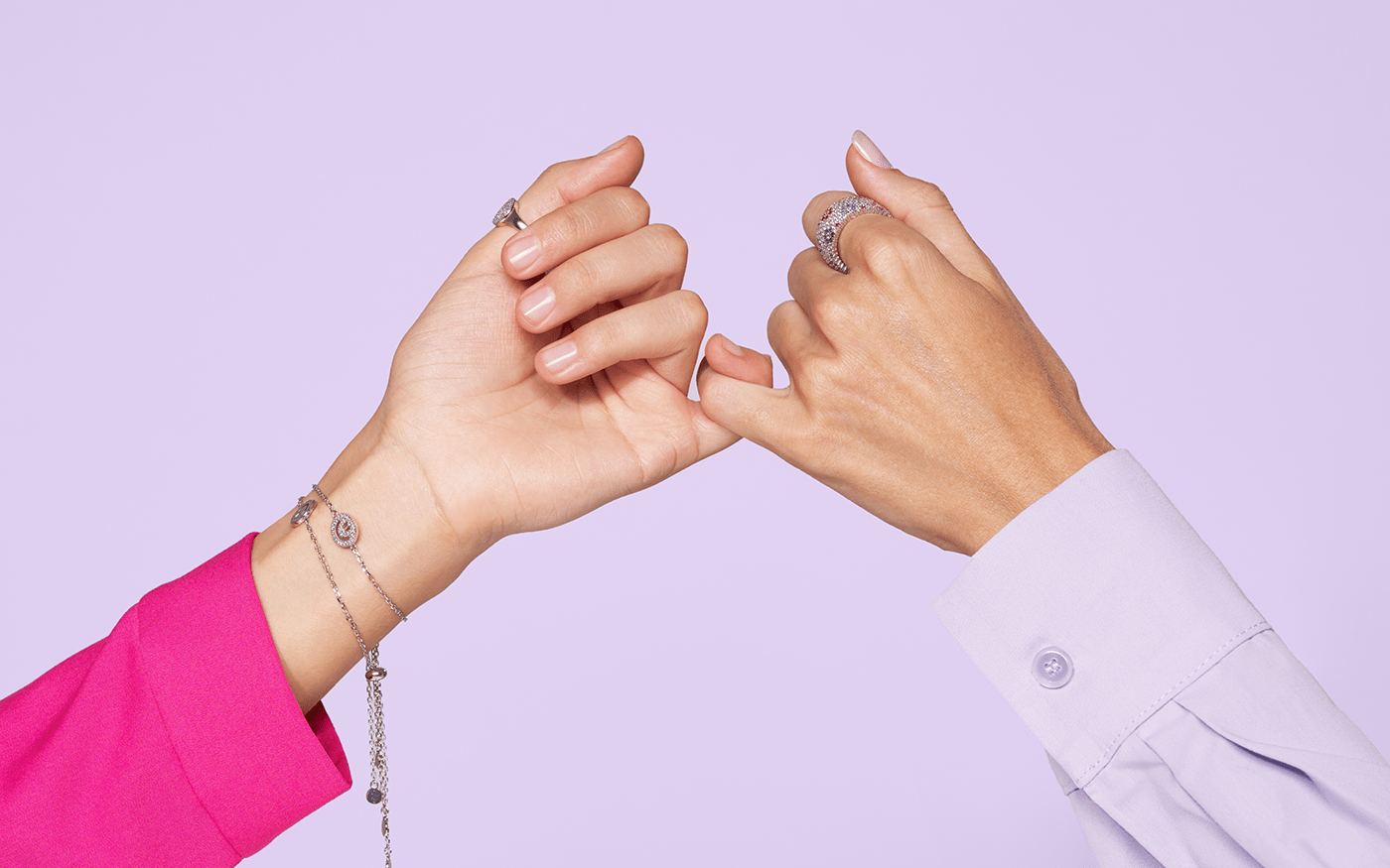
You can be 19 or 55, or maybe you’re 55 and you may feel like 19, or vice versa. You are a minimalist, or you like to show off and look overdressed. You are conservative or follow all the trends, you want to look frankly chic or keep a significant piece of jewelry under your clothes. Wanna stand out, or blend in with the crowd, wanna follow the dress code or act like a rebel, wanna put on all the jewelry when you’re taking out the trash, or put on ONLY some jewelry and stay home — do what brings you joy. Your individuality is the most important value for Wanna?Be! brand.
Base
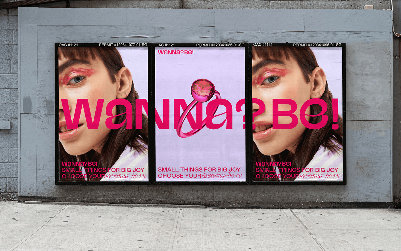
Our challenge was to create a new visual language for the brand that would reflect core values, and talk to the audience easily and casually about important things: identity, openness, irony, and courage.
We created a new logotype as more dynamic and bold, closed letters, which refer to the shape of the locks on the jewelry.
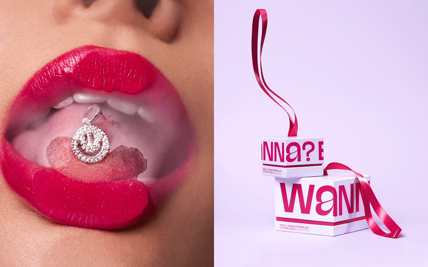
The inheritor of the previous visual identity became a smiley, a simple and understandable symbol for anyone around the globe, which translates a very obvious but important message: you are welcome here. Whatever choice you make you won’t stumble upon a snobbery here. We changed its shape and it became both: a part of the logo and an independent element — the liberty that evolved into a collection of jewelry.
Packaging
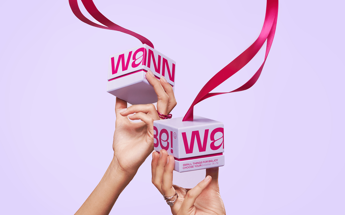
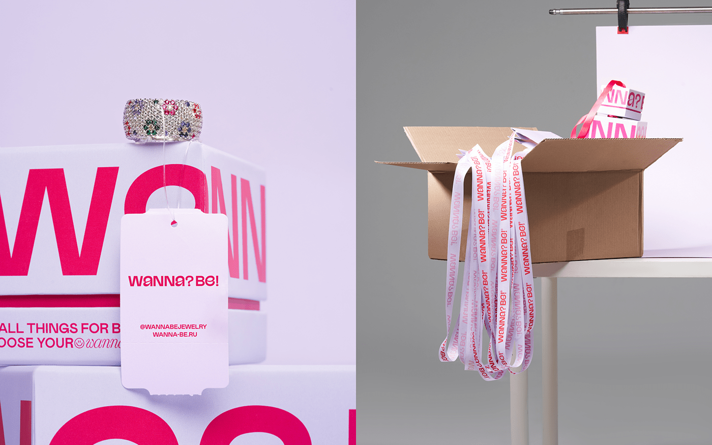
One of the most important areas of using identity for a jewelry brand is packaging, so we paid special attention to it and tried to create a system in which each element can be an accessory, a decoration for a brand's offline or online spaces. The hypertrophied long handles for the paper bags turn them into mini-bags that can be worn on the shoulder. Boxes can be used as your home jewelry box or could be hung on your hand, and small tissue bags can be used for storing and transporting your jewelry.
Pop-up store
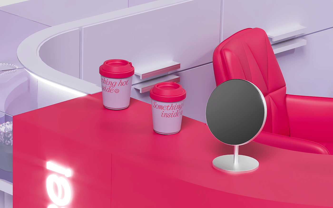
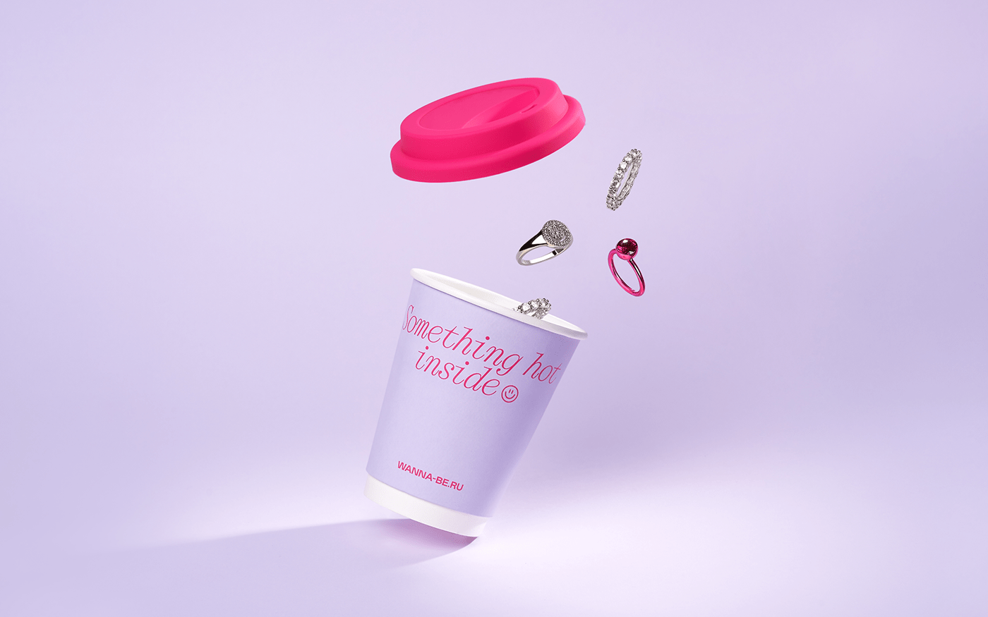
One of our challenges and interesting tasks from the brand was to create the concept of pop-up stores that are located in shopping malls. We wanted to create some sort of a bright island. And we came up with the concept of a jewelry bar — a place where you can not only buy some jewelry, but also have a cup of good coffee or tea, or maybe a glass of Prosecco, and where you can try on the latest new items and chat with Wanna?Be! Girls about current trends.
The continuation of this idea was the cup-like jewelry packaging, which we developed together with the founder of the brand.
Web Concept
The idea of the jewelry bar smoothly flowed into the digital space, where there is a dynamic down scroll bar,in addition to the main classic menu, which immerses us into a variety of jewelry.
Wanna?Bе!:
Founder and visionary — Irina Stroynova
Brand director — Vasilisa Sabadash
F61 AGENCY:
Art direction — Svetlana Lomakina, Sergey Polukhin
Designers — Svetlana Lomakina, Marie Kirillova
Copywriting, ToV — Svetlana Lomakina
Animation — Marie Kirillova
3D — Mikl Onkov
Web concept — Sergey Breus
Pop-up store visualization — Ilya Lapin
Main photo campaign and object photography:
Сoncept — Svetlana Lomakina
Art director — Svetlana Lomakina
Producer — Svetlana Lomakina
Photographer — Julie Belanska
Assistant — Mari Kirillova, Sergey Breus
MUA — Kristina Yakovleva
Model — Anastasiya Anastasieva
Photography:
Photographer — Ivan Filyshin
Stylist — Valeria Pekarskaya
MUA — Maria Malysheva
Producer — Zinia agency
Model — Sia Milivanovich


