London Posters using my typeface
MA Design & Art Direction London Project
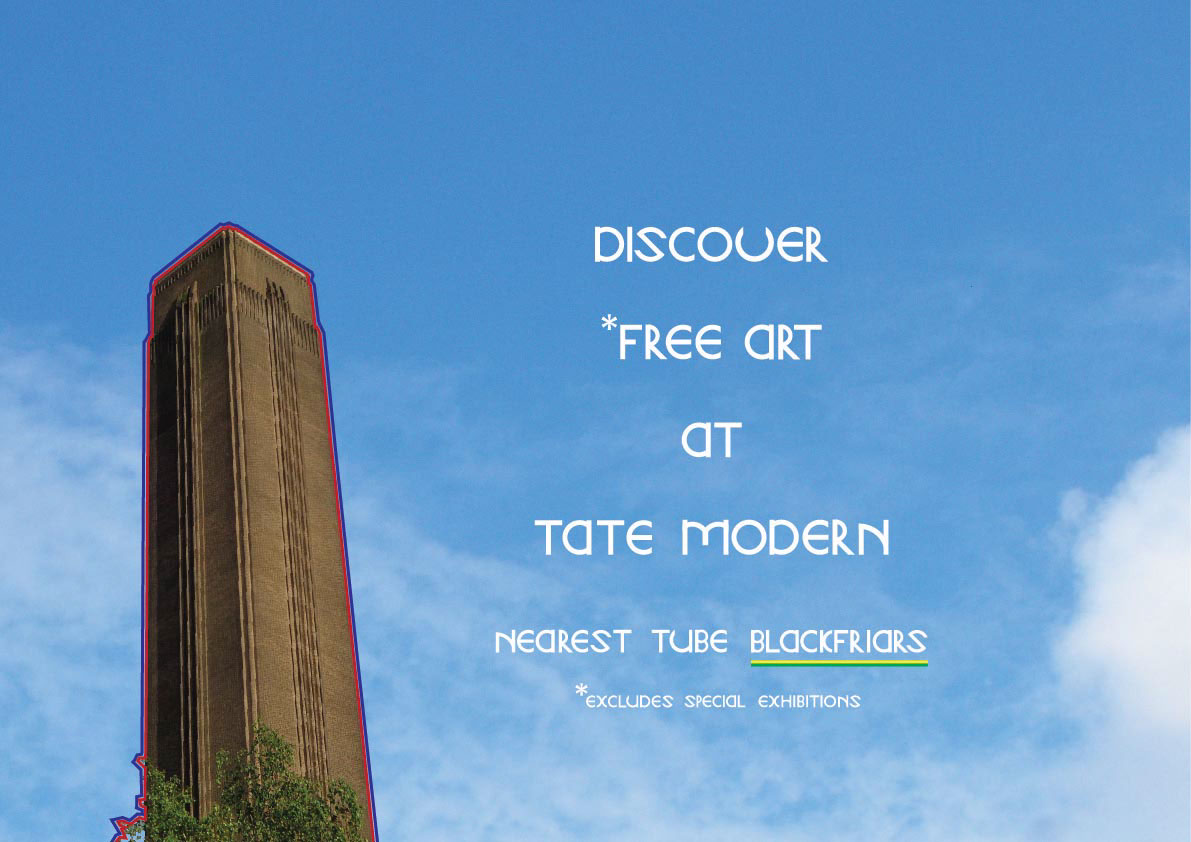
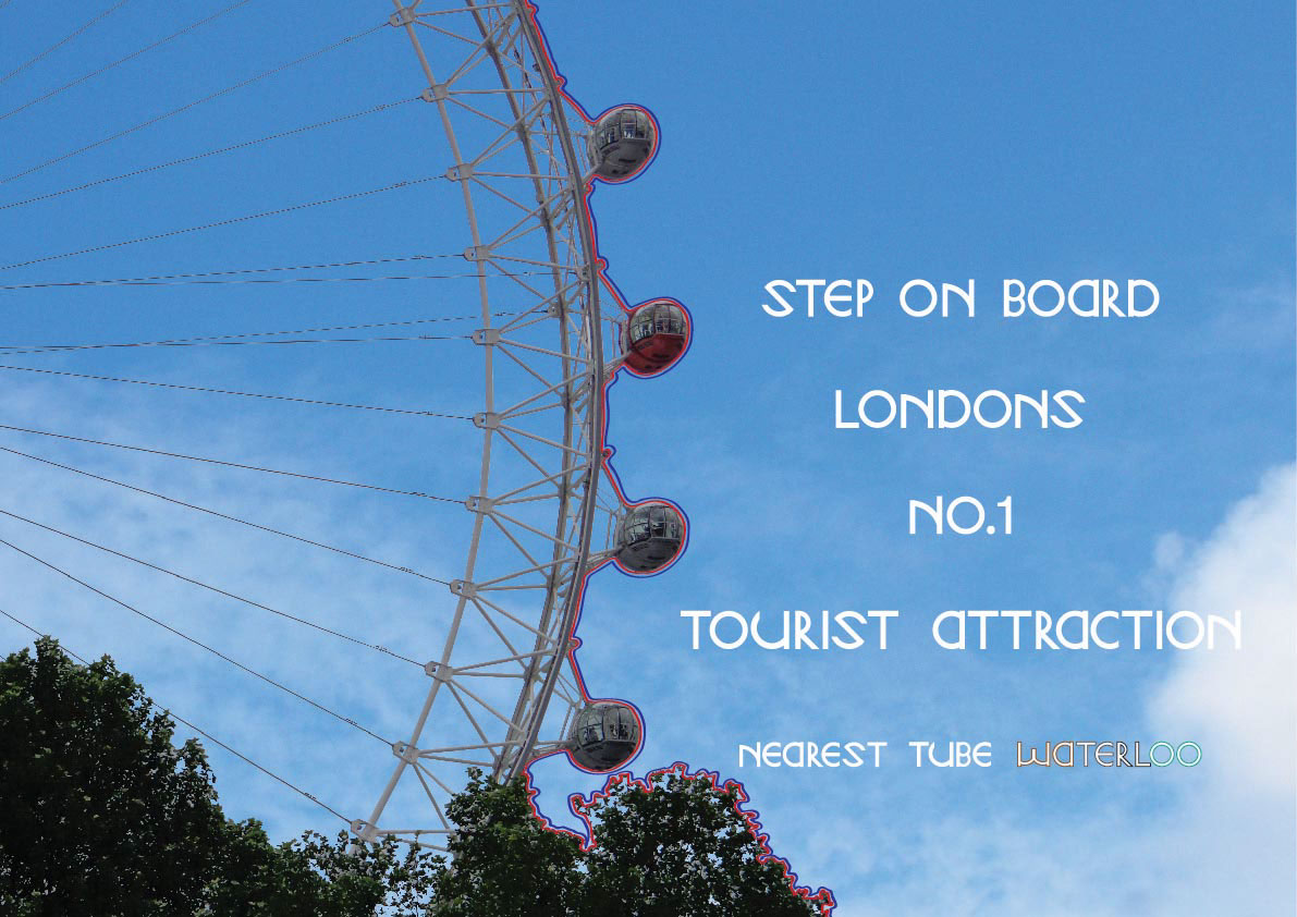
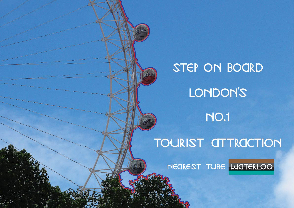
The idea is... to make posters from photos I took when I went to London, combined with the typeface I designed. The following images are three different poster designs (four of each design).
At the moment at University (July 2014), we have what's called Testing Time. This is where we put up our work for other students and tutors critique.
The first draft of the posters shown below are the ones with the blue and red type.
The theme is... here is a place of interest that is good to go and visit, here is how you get there.
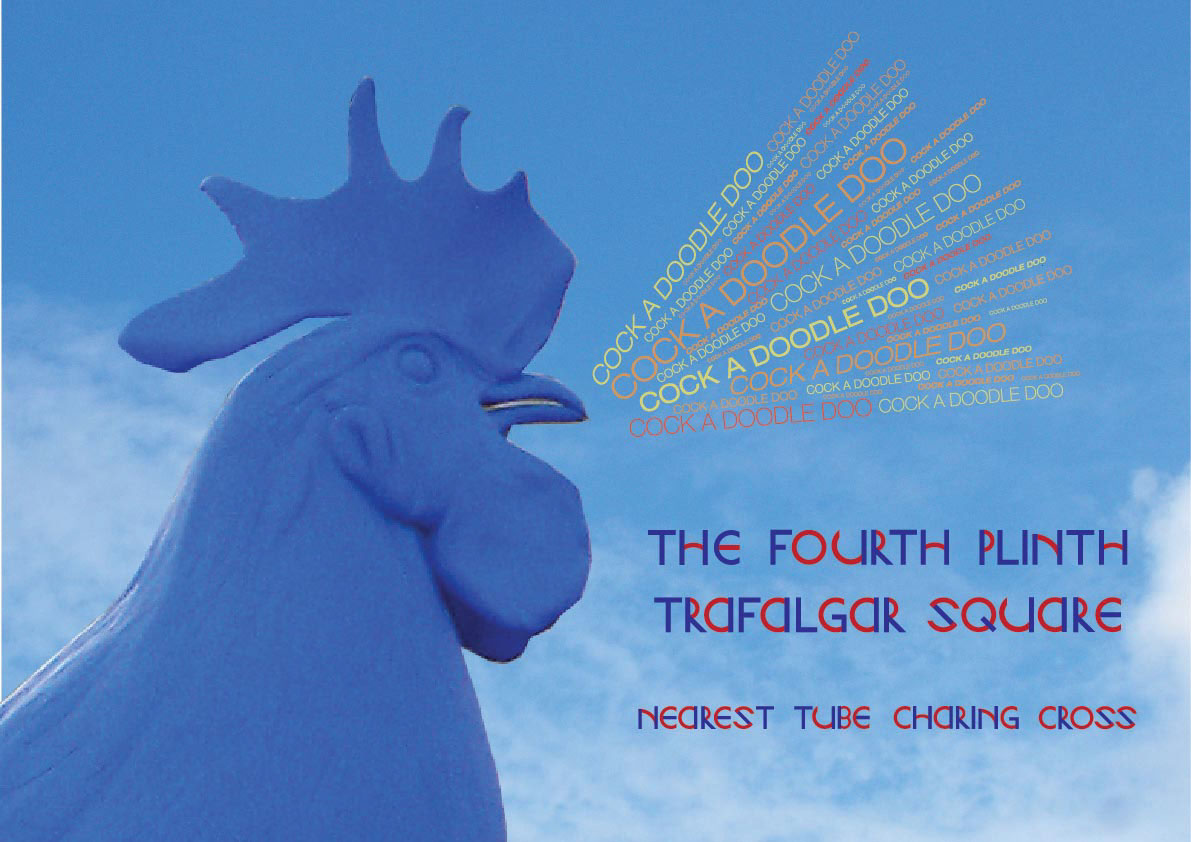
One of the comments about this poster was maybe trying to make a feature of both the image and text was a bit much, and the text seemed to get lost within the poster for some people. An idea formed from that... get rid of the 'cock a doodle doo', have the text white, have a red and blue line around the image to have it relate to the London Underground and have the tube line colour around the station name or somewhere nearby - I've tried to experiment with where to put the tube line colours.
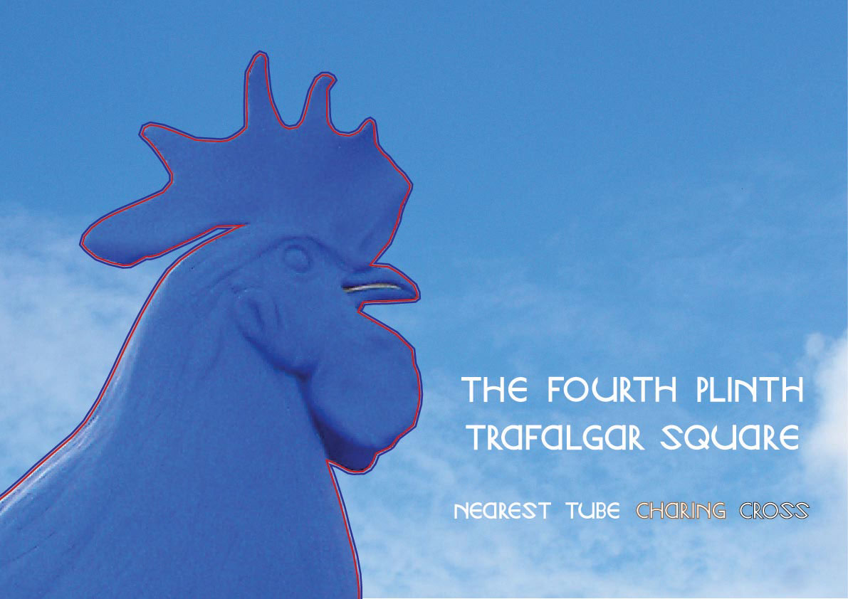

I really like these posters with the colours of the lines that stop at Charing Cross behind the word. My concern is do people viewing the posters pick up on the association (?)
The reason the two colours are this way round (brown/black) is because I put the lines in alphabetical order: Bakerloo and Northern.