

Today's society and people has changed ...
That’s why Le Pain Quotidien has decided to renew its strategy to reach new and younger consumer
to regain its status of trend-setter.
Loose a bit of this tradition bakery to a modern Premium Quality bakery.
-
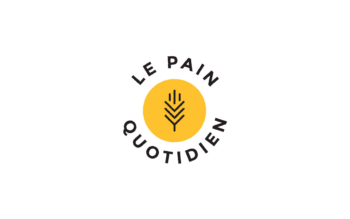
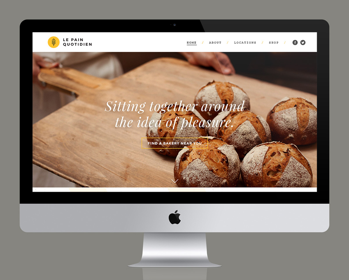
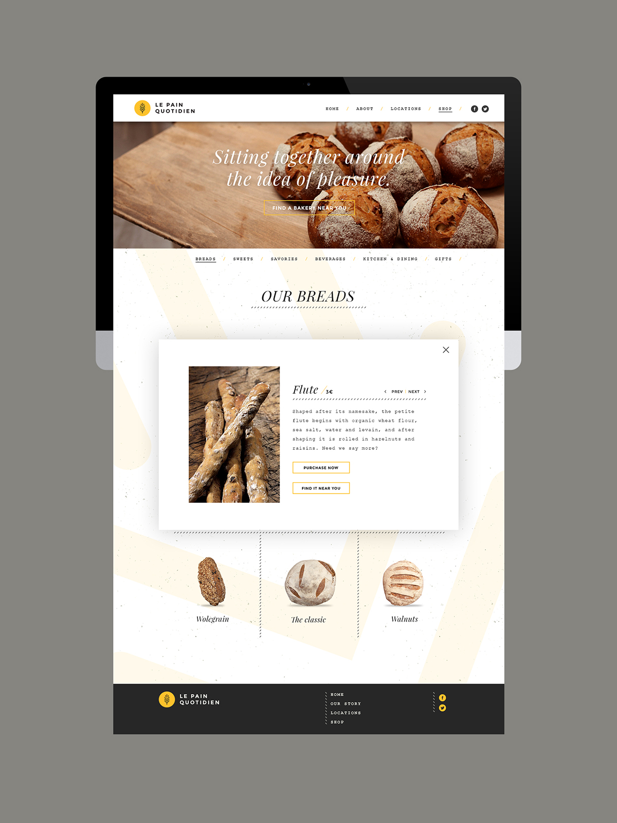
The new logo of Le Pain Quotidien had to be modern and easily recognizable.
That’s why i used a bold typeface and I kept the same contrasted colors of the initial logo.
The symbol I used is a wheat ears in a yellow circle which is the famous shape of LPQ breads.
-

-
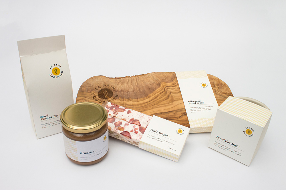
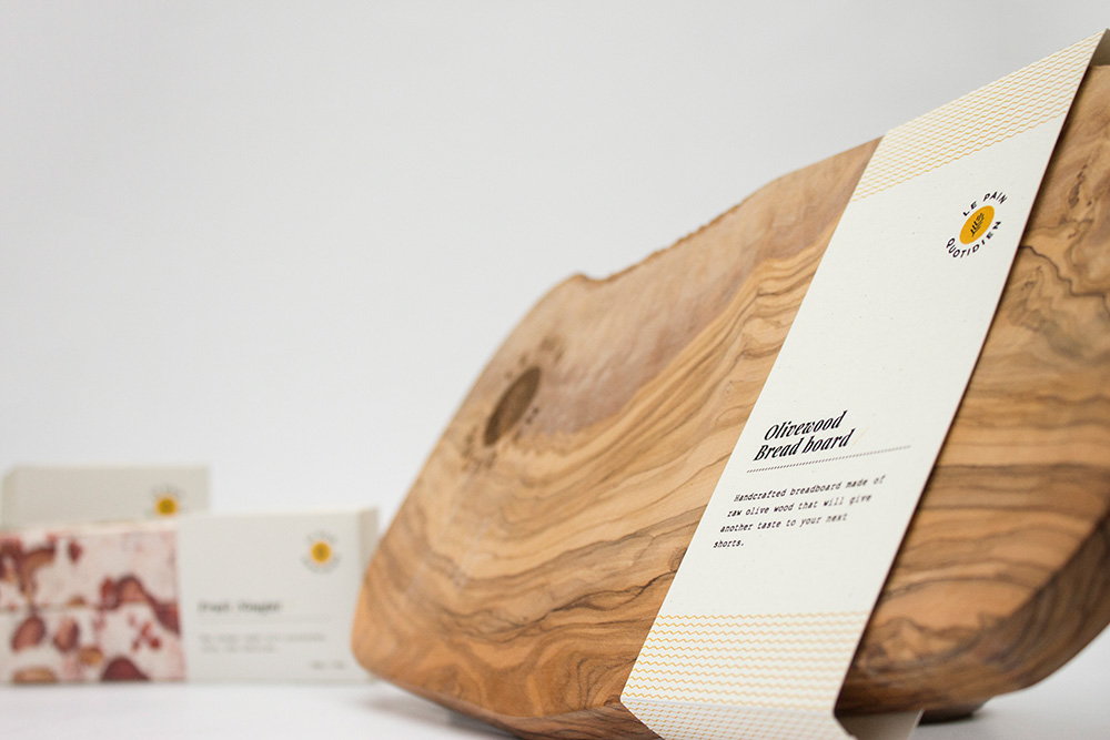
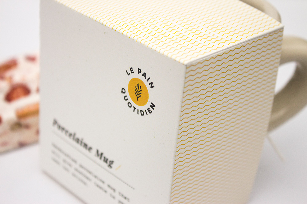
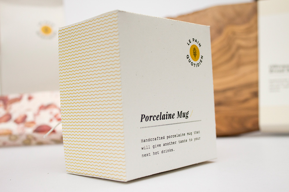
For the packaging design again Le Pain Quotidien needed something fresh and clear.
The subtle pattern remind us the logo symbol and a nice contrast between the titles and the informations.
The informations are written in Courier typeface to keep this feeling of handcrafted products.
And of course natural paper because at Le Pain Quotidien
everything is natural and organic!
-
-
-

-
-

-
-
-
-
-

-
-
THANKS FOR WATCHING
-


