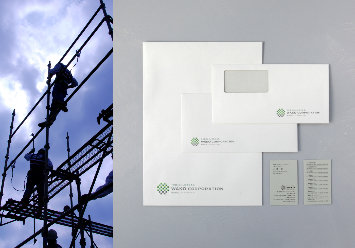
Wako Corporation
Logos, Corporate Identity
CI renewal for a scaffolding construction company celebrating its 50th anniversary. Through questionnaires, interviews, and various surveys with employees, I learned about the pride they take in their work. On the other hand, I also learned the frustration of not being able to share their aspiration with society because the industry tends to be classified as blue-collar work. The design goal was to solve that gap. In the logo, when looking at the lower part of the symbol, you will see a “W” in gray, taken from the company name and representing the support for society as its foundation. Also, the entire symbol represents the aspects of scaffolding by connecting structures, connecting people, and safely by the cross patterns that one can perceive within the logo. I believe that the CI communicates their pride that scaffolding is one of the initial tasks at a construction site, and they are responsible for the workers' lives and support the project as the unsung heroes.
Client: Wako Corporation Inc.
Art Direction: Shunpei Yokoyama Design Office
Copywriting: Shigeru Isobe


