
Brand Identity and UX/UI Case Study
Estonian Research Information System
The Estonian Research Information System (ETIS) is as a digital hub/portal that manages and shares research-related information in Estonia. Its mission is to enhance transparency, collaboration, and resource allocation within the research and scientific community. The ETIS portal offers a comprehensive repository of research projects, publications, funding sources, and researchers’ profiles, getting around 200,000 queries a day and contributing to assessing research impact and fostering a dynamic research ecosystem.
However, the last rebuild was in 2016 and struggle with an outdated technology, user experience, and lack of responsiveness. It was time for a revamp with a dashing Identity and a new user-friendly experience matching today's accessibility standards.

Who made it happen
The challenge was taken up by FinestMedia and me, David Castillo, who was given the exiting and challenging opportunity to bring ETIS portal Brand Identity and UX/UI to a new level with a new invigorating user experience, with a dynamic and intuitive interface to breathe life into its aesthetics and functionality.
The overview of the process
1. Immersion and discovery: Form a comprehensive understanding of ETIS platform, their users and challenges.
2. Brand Identity: Create a unique brand personality that represents ETIS and engages with the audience.
(Brand Personality, Brand elements as Logos, Fonts and Colours, Brand Guidelines).
3. Design System: Build the foundations and structure of the digital experience and create a UI design system that translates the brand identity. (Fundamentals, Spacing and grids, Font Styles, UI Colour palette, Components, Layouts)
4. Ideation and Design: Design a digital experience by shaping precise solutions (Design, test, iterate).
In UX/UI, the path isn't linear—it's a cycle. We loop back to refine insights from user behavior, shaping precise solutions. Similarly, the design system evolves in sync with the dynamic digital landscape and its shifting needs.

Immersion and understanding
Empathising with ETIS, it's users and challenges
Empathising with ETIS, it's users and challenges
We began with immersion and understanding. We delved deep into the world of ETIS, gaining insights into the portal's functionalities, its users, and their unique needs and behaviours. It was crucial for us to grasp the patterns of interaction, complex queries, and information retrieval methods that had become second nature to the portal's dedicated user base. We wanted to ensure that any improvements we made would seamlessly integrate with their accustomed workflows, without causing confusion or disruption.


Define Identity
ETIS personality, look and feel
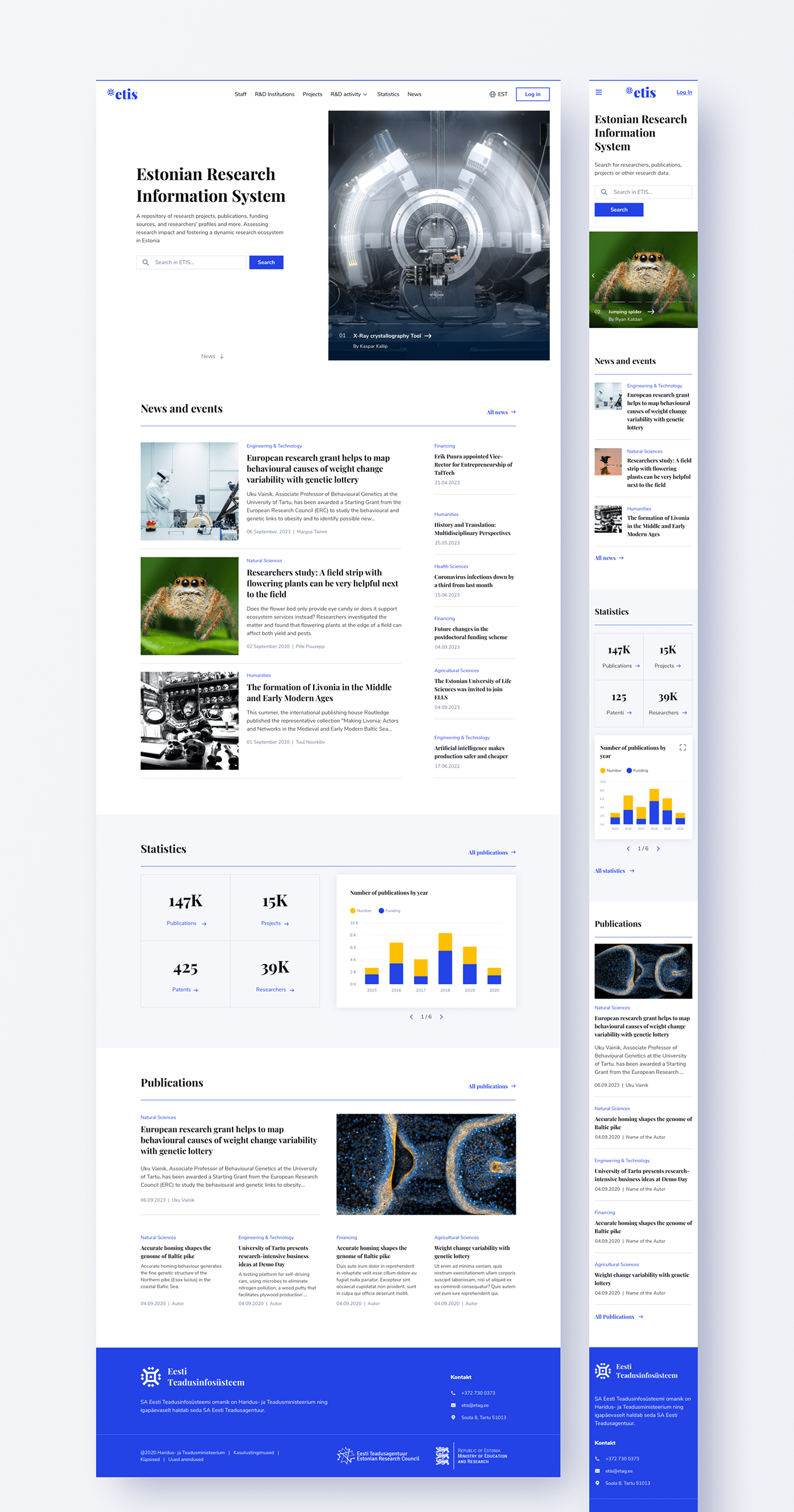
Inspired by renowned magazines like Scientific American and Psychology Today, we developed a clean and modern look that would engage the research and scientific community. The serif typography used in the headlines reflected an editorial aesthetic, while a color palette featuring royal blue, dark gray, and clean white paid homage to the Estonian national flag.
Surprisingly, we didn't start with the logo, as is customary in a branding makeover. Instead, we focused on the creation of one of the most pivotal pages—the homepage. This served as the face of the portal, providing a glimpse into the new identity we were crafting. Lastly, we reserved the logo design until almost before the first lunch—a curious fact.


Design System
The foundations
With the identity established, the focus was on building the foundations of the digital experience. We created a design system that would serve as the backbone of the portal, ensuring consistency and efficiency throughout its various components. This involved setting up the layout, grid, spacing, break points, and typography system, as well as expanding the color palette to provide visual depth and coherence. Equally important was the creation of responsive components for different screen sizes, enabling a seamless user experience across devices.

Ideation & Design
The outcome
Through meticulous design decisions and thoughtful organisation, we pieced together the puzzle of ETIS. We thoroughly explored the portal's intricacies, analysing how, where, when different content types were displayed, organising information hierarchies, and selecting relevant data. For instance, a publication contains 43 fields like title, journal, ISSN, article type, year, classification, authors, and more. Our goal was to empower researchers, providing them with the information they needed in a clear and digestible manner.
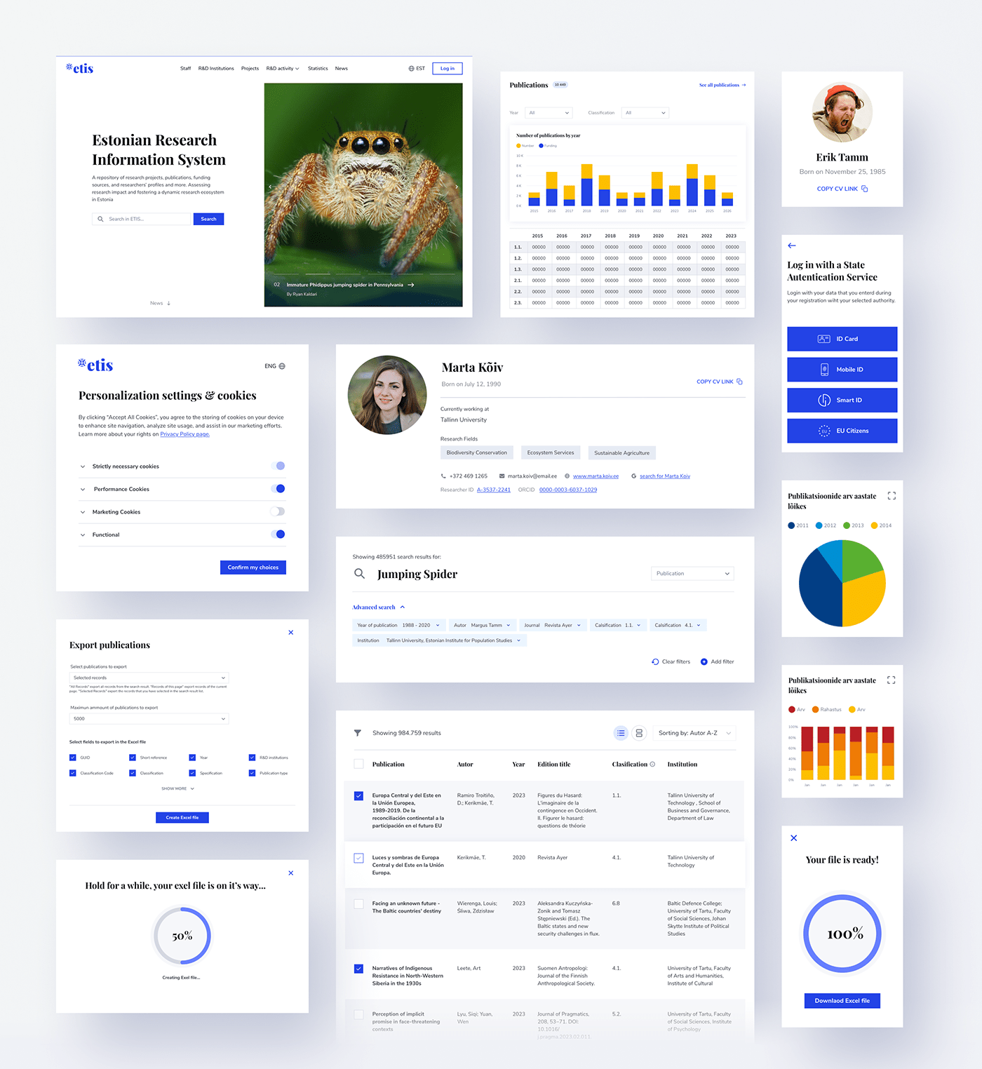
The ETIS portal functions as a dynamic information ecosystem, featuring a variety of pages and frameworks, each with its own distinct flows. Some of the most fascinating redesigns that deserve a mention are:
- The Search Queries framework & displaying search results modes.
- The individual page framework for 3 categories (CVs, Institutions and Publications)
- The Statistics pages framework
- The Statistics pages framework
- News/blog portal


Impact
Through meticulous design decisions and thoughtful organisation, we pieced together the puzzle of ETIS. The result was a rejuvenated portal that not only met researchers needs but also ignited their imagination, enhancing the user experience in exploring knowledge. Accessing a wealth of information was made effortless for researchers, presented in a way that was easy to navigate and comprehend.


The stunning visuals employed to present the ETIS portal design have been sourced from Wikimedia Commons and the Wiki Science Competition 2019. This international scientific photography competition was orchestrated by the global Wikimedia community in collaboration with the esteemed institutions of the University of Tartu and the Estonian Research Council.
Acknowledgments for photo contributions, listed in the sequence of their appearance:
- Two scientists inside LIGO Pre-Stabilized Laser enclosure, wondering what went wrong by Nutsinee Kijbunchoo. CC-BY-4.0
Thank you!
Do you want to create a brand and a digital experience that will help you reach your next milestone and drive growth?
Let's get in touch and see what it's to work with us:


