


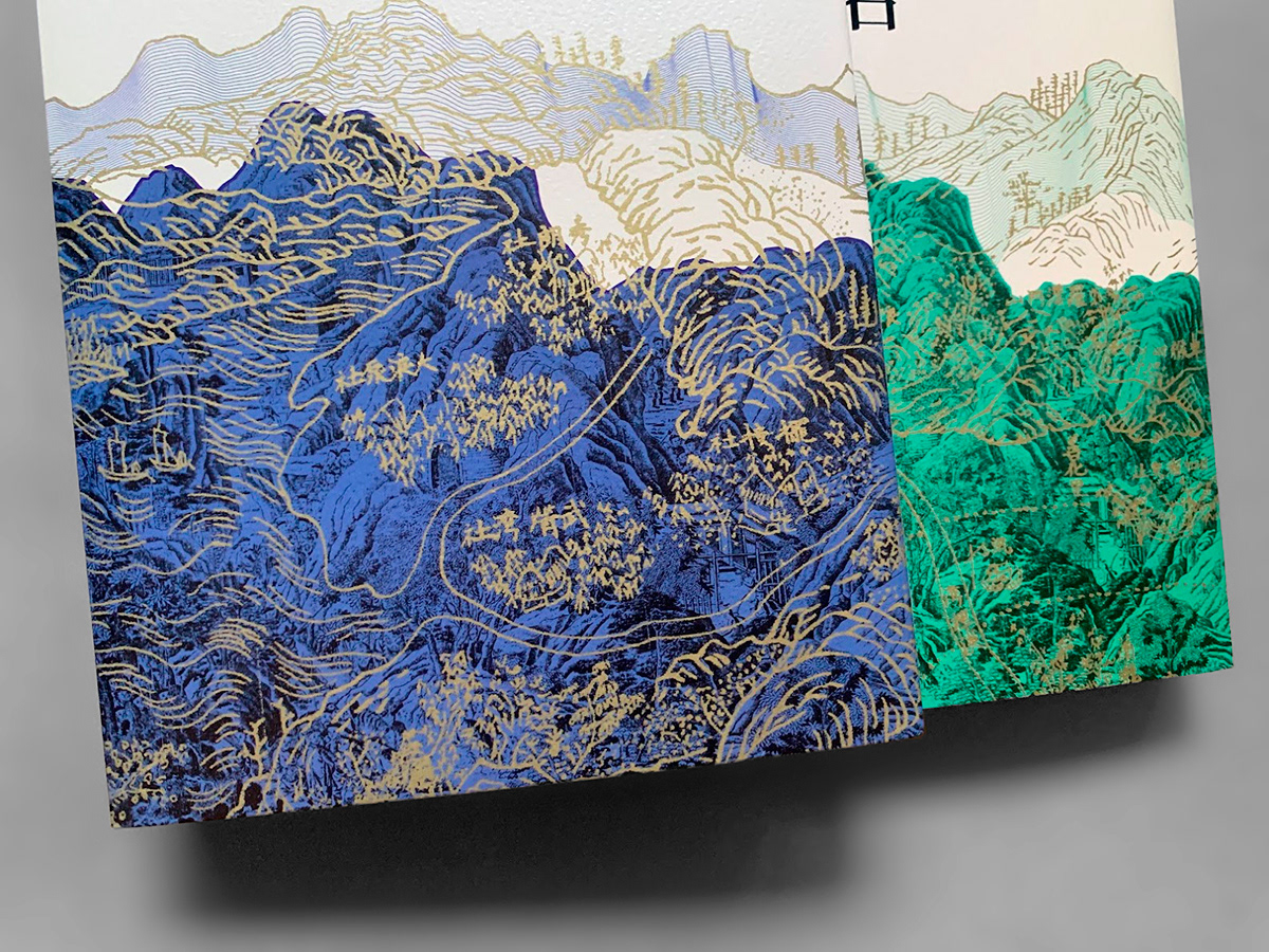
主視覺使用地圖的多重層次為核心概念,代表台灣地名的多樣性,跨越時空的變遷,從原住民文化到荷蘭、明朝、清朝等歷史階段的影響,再到現代的地名。為了突顯了每個地圖風格的獨特性,地圖以不同色彩呈現,色彩主題來自於台灣的自然景觀和文化元素,天空的藍色、山的綠色與礦的金色,以此向這片土地的多樣性致敬。通過色彩與圖像疊加,試圖在畫面上創造出一種複雜性,這種複雜性不僅體現在地理位置上,還體現在文化、語言和歷史上,試圖引導讀者思考,激發他們對台灣地名背後故事的好奇。
The core concept of the main visual is the use of multiple layers in the map, representing the diversity of place names in Taiwan. It transcends the changes across time and space, encompassing influences from indigenous cultures to historical periods such as the Dutch era, Ming Dynasty, and Qing Dynasty, all the way to modern place names. To highlight the uniqueness of each map style, different colors are employed, with color themes drawn from Taiwan's natural landscapes and cultural elements— the blue of the sky, the green of the mountains, and the golden hues of minerals. This serves as a tribute to the diversity of this land. Through the overlay of colors and images, an attempt is made to create complexity on the canvas. This complexity is not only reflected in geographical locations but also in culture, language, and history, aiming to prompt readers to contemplate and spark curiosity about the stories behind the place names in Taiwan.
The core concept of the main visual is the use of multiple layers in the map, representing the diversity of place names in Taiwan. It transcends the changes across time and space, encompassing influences from indigenous cultures to historical periods such as the Dutch era, Ming Dynasty, and Qing Dynasty, all the way to modern place names. To highlight the uniqueness of each map style, different colors are employed, with color themes drawn from Taiwan's natural landscapes and cultural elements— the blue of the sky, the green of the mountains, and the golden hues of minerals. This serves as a tribute to the diversity of this land. Through the overlay of colors and images, an attempt is made to create complexity on the canvas. This complexity is not only reflected in geographical locations but also in culture, language, and history, aiming to prompt readers to contemplate and spark curiosity about the stories behind the place names in Taiwan.
このデサインのコンセプトは、地図の多重なレイヤーの利用で、台湾の地名の多様性を象徴しています。これは時間と空間を超越し、先住民文化からオランダ時代、明朝、清朝などの歴史的な時代に影響を受け、現代の地名に至るまでを包括しています。各地図スタイルのユニークさを強調するために、異なる色が使用され、色のテーマは台湾の自然景観と文化要素から引用されています — 空の青、山の緑、鉱物の金色など。これはこの土地の多様性への敬意を表しています。色と画像の重ね合わせを通じて、キャンバス上に複雑さを創造しようとしています。この複雑さは地理的な位置だけでなく、文化、言語、歴史にも反映されており、読者に台湾の地名の背後にある物語について考え、好奇心をかき立てることを試みています。


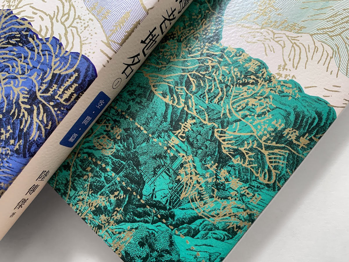
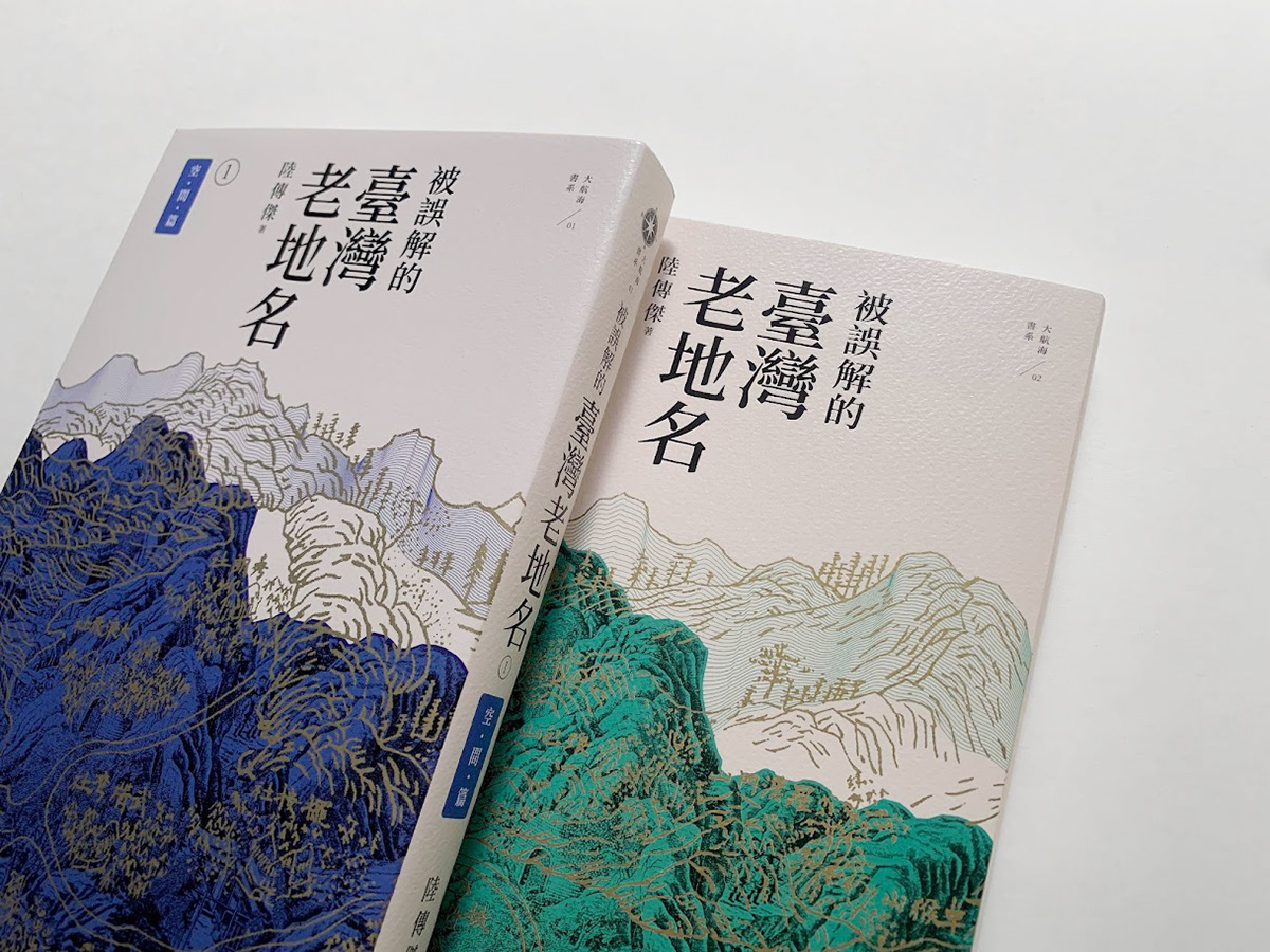
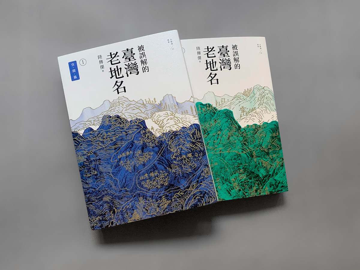
被誤解的臺灣老地名 陸傳傑 著
①空‧間‧篇
按空間分布,由北到南,從西到東
將地名當作一把解開歷史謎團的鑰匙
解開時光堆疊形成的誤解,重新認識這片土地曾經發生的故事
將地名當作一把解開歷史謎團的鑰匙
解開時光堆疊形成的誤解,重新認識這片土地曾經發生的故事
②時‧間‧篇
文史暢銷作家陸傳傑,集數十年文史踏查、研究之大成
上溯荷蘭時代,下探至1960年代台灣都市擴張時期
以地名的角度,認識台灣歷史與近代社會發展的面貌
遠足文化事業 出版 ISBN 9789865082635


