At the Peanut Company of Australia they are truly, deeply, fanatically nuts about quality. That is why they chose Curious to work along side them, as we are equally fanatical about great design!
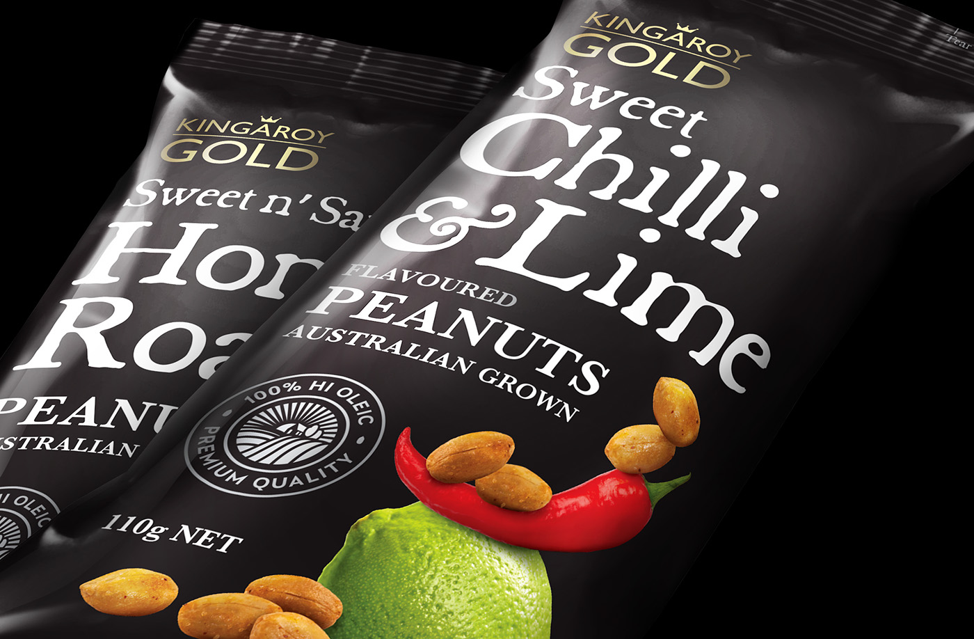
Our brief was to develop a brand and packaging for PCA's gourmet range of nuts, that would appeal to a younger and more discerning target market. This was successfully achieved by integrating layers of elements that delivered key cues to the consumer. Firstly we introduced a core colour palette of black and gold to express quality and sophistication. We then added creative compositions of imagery that combined the actual product and each flavour's unique ingredients. This was topped off with a 'hand crafted' style font that represents the care and attention that PCA lavish on producing their superior range of value added product.
The result? The humble peanut has finally come out of its shell!
Involvement : Concept, design and implementation
Featured on: