


Ongoing branding project for Agrea Foundation.
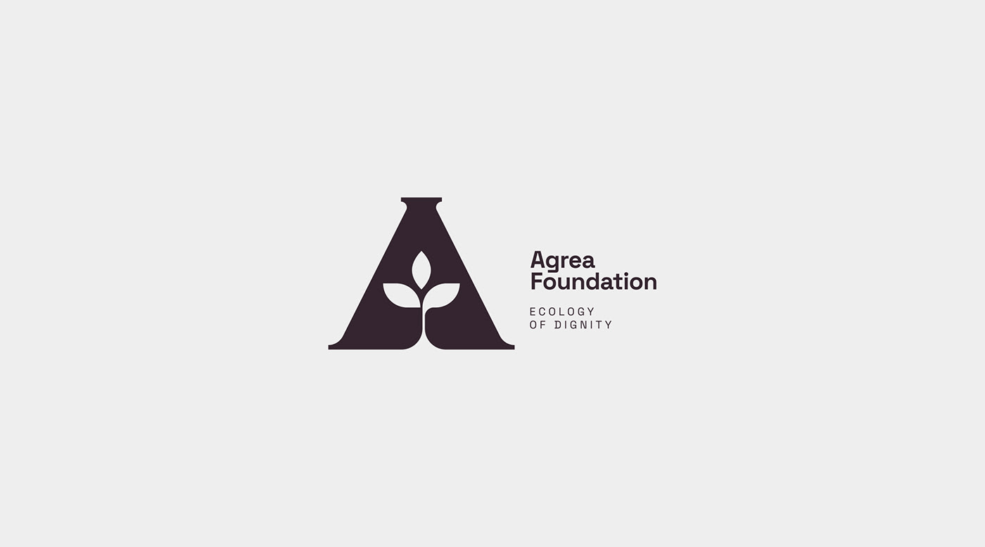
Agrea Foundation believes that through technology, education, and community empowerment, food producers can have a fairer business share, more autonomy, more dignity, and a better quality of life.
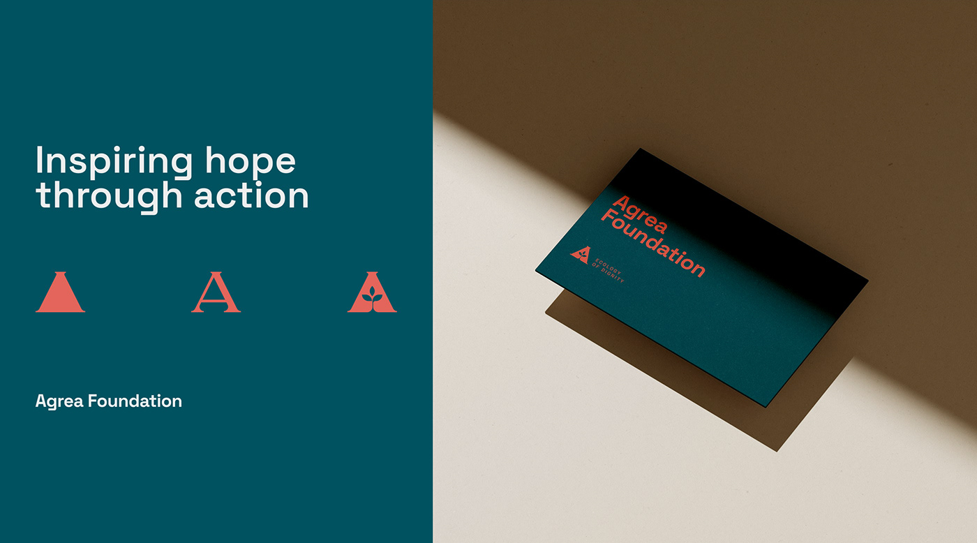
Agrea strives to be a champion of sustainable agriculture, so we used a symbol of exactly that, paired with a shape widely known to represent balance, stability, and shelter. Used here, the triangle connotes focus -- a spotlight on the main character.This also forms the silhouette of Agrea's initial, the letter A. Shelter is mentioned earlier, which, in context here, is protection from the elements. Further references include the 3 leaves, pertaining to the pillars that the Agrea Foundation lives by, namely Zero Hunger, Zero Insufficiency, adn Zero Waste -- which is also reinforced by the minimal approach to the mark, no unnecessary embellishments.
Done through Marinate Media.
Agrea Foundation believes that through technology, education, and community empowerment, food producers can have a fairer business share, more autonomy, more dignity, and a better quality of life.
Agrea strives to be a champion of sustainable agriculture, so we used a symbol of exactly that, paired with a shape widely known to represent balance, stability, and shelter. Used here, the triangle connotes focus -- a spotlight on the main character.This also forms the silhouette of Agrea's initial, the letter A. Shelter is mentioned earlier, which, in context here, is protection from the elements. Further references include the 3 leaves, pertaining to the pillars that the Agrea Foundation lives by, namely Zero Hunger, Zero Insufficiency, adn Zero Waste -- which is also reinforced by the minimal approach to the mark, no unnecessary embellishments.
Done through Marinate Media.


