Live is Life is wienlive
2012; Rebranding and Magazine Design for Echomedia Verlag

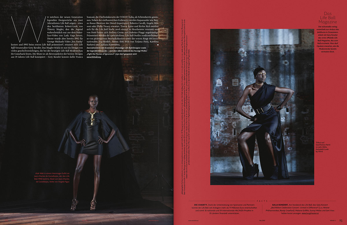
It is one of the biggest challenges in the world of magazine production: to edit an abundance of content in a way that it can be grasped by its readers as best as possible. The design plays a pivotal role here. The right proportions of pictures to headlines, of main information to side information, as well as the capital to small ratio constitute the decisive difference. With the relaunch of the Viennese city magazine wienlive brand unit has set a new benchmark for themselves and the publisher. The magazine has been graphically reinvented in terms of word and design mark, fonts and format. The result is a compact structure that provides quick orientation and enables a joyful read. And likewise it gives its readers the feeling of holding a product in their hands which is not only informative but also of high quality and on the pulse of the time. Forty best-of pages right at the beginning let you dive into a vivid, vibrant city. Afterwords it gets even deeper with big stories and interviews, followed by a focus on urban life in terms of fashion, art, culture and living. And even for the embedding of promotions brand unit has come up with something new ...


Art Direction: Albert Handler, Alexander Nußbaumer; Graphic Design: Dominik Schatz; Account Director: Andreas Oberkanins


