ABOUT BRAND
Lorem Ipsum is simply dummy text of the printing and typesetting industry. Lorem Ipsum has been the industry's standard dummy text ever since the 1500s, when an unknown printer took a galley
PHOTOGRAPHY
Photography is crucial in giving the brand a personal touch and dispelling the notion that our services is just for a select few. It gives us the chance to illustrate our objective and show that our service can benefit everyone looking to invest in quality

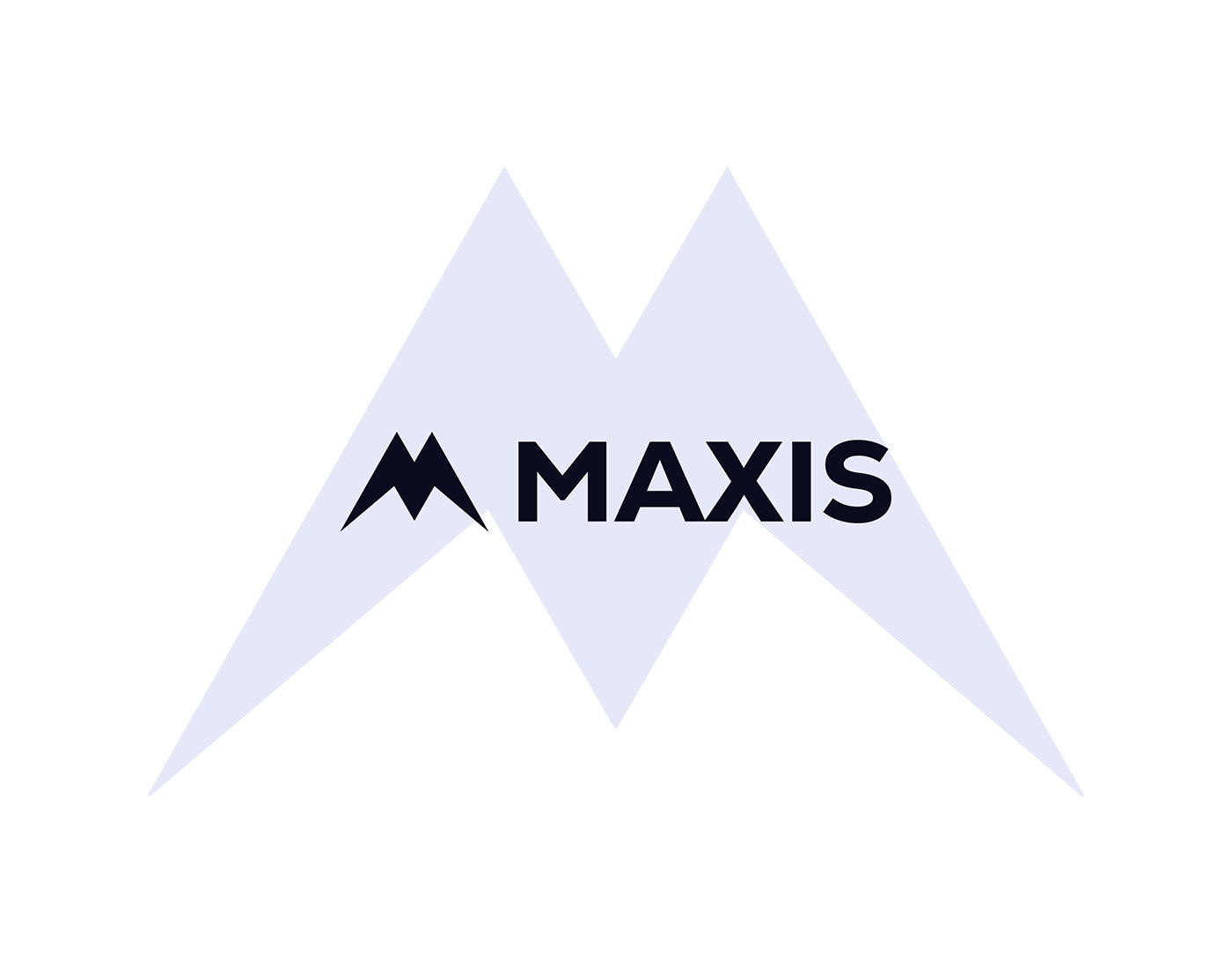
GRID
Beginning with the concept of a specified symbol, the grid was built using multiple trapeziums and a house shape with negative space to get a pleasing and visually cohesive result. The emblem is completely symmetrical, as can be seen on the side, and represents the three main constituents of the logo.


App Icon


COLOUR PALETTE
The basic color palette chosen to create the brand is supplemented by hues of green, based on market research and focusing on the brand's existing positioning. They are colors that convey the beauty of nature and the comfort in tranquility , as well as responsibility and dedication. These colors were used to create a secondary palette that can be used to help assemble the visual identity, especially in digital media.


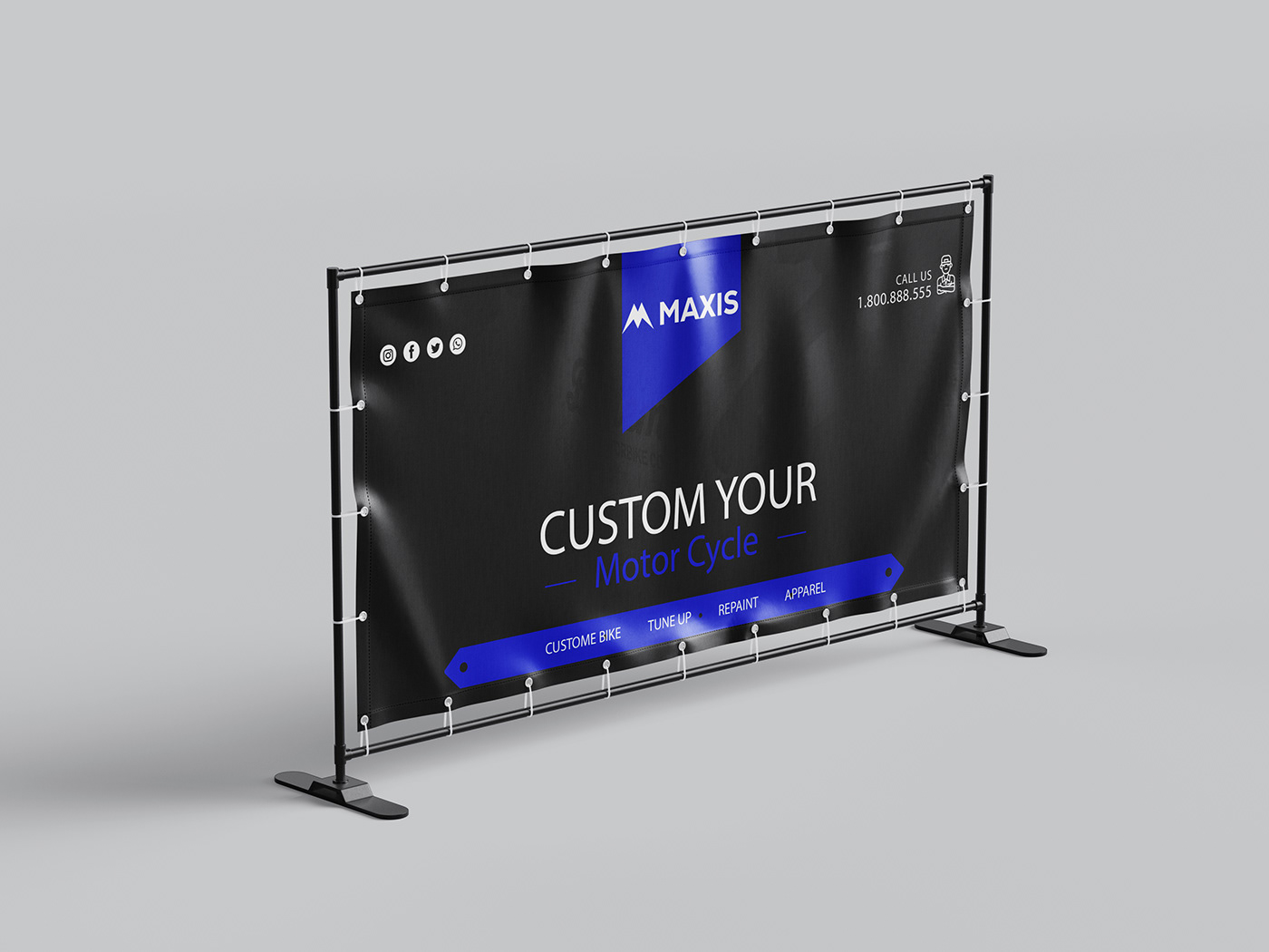
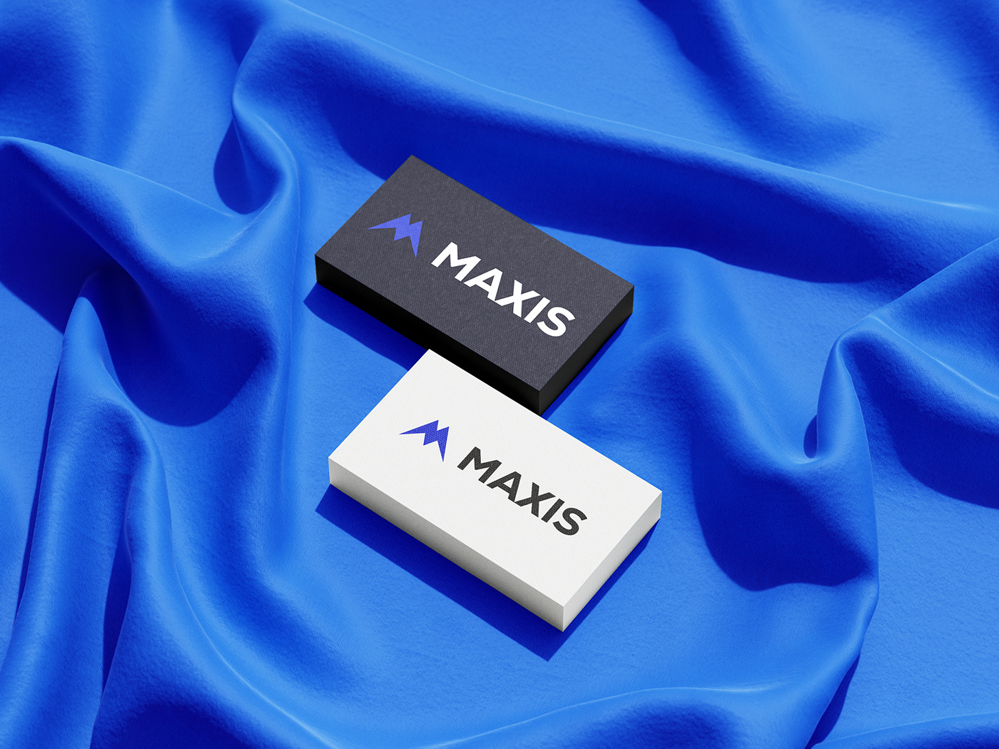
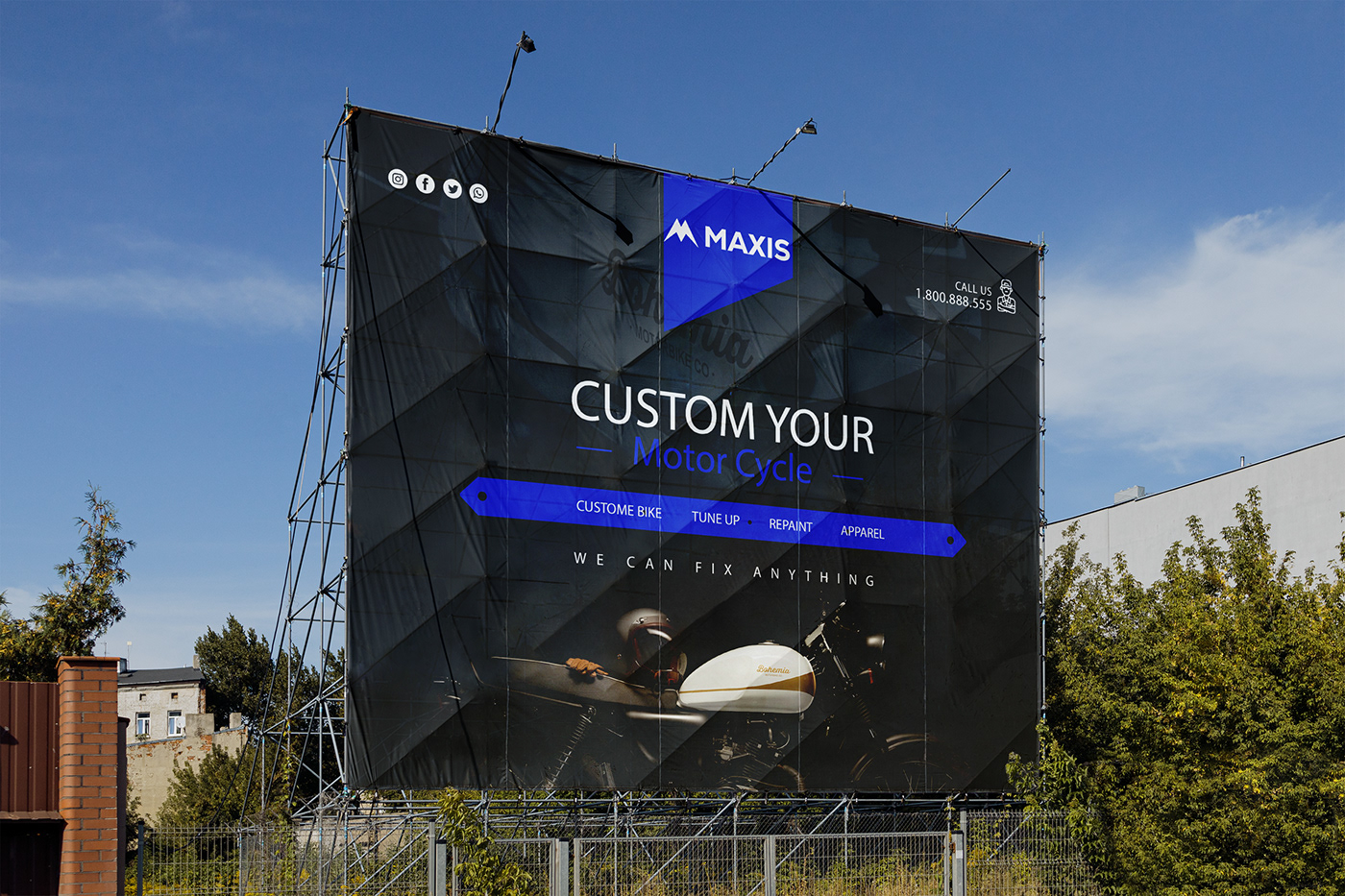
BRAND APPLICATION
This is the rollout of the brand's new identity on all the brand assets, ranging from corporate materials like letterhead, business cards etc, to the banners, posters and all other marketing materials and other client’s touchpoints, A significant step towards allowing their clients to get to know the brand as an organization is making the brand communicate with its customers through a consistent brand voice and cohesive appearance