SYNEX medical lab
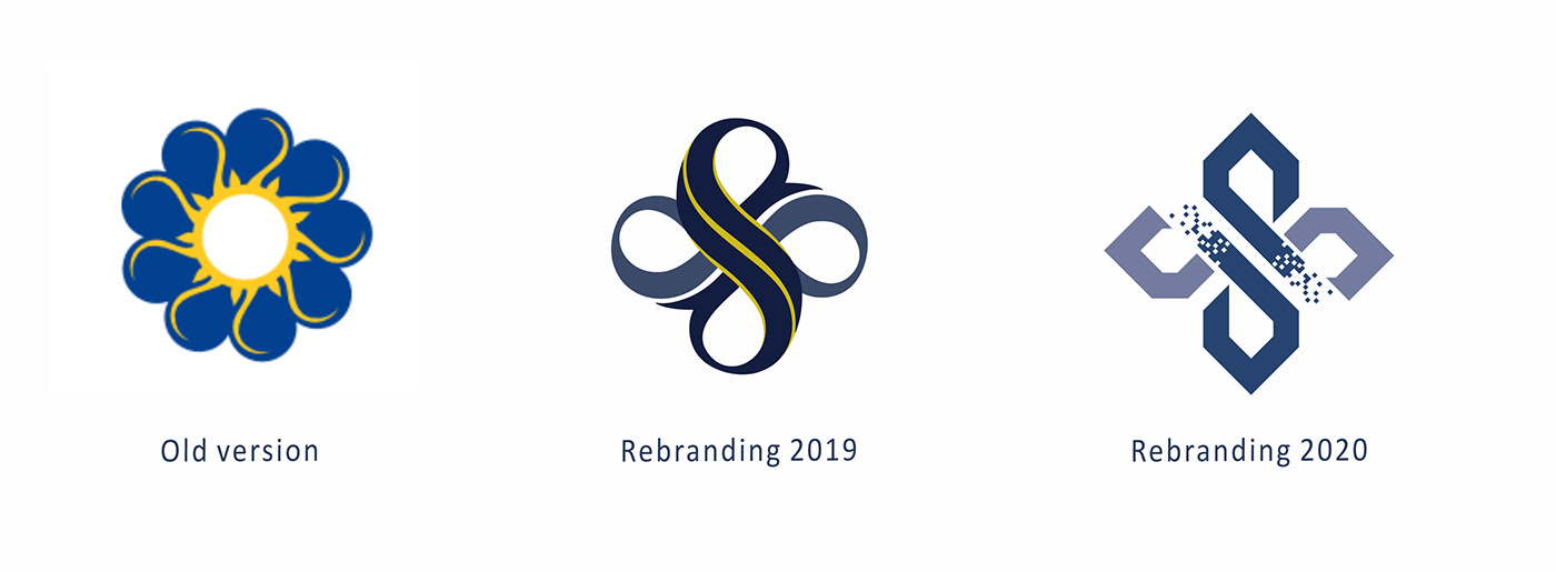
My client bought a medical labs chain, that previously had a different name and well-known logo in the region. In this case the rebranding should be subtle enough that consumers would still quickly recognize the brand. At 2019 my task was to change the logo in a way that it would still be associated with the old labs. This stage of rebranding was intermediate before the less conditioned design process.
I left the flower as a fundamental part of the logo but stylized with the initial S integrated in it. I used a similar color combination and proportion to the old logo. Meanwhile the yellow color was gradually removed so I created the additional version of the logo to implement it in the corporate identity.
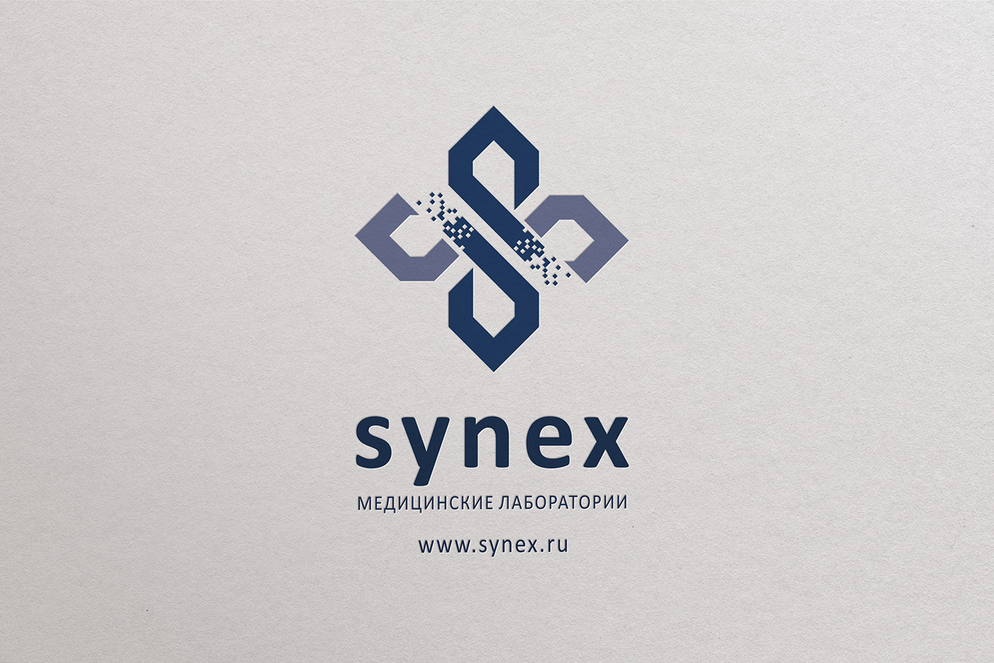
The next step of the 2020 rebranding had a bigger impact. The logo had to represent innovative technologies and a modern but at the same time very clear visual identity and structure.
Here is the result of the progressive changes.
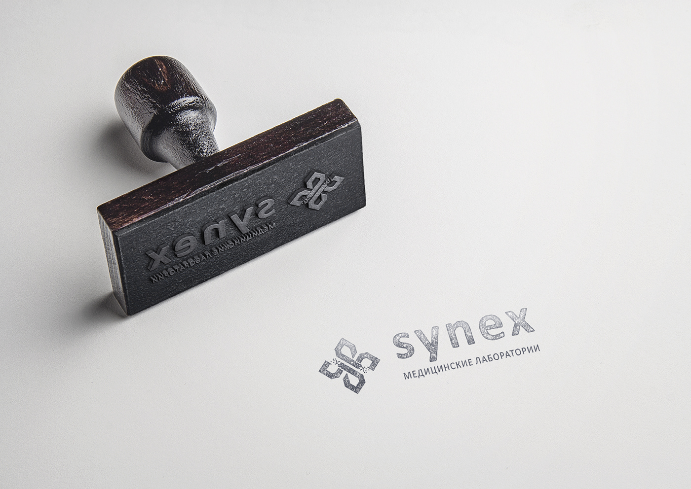
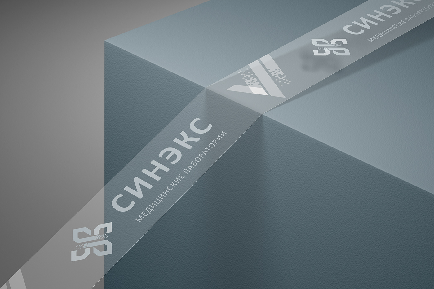
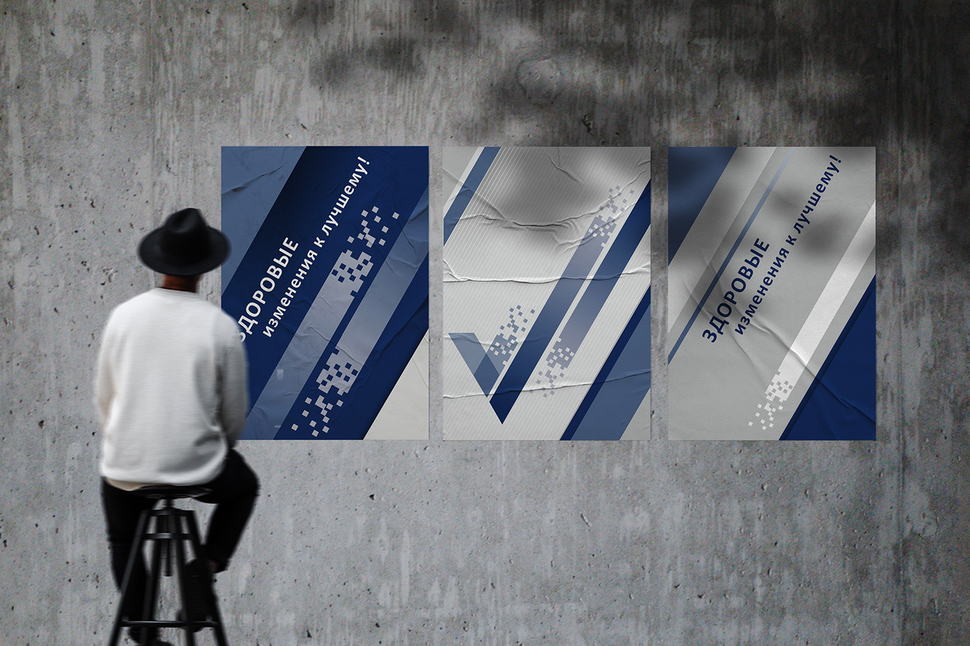
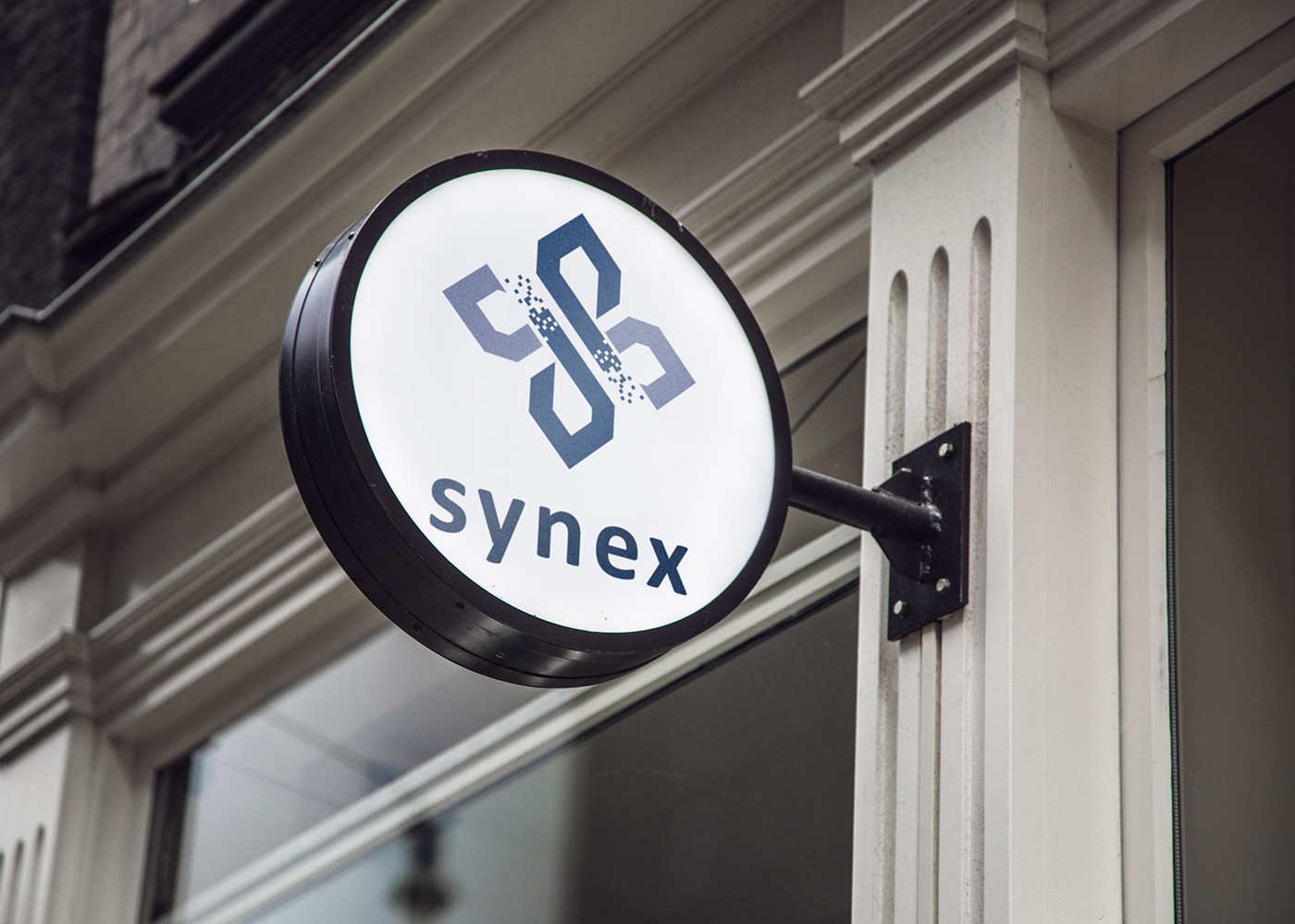
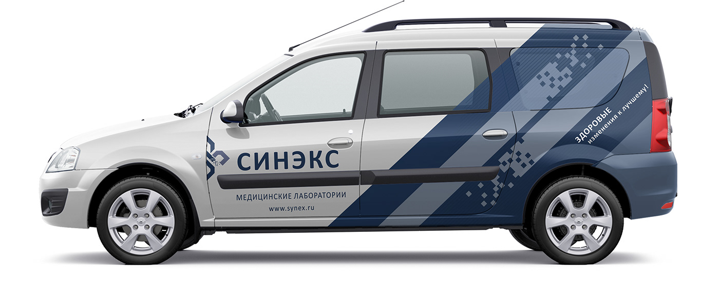
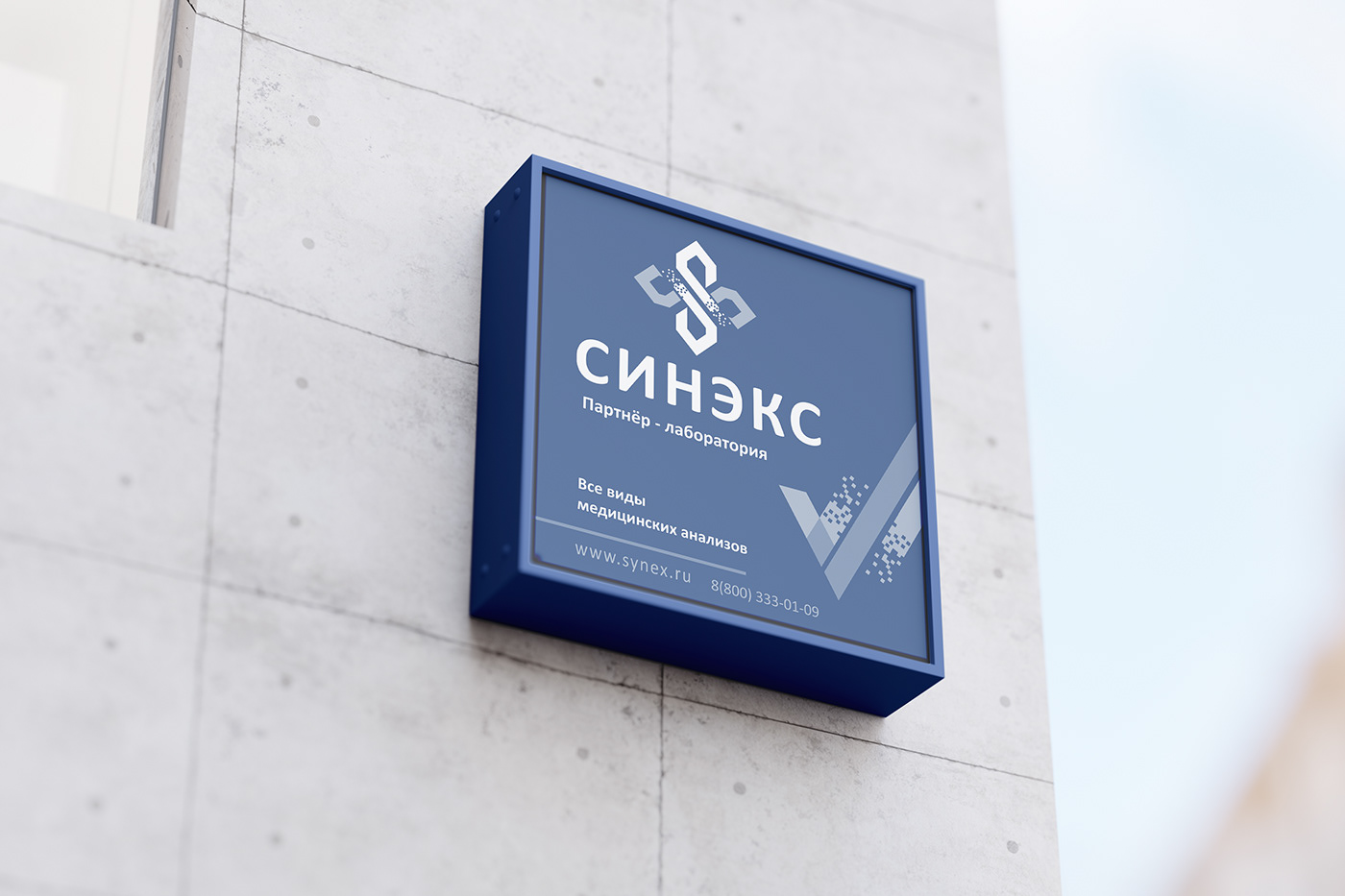
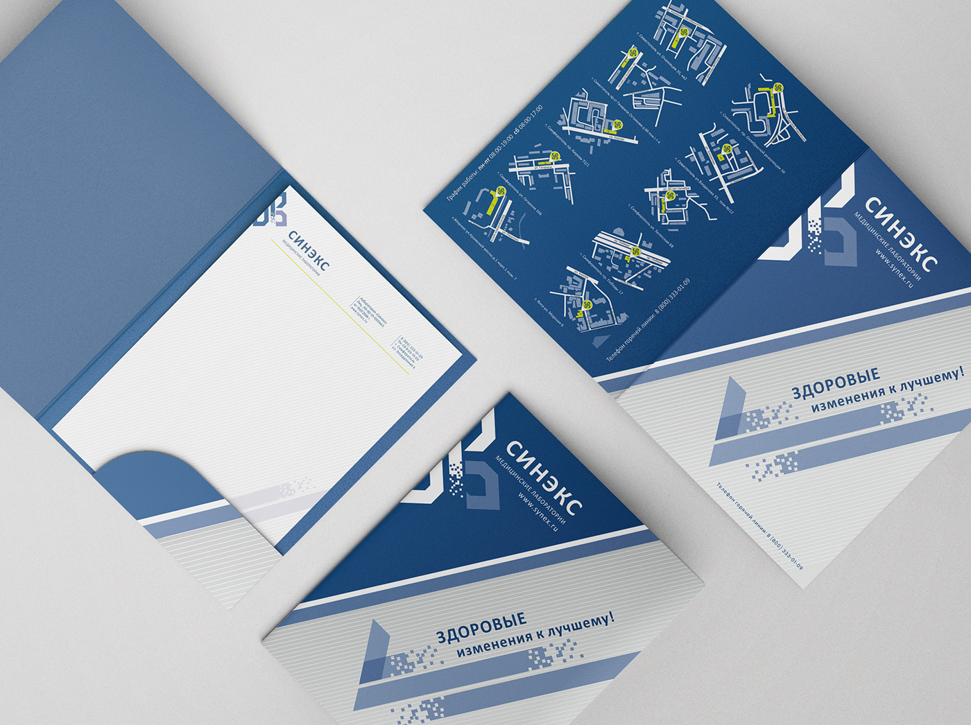
I have created a wide variety of layouts and surface designs. Beside premium business cards and all the stationary design, catalogue and posters, I have designed 10 lab entrances, a branded car design and every single detail of the laboratory.


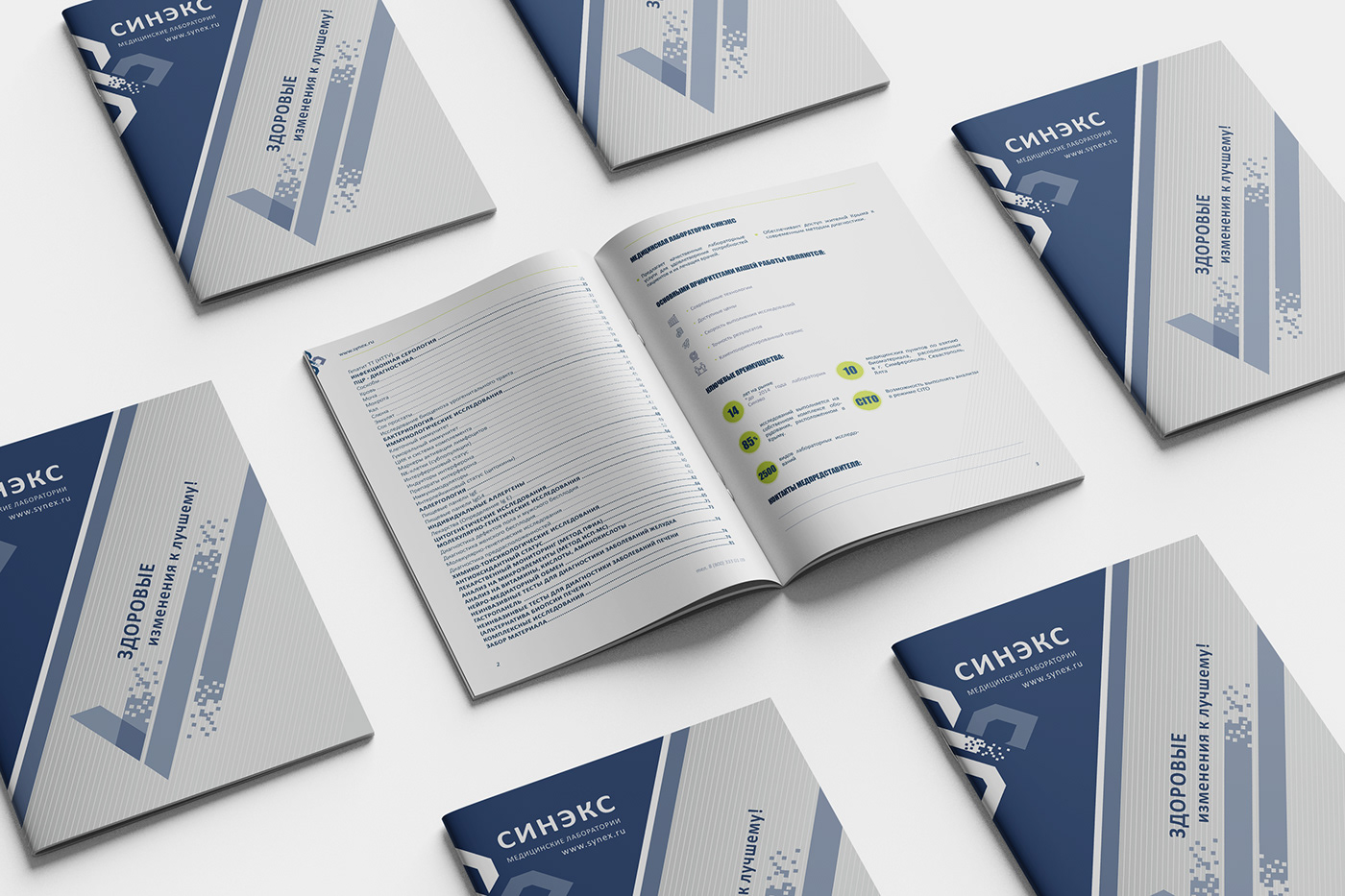
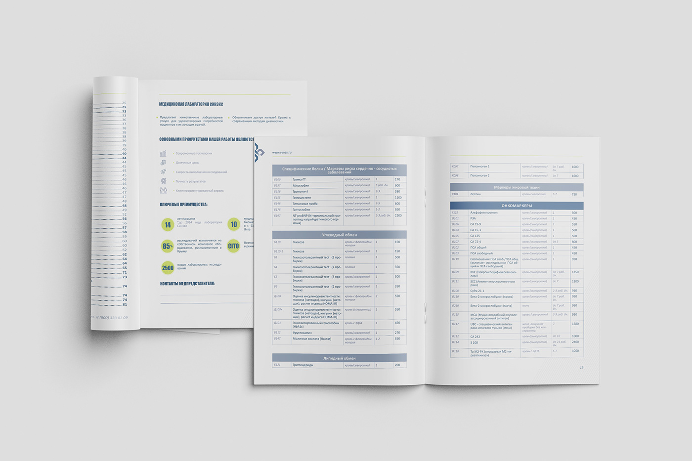
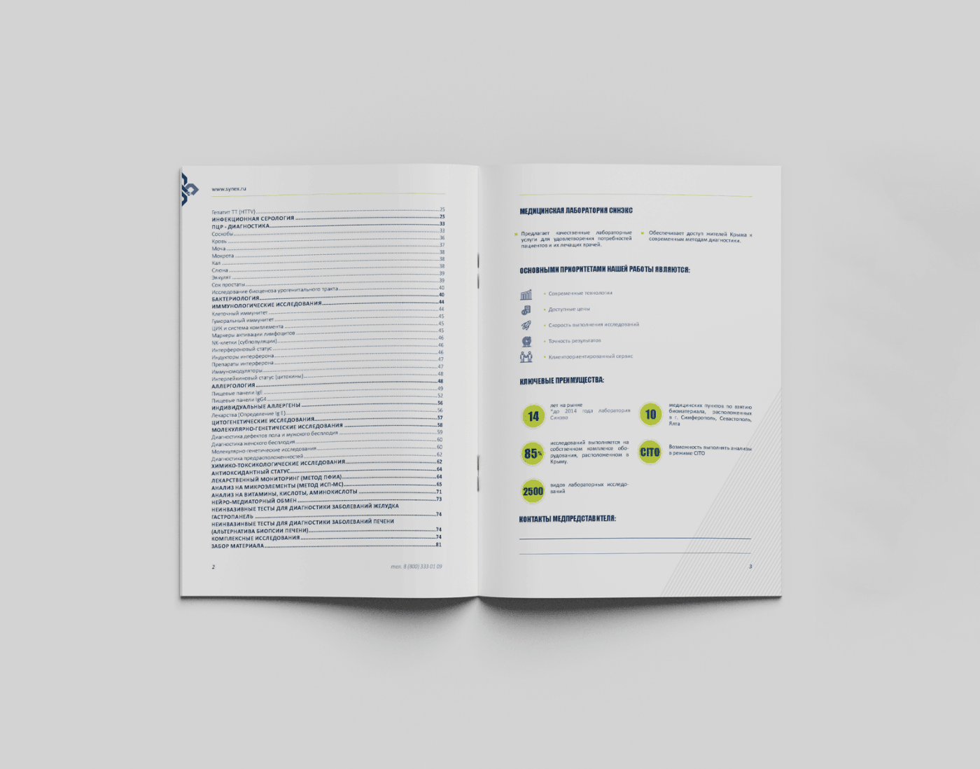
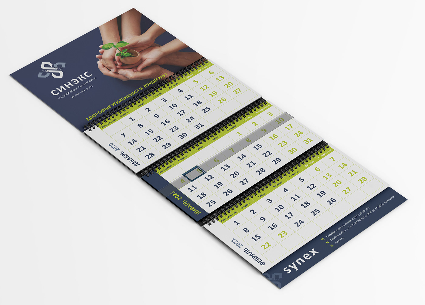
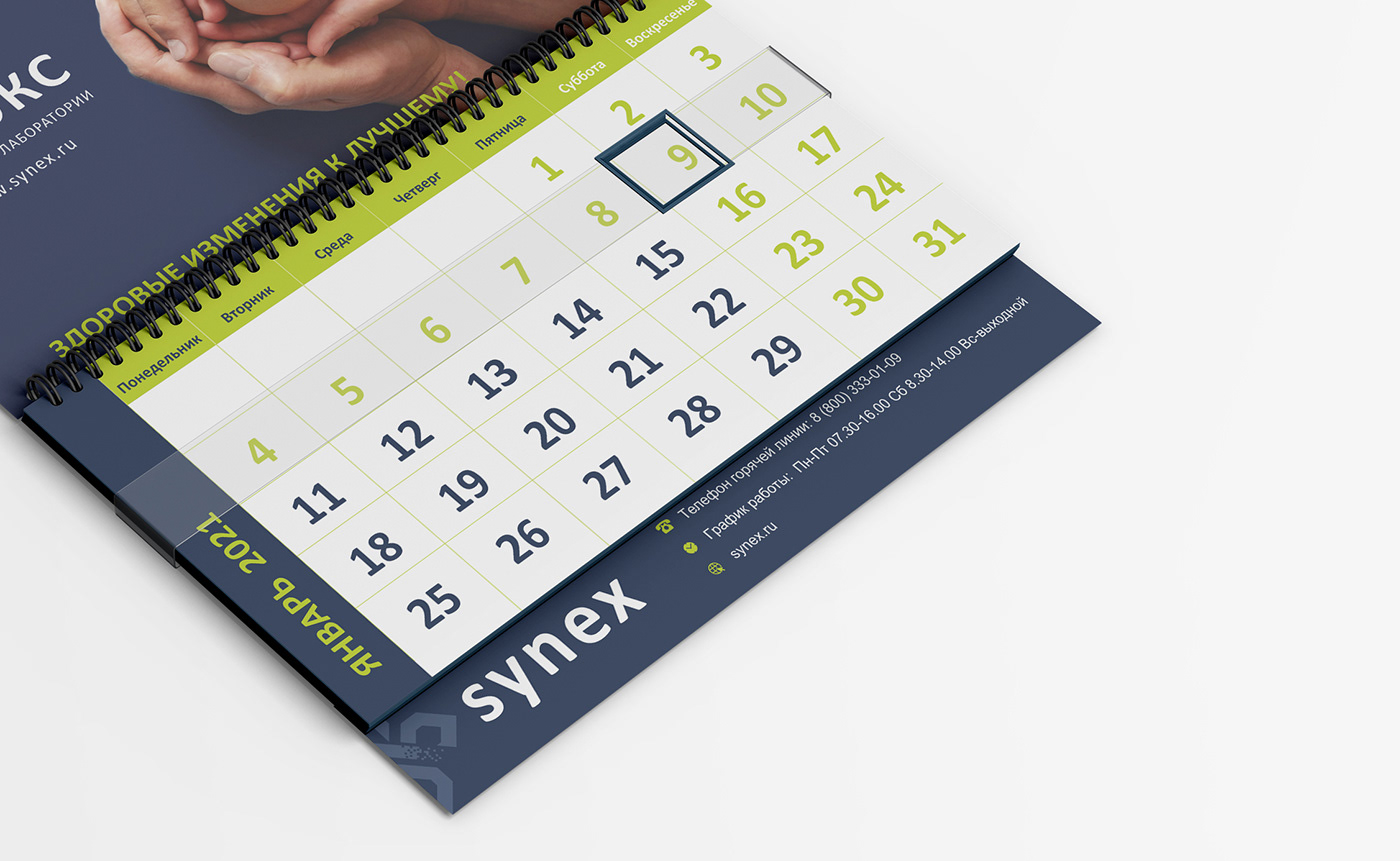
Every year I update their multi-page price publications and calendars.


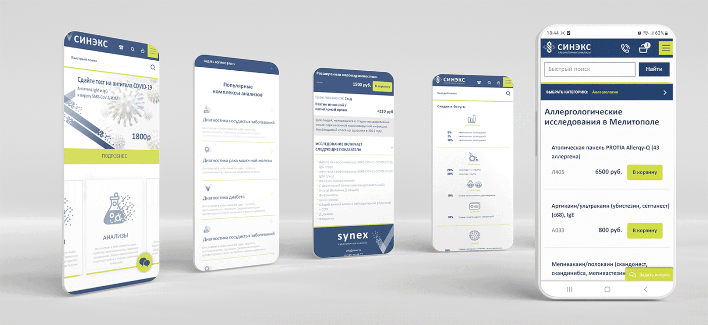
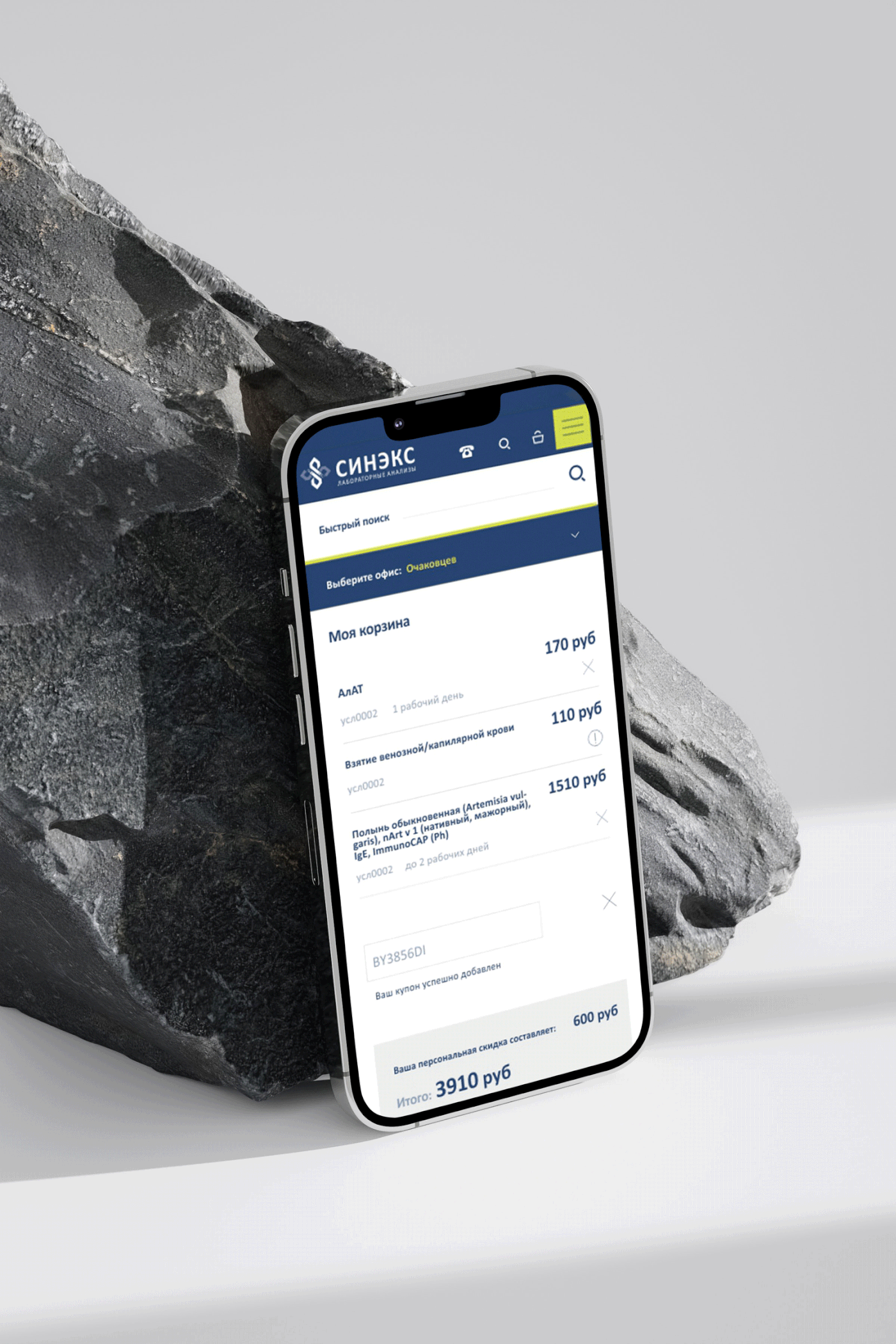
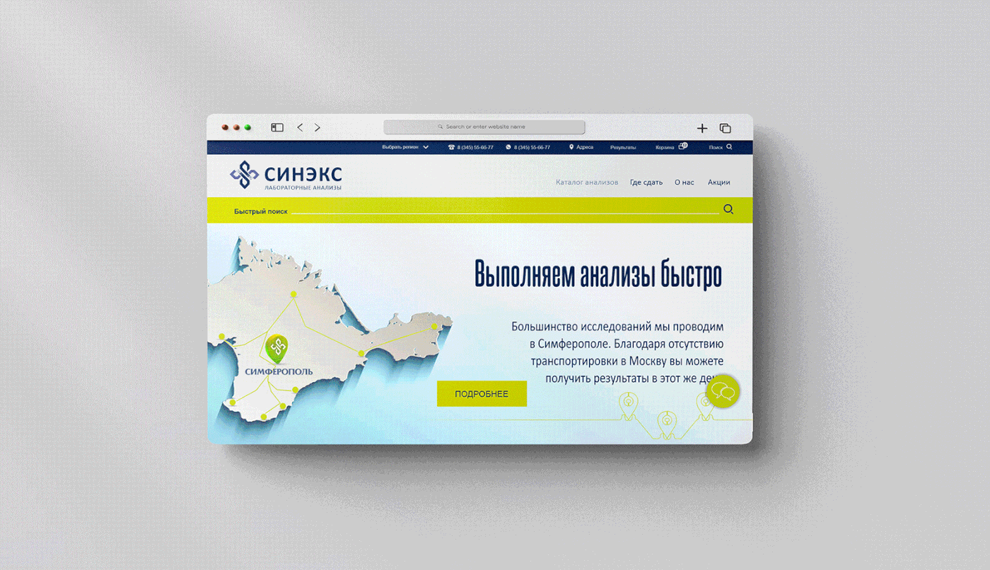
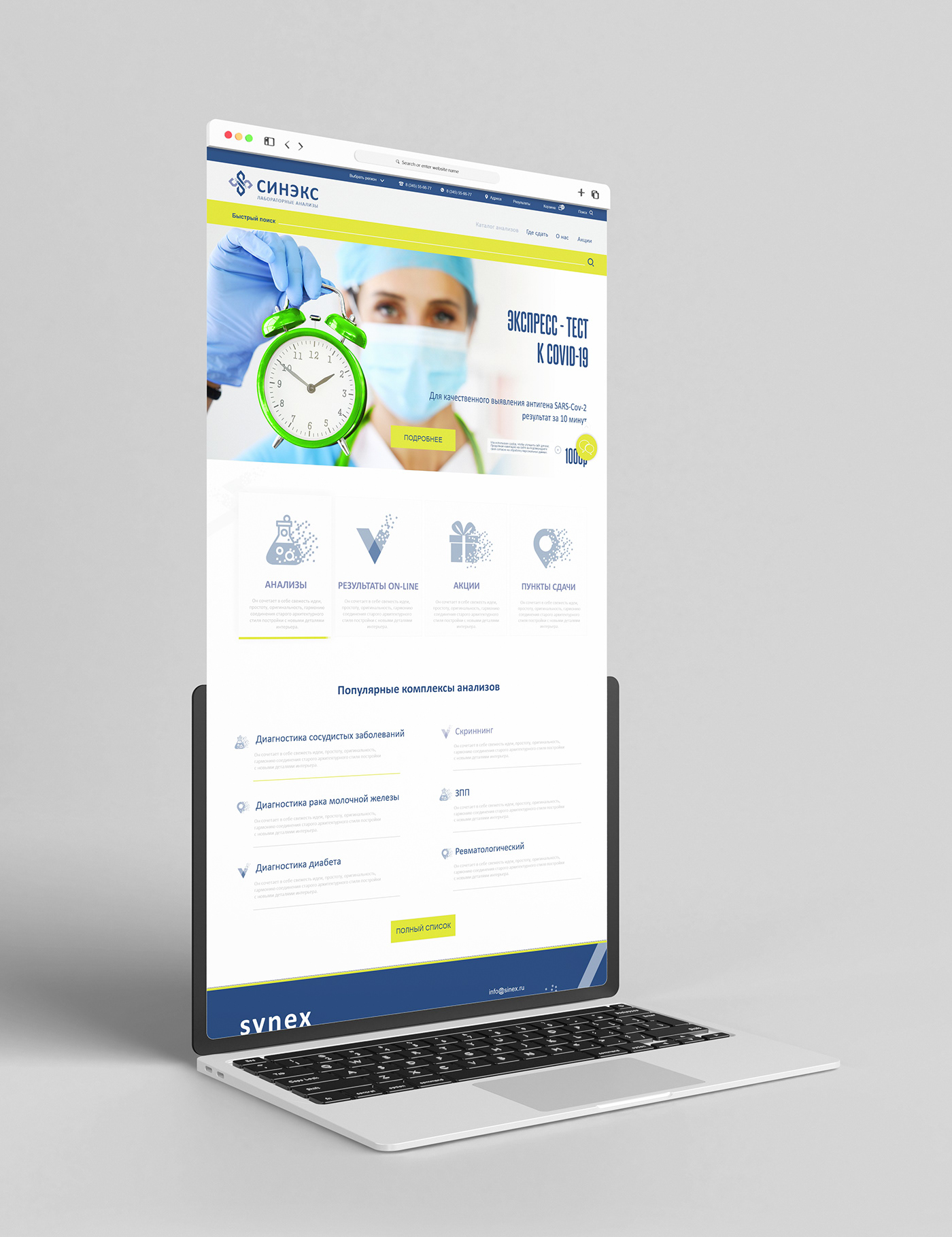
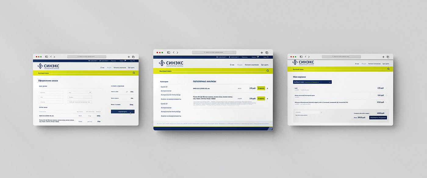
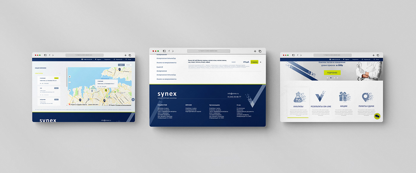
The Synex website structure is quite complex. I had to organize the clinical analysis section in such a way that the client does not get lost in it. The design had to be clean enough for one to be able to easily find information. I have created both the desktop and mobile versions.
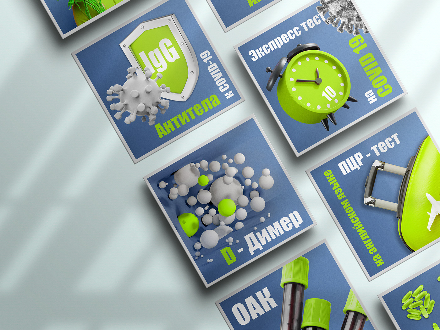
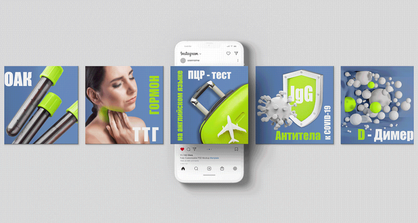
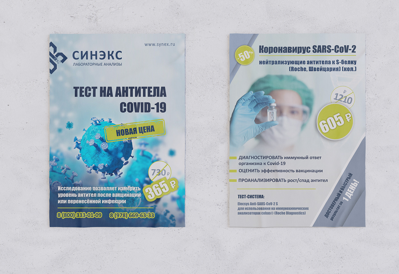
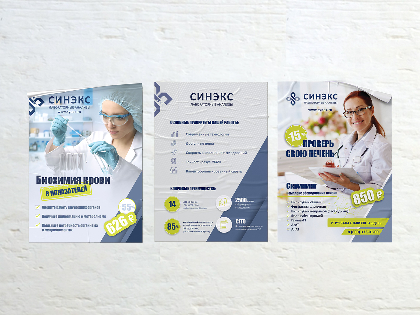
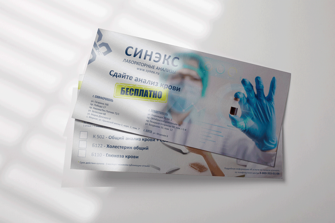
The laboratory activity requires constant updating of new services and pricing. I have created several layouts for advertising: posters, flyers, roll-ups and feed for socials publishing.