Persuasive Posters:
Creating a persuasive poster to support an environmental cause
Step 1: Choosing environmental cause
The environmental cause I choose for these persuasive posters is pollution
Step 2: Choosing audience
The audience for my posters will be young adults (aged 20-25), as I believe these are the people most likely to be impacted by my posters and the environmental cause
Step 3: Poster Iterations
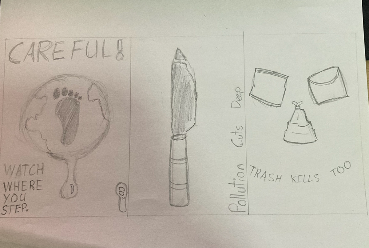
Tools: Graphite Pencil
Process: For each poster sketch I first chose a type of pollution or symbol of pollution that would act as the main piece of the poster. From there I came up with a way of turning that symbol or type of pollution into something that looks dangerous at a glance. I then came up with a tagline to go along with every poster.
Reflection:
Left Poster: The idea for this poster was to play a take on the 'carbon footprint' as I believe this is a symbol that most people would recognise. The exact idea in relation to the poster was that the footprint over the size of the Earth represent how even small humans can have a world-wide impact. The large careful! text acts as a warning sign and a way of attracting passer-by's.
Middle Poster: I chose the factory tubes that pump out pollution into the atmosphere as the symbol for this poster. My idea was that the tube and the smoke that it produces could shape into a knife. A knife is something that almost everyone could recognise and actively see as something dangerous. It also allows word play with 'pollution cuts deep' which is an impactful punchline to leave an impact on the viewer.
Right Poster: I wanted to try and represent the facial features of a skull by using trash that would be throw into the ocean. I used a chip bag as one eye, a chip packet as the other, and a garbage bag as the indentation of the nose. Finally, I used the tag line curved to create the impression of the teeth. This is probably weakest one as I don't think it is obviously dangerous at a glance.
Step 4: Final Poster Version 1


Tools: Procreate, Ipad
Process: I first sketched out the layout for the posters based off the original sketches I produced in the last step. I then drew the main focus of the poster, followed by coloring and then added the text later on top.
Reflection: I created these posters originally because they were the designs that I liked from the sketches. The poster on the right does its job of looking like a knife however I think that the overall composition is rather lackluster so I created the poster on the left. The poster on the left was much better in my opinion but I wasn't overly happy with the way the text was placed. The overall composition was an improvement but there is still some space where the eye can get trapped.

Tools: Procreate, Ipad
Process: I roughly sketched the underlying lineart and then refined the lineart, added coloring and then created a drawn type.
Reflection: After the past attempts at creating a poster I wasn't super happy with the results so I created this poster. The poster makes the earth look like an ice cube as it melts over the floor. Ice melting is a disturbing feeling especially when made to look like the Earth that we live on. The warm inviting tone draws the reader in, but the depressing realisation leaves the reader wanting to maintain the world that they have left. I was happier with the overall composition of this poster. I think that general elements like the text and maybe the sun could definitely be improved by it has the feel of a good poster.
Step 4: Final Poster Version 2

Tools: Digital collage
Process: I took the image that I had previously created and found images online that suited the material of the object I was trying to make. I then laid those images over the object to recreate the poster in a digital collage poster.
Reflection: I'm still happy with the overall composition of this poster but I wasn't a fan of the collage element. I don't think it works in this way even after trying to add shading under some of the objects.

Tools: Digital collage
Process: I took the image that I had previously created and found images online that suited the material of the object I was trying to make. I then laid those images over the object to recreate the poster in a digital collage poster. I also manipulated the text and composition of the base poster to produce a better element.
Reflection: I wasn't happy with the previous collage poster creation so I decided to test how this poster would look in a digital collage style. I think that this poster works better with the digital collage because seeing the realistic world makes the poster's message more poignant. The change in composition from the base poster did clear up some of the trapped space and makes it flow better but there are still opportunities for the poster to be better.
