Persuasive Posters
For week 4 we were tasked to make a persuasive poster on an environmental cause of our choice. I chose food waste, targeted towards young adults (20-25). During my brainstorm, I originally had ideas of posters that de-promoted reckless spending and buying of fresh produce. But during this process, I felt frustrated at the pressure put on young consumers to fix food waste when supermarkets have much bigger impacts.
Supermarkets have high and strict cosmetics standards for fruit and veg that cause food waste and affect farmers.
So, to create a persuasive poster that brings light to this occurrence ttargeted towards young adults I made three drafts and showed it to friends.
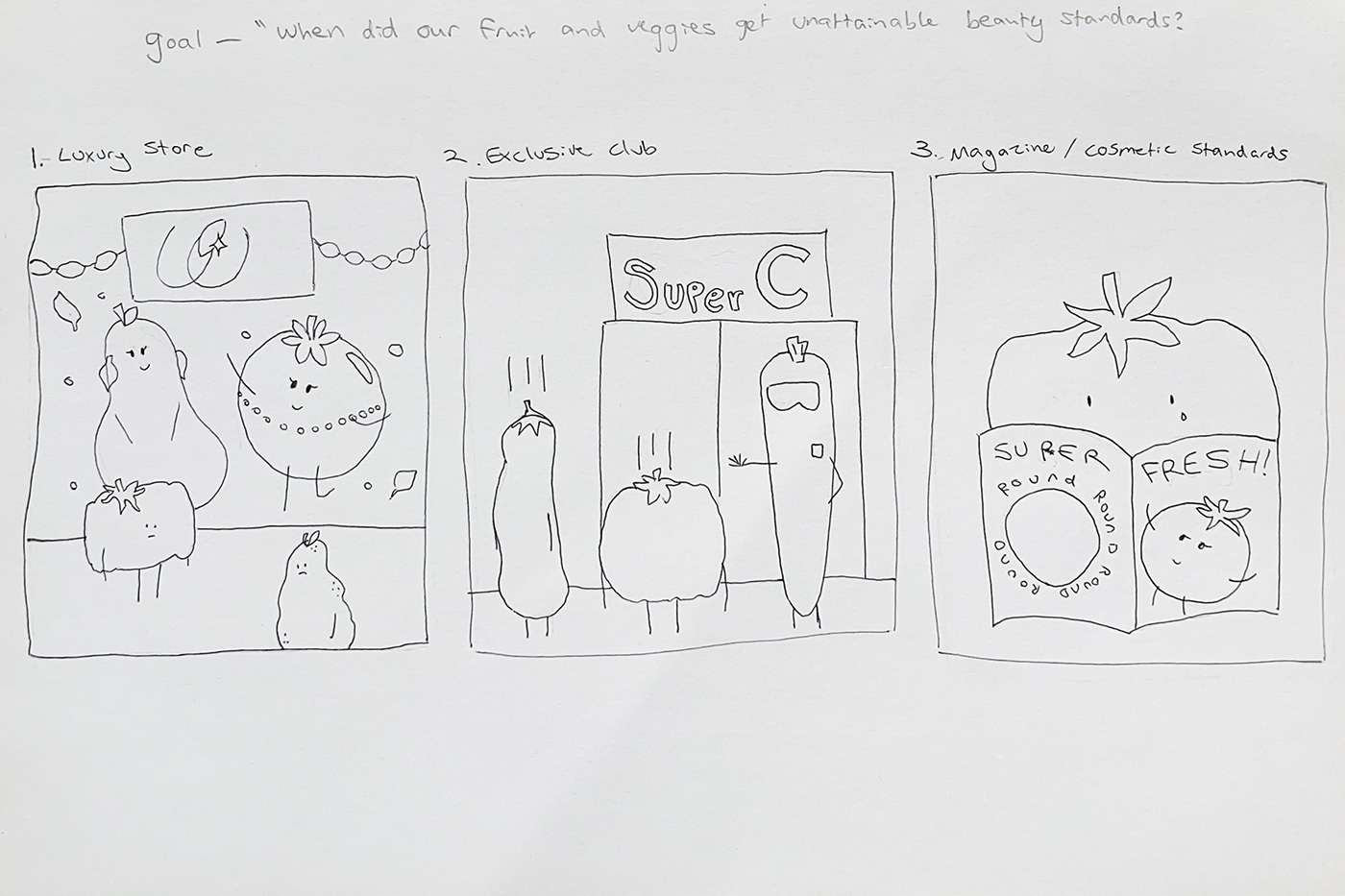
Poster 1. is titled 'Luxury store' and shows imperfect fruit and veg outside of a luxury store. This poster got good feedback saying they felt bad for the produce outside the window.
Poster 2. is titled 'Exclusive club' and show imperfect fruit getting rejected from a club, this poster got feedback saying it is clever and easily understandable as the notion of getting rejected is obvious.
Poster 3. is titled 'Magazine/Cosmetic standards' and shows a lumpy tomato looking at a poster titled "Super Fresh!" Round edition. The feedback for this poster was also that it is clever, but I got told it wasn't clear that it is about fruit and veg getting rejected from supermarkets without extra context.
I tossed up between poster two and three but decided on poster three as I felt like it related to more young people, not just young women. And the desired message of fruit and veg getting rejected by supermarkets was clearer.
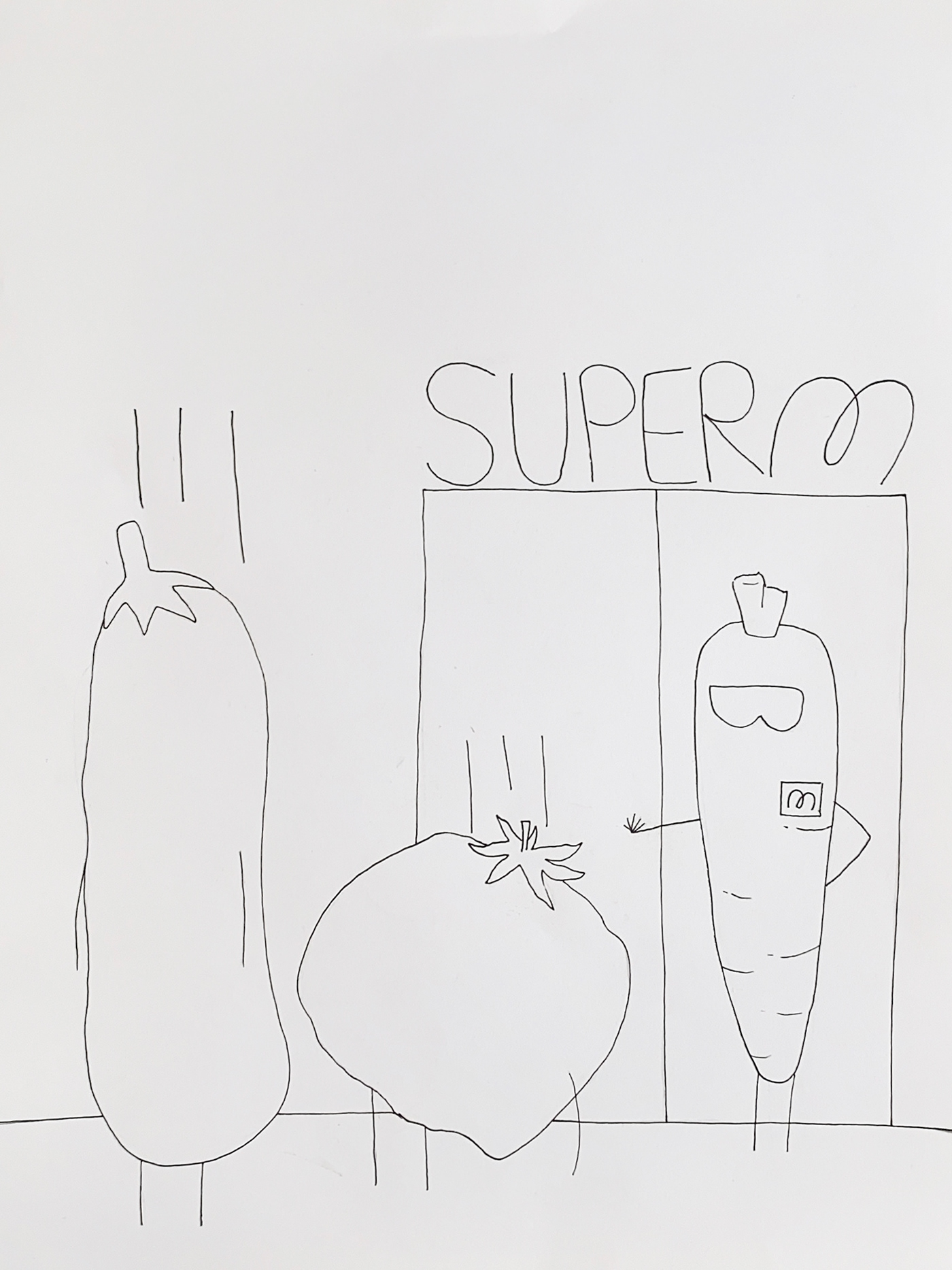
For the final ink drawing of the poster, I used a Comic mild liner as I thought I might use comic markers to colour it in.
I tossed up different names for the club such as 'CCC', 'Fresh C', and 'Super C' but eventually went with 'Super M' which is a shortening for Super Market and a reversal of the Woolworths M logo. The handwritten San serifs are rounded as my own reference and nod to the 'round edition' magazine from poster 3.
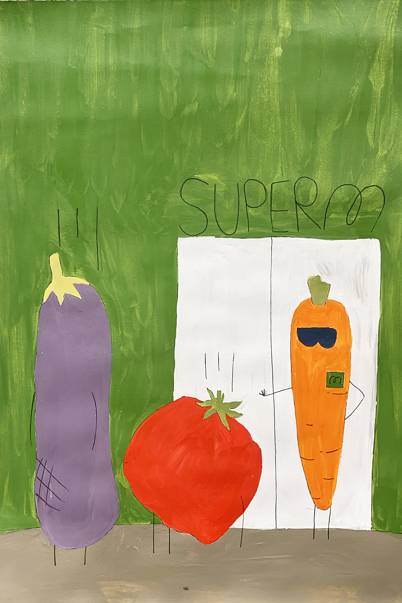
Coloured version 1. Was painted using acrylic paints, after the in-class colour wheel activity, I felt inspired to make a rustic feel with the paint texture.
The green background symbolises the supermarket, green can also be symbolism of freshness/nature but also greed/money. I then had to be careful with what colour I made the eggplant stem and made it denatured in comparison. The three veg are three different colours, they are the colours of the vegetables and not much thought was put into them.
I got the desired effect with the green background but wish the black topic lines weren't there, maybe in future I would go over it with brown acrylic paint to tie it all together and tone down the black.

Coloured version 2. Using collage technique. I went to Woolworths and got one of their fresh food recipe books they hand out for free. Using textures from that one magazine gave me limitations on the colours I could use.
I am much happier with this version of the poster, I feel like the green background is overwhelming and actually appears behind the door instead of apart of it. I decided to use the real vegetable textures on the carrot. While this was accidental as I couldn't find real texture for the eggplant, using textures for the rejected veggies that aren't the real food hopefully convey the story that they aren't considered 'fresh' enough to join the Super Mart club. In this second version of the poster, I improved the type for the door as well.
If I could improve this poster further, I wish I added a height meter or round door fruit and veg have to fit through such as those on amusement park rides. I believe that would've added extra context without having to add text to the poster.
But overall I think this poster is effective in reaching the intended target audience as the notion of being rejected from a club is understandable, even if it hasn't happened to the person specifically. I am happy with my second version and feel like I improved the message. I liked using the recycled magazine to create this and I feel like it adds an extra layer of story and sustainability to the message. I improved my painting skills as I wasn't very familiar with acrylic paint prior to this, and thoroughly enjoyed making the collage and being resourceful with colours as it was a challenging exercise.


