School/Social Service Organization | Cincinnati, Ohio
We helped St. Aloysius, a Cincinnati landmark since the early 1800′s, define and refine their brand and messaging through an intensive and structured process. We performed leadership interviews, facilitated internal and external design charrettes and finally, assembled our findings and recommendations into an electronic document for distribution to stakeholders.
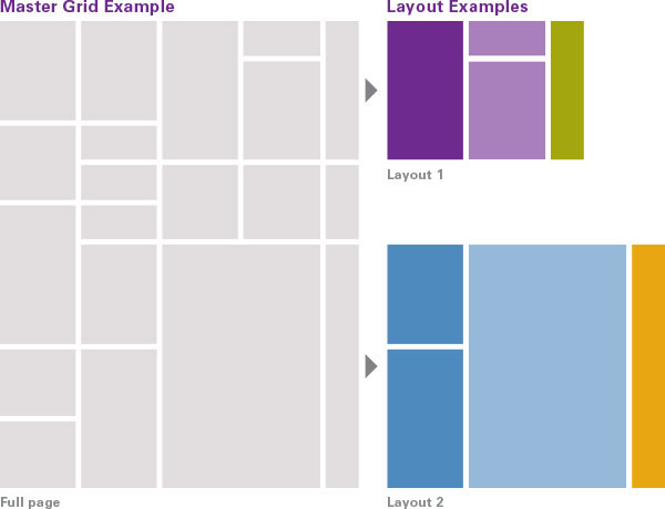
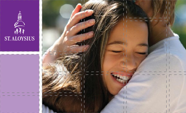
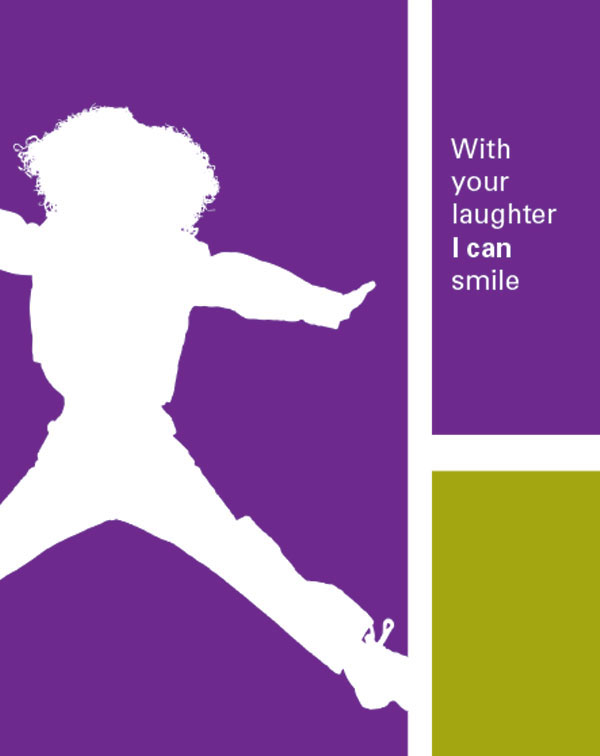
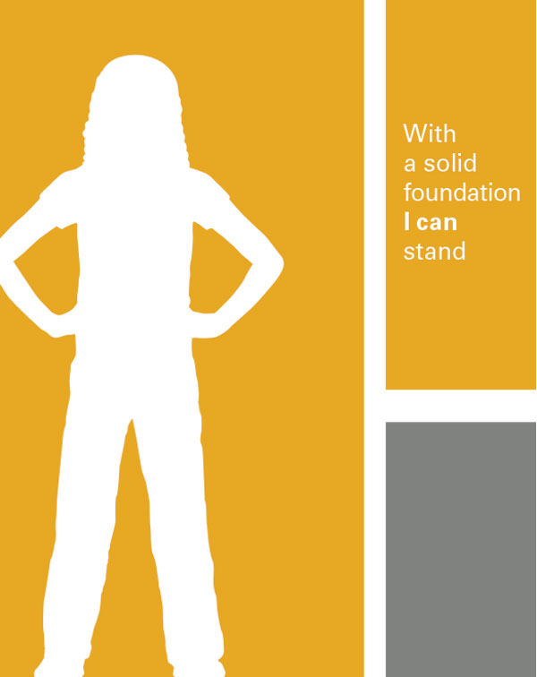
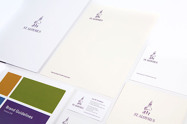
We wrote the book on St. Al’s design standards and message architecture. These two guidelines combine to form a consistent way of communicating St. Al’s message to employees, clients and partners. Inspired by Simon-Sinek‘s WHY, HOW, WHAT message-tree structure, we developed the St. Al marketing materials in such a way as to ensure that the message take away for everyone is consistent. Our graphic design system supports and leverages the message structure, by increasing communication effectiveness through consistency, simplicity and appropriate imagery and narratives. More and more corporations and organizations, like St. Al’s, are realizing the importance and power of uniformity in messaging and delivery through all mediums—a recipe we have been trumpeting for decades!


We were introduced to St. Aloysius through GBBN Architecture. The folks at St. Aloysius toured the United Way of Greater Cincinnati—another GBBN / White Design Studio partnership—and were impressed with our creative solutions.
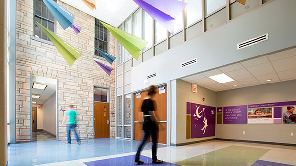
We created an overall message and design strategy that correlates with the building architecture both in style and function. While we were at it, we decided to clean up the St. Aloysius corporate identity and message structure too. The lobby, shown above, features a paper-airplane-inspired sculpture that is intended to be both fun and aspirational. The planes hang in formation and are poised to take off into the world—much like St. Al students are after receiving the compassionate training, support and guidance from the family of St. Aloysius professionals. A life-sized St. Aloysius logo is etched into the windows—in the shadow of the actual iconic dome that it depicts—and illustrates the range of kids, adults and families that St. Al’s serves.
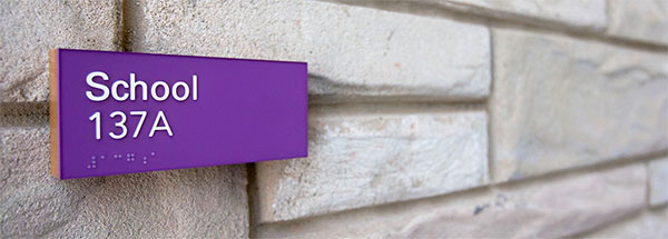
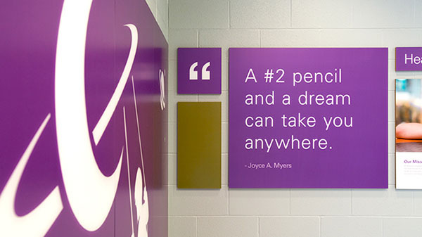
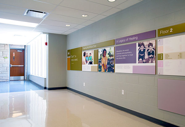
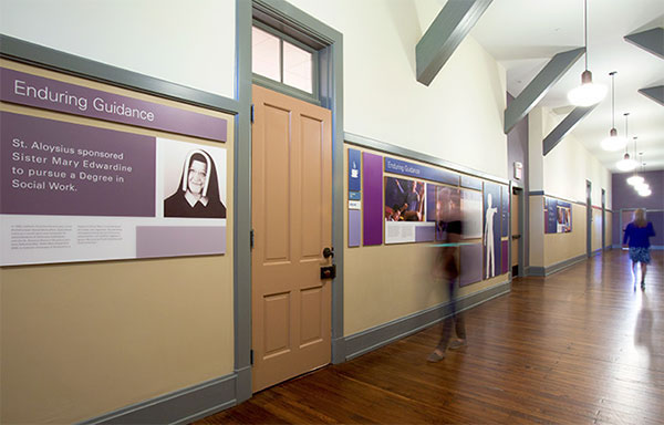
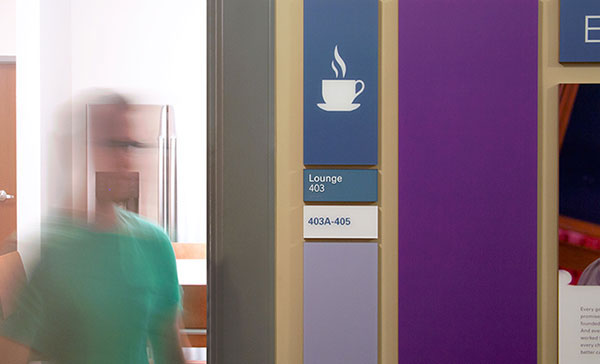
The project features a modular wall-mounted graphic system that integrates educational/history/program messaging with interior wayfinding and aspirational images. Area-specific content is matched to appropriate locations based on function and audience. The entire system takes its design cues from the ashlar stone design utilized in the original building. All designs use our Graphic Guidelines, Messaging Architecture and Identity Refinements.
We love working with the team at St. Aloysius so much that we have stayed on as a marketing consultant – translating all print and electronic materials through our new design and messaging standards. We are proud to be part of the St. Aloysius family and the work they do. Look for additional stories in the future as we work our way through all of St. Al’s communication materials.
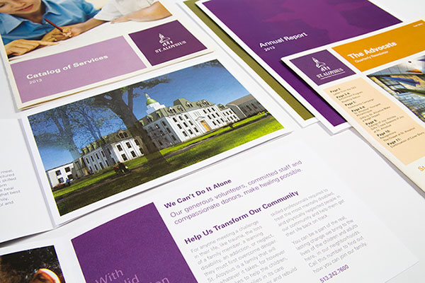
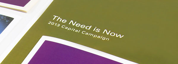
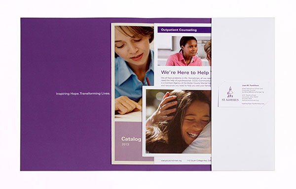
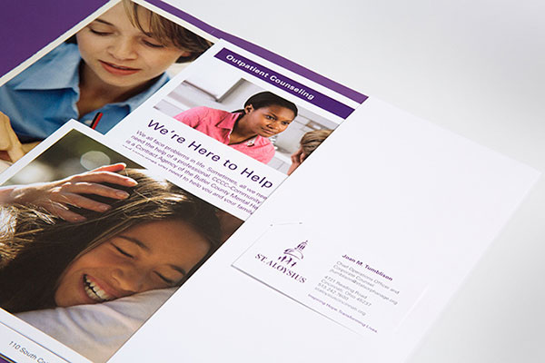
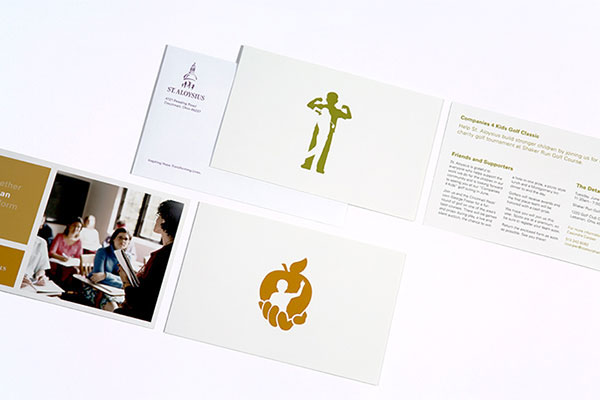
We wrote the book on St. Aloysius. We made the rules. And now we are putting them into effect through a wide variety of printed communications. Our structured system uses both physical size and orientation as visual cues to the type of message and audience. Design standards and paper selections for each piece leverage printing efficiencies. Business cards, capability brochures, pocket folders, letterhead, envelopes, service brochures and data sheets, as well as invitations and newsletters, are just some of the members in the St. Al print family. Each member does its job, at every level of communication, for every audience. Look for new relatives in the future.

