Image Design and Production
DVB102 | #oneperday2023
Week 7
Relief Printing
Week 7's activity involves continuing on Lino (or relief) printing as a technique but using self-portraiture as the theme.
The self-portrait is also based on these given questions:
1. One colour to represent you?
Blue.
2. One word the defines you?
Introverted.
3. Token animal that represents you?
A bear because it hibernates regularly.
4. Favourite landscapes/nature space/natural scene?
Mountainous areas with grass or sea/rivers.
5. What two features/elements of your face stand out?
My hair and eyes.

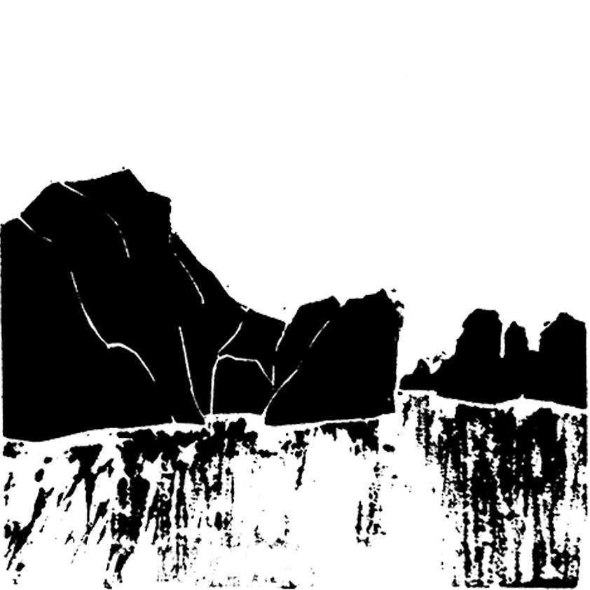
Image 26
Self portrait - Black and White
Black and white print of mountains that becomes the focus for the whole piece.
Materials and Apparatus
A4 paper, 2H graphite pencil, square piece of Lino, carving tools, thick printing ink and a printing press machine.
Techniques and Process
Using a graphite pencil, I sketched onto the Lino piece. Then with carving tools, I carved out the outline of the sketch, leaving out the mountains. When done, with a roller and printing ink, I rolled ink onto the carved Lino and used the printing press machine to transfer the ink onto A4 paper.
Reflection
Although this was a self-portrait activity, instead of carving an image or silhouette of my face, I used objects that represented my identity for an abstract self-portrait. In this print I used the mountains found in Hạ Long Bay in Vietnam, to represent my vietnamese identity. Initially, there were supposed to be no streak marks located under the mountains. However, instead of carving it out and reprinting, I kept it in as it looked like the reflections of the mountains in water.

Image 27
Self portrait - Black and White Plus One Colour
Black and white print with one additional colour.
Materials and Apparatus
A4 paper, 2H graphite pencil, square piece of Lino, carving tools, acrylic paint mixed with sunflower oil and a heavy-weight item to press. Adobe Photoshop to edit the prints together.
Techniques and Process
Using a graphite pencil, I sketched onto the Lino piece. Then with carving tools, I carved out the outline of the eyes. When done, with a roller and my acrylic and oil mixture, I rolled it onto the carved Lino and used a heavy weighted item to help press and transfer onto A4 paper. After scanning the prints, using Photoshop I placed the images together.
Reflection
For this print, I wanted to portray a feature on my face that I felt stood out. In this case, it was my eyes. Although the print is simple, I chose my eyes because eyes are the first thing most people look at and seeing myself in person would have any person automatically assume I am a constantly tired person (in which I am) due to my dark circles. This print took multiple tries as I had to use a homemade mix for the ink, which was acrylic paint mixed with sunflower oil. Initially, it would have been just acrylic paint but the paint would dry to quickly after I rolled it onto the lino and tear the paper when pressed. Resulting to mixing in oil due to my previous use of using oil in my paint and noticing it took a bit longer to dry. I also chose blue because it represented the water in Hạ Long Bay but also because as an introverted person, I felt a cold blue represented me.

Image 28
Self portrait - Black and White Plus Two Colours
Black and white print with two additional colours.
Materials and Apparatus
Acrylic paint mixed with sunflower oil, a paintbrush and a heavy-weight item to press. Adobe Photoshop to edit the prints together.
Techniques and Process
Used monoprinting instead of relief printing to create a texture. On a flat surface I placed a acrylic paint and oil mixture and rolled it out. Then with the end of a paintbrush, I carved out squiggly lines. I repeated this process multiple times and used the two prints I preferred the most. After, I scanned the print and edited it into the previous image on Photoshop.
Reflection
A wavy texture was chosen for this print as it was to symbolise my hair which is wavy. It is also green as green is another commonly used cool colour and represented my introvertedness. I also used two prints overlapping each other to fill up white space and also create a clash of the wavy lines for chaos.

Image 29
Self portrait Poster - Black and White
Greyscale version of the digital self portrait poster.

Image 30
Self portrait Poster - Colour
Coloured version of the digital self portrait poster.
Materials and Apparatus for Image 29 and 30
Adobe Photoshop and Illustrator.
Techniques and Process for Image 29 and 30
Used Photoshop to recolour and render the original lino print (image 28) and then drawing in a bear. Illustrator was used for the typography.
Reflection for Image 29 and 30
The lino print was rendered and redid to look similar to that of a children's book. The reason behind this is because I felt the lino print reminded of a cover from a children's book when I was younger and with a bear representing my identity, I automatically thought of the title 'Sleeping Bear of the Bay'. Overall, the poster depicts my identity using features and symbolism that represented me. Additionally, the title very much describes me as a person, someone who tends to sleep a lot, barely seen outside unless needed.
This activity was good experience for me to learn more techniques within Photoshop as a drawing and editing platform as I played with the features.


