


Published 2023
branding, graphic, typeface
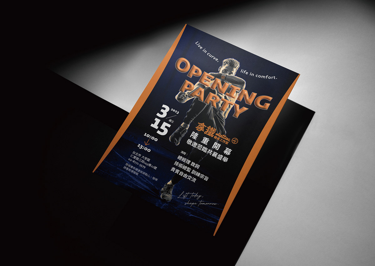
拿鐵健身工作室,就如拿鐵本質,追求完美調和!和日常生活中我們想追求一個平衡;拿鐵健身提供一個有溫度及溫暖的空間,讓大家有舒適運動、放鬆的環境。
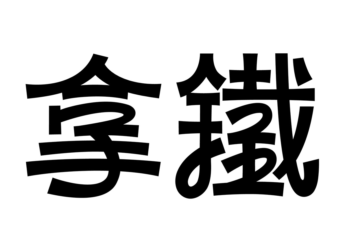
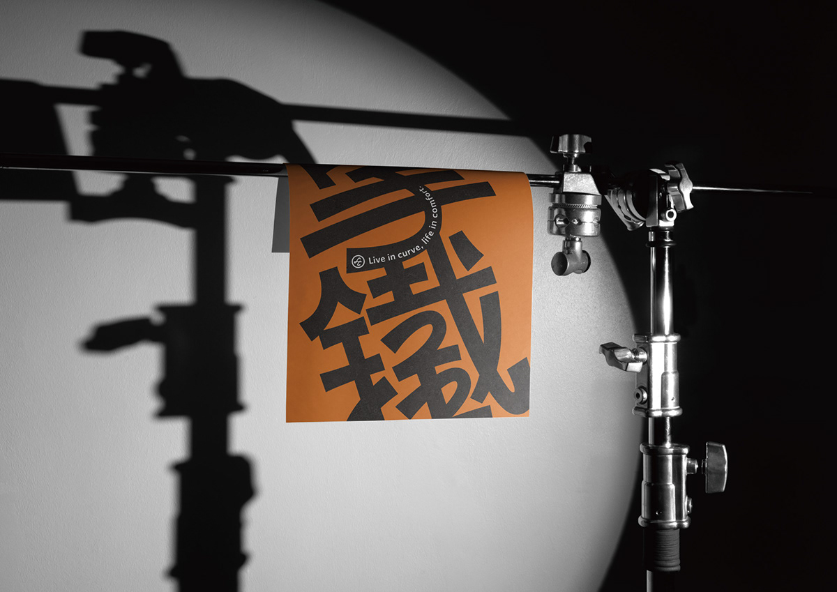
商標及標準字以線條表現運動曲線,粗線有強壯厚實、穩重的視覺效果,細線則有細膩、靈巧,就像拿鐵除了想帶給大家體魄強健外,也想協助調整身體平衡。
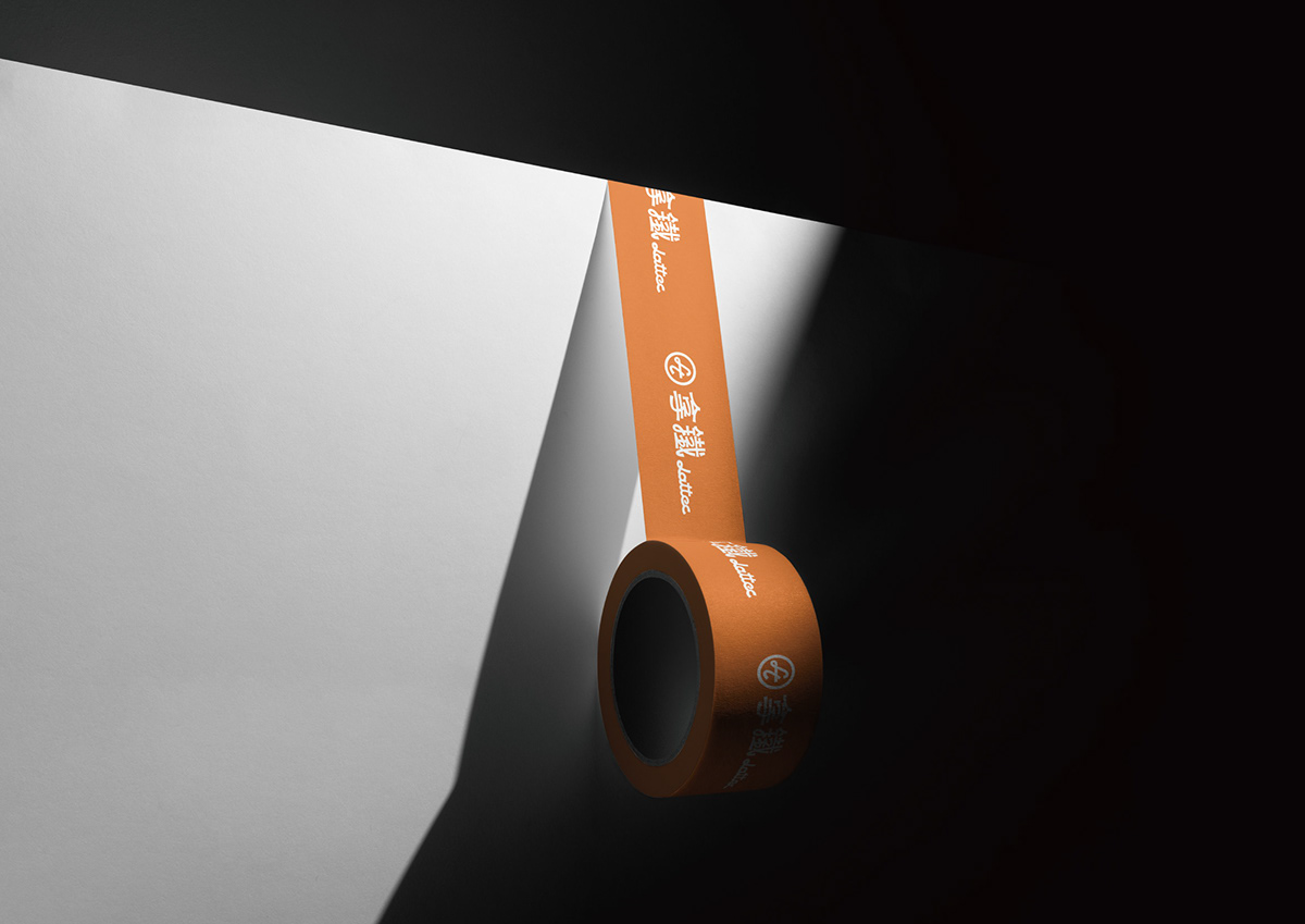
標準色以暖色系橘色,帶給人們充滿活力及關懷的感覺;點綴冷色系藍色,健身專業帶給人們信賴、穩重安心感覺。
Lattec Fitness Studio just like the essence of latte, pursuit of perfect harmony. Also like we want to pursue a balance in our daily life. Latte Fitness provides a warm space, let everyone have a comfortable exercise and relaxation environment.
The logo and standard characters express the movement curve by lines, while thin lines have delicate and dexterous, just like Latte Fitness not only wants to bring everyone physical strength, also can help adjust the body balance.
The standard color is orange, which is a warm color, which brings people a feeling of vitality and caring; with the cool color blue, it makes people a sense of trust, stability and peace of mind in the fitness industry.
Designer 鄭啟宏、賴永盛

