


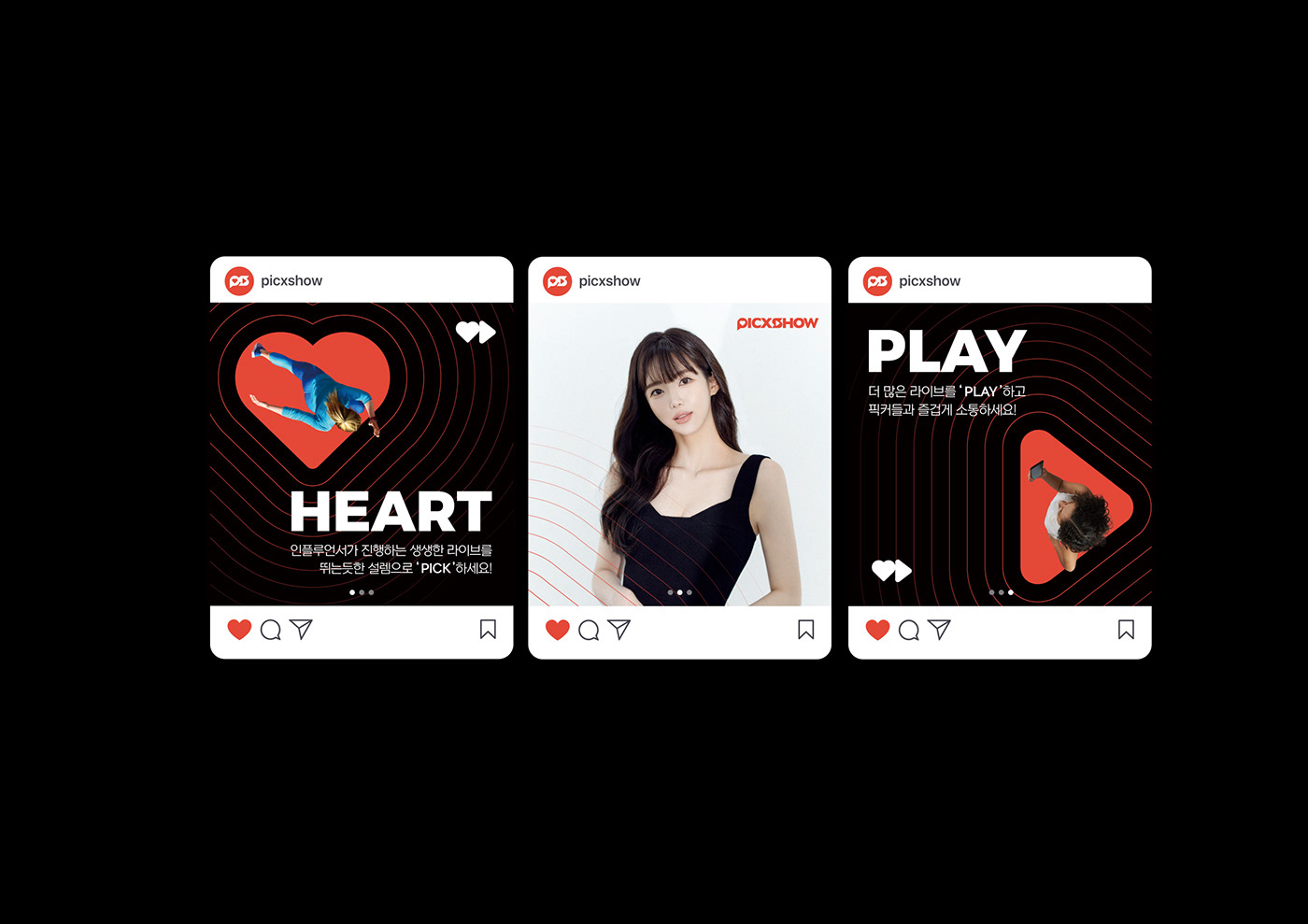
BRAND POSITIONING
픽쇼는 팬덤 소비자에게 셀럽과의 실시간 소통을 통해 취향 맞춤 컨텐츠와 다양한 아이템을 제공하며, 인플루언서들에겐 최적화된 원스톱 커머스 솔루션으로 단순한 소비를 넘어 쇼핑이 즐거운 놀이가 되는 공간이자 소통과 교감이 실시간으로 재생되는 라이브 커머스 플랫폼입니다.
PICXSHOW is a live commerce platform where fans can enjoy personalized contents and various products through celebrity interactions and live communication. It's not just about shopping; it's a fun space for influencers with an optimized one-stop commerce solution, fostering real-time communication and connection.

DESIGN REQUIREMENT
고객에게 디지털 환경뿐만 아니라 다양한 온/오프라인 매체에서 픽쇼의 핵심 가치와 메시지를 전달할 수 있도록 브랜드 디자인이 갖춰야 할 요구사항과 방향성을 명확하게 정의합니다.
We define the clear requirements and direction for brand design to effectively communicate PICXSHOW's core values and messages to customers across various online and offline channels, not just in the digital environment.


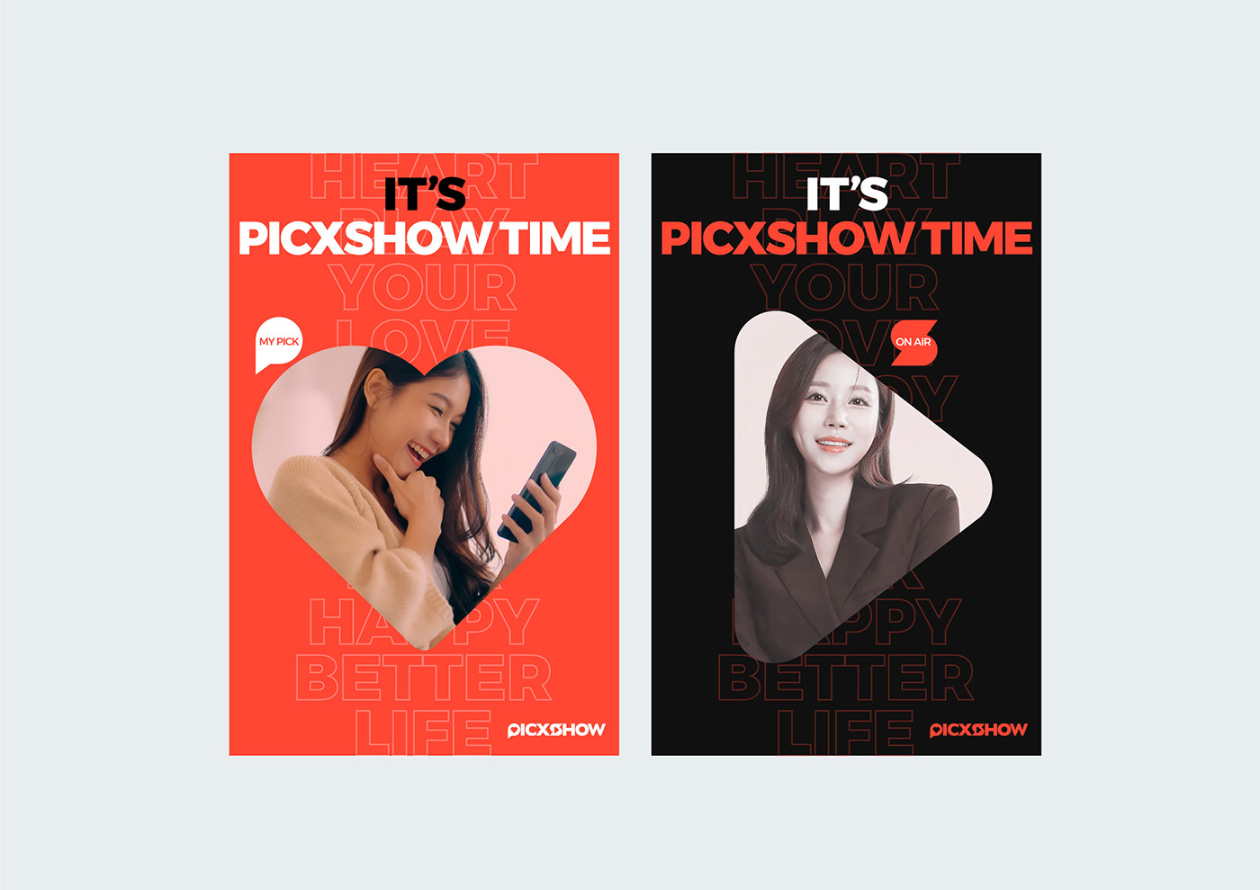
BRAND SLOGAN
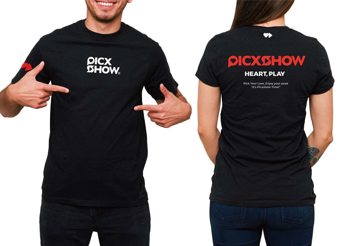
고객과 크리에이터 간의 열정과 연결을 의미하는 픽쇼의 슬로건은 다양한 개성과 취향을 이해하며 모든 구성원들의 마음에 다가가 공감대를 형성합니다. 즐거운 상호작용을 강조하며 조화로움을 표현하는 무대인 픽쇼의 철학을 간결하게 대표하는 메시지 입니다.
PICXSHOW's slogan symbolizes the passion and connection between customers and creators, understanding diverse personalities and preferences, and forming a sense of empathy in the hearts of all members. It simply represents PICXSHOW's philosophy as a stage that emphasizes the concept of enjoyable interaction and harmony.

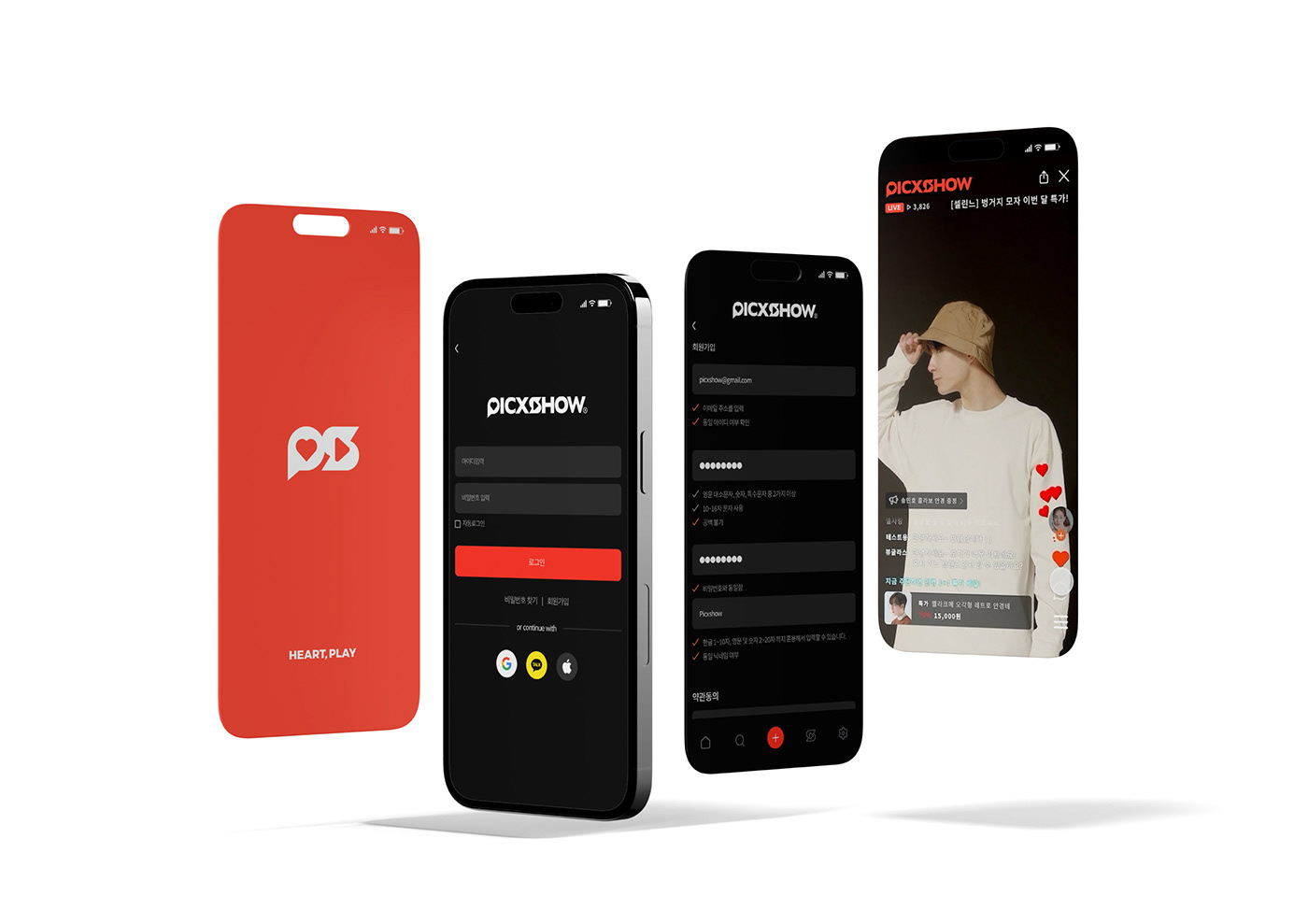
LOGOTYPE
픽쇼의 워드마크 타입 로고는 고객의 취향 소비 경험과 인플루언서의 라이브 커머스 기능을 의미하는 아이콘의 결합으로 디자인되었습니다. 볼드하고 가독성 높은 폰트를 사용해 심플하고 직관적이며 뚜렷한 개성을 지닌 픽쇼만의 룩앤필을 전달합니다.
The wordmark type logo is designed through the combination of icons representing customer preference consumption and influencer live commerce. It uses a bold and highly legible font to convey a simple, intuitive, and unique PICXSHOW look & feel.


ICONOGRAPHY
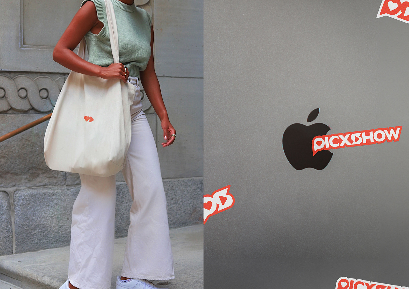
그래픽 모티프와 조형적 특징을 반영하여 차별화된 픽쇼의 아이콘을 개발하였습니다. 디지털 환경에서 브랜드를 더욱 쉽게 인식할 수 있도록 돕는 동시에 일관성 있는 브랜드 아이덴티티를 형성합니다.
We created a unique 'PICXSHOW' icon that reflects our graphic motifs and design features. This enhances brand recognition in the digital realm and maintains a consistent brand identity.

TYPOGRAPHY
가독성과 개성이 뛰어난 산세리프 영문 폰트는 심플하며 자신감 있는 무드를 전달하여 픽쇼의 브랜드 이미지를 강화합니다. 간결하면서도 조형적 특징을 갖고 있는 스타일의 국문 폰트는 서체의 일관성을 유지하며 온/오프라인 환경에서 다양하게 활용 가능합니다.
Our simple and legible sans-serif English font conveys a sense of simplicity and confidence, while our concise and stylistic Korean font ensures consistency for both online and offline use.

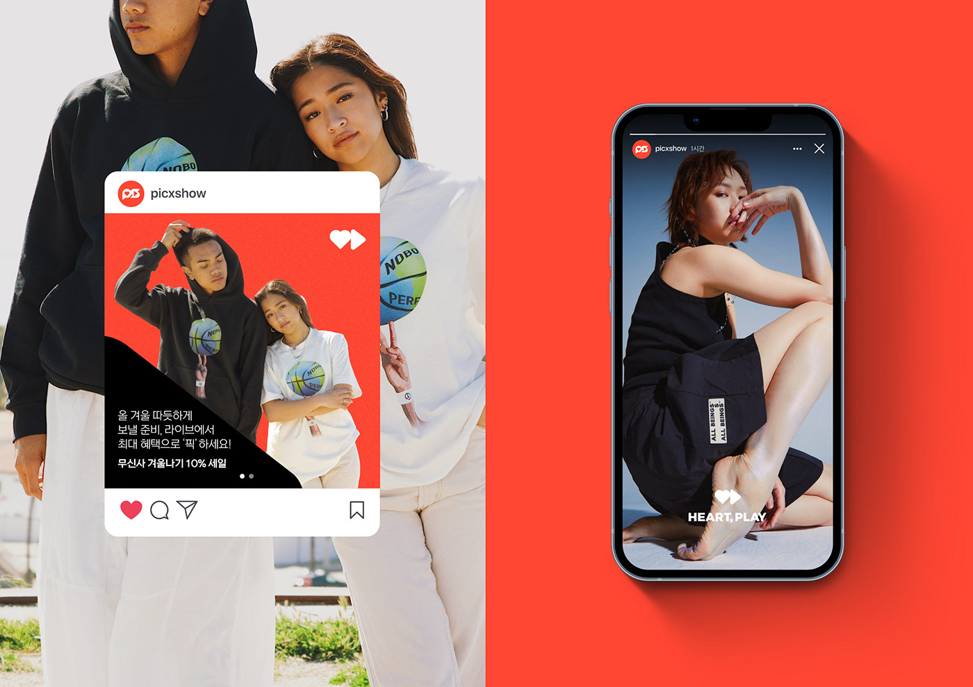
COLOR SYSTEM
픽쇼의 컬러 시스템은 레드 계열의 메인 컬러를 활용하여 활기와 에너지 넘치는 경험을 제공하는 브랜드 이미지를 표현하며
라이프스타일과 관심사에 맞는 커뮤니케이션을 상징하는 서브 컬러의 조합으로 픽쇼의 가치를 더욱 풍성하게 전달합니다.
PICXSHOW uses red as its main color to convey a vibrant brand image. It combines sub-colors to communication various lifestyles and interests, adding depth to PICXSHOW's values.


PICXSHOW
Client ⎹ Lala station, Srook
2023 MAY - SEP
Project Managing ⏐ Eonhwi Shim
Verbal Branding ⏐ MOEX BX Team
Visual Identity Design ⏐ MOEX BX Team
Inspiration to Reality
MOEX ⏐ NOTSUN ⏐ NOTSUN Studio
www.notsun.com
©MOEX Corperation. All rights reserved.


