

Wefight's acquisition cost was unsustainable. To drop the CPA, the Marketing team first tested a reward concept to incentivize users to download our app. The MVP consisted in using a third party platform to give users a voucher if they downloaded Vik from the ads that promised a reward. That led the acquisition cost to be 10x less expensive by the time I arrived. The validation of this MVP inspired us to this reward concept further.

Marketing wanted to package a module that would reward patients not only for joining our community, but also for being active members in it. For that, it needed to work as a stand alone brand existing outside the app (acquisition) and inside the app (retention).
After our Visual Designer worked on the first branding elements above, we decided to put our focus on the integration of the newly named "VIP Program" in the app.

One of my favorite tools to align teams on flows at such early stages is a piece of paper and a pencil. I drew a flow pointing out in red the short, mid and long-term modules for Product to challenge. We finally agreed on an MVP, placing green dots on the easiest to implement parts that were covering Marketing needs as well as being the smoothest for our users.

After my team got reduced, I had to re-think the way I produced assets, and I used for the VIP Program Adobe Stock elements as a base that I tweaked. Since we aimed at gamifying rewards, our benchmark quickly showed us that animations were a must, thus why we collaborated with a freelance to animate the static assets I delivered.
Most of the components of this flow were already implemented from previous projects (Surveys, Consents). Moreover, the 3 screens to collect a reward were constrained by the 3rd party we considered using: as we embedded them, we could only act on the UI. so I mainly had to focus on designing the description page.

I decided to opt for a modular structure, capable to adapt the different needs the page would address at the different points of the journey. First, users would have to register on it. When the registration process would be completed, the CTA would disappear. However, if they dropped in the middle, I had to factor in a way for them to pick up where they left off. Finally, anticipating a probable Business need to cumulate points to get to a reward in the next 6 months, I had to foresee a dedicated space to visualize it.

Originally, there was only 1 card in the home, to collect users' mood overtime. Since we were only collecting their mood only once a day, I wanted to optimize this precious spot and decided to transform it into a carousel. This way, it would push Vik's main communications, starting with our VIP Program.

Once I aligned with the Product Team the objective to test as well as the metrics to assess whether the objective was reached or not, we established a User Test Protocol. We chose Odaptos, a AI-powered user testing platform that use text and emotions recognition to cross what people do, say, feel and think. This way, we could guarantee the highest level of objectivity in the qualitative insights collection, compared to traditional 1to1 user tests.
Our KPI were successfully met. That said, we got 2 insights that we would love to integrate in our next iteration:
- One user out of the 5 we interviewed went first to "My profile" to register to the VIP Program, while we expected him to find it in the carousel or in the Settings. He used different apps with loyalty programs that all placed it the the profile, so it made sense we factor in this feedback.
- One user out of the 5 we interviewed didn't see at first the labels "VIP" on the functionalities that led to a reward, since they were too small. She was expecting a place that gathered the different eligible functionalities, as we planned it for a V3.
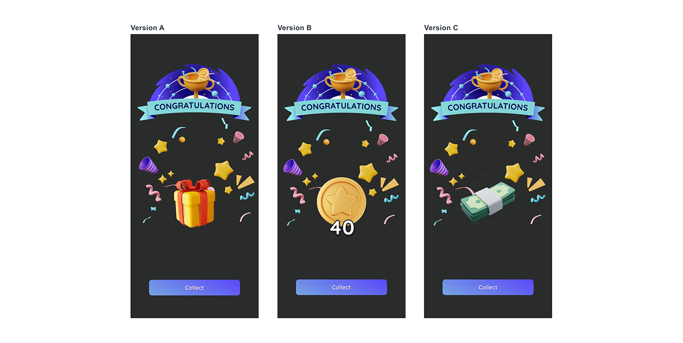
We also wanted to test the perception of the reward, and conducted a ABC Testing with our users. Version A resulted in a consensus since it reminded users of a surprise which brought them excitement. Version B got mixed results: our Millenials segment - which represent our main target, accepted it since they had more landmarks playing video and mobile games, while it brought confusion to our older segment who didn't understand what it could be. Finally, Version C got discarded in France since it was too monetary looking, which removed the element of surprise and excitement of versions A and B. Those results comforted our decision to start with the Version A for the first release.

At the end of the user testing process, we decided to do a retrospective to map out what worked and what didn't, in order to improve the process.


