A fresh take on the daily dining experience.
For Grubways, the ultimate goal is to shrink all the steps between choosing what to eat and the satisfaction of eating what has been selected.
For a lot of Grubways users, time is more important than anything, and the extra time that goes into making the great meals they crave could be channeled into another, usually more important, activity.
This project's aim was to re-think the Grubways brand image to be more modern, well-thought-out, and original. Elements that make up the core appearance of the brand needed to be updated and streamlined to fit into its market even better.


Bright and Bold, the Grub way.
Daring colors with intense hues make the brand appearance almost ‘pop out’ at the viewer, making for an intense, hard-to-forget experience anytime a user interacts with the brand. The colors selected are largely inspired by hues that are associated with food, appetite and satisfaction.


Accentuating the simple identity with type
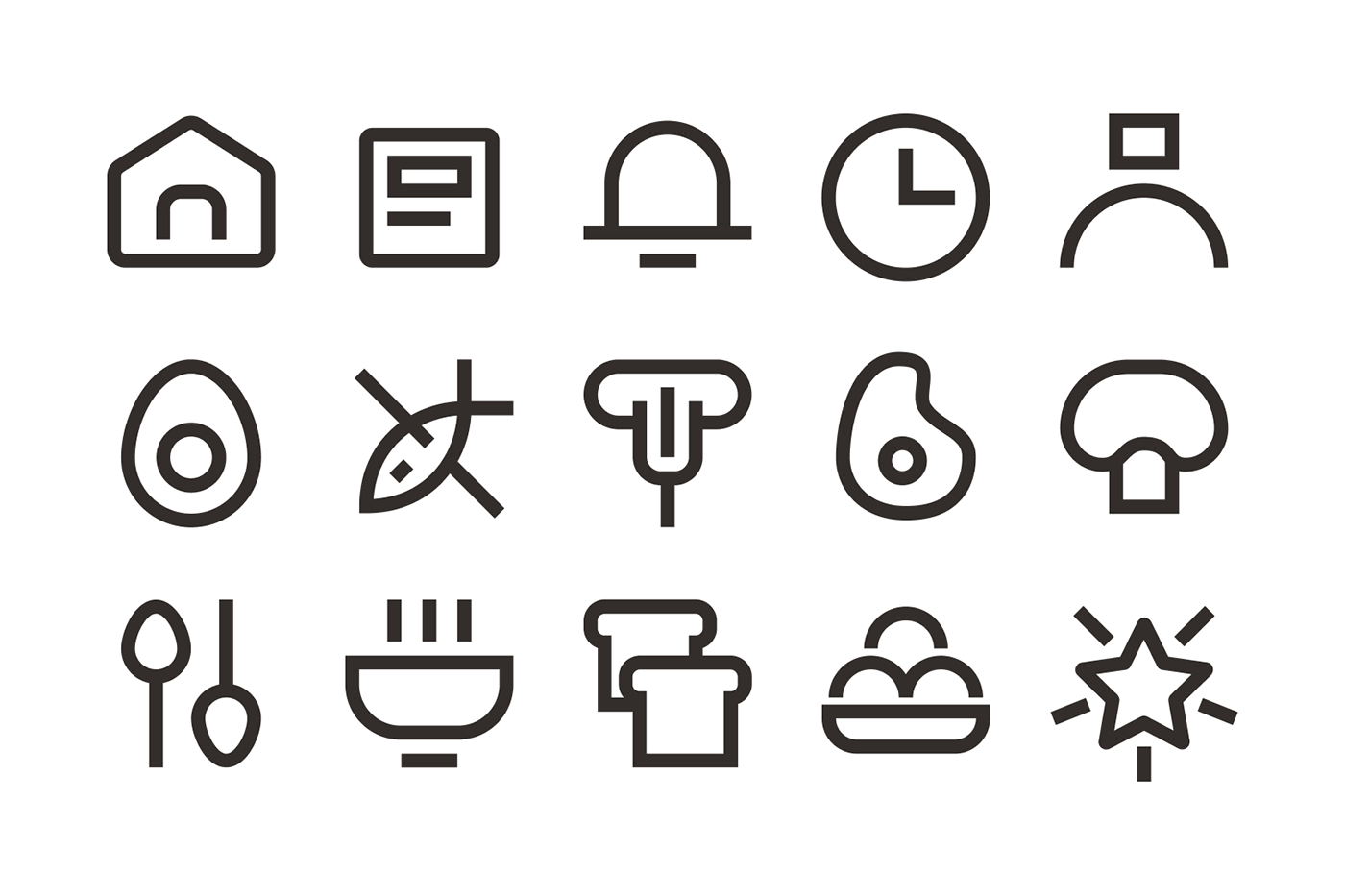
and a matching custom iconography
With visual simplicity as a key goal, typography and iconography are approached to match each other and behave as siblings of the same system. ‘Chillax’, the selected main typeface makes for a simple but equally daring look.


Creating iconography for the branding was treated not as a separate section of the project, but as an extension of the character, form, and typography of the brand.
The iconography features the consistent use of a 32px by 32px grid, with clean strokes that terminate at a straight edge - mimicking the shape and form of the typeface.