About The Brand
Quik is more than just a fintech startup. Their platform is one that empowers individuals to unlock their financial potential and dreams through savings, investing and payments. Their mission is to make financial growth accessible to all, regardless of their background or income level. With innovative tools and user-friendly interfaces, they strive to simplify the complexities of finance enabling users to achieve their dreams and secure a brighter future.
Project Objectives
1. Brand Identity Definition (Mission, Vision, Values)
1. Brand Identity Definition (Mission, Vision, Values)
2. Target Audience Analysis (Needs, Pain points)
3. Brand Positioning (Finding out what sets the company apart from its competitors)
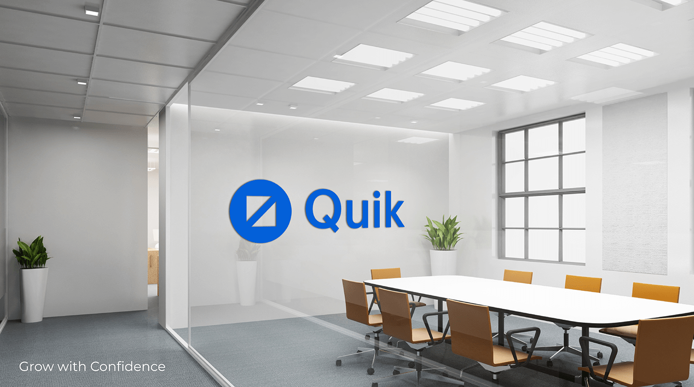
4. Logo and Visual Identity (Creating Visual Languages)
5. Brand Messaging, Marketing Collateral, Social Media Posts.
Creative Solutions
1. Market Research
2. Target Audience Analysis
3. Unique Value Proposition
4. Creative Brand Identity.

Brand Values
1. Growth 2. Teamwork 3. Innovation
4. Strength 5. Empowerment.
Brand Imagery
Our strong brand imagery resonates with our audience, conveying not only what our brand offers, but also its personality and ethos.


Logo Grid and Clear Space

Logo Meaning
The quik logo is made up of a perfect circle and two triangular, arrow-like forms that are angled and facing in opposite directions. When combined or when a second square is made from the fictitious visual intersection, these shapes make a perfect square.
The two triangular arrow-like designs symbolize both the brand's forward motion and the addition of money from all sides. Additionally, both sides can be used to show speed. The logo's strength is demonstrated by the square enclosed in the circle, which also gives it a polished appearance. On the other hand, the circle conveys a sense of warmth and community and makes the icon compatible with the next type that begins with the letter Q.


Typography Style
The Roboto font is a versatile font that effortlessly balances professionalism with a friendly demeanor. Its clean and modern design exudes a sense of expertise, making it an ideal choice for our wide range of professional contexts.
This touch of friendliness ensures that the font remains welcoming and relatable, even in formal settings. Whether used in business documents, websites, or branding materials, Roboto manages to strike the perfect harmony between professionalism and a personable charm, making it trusted companion for effective communication.

Color Palette
Blues and greens are the primary color choices for the brand. The professionalism, growth, and friendliness that are the cornerstones of our brand's culture are all conveyed by these hues.

Illustration Style

Brand Application and Collaterals


Brand Iconography
We aim to portray strength, professionalism, simplicity, easy visualization, and professionalism, hence none of our icons have rounded corners.