01 INFORMATION
Release: File Formats: Designer:
2023 OTF, TTF, WOFF2 Jona Saucedo
About:
Non Bureau typeface was initially created with the purpose of meeting some internal design needs. Bureau has that character in its Swiss typographic style structure, which makes it a universal option to cover any requirement. Moreover, it was crucial for us to offer a functional collection capable of adapting to various environments without losing its legibility in continuous text.
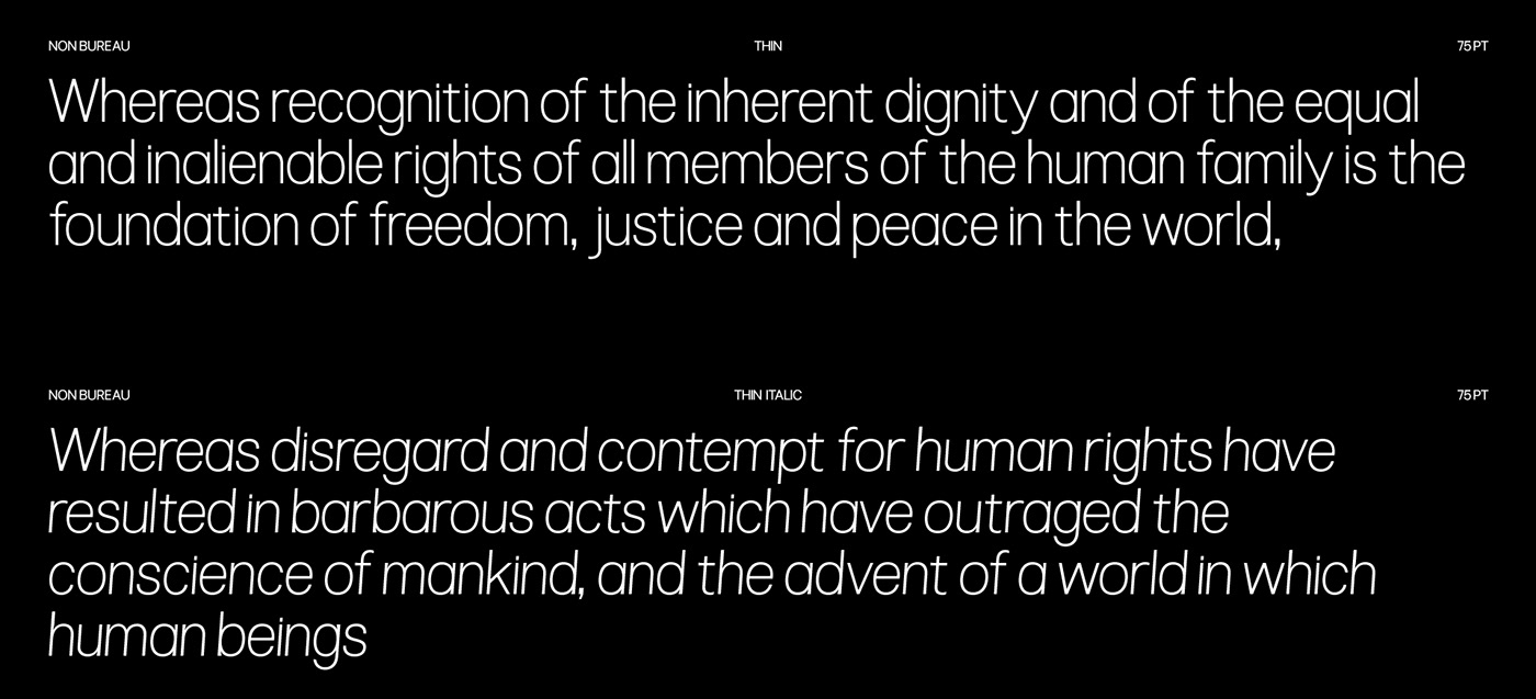
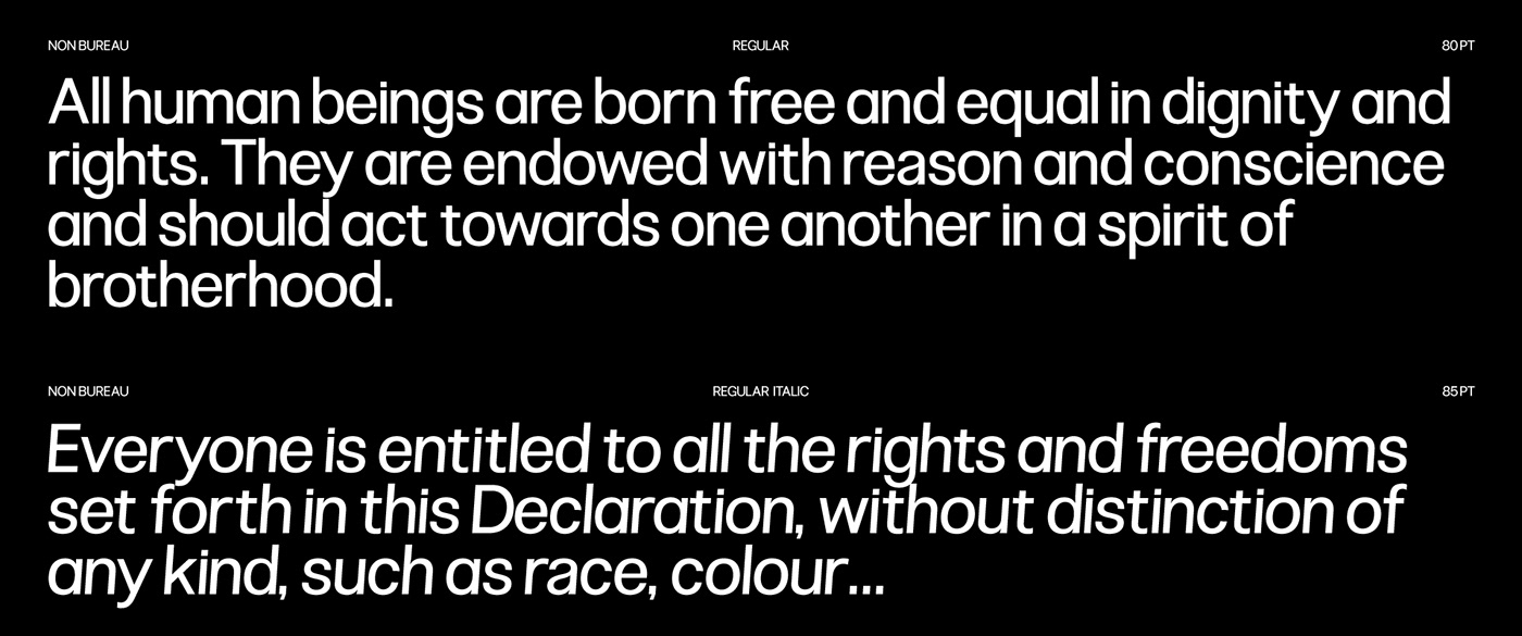
One of the aspects to consider in Bureau is its spacing, intentionally made narrower compared to other typographic fonts. We believe that for practicality and to achieve better results, it is easier to open up tight spacing in text rather than doing the opposite, widening it.
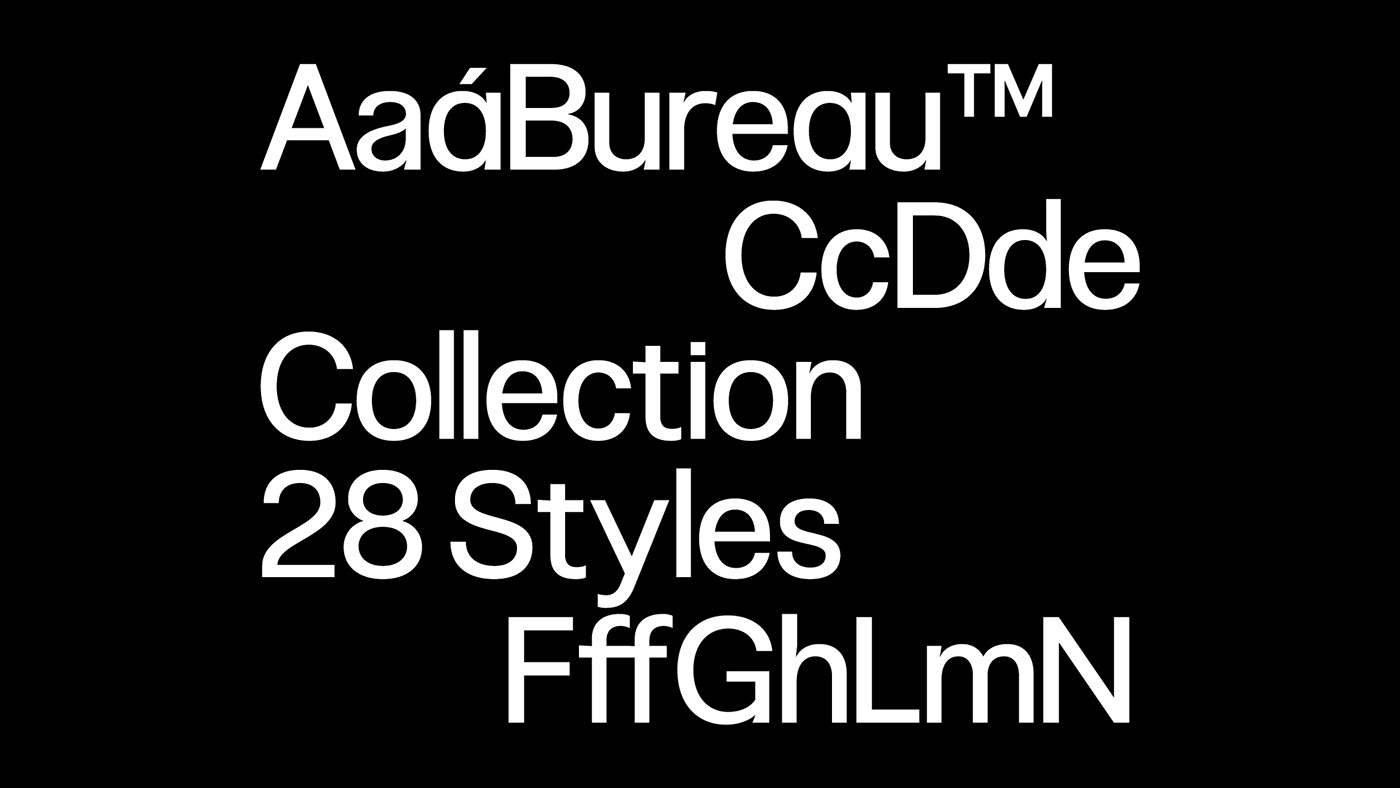
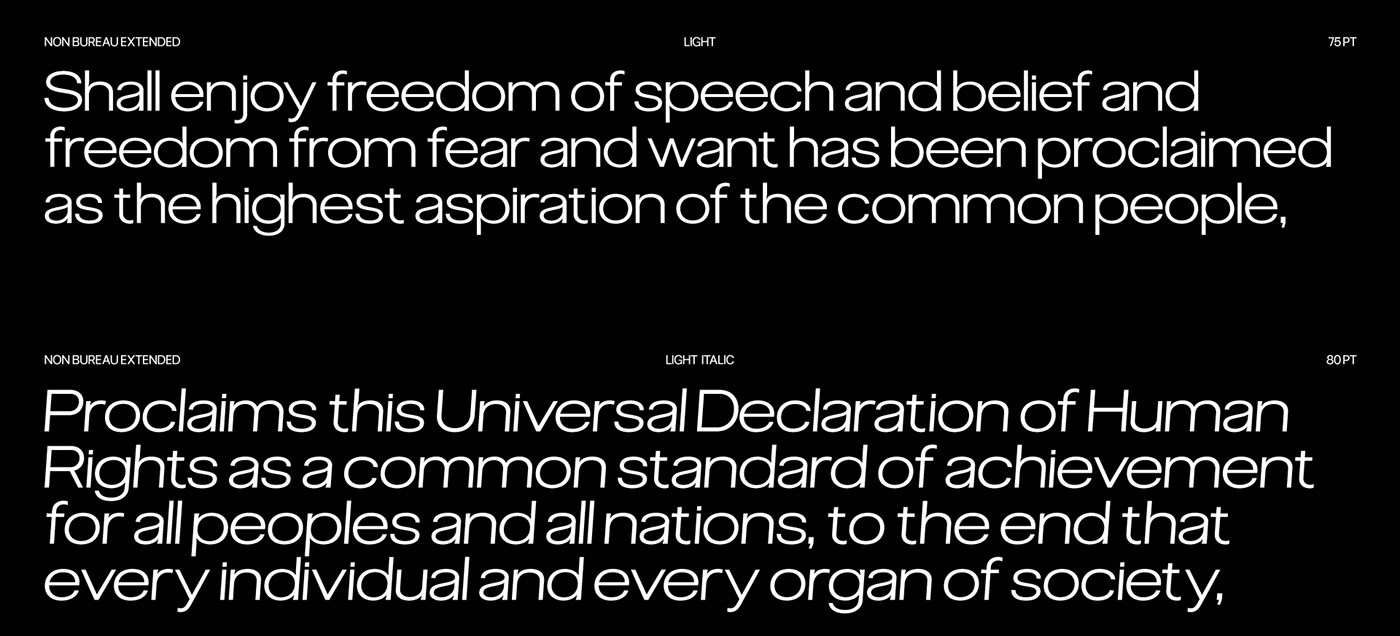
Taking into account these design variables, shapes, spacing, etc., we believed it was essential to create another variant of Bureau, but with the purpose of functioning in headlines. Non Bureau Normal meets this need very well, but we needed something that could complement it, that could be combined. The essence of this extended version can still be appreciated, but now the letters are wider, with the details slightly more exaggerated.
One of the aspects to consider in Bureau is its spacing, intentionally made narrower compared to other typographic fonts. We believe that for practicality and to achieve better results, it is easier to open up tight spacing in text rather than doing the opposite, widening it.
Taking into account these design variables, shapes, spacing, etc., we believed it was essential to create another variant of Bureau, but with the purpose of functioning in headlines. Non Bureau Normal meets this need very well, but we needed something that could complement it, that could be combined. The essence of this extended version can still be appreciated, but now the letters are wider, with the details slightly more exaggerated.


02 CREDITS
Follow Non™: Contact us: Playlist:
–
Copyright © 2023 by Non Foundry. All rights reserved.


