

Jaksent™
Energy drink brand Identity & packaging design | 2020


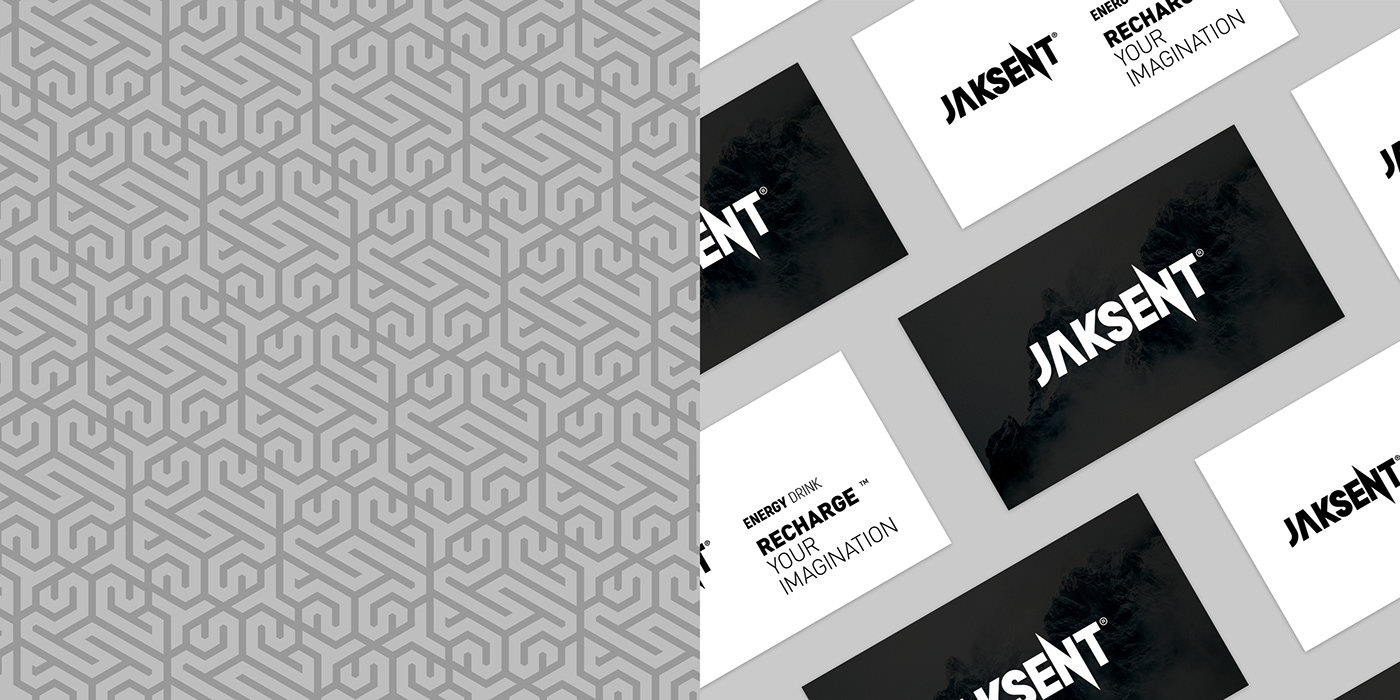
Jaksent™ is a new energy drink available in the market in five different flavors. This brand focuses on idealism, creativity, and energy as its core elements in designing its logo and visual identity. The Jaksent™ logo is designed using simple and minimalist lines, evoking a sense of dynamism and vitality to customers.
The minimalist packaging of Jaksent is also highly appealing. Through the use of vivid colors, simple design, and concise wording, the packaging aligns perfectly with the brand's visual identity. Not only is the packaging visually attractive, but it is also easily recognizable and holds great appeal for customers seeking an innovative and captivating experience. Overall, Jaksent™ stands out as a new and distinctive energy drink in the market, thanks to its unique logo and visual identity, as well as its minimalist packaging.
ــــــــــــــــــــــــــــــــــــــــــــــــــــــــــــــــــــــــــــــــــــــــــــــــــــــــــــــــــــــــــــــــــــــــــــــــــــــــــــــــــــــــــــــــــــــــــــــــــــــــــــــــــــــــــــــــــــــــــــــــــــــــــــــــــــــــــــــــــــ
That's what Jaksent™ wants, a feeling of the power...


