PT -BR
Gabriella Fagundes é uma fisioterapeuta especializada em atendimento clínico e domiciliar, além de atuar como instrutora de Pilates. Ela adota uma abordagem biopsicossocial em sua prática de fisioterapia, com o objetivo de restaurar e preservar a funcionalidade dos seus pacientes. Gabriella busca proporcionar um atendimento humanizado e personalizado, sempre priorizando o bem-estar e as necessidades de cada paciente.
Os principais atributos para o direcionamento da construção da identidade visual da marca foram:
ELEGANTE | CONFIÁVEL | PROFISSIONAL | MODERNA
–
EN - US
Gabriella Fagundes is a physiotherapist specializing in clinical and home care, in addition to acting as a Pilates instructor. She takes a biopsychosocial approach to her physical therapy practice, with the aim of restoring and preserving her patients' functionality. Gabriella seeks to provide a humanized and personalized service, always prioritizing the well-being and needs of each patient.
The main attributes for directing the construction of the brand's visual identity were:
ELEGANT | RELIABLE | PROFESSIONAL | MODERN
PT -BR
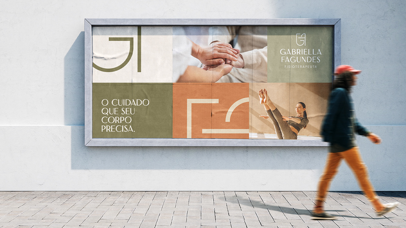
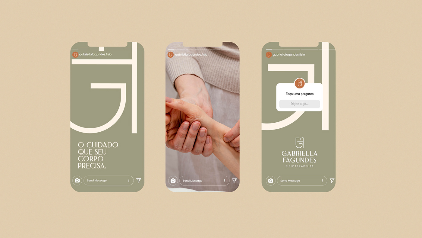
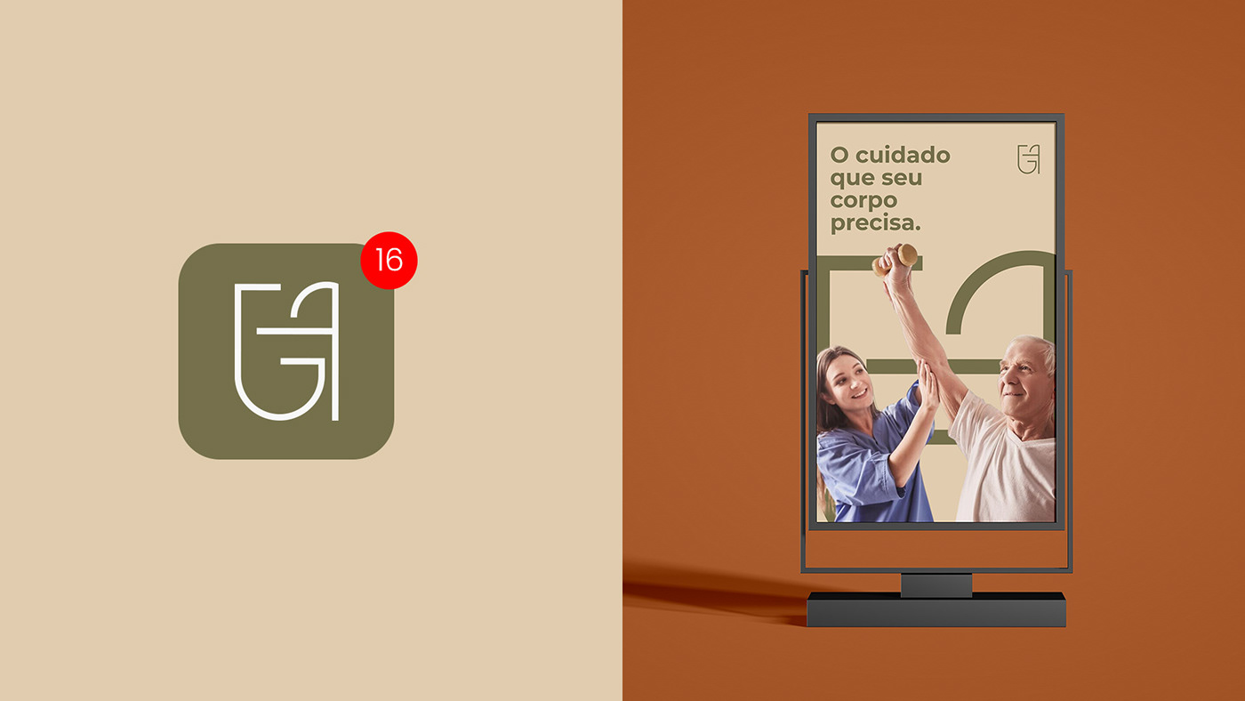
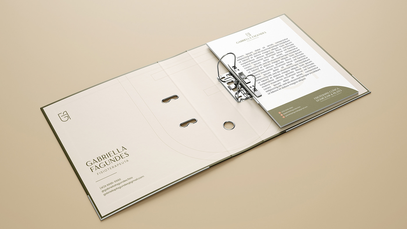
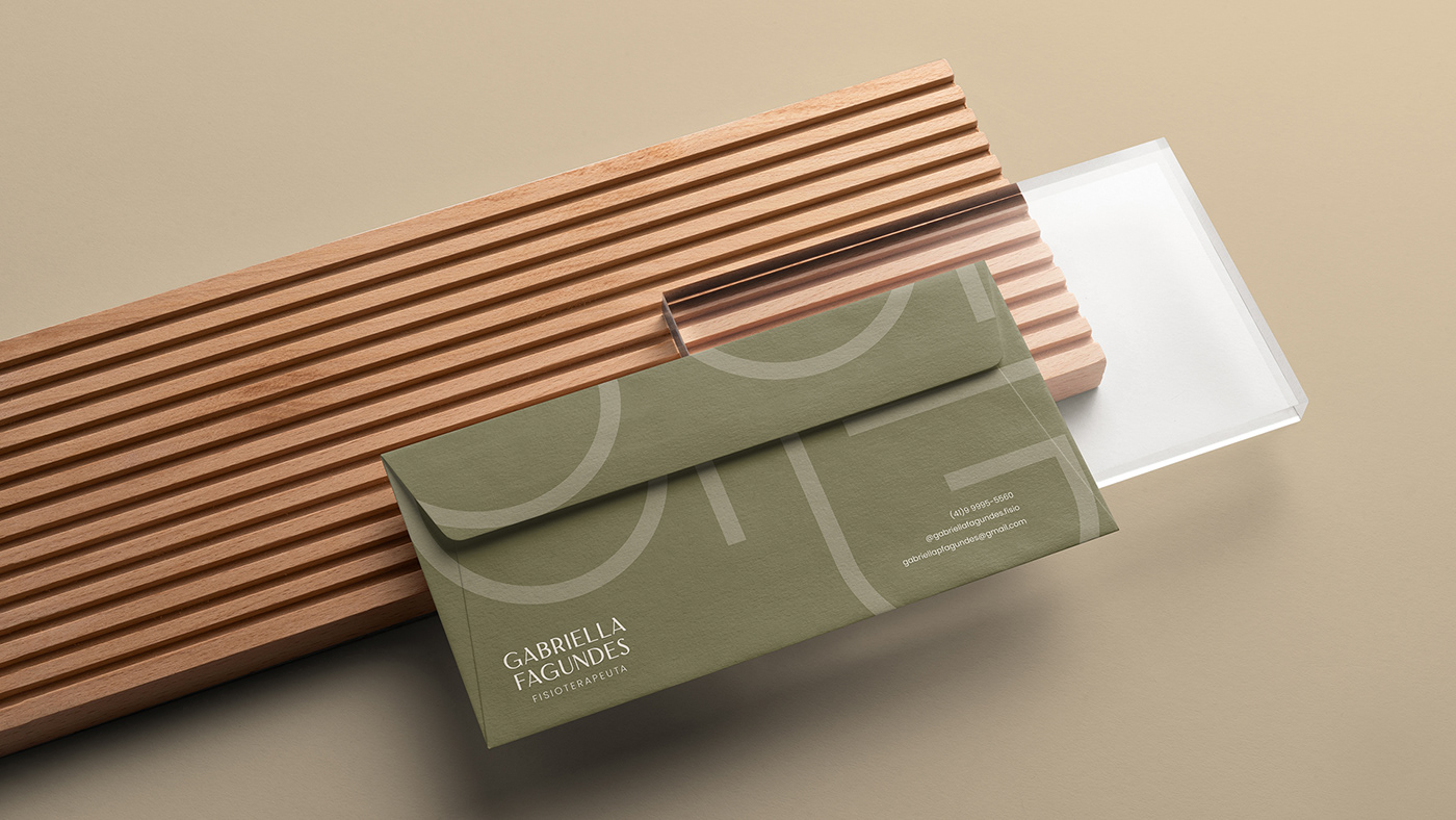
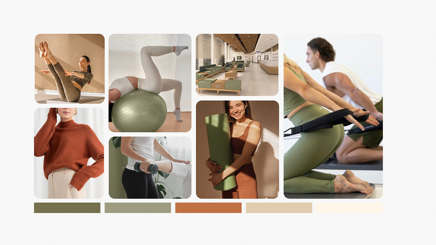
A paleta de cores foi definida de forma estratégica também levando em consideração os desejos da cliente. O verde oliva, o terracota, o nude e o creme foram selecionados para trabalhar em harmonia. O verde oliva é uma cor que transmite sofisticação e tranquilidade. Sendo associado à harmonia e segurança, além de possuir propriedades relaxantes que ajudam a aliviar o estresse e a ansiedade. Essa cor também está relacionada à cura e ao crescimento pessoal. Já o terracota traz consigo sentimentos de calor, aconchego e estabilidade. Ele evoca uma energia vibrante e calorosa, adicionando um toque alegre ao projeto transmitindo vitalidade e entusiasmo. Para garantir a harmonia visual, o nude e o creme complementam a paleta. Sendo cores atreladas à delicadeza e elegância. Elas transmitem uma sensação de suavidade e sofisticação, contribuindo para o equilíbrio estético do projeto.
–
EN - US
The color palette was strategically defined, also taking into account the client's wishes. Olive green, terracotta, nude and cream were selected to work in harmony. Olive green is a color that conveys sophistication and tranquility. Being associated with harmony and security, in addition to having relaxing properties that help relieve stress and anxiety. This color is also related to healing and personal growth. Terracotta already brings with it feelings of warmth, coziness and stability. It evokes a vibrant and warm energy, adding a happy touch to the project and conveying vitality and enthusiasm. To ensure visual harmony, nude and cream complement the palette. Being colors linked to delicacy and elegance. They convey a sense of softness and sophistication, contributing to the aesthetic balance of the project.

PT -BR
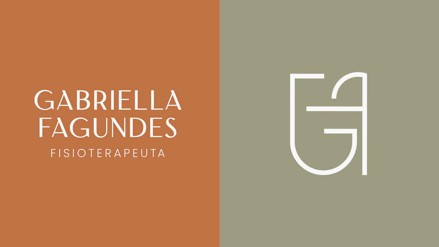
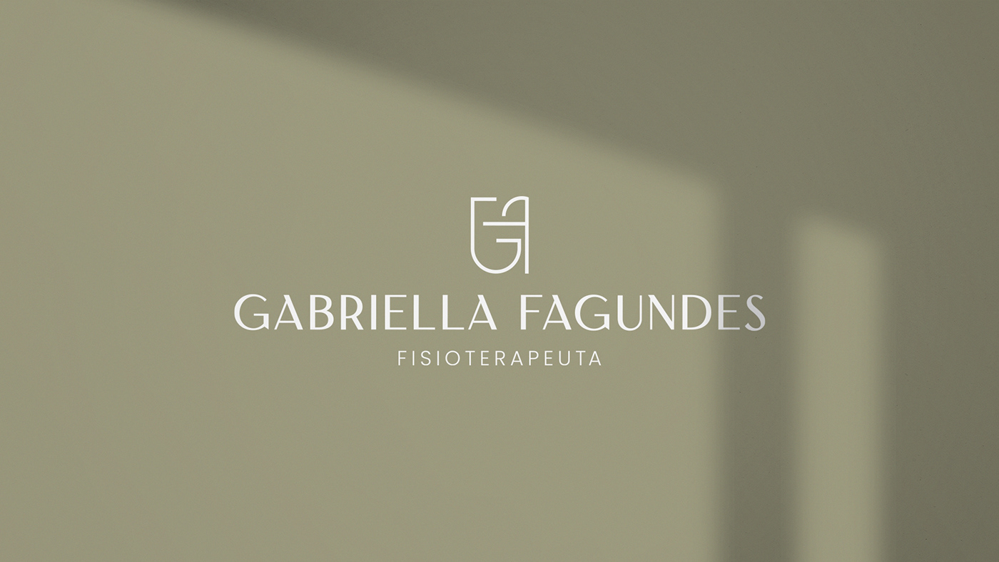
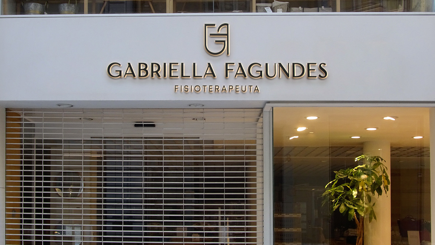
O símbolo proposto é um monograma que combina as iniciais do nome “Gabriella Fagundes”. Com o intuito de agregar personalidade e maior significado, a criação do símbolo foi projetada para evocar os movimentos de alongamento do corpo humano. Dessa forma, o símbolo ganha vida e movimento, trazendo uma conexão visual com a ideia representada.
–
EN - US
The proposed symbol is a monogram that combines the initials of the name “Gabriella Fagundes”. In order to add personality and greater meaning, the creation of the symbol was designed to evoke the stretching movements of the human body. In this way, the symbol comes to life and movement, bringing a visual connection with the represented idea.