


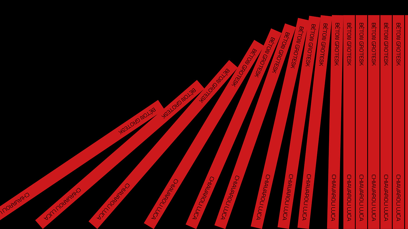
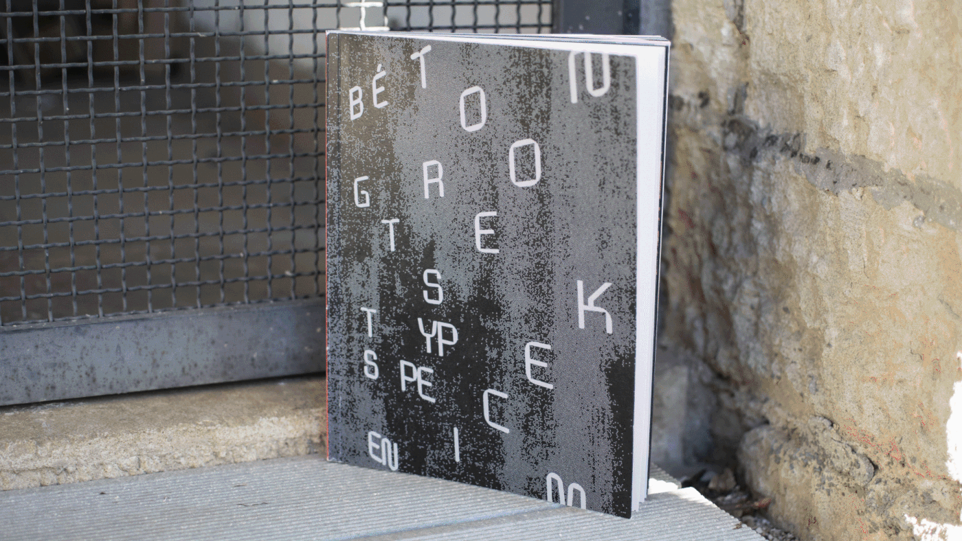
Béton Grotesk
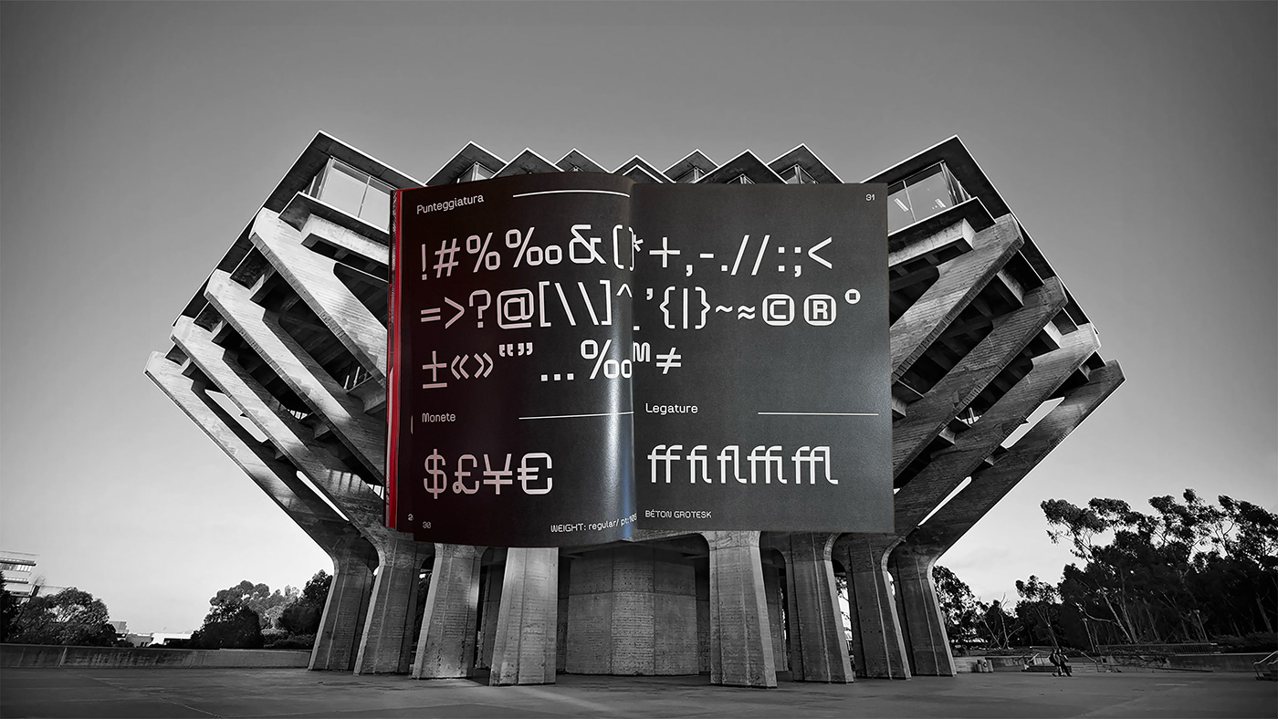
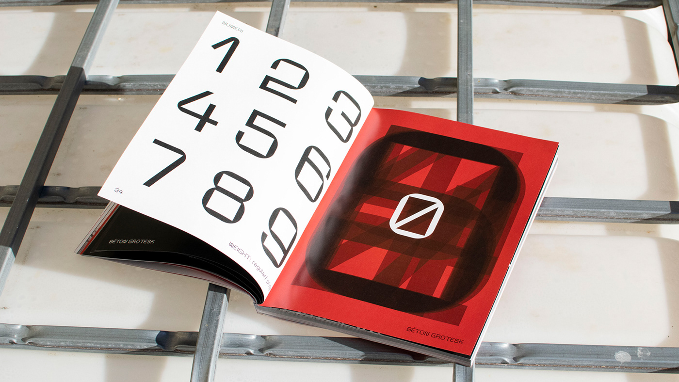
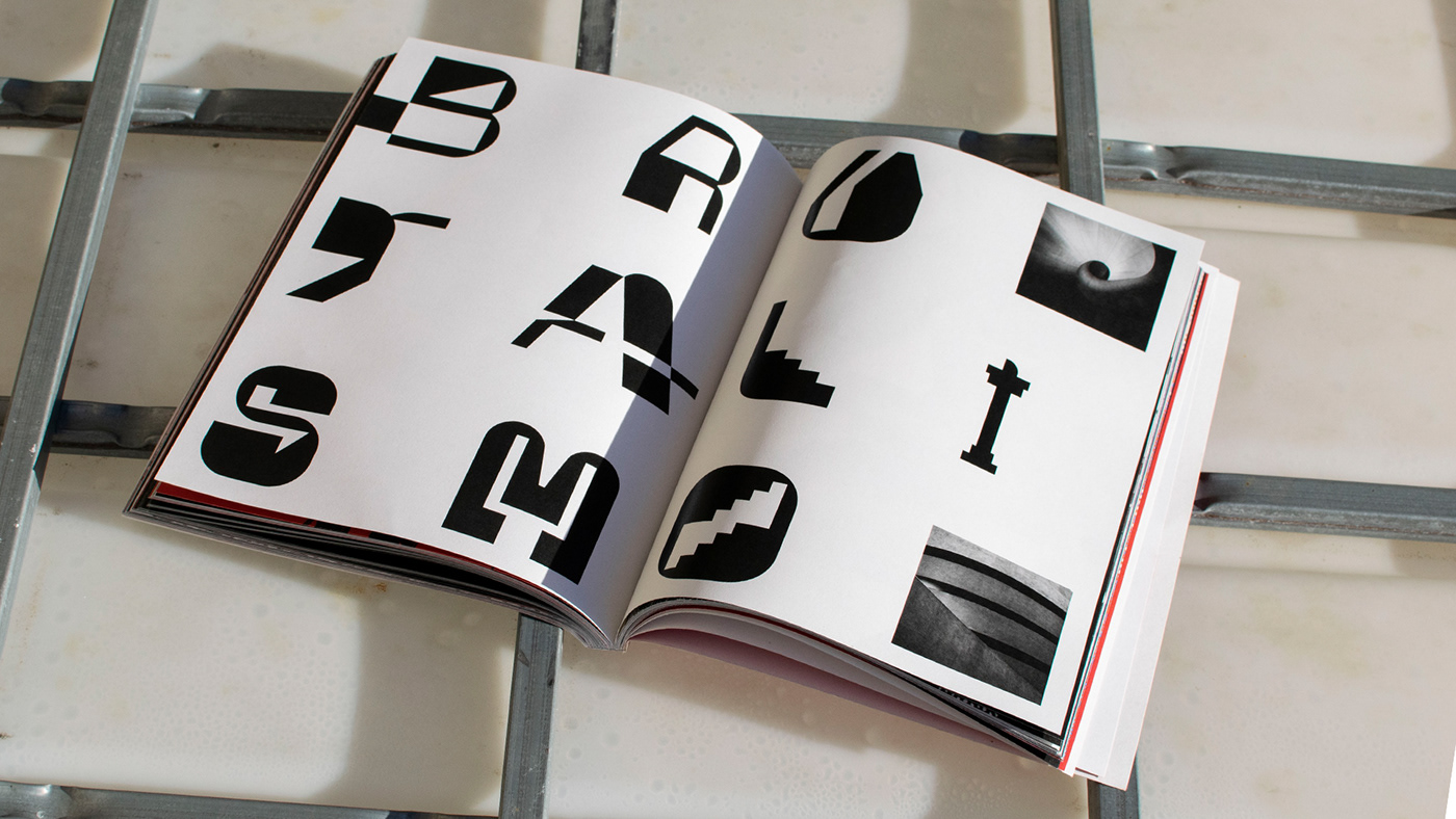
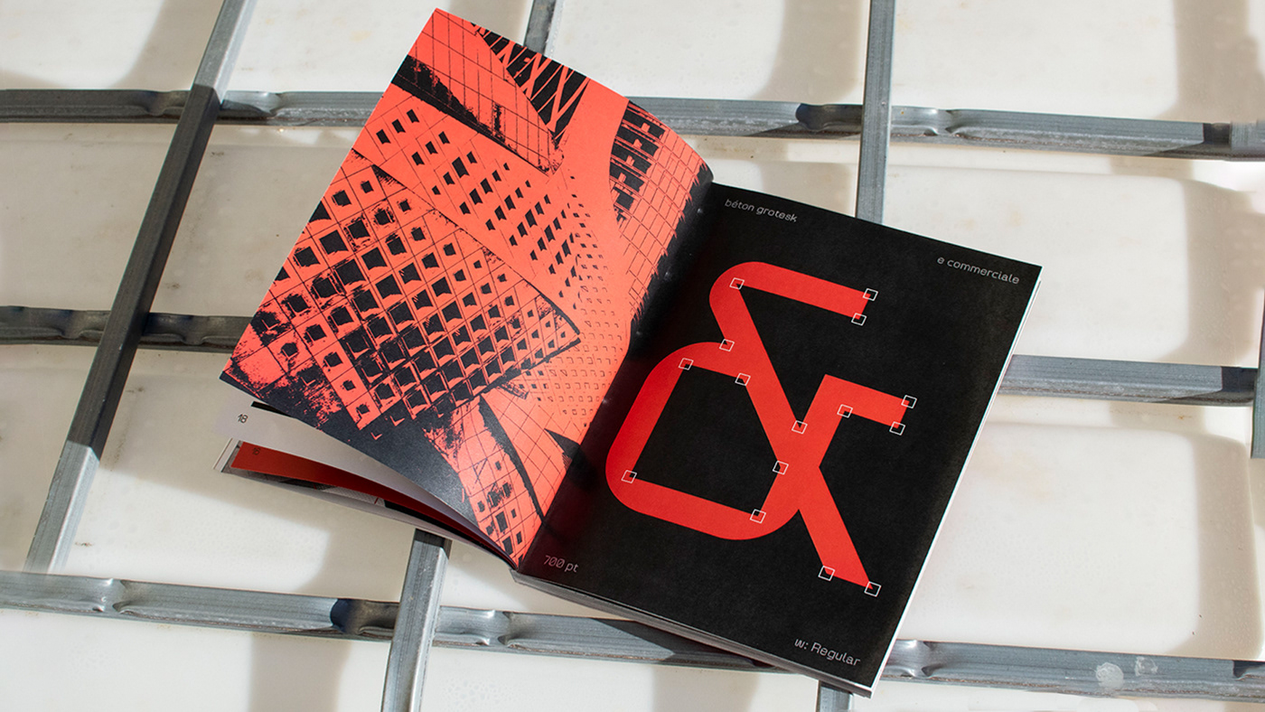
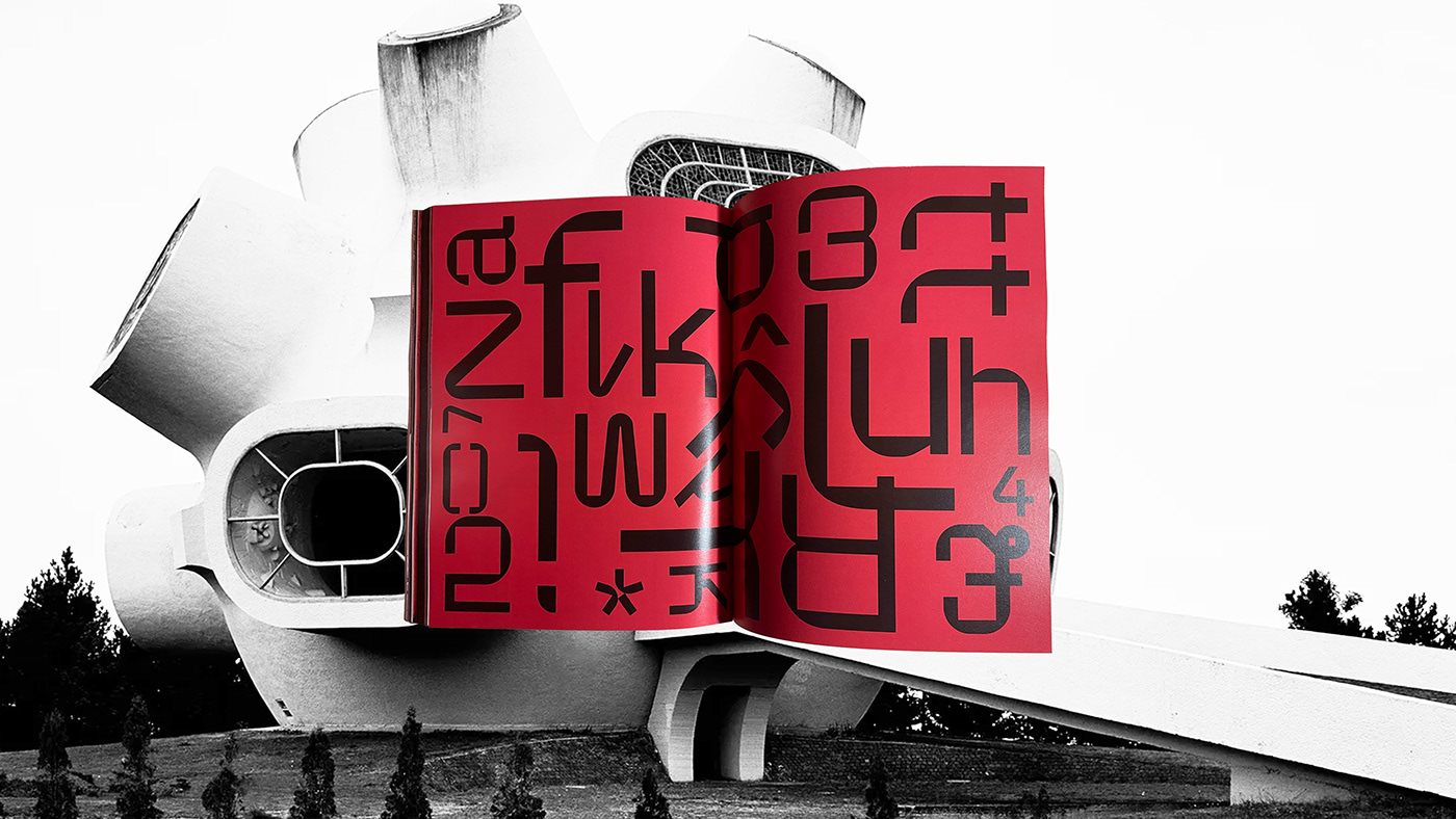
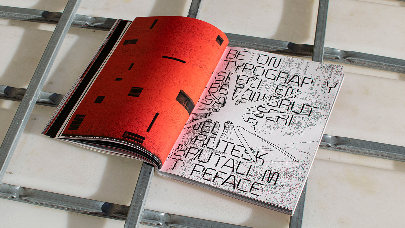
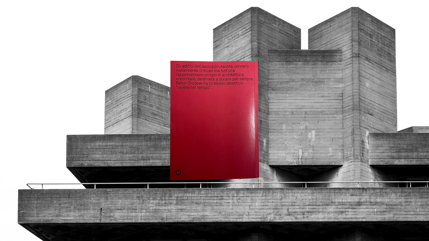
[ita] Béton è un nuovo carattere tipografico lineare, appartenente alla famiglia dei Grotesk. L'origine del nome deriva proprio dalla sua ispirazione, béton brut è un termine francese che significa cemento a vista. Il carattere tipografico nasce proprio dalle linee razionali e squadrate utilizzate dalla corrente architettonica brutalista. Le forme di ogni carattere portano con sé sia le linee squadrate che sinuose degli edifici dell'epoca brutalista. Il fulcro del progetto è il contrasto di due forme geometriche semplici:
cerchio e quadrato.
[ENG] Béton is a new linear typeface, belonging to the Grotesk family. The origin of the name derives from its inspiration, béton brut is a French term which means exposed concrete. The typeface was born from the rational and squared lines used by the brutalist architectural current. The shapes of each character carry with them both the squared and curvy lines of the buildings of the brutalist era. The focus of the project is the contrast of two simple geometric shapes:
circle and square.
circle and square.


Tesi a.a. 2021-22 ISIA Pescara Design
Supervision by:
Relatore_Leo Margiotti
Correlatore_Raffaeleandrea De Simone
All rights reserved ©


