

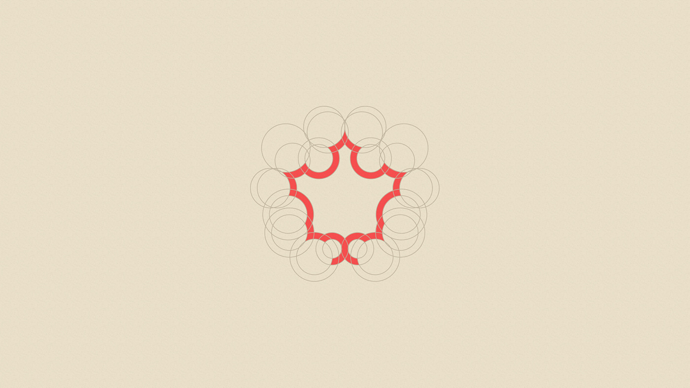
The brand was created with inspiration in the wood, which is the primary matter of the customer's work and also the shape of the tree leaf that originated the name of the company. The leaf of the Quercus Rubra tree in autumn is red in color, and was used to create the symbol of the mark, with circles that maintain a proportion in their forms. The layers inside the wood were used to complement the visual identity, using a circle on the outside and the shape of the sheet inside and the transition between the two forms gave rise to the pattern for the brand identity. The colors are brown and red, wood and leaf of the tree in autumn.


Obrigado!
Thank you!
Follow us on Instagram
@e.couy


