


In my endeavor to redesign the Froot Loops logo, I delved into a realm of creative exploration. Inspired by the kaleidoscope of nature's beauty, I aimed to capture the essence of each fruity flavor. The result was a dynamic interplay of vibrant colors and harmonious shapes that pay homage to the iconic loops while infusing a fresh and contemporary spirit. Through this redesign, I sought to evoke a sense of joy and anticipation, reminiscent of childhood excitement every time a bowl of Froot Loops is poured.
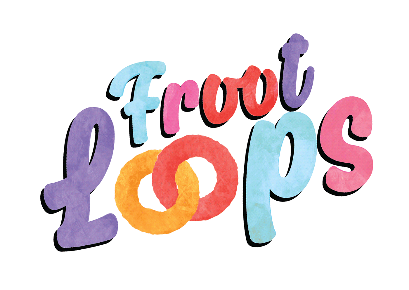
Infusing my own palette of carefully chosen shades, I embarked on a creative journey to reimagine the iconic loops of the Froot Loops logo. Inspired by contemporary design trends, I embraced a minimalist approach, distilling the essence of Froot Loops into clean lines and bold color blocks.

On the company's letterhead, the redesigned logo takes center stage, confidently asserting its presence with a clean, minimalist backdrop. Against a white canvas, the logo's colorful loops create a striking focal point, embodying the brand's commitment to taste and joy.
The envelope continues this theme of balance, where the logo's loops dance elegantly across the corner, bringing a burst of color to the recipient's first interaction with the brand. This envelope design not only conveys the brand's essence but also creates an element of anticipation – much like the excitement of pouring a bowl of Froot Loops.
Business cards follow suit, with a modern and sleek aesthetic. The logo takes center stage, occupying a significant portion of the card. The backdrop is kept clean and minimal, allowing the vibrant loops to command attention. The bold design mirrors the brand's confident personality, making each business card an unforgettable representation of the brand's identity.

In this mockup, the Froot Loops logo takes center stage on a sleek black t-shirt. Against the deep, rich backdrop, the logo's colorful loops pop with a captivating contrast. The t-shirt's dark canvas provides the perfect setting for the logo to shine, creating an eye-catching ensemble that seamlessly merges style and playfulness.
The Froot Loops logo finds itself at home on a vibrant blue bowl. Nestled against the cerulean hue, the logo's loops exude a sense of taste and anticipation. The blue bowl serves as a harmonious backdrop, enhancing the logo's colorful vibrancy.
On a clean and crisp white tote bag, the Froot Loops logo stands as a symbol of creativity and flavor. Against the white canvas, the logo's loops radiate a burst of colors, becoming a mobile piece of art that sparks curiosity and smiles. The tote embodies practicality while carrying the essence of taste and innovation. As the logo graces the bag, it transforms it into a statement piece, showcasing a fusion of playfulness and functionality.

The new Froot Loops packaging redesign is a vibrant and creative masterpiece. It features a palette of soothing blues and purples as a backdrop, while a lively orange tiger-like mascot enjoys a bowl of Froot Loops on the front, capturing the cereal's essence. The interplay of colors draws attention, making the packaging visually appealing. On the back, a maze-like mini game adds an interactive touch, engaging consumers while they enjoy their cereal. This redesign transforms the cereal box into a captivating experience, blending colors, flavors, and fun to create a delightful breakfast journey.


The Froot Loops launch ad unveils the new cereal experience through a vibrant and engaging visual journey. It starts with a burst of colours, introduces the refreshed logo, and features a charismatic mascot enjoying Froot Loops. The ad captures the explosion of flavor and crunch, leading to an interactive mini game on the packaging. It encourages viewers to join the flavourful adventure, concluding with the sparkling logo and the slogan " Join the fruity fun with Froot Loops " The ad beautifully encapsulates the essence of Froot Loops – a fusion of taste, color, and fun, inviting everyone to indulge in a magical breakfast experience.


Theses ad campaigns creatively uses simple doodle lines to express the connection between Froot Loops and various weather conditions.


A game controller takes center stage, symbolizing the ordinary breakfast routine. But as Froot Loops appear, the controller transforms, evoking the power to level up. With Froot Loops in your bowl, breakfast becomes a high-score adventure that propels you into a day of victory.
A man freefalls from the sky on a parachute, capturing the exhilarating experience of embracing Froot Loops. The tagline "Take a Leap into Flavor, Freefall into Deliciousness" encapsulates the sensation of diving into a bowl filled with color and taste, as exciting as soaring through the air.
A padlock in the shape of a bowl signifies the potential locked within your morning routine. As the padlock opens, a cascade of Froot Loops pours out, symbolizing the liberation of taste and joy. "Unlock Your Morning Bliss with a Bowl of Froot Loops" inspires viewers to start their day on an unlocked note.


