One of the largest distribution companies in Azerbaijan contacted me with a request for a radical redesign of two
brands of butter imported from Ukraine and New Zealand. The brief pointed out that due to the uninteresting appearance of the products the consumers perceived them like cheap vegetable oils (spreads) although it was high-quality butter with a fat content of 82.9%. Because of the lack of time, it was necessary to work simultaneously with both brands. The task was simple: to create a design that could compete with well-known brands such as Westgold, Anchor, Valio, President etc.
brands of butter imported from Ukraine and New Zealand. The brief pointed out that due to the uninteresting appearance of the products the consumers perceived them like cheap vegetable oils (spreads) although it was high-quality butter with a fat content of 82.9%. Because of the lack of time, it was necessary to work simultaneously with both brands. The task was simple: to create a design that could compete with well-known brands such as Westgold, Anchor, Valio, President etc.

Work process. It was obvious that these trademarks were not created by specialists, and this applies not only to design but also the naming. Nevertheless, the customer immediately rejected the idea of brand renaming. The client also didn’t want to participate in discussions on design development; it was required to propose two complete and absolutely different designs for each project at once.
I worked with the Golden Cow brand, referring directly to the product name. Obviously, it was necessary to draw
cow (as well as an element associated with gold or luxury) and decorate this image with handwritten lettering.
cow (as well as an element associated with gold or luxury) and decorate this image with handwritten lettering.


As the client himself did not take part in working out the design, I had to try myself in a critic's role and choose the best versions. The version I chose fully reflected the expectations of the client; they were unique, attractive, and could compete on equal terms with premium competitors.


So hour X has come: the presentation of the entire amount of work was held, demonstrating two final versions.
The client chose one of the variants. In the next few days, work on the packaging design was completed.
The client chose one of the variants. In the next few days, work on the packaging design was completed.

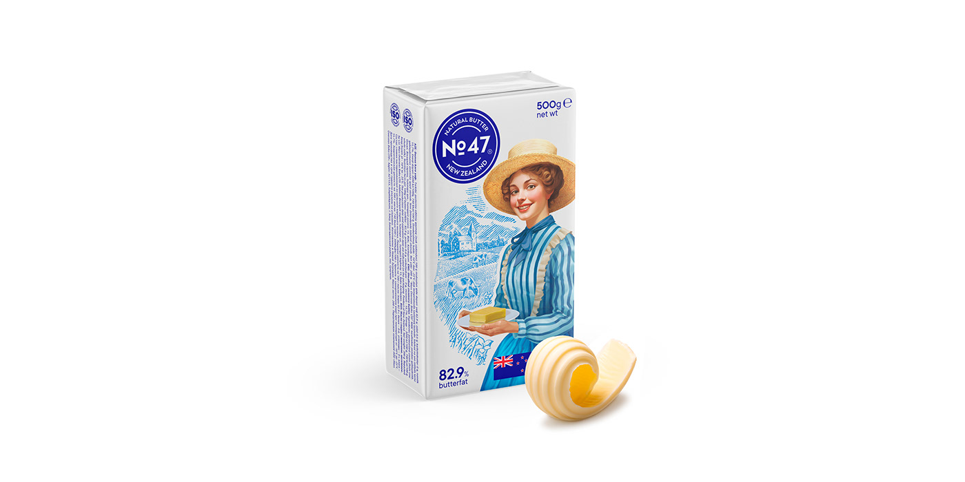
But as I noted above, there were two projects, and as time has shown, the second project turned out to be much more complex; it would also be remembered for being the first project supported by Artificial Intelligence in Azerbaijan. Unlike the previous project, the brand name of this one did not cause any associations. No. 47, so what is it? A sort of butter, a farm number, milk acidity classification? There was no way to proceed from the name, though there was a second hint: the product was made in New Zealand, and I decided to focus on this important factor for the consumer. I determined to create an image of a beautiful peasant woman with European features in 19th-century clothes (the period of European settlement) on an alpine meadow background, which is spread in New Zealand.
My idea was that one of the women hold a dish of butter in her left hand and make a "bon appétit" gesture with her right hand, a gesture that most people associate with the excellent taste of the product. The second woman had a more peaceful look; holding the dish of butter in both hands, she was dressed as a peasant woman from the Middle Ages. Although during this period New Zealand was not known to anyone else in Europe, it was worth completing it as a version.


Creating the image of a peasant woman was not the only aim. Since I am the author of a unique mixed technique in which the drawing is performed in fragments in different styles, I decided to use this technique in this case. In contrast to the raster, full-color illustration of a peasant woman, I created a background in vector format in a graphic style.


The presentation of both images took place immediately after Golden Cow; this was more difficult for me, and I was convinced that the client would accept one of the variants without any comments. Imagine my surprise when the client refused both portraits. I was shocked by the customer’s decision; there was nothing like it on the market, even in the segment of premium butter. Never before has a butter manufacturer had such an attractive mascot! The reason for rejection was that the gesture of the first peasant woman could have an offensive context, while the second woman had problems with the mimics: the customer thought the peasant woman looked very sad. Devastated by the client's decision, I had to start from a nearly clean slate. The decision of the customer seemed completely unreasonable, but disputes would be a waste of time.
Actually, creating a mascot from scratch can often be problematic, even if you’re an experienced artist. Usually, stock materials help out in such situations; you find a suitable model and just copy it. But even these searches can sometimes take hours or even days. Realizing the lack of time, I sought help from artificial intelligence for the very first time. I set the parameters in the hopes that the AI would generate a model for me to draw. I was skeptical about it, and what was my surprise when I got the results?


The elements of clothing, the hands, the body proportions—all this contained absolutely ridiculous errors, but for all that, I got a huge number of face variants in a few minutes. Beautiful features, a cute look, a sincere smile—I would spend long days looking for such material, but I got the images I needed just within minutes. This single experience radically changed my attitude towards AI, as I saved hours of work and got incredible results. Further, I used the help of AI already everywhere.


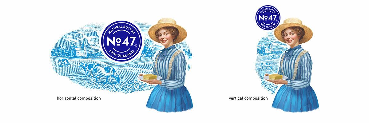
While working, I also noticed that absolutely all the butter packages had a horizontal layout. For some reason, everyone decided that the layout should be exactly horizontal, despite the fact that the space on the showcase was very limited in width while there was a large free area in height.

From my observations and understanding of the problem, I created the world's first design of butter in a vertical layout; thus, I was able to mark out the product on the showcase from all other competitors at no additional cost. Besides that, I also created a horizontal design that could be used in cases when the packaging cannot be placed vertically.
Yesterday, this product had a completely plain appearance, which is why the company did not receive the expected monthly income. In a short time, I radically changed the brand image by introducing innovations not previously used in this field, and the high-quality product took its well-deserved place in the showcase.

The products you make may be of a high quality and at an affordable price but its plain look can deprive you of a competitive advantage. It doesn't matter where you are if your business is facing similar problems and you need expert help, contact me. I am a qualified design professional with about 30 years of experience; I do all the work by myself that’s why my service costs are 70-80% more affordable than in design agencies; 90% of my work is made under the NDA (Non-disclosure agreement); I do not post these works in my portfolio and upon the project completion I transfer to the client not only the commercial rights but also copyrights without any additional payments.